Most tool reviews are either uselessly polite or weirdly theatrical.
You get a list of features copied from the pricing page, a few vague claims about “saving time,” and absolutely no proof that the person has used the thing for more than six minutes. Or you get the opposite: a dramatic takedown built on one annoying bug and a wounded ego. Neither helps someone decide.
If you want your review content to actually earn trust, you need a better structure. That is where a simple tool review proof screenshot framework for creators helps. Not because screenshots magically make content credible, but because the right screenshots, paired with the right commentary, show that you used the tool, noticed what matters, and can explain it like a functioning adult.
This piece will help you build reviews that are clearer, more believable, and much more useful for readers who are trying to decide if a tool is worth their money, time, or patience. We’ll cover what to screenshot, how to organize proof, how to explain tradeoffs without sounding bitter, and how to make the review lead naturally into trust, affiliate clicks, consulting, or content that actually converts.
For the full path around this topic, head to the parent guide.
Why most creator tool reviews fall apart
A lot of creators review tools like they are trying to finish a homework assignment fast enough to get back to scrolling.
The usual problems are predictable:
- They describe features instead of user experience
- They use screenshots with no point attached
- They say a tool is “great for creators” without saying which creators
- They skip friction, limitations, and setup pain
- They review the homepage instead of the workflow
- They bury the actual verdict under filler
That is why so many reviews feel fake even when they are technically accurate. Readers do not just want to know what a tool does. They want to know what using it actually feels like, what kind of work it fits, what breaks, what is smooth, and whether the results justify the cost.
A screenshot by itself does not prove much. A screenshot with context does. A screenshot tied to a claim does. A screenshot that shows the exact moment where the tool saves time, creates friction, or changes output quality is where the review starts becoming useful.
The simple tool review proof screenshot framework for creators
Here is the framework in plain English:
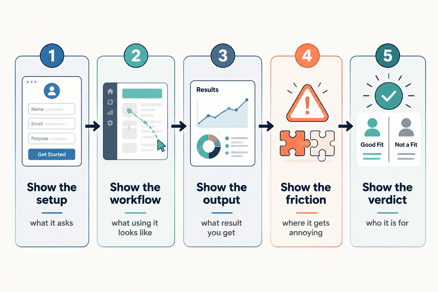
- Show the setup: what the tool asks for before it can do anything useful
- Show the workflow: what using it actually looks like
- Show the output: what the result is
- Show the friction: where it gets annoying, confusing, limited, or slow
- Show the verdict: who it is for, who should skip it, and why
That is the core. Simple on purpose. You do not need a 47-point review matrix to say something helpful. You need enough proof to support your claims and enough structure so the reader can make a decision without feeling manipulated.
Think of your review like a guided walkthrough, not a product brochure. You are helping the reader answer a buying question, not auditioning for a brand deal.
1. Show the setup
This is where you establish credibility fast. Show what the tool asks for before the magic allegedly begins.
Useful setup screenshots might include:
- Onboarding questions
- Dashboard first view
- Integration options
- Account setup steps
- Any required data, imports, or templates
- Pricing or plan gates that affect usefulness
The point here is not “look, I signed up.” The point is showing the activation energy. Some tools are promising but annoying to configure. Some are refreshingly light. That matters. Readers want to know if they are buying a shortcut or a side project.
2. Show the workflow
This is the heart of the review. If your screenshots only show polished dashboards and final outputs, you are hiding the part that matters most: the middle.
Show the actual steps you took to use the tool for a real task. For creators, that usually means one of these:
- Generating post ideas
- Drafting content
- Editing video or audio
- Organizing leads or content assets
- Scheduling posts
- Collecting research
- Tracking outreach or pipeline
- Building a landing page or funnel asset
A good workflow screenshot proves two things at once: what the tool expects from the user and what the user gets back at each step.
If the process is clunky, say it. If it is smoother than expected, say that too. Honest specificity beats brand-safe niceness every time.
3. Show the output
Now show the result. Not as a triumphal reveal. As evidence.
This is where weak reviews usually get vague. They say things like “the outputs were solid” or “it gave me some useful ideas.” Fine. But what does that mean?
Better:
- Show the generated outline and explain what was useful
- Show the drafted social post and point out what needed rewriting
- Show the analytics dashboard and explain what insights were actually actionable
- Show the content calendar and explain whether it improved planning or just looked tidy
If the tool creates output that requires heavy cleanup, that is not a dealbreaker. But it is part of the review. Pretending messy output is “good enough” just because the tool is fast is how creators end up paying for software that mostly produces chores.
4. Show the friction
This is the part that separates a trustworthy review from a suspiciously cheerful one.
You do not need to roast the tool. Just show where it gets awkward.
- Confusing UI choices
- Feature limitations on lower plans
- Export annoyances
- Weak AI outputs without strong input
- Slow processing
- Limited customization
- Redundant steps
- Places where another tool still does it better
Friction is useful information. It helps the reader self-sort. A thing that annoys you might not bother someone else, but they should still know it exists.
And yes, this part often improves conversion. Weird but true. Balanced criticism makes your positive points more believable because the review no longer reads like a hostage note written by an affiliate partner.
5. Show the verdict
End with a clean recommendation. Not “overall, this tool has pros and cons.” That says nothing and wastes everyone’s remaining patience.
Instead, answer three things:
- Who is this tool best for?
- Who should probably skip it?
- What is the main reason to choose it or avoid it?
That gives the reader a decision frame. It also makes your review easier to scan, clip, repurpose, and turn into comparison content later.
What screenshots actually help in a tool review
If you are not sure what to include, this simple list will keep you out of the weeds.
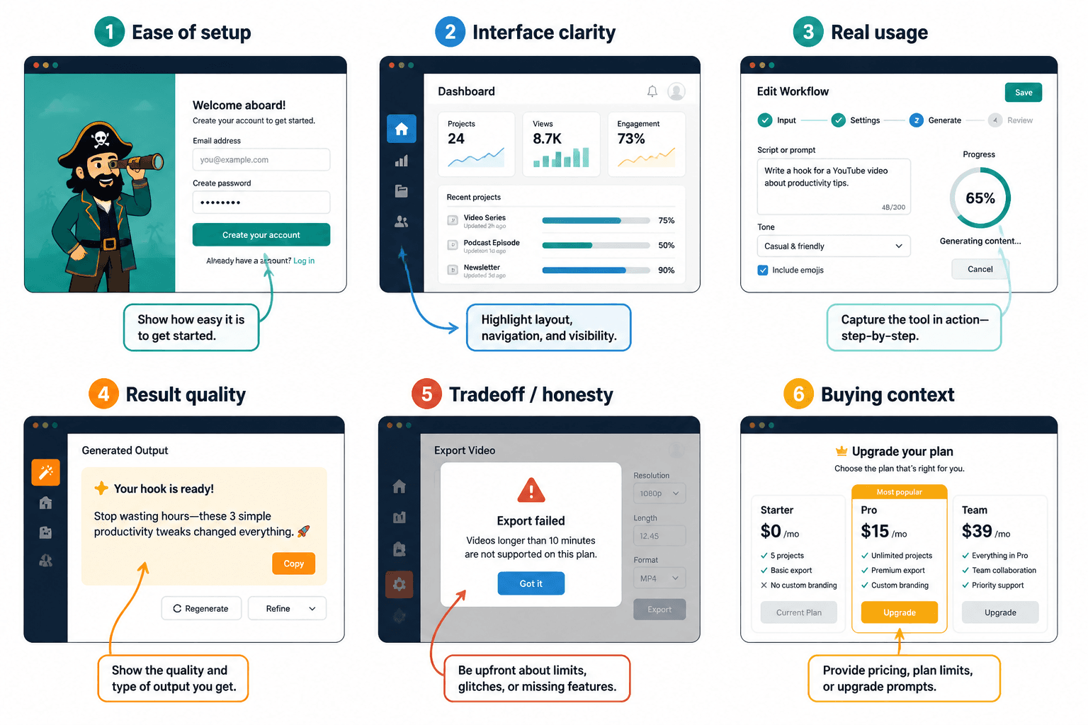
| Screenshot type | What it proves | Why it matters |
|---|---|---|
| Signup or onboarding | Ease of setup | Shows time-to-value |
| Main dashboard | Interface clarity | Shows complexity or simplicity |
| Workflow step in progress | Real usage | Shows what the tool asks from the user |
| Output example | Result quality | Helps readers judge usefulness |
| Limitation or error | Honesty and tradeoffs | Builds trust |
| Plan restriction or upgrade prompt | Practical buying context | Shows hidden friction |
If you want a deeper breakdown, pair this article with what to screenshot in tool reviews. It will help you choose screenshots that support the decision instead of just decorating the page.
How to write around the screenshots so they do real work
The screenshot is not the point. The explanation is.
For each screenshot, write a short note that answers one of these:
- What am I showing here?
- Why does it matter?
- What surprised me?
- What worked better than expected?
- What was more annoying than it should have been?
- What kind of user would care about this?
This is where many reviews drift into dead language. “The interface is intuitive.” “The tool is robust.” “The functionality is solid.” Those phrases feel professional in the way cardboard feels like furniture.
Say what happened instead.
Weak: The dashboard is user-friendly.
Stronger: I could get from signup to first draft in about ten minutes without hunting through five menus, which already puts it ahead of a lot of “creator workflow” tools.
Weak: The AI output was decent.
Stronger: The first draft gave me usable structure, but the wording was flat and generic. Good for speed, not good enough to publish without a rewrite.
That kind of commentary gives readers something they can actually use. It also makes your review sound like a person with standards wrote it.
A simple review structure you can reuse every time
If you create review content regularly, use a repeatable structure. It saves time and makes your reviews easier for readers to trust because the format stays consistent.
Try this:
- What the tool is for
One clear sentence. No hype. - Who it is best for
Name the user type, not “everyone.” - How I tested it
Briefly explain the task or workflow. - What worked
Best parts with proof screenshots. - What did not
Friction, missing features, weak spots. - Best use case
Where the tool earns its cost. - Skip it if
Help readers self-select out. - Final verdict
Short, specific, honest.
This framework works for blog posts, LinkedIn carousels, X threads, email breakdowns, YouTube scripts, and comparison pages. It is flexible without becoming mushy.
If you want more examples of what good review structure looks like in practice, read tool reviews examples that actually help a buyer decide and tool reviews guide for creators who care about quality.
How creators can use proof screenshots without becoming unbearably salesy
There is a fine line between useful review content and obvious funnel bait wearing glasses.
If your screenshots exist only to push a click, people can feel that. The review gets flatter. The praise gets shinier. The criticism disappears. Suddenly the whole thing reads like you are trying to sell vitamins from a beach condo.
A better approach is simple: earn trust first, then give the next step.
- Use screenshots to support claims, not replace them
- Be clear about fit, not just benefits
- Mention tradeoffs before the CTA, not after
- Recommend alternatives when relevant
- Make the next step low-pressure and obvious
That next step might be an affiliate link, a comparison guide, a service, a newsletter, or another review. The point is not to avoid monetization. The point is to avoid acting like trust is optional.
For broader tool review strategy, you can also connect this with the parent topic here: tool reviews. If you are building review content as part of a larger content-to-revenue system, these related pages help too: monetization funnels and money content paths.
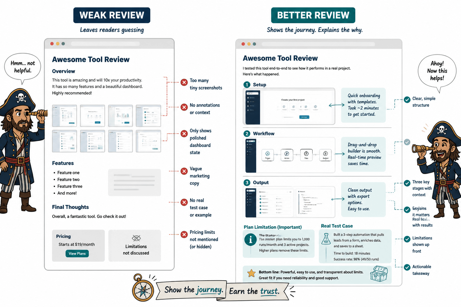
Common mistakes that make screenshot-based reviews worse
- Posting too many screenshots
More proof is not always more useful. Show the moments that matter. - Using screenshots with no commentary
If the reader has to guess why an image matters, the review is doing less than it should. - Only showing polished states
Readers need the messy middle too. - Hiding plan limitations
If a feature only exists on a higher plan, say so. - Reviewing without a test case
If you did not try to use the tool for a real task, your review is mostly decorative. - Talking like a brand brochure
“Seamless,” “powerful,” and “intuitive” are not a review. They are fog.
One more thing worth saying: not every review needs ten screenshots. Sometimes three great ones are enough if they show setup, workflow, and output clearly. Precision beats bulk.
Best use cases for this framework
This simple tool review proof screenshot framework for creators works especially well when you are reviewing:
- AI writing and content tools
- Scheduling tools
- Creator CRM systems
- Email marketing tools
- SEO and research tools
- Landing page builders
- Course or product platforms
- Design and editing tools
Why these categories? Because buyers usually need to see the interface, the process, and the output to make a decent decision. Claims alone are weak here. Visual proof matters more.
If you want to build a broader stack of review methods, best creator tools and review frameworks for tool reviews is a useful next read.
Quick FAQ
How many screenshots should a tool review include?
Usually 3 to 8 is enough. Include more only if each one helps the reader make a clearer decision.
Do screenshots really improve trust?
Yes, if they support specific claims. No, if they are random interface photos with no explanation.
Should I include negatives in affiliate tool reviews?
Absolutely. If you do not, the review looks less credible and the recommendation gets weaker.
What is the most important screenshot in a creator tool review?
The workflow screenshot. It shows what using the tool actually requires, which is often more useful than the final result.
Can this framework work for short-form content too?
Yes. You can turn it into a carousel, short thread, email, or mini case study by keeping one screenshot per proof point.
Use screenshots like proof, not decoration
A simple tool review proof screenshot framework for creators is not about making your review look more serious. It is about making it more useful.
Show the setup. Show the workflow. Show the output. Show the friction. Then give a clean verdict. That is enough to create review content that feels honest, helps people decide, and supports monetization without turning your content into a grinning sales pamphlet.
The bigger point is simple: clearer structure and clearer writing make the piece more useful. That is usually what makes the ending land better too.