
Most product and service descriptions do one of two unhelpful things: they ramble like a sales page with no editor, or they list features like a bored software manual.
Neither works very well. People are not looking for a wall of information. They are trying to answer a simpler question: “What is this, why should I care, and is it right for me?”
That is where a good feature section earns its keep. Not by sounding impressive. By making the offer easier to understand, easier to trust, and easier to buy.
If you need Simple Product & Service Descriptions Feature Sections Templates for Busy Creators, the goal is not to create some grand copywriting masterpiece. It is to build a section you can reuse, adapt fast, and publish without staring at your screen like it personally offended you.
This guide will help you write cleaner feature sections for products and services, show you what to include, and give you simple templates you can steal without making your site sound like everyone else’s beige cousin.
For the main guide behind this topic, visit the parent guide.
What a feature section is actually supposed to do
A feature section is not just a list of what is included.
It is the part of the page that helps the reader understand how your offer works in practical terms. What they get. What each part does. Why those parts matter. And ideally, why your version is worth paying for.
That means a strong feature section usually does four things:
- Names the feature clearly
- Explains what it is in plain English
- Connects it to a useful outcome
- Keeps the reader moving instead of burying them in detail
Simple matters here. Busy creators do not need more copy gymnastics. They need structure.
Why most feature sections fall flat
The problem is usually not that the offer is weak. The problem is that the description forces the reader to do too much interpretation.
Here is what people keep doing wrong:
- Using vague labels like “custom strategy support” or “premium resources”
- Listing deliverables without saying why they matter
- Writing every feature at the same level of importance
- Stuffing in too many features just to justify the price
- Sounding polished but not actually clear
If your feature section reads like the reader needs to decode it, it is not helping. It is adding friction.
A feature should not make the reader think harder. It should make the offer feel easier to understand and safer to choose.
A simple structure that works for most product and service descriptions
If you want your feature section to be clear without feeling skeletal, use this format:
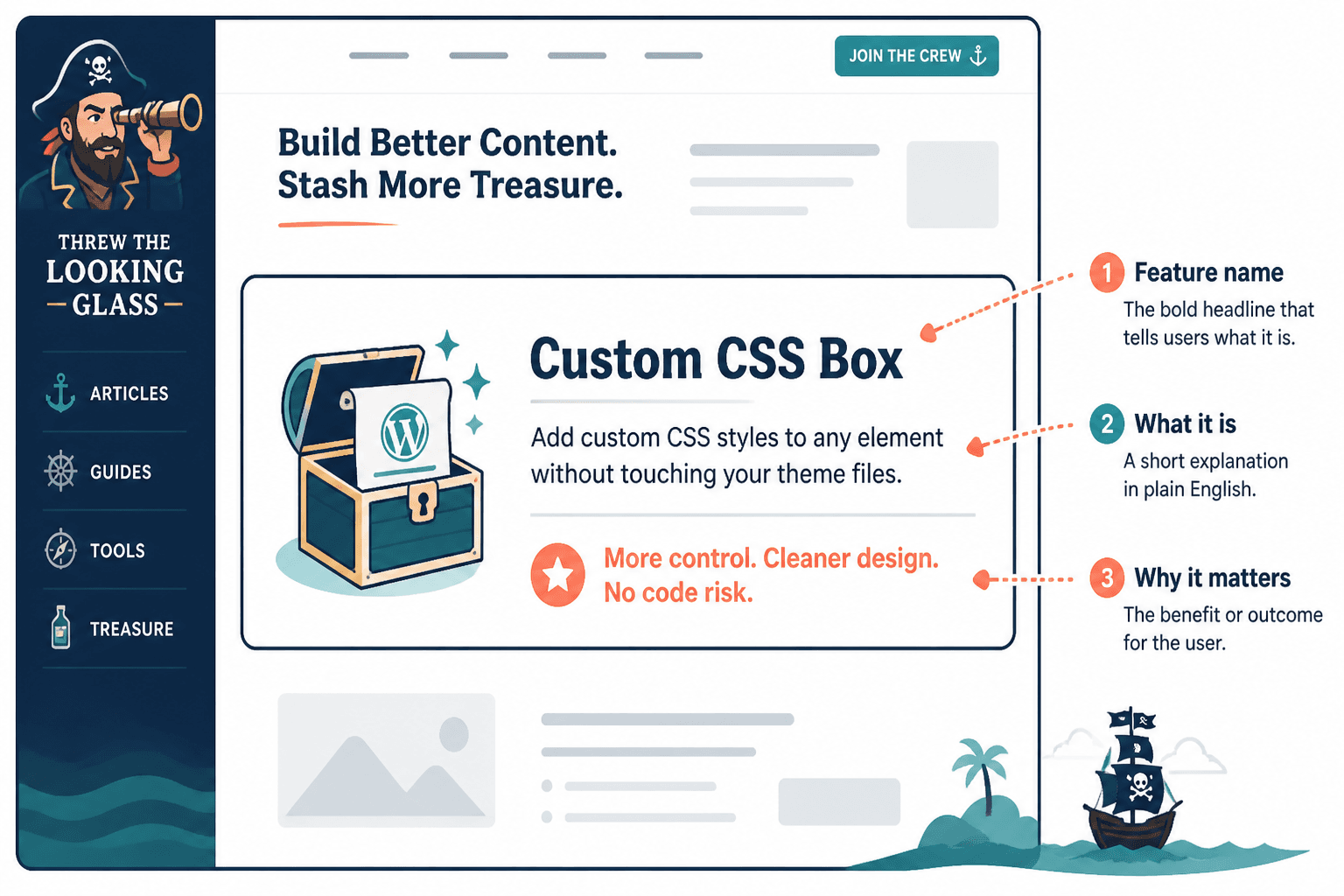
- Feature name
- One-sentence explanation
- Outcome or benefit
- Optional detail if the buying decision needs more clarity
In other words:
[Feature] — What it is. Why it matters. Optional useful detail.
That tiny structure solves a lot. It stops you from naming random parts of the offer and assuming the reader will connect the dots. Most will not. They are skimming. Help them out.
Basic feature template
[Feature name]
Short explanation of what this includes or does.
Why that matters to the customer.
Example:
Custom messaging guide
You get a clear messaging document built around your offer, audience, and positioning.
So your website, posts, and sales conversations stop sounding slightly different every time.
Simple Feature Section Templates for Product and Service Descriptions
Below are practical templates you can adapt fast. Some work better for services, some for digital products, and some for either. Use the one that fits the buying decision you are trying to support.
Template 1: The straightforward feature list
Best for: simple offers, landing pages, shorter product descriptions, service pages that need clarity fast.
Structure:
- Feature name — What it is and why it helps.
- Feature name — What it is and why it helps.
- Feature name — What it is and why it helps.
Example for a service:
- Offer audit — A full review of your current sales page, positioning, and conversion gaps so you can see what is confusing buyers.
- Messaging recommendations — Clear suggestions for improving headline, structure, feature framing, and CTA language.
- Rewrite priorities — A focused action plan so you know what to fix first instead of rewriting everything because you panicked.
Example for a product:
- 50 headline prompts — Ready-to-use prompts to help you write stronger opening lines faster.
- Feature section templates — Fill-in-the-gap structures for describing what your product or service includes.
- Real examples — Swipeable examples so you can see what good looks like before you publish.
Template 2: The feature plus outcome format
Best for: offers that need a stronger connection between what is included and what the buyer gets from it.
Structure:
- Feature: what is included
- Result: what this helps the buyer do
Example:
- Homepage copy draft: You get a clear first-pass homepage written around your offer and audience.
Result: Your site becomes easier to understand and much less likely to lose good-fit visitors in the first ten seconds. - CTA recommendations: You get tailored calls to action based on your audience readiness and offer type.
Result: More readers know what to do next instead of politely disappearing.
This format works well because it does not assume the benefit is obvious. And honestly, it often is not.
Template 3: The “what’s included” card section
Best for: services, packages, retainers, audits, consulting offers, and product bundles.
Structure for each card:
- Title
- One-line description
- One line on why it matters
Example:
- Strategy call
A focused session to identify what is hurting clarity or conversions.
So we are fixing the real issue, not just polishing words. - Copy teardown
A review of your existing product or service description with specific rewrite notes.
So you can see where the page gets vague, bloated, or forgettable. - Rewrite plan
A prioritized roadmap for improving the page without rewriting your whole website in one dramatic weekend.
So you can make changes that matter first.
Template 4: The step-by-step feature section
Best for: services with a process, onboarding-heavy offers, or products where the buyer wants to know how it unfolds.
Structure:
- Step name — What happens here and why
- Step name — What happens here and why
- Step name — What happens here and why
Example:
- Review — We assess your current page, offer, and messaging to find the biggest clarity problems.
- Refine — We tighten the value proposition, feature descriptions, and CTA so the page becomes easier to trust and easier to act on.
- Deliver — You get final copy and practical notes for implementation, so nothing gets stuck in “great feedback, no idea what to do now” territory.
This one is especially useful for services because it reduces uncertainty. Buyers are not just purchasing an outcome. They are also buying confidence in the process.
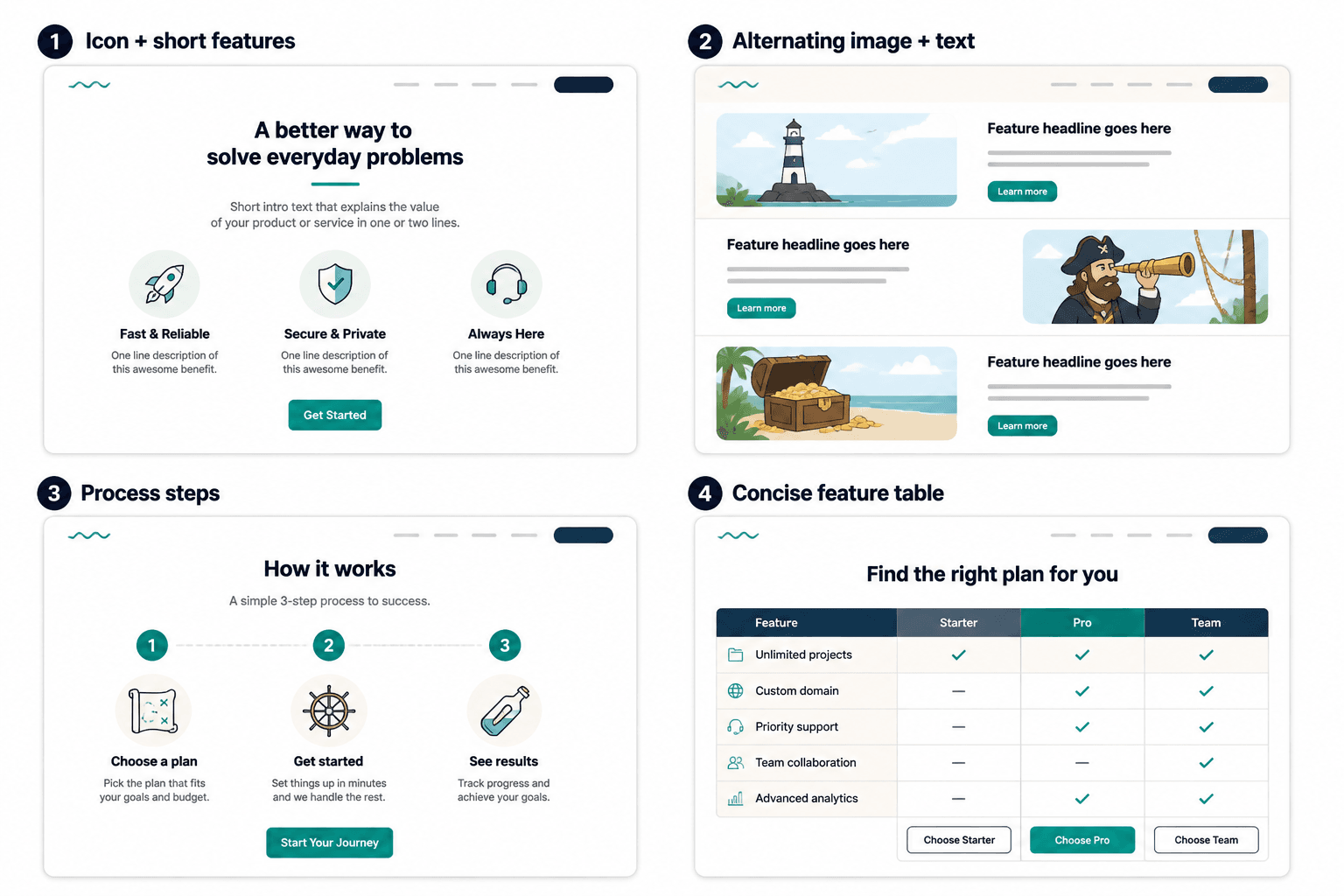
Template 5: The concise feature table
Best for: pages where readers want speed, comparison, or a cleaner visual scan.
| Feature | What it includes | Why it matters |
|---|---|---|
| Audience messaging | Refined messaging based on your buyer’s actual concerns | Makes the offer feel more relevant fast |
| Page structure | A recommended flow for sections, proof, and CTA | Helps readers follow the argument without getting lost |
| Feature rewrites | Clearer descriptions of what is included | Turns fuzzy deliverables into reasons to buy |
Tables can be useful, but do not use them just because they look tidy. Use them when comparison or scanning genuinely helps.
How to write feature sections that sound useful, not inflated
The easiest way to ruin a feature section is to write it from your perspective only.
You know what the feature is. You built it. The reader does not. They need translation. They need context. They need a reason to care that is bigger than “this is included.”
Here are a few practical rules that help.
Name the feature like a human would understand it
“Conversion acceleration framework” is not helping anyone at 11:30 p.m. while they compare service pages.
Say what it is.
- Bad: Strategic visibility asset
- Better: Profile headline rewrite
- Bad: Messaging intensives
- Better: 90-minute messaging session
Do not stop at the deliverable
A deliverable is not a benefit. “Three email templates” tells me what exists. It does not tell me why those templates matter.
Instead of:
3 nurture emails
Try:
3 nurture emails
Prewritten emails to help new subscribers trust your offer without dropping them straight into pitch mode.
Keep the level of detail proportional
Not every feature needs a paragraph. Some need one line. Some need two. One key feature might deserve a short block of extra explanation because it helps justify the offer.
This is one of those places where writing should feel a bit more human and a bit less mechanically symmetrical. If one feature is the core thing people are really buying, give it room.
For example, if you are selling a website copy package and the real value sits inside the messaging strategy, it is worth slowing down and explaining that piece well. Not with fluff. With useful context. Something like:
Messaging strategy foundation
Before any page copy gets written, we pin down the audience, core problem, value angle, and buying objections. This keeps the final copy from sounding polished but generic. It also means your homepage, offer page, and CTA are all working from the same logic instead of saying three slightly different things and hoping nobody notices.
That extra explanation is not “too much.” It is doing actual sales work.
Cut anything that only exists to sound premium
Words like premium, signature, bespoke, elevated, transformational, and high-level are not banned. They are just wildly overused, and usually lazy.
If the feature is strong, describe it clearly. If you need six fancy adjectives to prop it up, the copy is probably compensating.
Before and after: quick feature section rewrites
Example 1
Before:
Comprehensive content strategy support tailored to your unique business needs.
After:
Content strategy plan
A focused content plan built around your offer, audience, and lead path.
So you know what to publish, what each piece should do, and how content connects to actual business goals.
Example 2
Before:
Access to exclusive templates and premium resources.
After:
Templates and swipe files
Plug-and-play examples for headlines, feature sections, CTA lines, and offer descriptions.
So you are not rebuilding basic copy structure from scratch every single time.
Example 3
Before:
One-on-one support for clarity and momentum.
After:
Private review session
A live call to review your copy, fix weak spots, and answer specific questions.
So you leave with sharper messaging and an actual next step, not vague encouragement and three tabs of notes.
A fast fill-in template you can use today
If you need to write a feature section quickly, use this:
[Feature name]
[What the buyer gets, in plain English.]
[Why this matters or what it helps them do.]
[Optional extra detail if needed.]
Example:
Audience-specific homepage copy
You get homepage copy written for the audience you actually want to attract, not a vague everybody-and-nobody version.
That makes the page clearer, more relevant, and more likely to turn good-fit visitors into inquiries.
It also gives you stronger language to reuse across your profile, posts, and email marketing.
The bigger point is simple: clearer structure and clearer writing make the piece more useful. That is usually what makes the ending land better too.