
Most landing pages do not sound salesy because they are trying to sell. They sound salesy because they are trying too hard to sound like a landing page.
That is how you end up with headlines full of vague promises, body copy stuffed with “transform,” “accelerate,” and “unlock,” and buttons that sound like they were approved by a committee that has never had a normal conversation in its life.
If you want to learn How to Write Landing Pages Without Sounding Salesy or Robotic, the fix is not to make the page softer, longer, or more “authentic” in the fake handwritten-notes sense. The fix is to make it clearer, more specific, and more human. A good landing page should sound like a smart person making a strong case, not a funnel template wearing a blazer.
Here’s how to write landing pages that actually persuade people without sounding needy, stiff, or suspiciously overpolished.
Want the broader roadmap? Start with the parent guide.
Why landing pages get weird so fast
Landing pages sit in a dangerous little corner of the internet. People know they need to convert, so they start writing like conversion is produced by aggressive adjectives and manufactured urgency.
It is not.
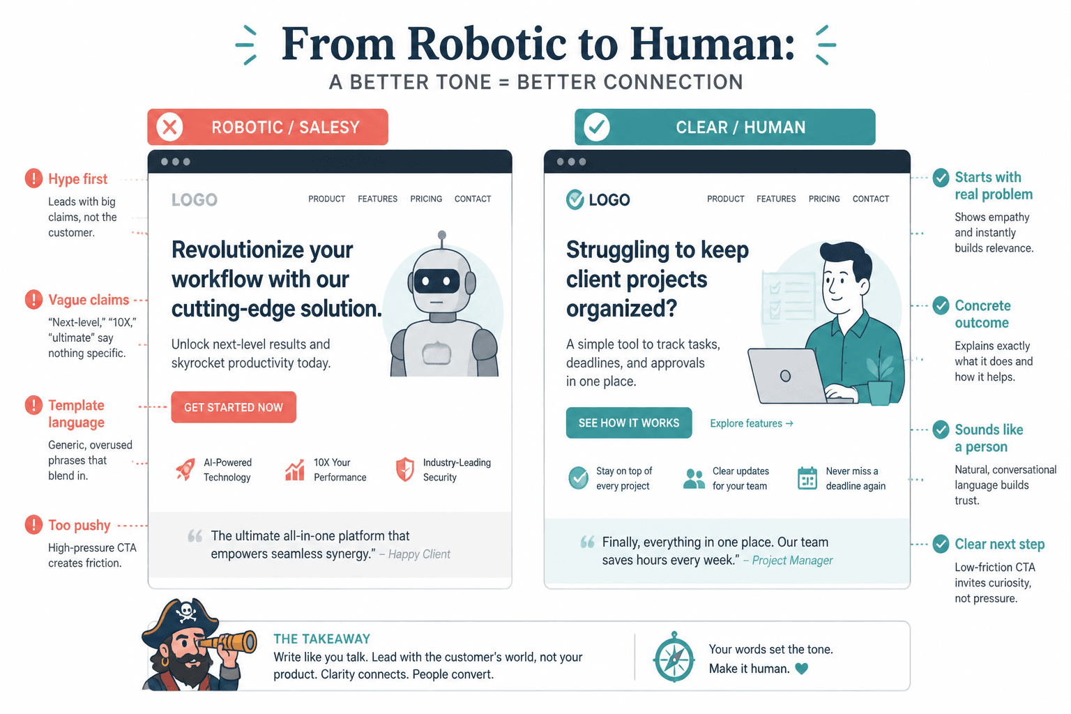
Most robotic landing pages suffer from the same handful of problems:
- They lead with hype instead of a real problem
- They use broad claims instead of concrete outcomes
- They sound like templates, not people
- They overexplain basic points and underexplain the parts buyers actually care about
- They push too hard before trust exists
- They hide simple meaning under expensive-sounding language
The good news is that you do not need to become “less persuasive” to fix this. You need to become easier to believe.
That usually means writing like someone who understands the reader’s problem well enough to describe it plainly, explain the offer clearly, and make the next step feel sensible instead of dramatic.
Start with the reader’s reality, not your marketing voice
The fastest way to sound robotic is to write from your brand voice document instead of the reader’s actual situation.
People arrive on landing pages with questions already running in the background:
- Is this for someone like me?
- What exactly is this?
- Will it solve the thing I care about?
- Why should I trust you?
- What happens if I click?
If your page opens with abstract slogan soup, you are making them work too hard. And people do not work hard on landing pages. They bounce.
Weak opening
Scale your business with a proven framework designed to unlock aligned growth.
Better opening
Get a landing page that explains what you do, builds trust fast, and turns more visitors into booked calls or buyers.
The second version is not clever. Good. Landing page visitors are rarely begging to be dazzled. They want clarity, relevance, and a reason to keep going.
If your openings tend to sag into generic fog, read how to start landing pages without a weak opening. A lot of “salesy” copy is just weak copy trying to compensate.
Use specific language people can picture
Salesy copy often sounds fake because it is impossible to picture. It promises “results” and “growth” and “success” but never says what those look like in real life.
Specificity lowers suspicion. It tells the reader you know what they are actually trying to do.
Replace abstract claims with concrete outcomes
| Too vague | Better |
|---|---|
| Improve your online presence | Turn your site into something that explains your offer in under 10 seconds |
| Attract your dream clients | Bring in more qualified leads who already understand what you do |
| Scale with confidence | Build a page you can send traffic to without apologizing for it |
| Transform your messaging | Clarify your message so visitors stop bouncing and start clicking |
You do not need to remove every ambitious claim. You do need to support it with language that means something. Readers trust copy they can mentally test.
A simple check helps here: if a phrase could describe almost any service in almost any industry, it is probably too vague to earn trust.
Cut the phrases that instantly make people brace for nonsense
Some landing page phrases are not technically wrong. They are just exhausted. They have been dragged through so many low-trust pages that readers now treat them like a warning sign.
Here are a few usual suspects:
- Proven system
- Done-for-you solution
- Skyrocket your results
- Unlock your potential
- Revolutionary framework
- Results-driven approach
- High-converting secrets
- Finally achieve the success you deserve
That kind of copy is trying to borrow authority from familiarity. Instead, it borrows suspicion.
Write the plain version first. Then sharpen it. Most pages should sound more like this:
- What it is
- Who it is for
- What problem it solves
- What the reader gets
- What happens next
That structure may not feel glamorous. It converts because it respects the reader’s brain.
Write like a human making a case, not a funnel generator on autopilot
If you want to know How to Write Landing Pages Without Sounding Salesy or Robotic, this is the core shift: stop trying to sound like “copy.” Start trying to sound credible.
Credible copy has a few traits:
- It makes claims in proportion to the proof
- It admits nuance where needed
- It uses natural phrasing instead of buzzword stacks
- It answers obvious objections before the reader has to ask
- It does not pretend every offer is life-changing
That last one matters more than people think. Not every offer needs to “transform” someone’s entire business or life. Sometimes the actual appeal is simpler and stronger than that. Maybe your offer saves time. Maybe it removes confusion. Maybe it helps them stop publishing pages that feel like cardboard wearing cologne.
Say the thing you can really stand behind.
Example: robotic vs human
Robotic: Our signature methodology empowers brands to craft compelling digital experiences that drive measurable impact.
Human: We write landing pages that make your offer easier to understand and easier to buy.
The second version is shorter, plainer, and more believable. It also gives the reader something they can judge quickly. That is useful. Useful beats impressive a lot more often than people want to admit.
Structure the page so persuasion feels earned
A page can sound salesy even when the wording is fine if the section order feels pushy. For example: giant promise, hard CTA, random testimonials, more promises, another CTA, then finally an explanation of what the thing actually is.
That is not persuasion. That is impatience.
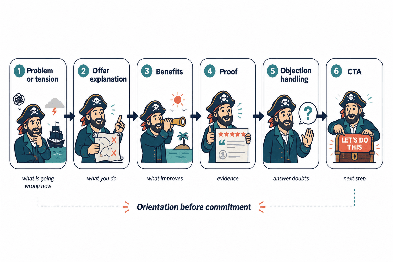
A cleaner landing page usually follows a simple sequence:
- Clear promise: what this is and why it matters
- Problem or tension: what is going wrong now
- Offer explanation: what you do or provide
- Benefits: what improves for the reader
- Proof: examples, testimonials, results, credibility markers
- Objection handling: common doubts, answered cleanly
- CTA: the next step, without melodrama
That order works because it follows how people decide. They need orientation before commitment.
If your sections feel generic or out of order, see how to improve landing pages section order without sounding generic. A lot of “bad tone” problems are actually structure problems in nicer clothes.
Stop overselling the offer and start reducing friction
When writers worry that a page feels flat, they often add more hype. In reality, many pages would perform better if they reduced friction instead.
Friction is what makes a reader hesitate:
- I still do not fully get what this is
- I do not know if this is for me
- I am not sure what happens after I click
- The promise feels bigger than the proof
- The CTA feels like a trap
Instead of adding more dramatic copy, answer those concerns directly.
Examples of friction-reducing copy
- For clarity: “You’ll get a custom landing page draft, messaging recommendations, and a revised CTA section.”
- For fit: “Best for coaches, consultants, and service businesses with an existing offer.”
- For process: “After you book, you’ll get a short intake form and we’ll start with a messaging review.”
- For commitment: “No long-term contract. One project, one clear scope.”
- For CTA trust: “Book a consult” is usually better than “Claim your breakthrough now.”
You are not making the page weaker by lowering friction. You are making it easier to say yes without feeling manipulated, which is kind of the point.
Use proof that sounds real
Proof is one of the best antidotes to salesy copy, but only if it sounds like it came from actual experience rather than a testimonial generator.
Weak proof says:
- “Amazing experience”
- “Highly recommend”
- “Changed my business”
Better proof says what changed, what improved, or what the person was worried about before working with you.
Stronger testimonial style
Before this rewrite, people were landing on my page and still asking what I actually offered. After the new version went live, I started getting inquiries from people who were a much better fit and already understood the value.
That sounds believable because it includes a before, an after, and a concrete shift.
If you do not have testimonials yet, use other forms of proof:
- Clear process breakdowns
- Relevant credentials
- Short case examples
- Specific deliverables
- Examples of your thinking
Proof does not need to be flashy. It needs to reduce doubt.
Make your CTA sound like a next step, not a hostage note
CTA buttons are where many otherwise decent landing pages suddenly lose the plot.
There is nothing wrong with being direct. There is something wrong with sounding like the click will trigger a cinematic transformation sequence.
Overcooked CTAs
- Yes, I’m Ready to Transform My Business
- Unlock My Growth Now
- Claim My Spot Before It’s Gone
Better CTAs
- Book a Call
- Get the Guide
- See Pricing
- Start Your Project
- Request a Quote
- Download the Template
A CTA should reduce uncertainty, not introduce theater. Good CTA copy tells the reader what happens next in plain English.
If your goal is leads or sales, it helps to think beyond the button itself. The page, the profile, the form, and the follow-up all shape conversion. For that bigger picture, read how to turn landing pages into more leads or sales.
Keep some personality, but do not perform personality
People often hear “sound human” and swing too far into forced relatability. Suddenly the landing page is full of winky lines, fake confessions, and “hey friend” energy that feels less trustworthy than the original corporate mush.
You do not need a stand-up routine. You need a voice.
That can look like:
- A sharp phrase where it fits
- A clear opinion about what does not work
- A direct sentence that sounds like a real person wrote it
- Small moments of warmth or dry honesty
For example:
Most landing pages do not need more adjectives. They need a clearer point and fewer trust-destroying clichés.
That has personality. It also still serves the job of the page. Good personality clarifies. Bad personality distracts.
A simple rewrite process for salesy or robotic landing pages
If you already have a draft and it sounds stiff, here is a practical cleanup process.
The bigger point is simple: clearer structure and clearer writing make the piece more useful. That is usually what makes the ending land better too.