
Most sales pages do not have a traffic problem first. They have a flow problem.
People land on the page, skim a little, feel mildly confused, slightly unconvinced, or quietly overwhelmed, then leave. Not because the offer is bad. Not because your audience is cheap. Because the page keeps asking for belief before it has earned it.
That is what makes sales page flow so important. A strong page does not just contain the right sections. It moves people through the right thoughts in the right order. It answers the obvious questions before new objections show up. It builds clarity, trust, desire, and action without making the reader work weirdly hard.
If you are trying to fix Sales Page Flow Mistakes That Hurt Performance, this is where to look. Not at trendy button colors. Not at some headline formula with too many brackets. At the sequence. At the pacing. At what your reader needs to understand, feel, and believe before they will buy.
We are going to cover the page flow mistakes that quietly wreck conversions, what to do instead, and how to make your sales page read like a persuasive experience instead of a stack of disconnected copy blocks pretending to be strategy.
For the full path around this topic, head to the parent guide.
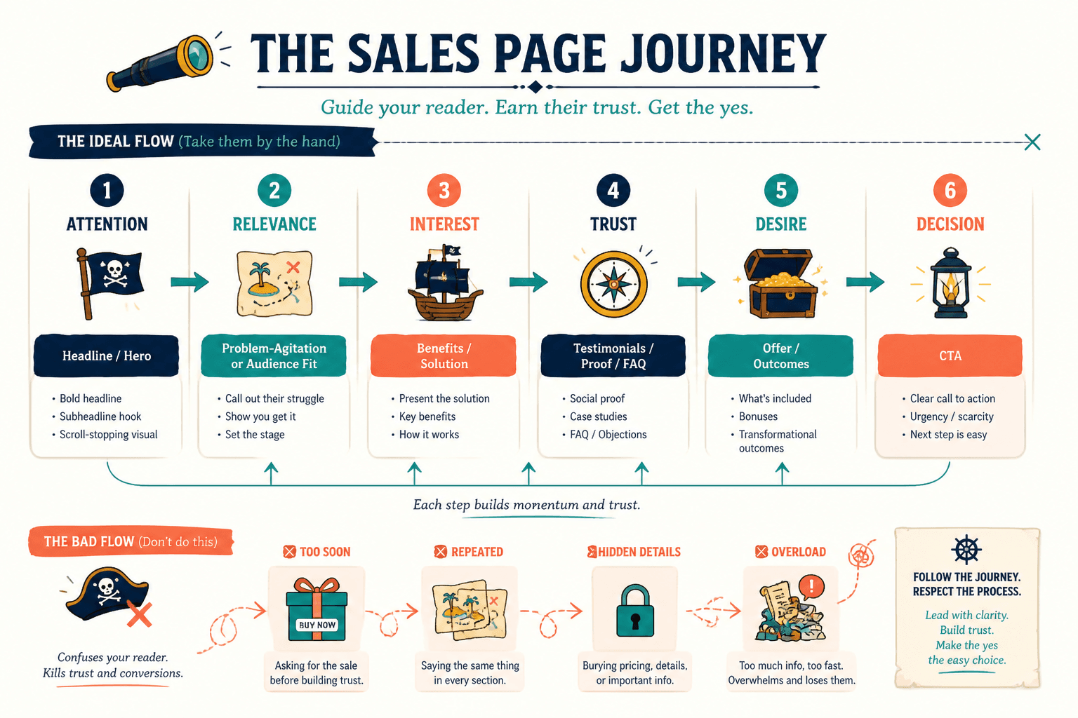
What sales page flow actually means
Sales page flow is the order and momentum of the page.
It is not just what sections you include. It is how one section earns the next. Good flow helps the reader move naturally from:
- attention
- to relevance
- to interest
- to trust
- to desire
- to decision
Bad flow does the opposite. It jumps ahead. Repeats itself. Answers the wrong questions too early. Hides important details until the reader is already annoyed. Or piles on so much information that buying starts to feel like homework.
A page can have strong writing and still perform poorly if the flow is off. That is the annoying part. You can write a decent headline, a solid offer section, good testimonials, and a clear CTA, then still lose people because the page feels mentally slippery.
1. Leading with cleverness instead of clarity
A lot of sales pages open with copy that is trying very hard to sound smart, bold, premium, disruptive, magnetic, revolutionary, or all five at once.
The problem is that readers are not there to admire your verbal gymnastics. They are trying to answer three basic questions fast:
- What is this?
- Is it for me?
- Why should I care right now?
If your opening section dodges those questions in favor of mood, slogans, or abstract positioning, the page starts leaking attention immediately.
What this looks like
Headlines like:
- Build a business that feels like freedom
- Your next level starts here
- A new way to grow with alignment
None of that tells the reader enough. It sounds nice. Nice does not convert.
What to do instead
Open with a sharp promise tied to a specific outcome, audience, or problem. You can still have personality. You just cannot make the reader decode your offer like it is a literary puzzle.
Weak: Scale with simplicity and power
Stronger: Build a sales page that makes your offer clearer, more credible, and easier to buy without sounding like a funnel goblin
If your top section is vague, the rest of the page has to work twice as hard. Usually it does not.
2. Asking for the sale before building belief
This one is everywhere. Big button. Price. “Join now.” “Apply today.” “Secure your spot.” All placed before the page has done much of anything to establish why the offer matters.
Yes, some visitors are warm and ready. That is why having an early CTA is fine. But if the page keeps pushing action before it has built enough belief, you create friction instead of momentum.
Belief usually needs a few layers:
- This offer is relevant to me
- This person understands my problem
- The method makes sense
- The result feels plausible
- The investment seems justified
If those beliefs are missing, the CTA feels premature. Premature CTAs are not assertive. They are awkward.
Put another way: if your page keeps saying “buy now” before the reader is even convinced they need the thing, that is not confidence. That is impatience in button form.
3. Dumping all the pain at the top and exhausting the reader
Many sales pages think empathy means dragging the reader through a swamp of every possible frustration, fear, failure, and identity wound before offering relief.
A little problem agitation can help. Too much turns the page into emotional spam.
If the first quarter of your page is just:
- Are you tired of this?
- Still struggling with that?
- Fed up with everything?
- Feeling unseen, stuck, overwhelmed, underpaid, and slightly haunted?
People start to feel managed, not understood.
Better flow
Name the problem clearly. Reflect the stakes. Then move. The reader does not need twelve paragraphs proving their pain is valid. They need a page that shows a credible path forward.
Good sales copy spends less time circling the wound and more time helping the reader see the shift.
4. Explaining the offer before the reader understands the problem
This is a sequencing issue, and it quietly kills interest.
If you launch into modules, features, deliverables, timelines, bonuses, Voxer access, portal details, and PDF names before the reader has fully recognized why your approach matters, those details land flat.
Features need context. Deliverables need meaning. Otherwise the page feels like an inventory list.
The fix
First, clarify the problem and why common solutions fall short. Then show your approach. Then explain the offer structure.
That sequence matters because people buy logic wrapped around a result they want. They do not buy six modules because six is a charming number.
If you need help making the copy itself less flat, this guide on how to rewrite boring sales pages will help sharpen the language once the structure is right.
5. Hiding the actual offer under too much scene-setting
Some sales pages take forever to get to the point.
You scroll through a manifesto, a philosophy essay, a half-brand documentary, a mini memoir, and three atmospheric paragraphs about “doing business differently” before you find out what the person is actually selling.
That is not elegant. It is annoying.
Context can help. Positioning can help. But the page still needs to reveal the offer clearly and early enough that the reader can orient themselves.
A simple rule: by the time someone finishes your hero section and first supporting section, they should know what the offer is, who it is for, and what outcome it is meant to create.
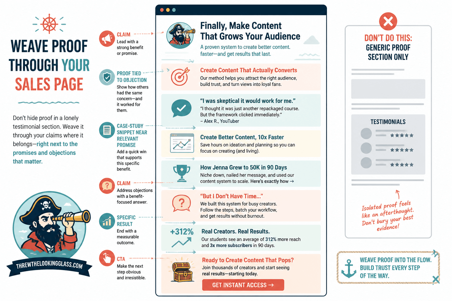
6. Using proof too late, too weakly, or too generically
Proof is not decorative. It is structural.
Too many pages treat testimonials like a mandatory block shoved near the bottom after the reader has already developed objections. By then, weak proof is doing CPR on fading intent.
Proof should appear when the reader starts wondering things like:
- Will this actually work?
- Has it worked for someone like me?
- Can I trust this person’s claims?
That often means threading proof throughout the page, not dumping five vague testimonials in one sad cluster.
Weak proof examples
- “So helpful!”
- “Loved this program”
- “Highly recommend working with her”
That is nice. It is also nearly useless.
Stronger proof examples
- Specific before-and-after shifts
- Concrete results with context
- Testimonials tied to objections
- Case-study snippets placed near relevant claims
If your proof section sounds like every other page on the internet, fix that next with how to improve sales pages proof sections without sounding generic.
7. Breaking momentum with giant blocks of explanation
Sometimes the flow problem is not the order. It is the drag.
You are moving the reader forward reasonably well, then suddenly they hit a slab of text explaining your method in painful detail. Or a long founder story that should have been six lines. Or a FAQ answer that somehow became a small hostage note.
Momentum matters because reading a sales page is a series of micro-decisions. Keep going. Keep trusting. Keep considering. Keep imagining. Every bloated section increases the chance of “actually, never mind.”
How to tighten without oversimplifying
- Give each section one job
- Cut repeated claims
- Move deep detail lower on the page
- Use bullets where skimming helps
- Keep paragraphs short
- Save nuanced explanation for moments where the reader genuinely needs it
Not everything should be a bullet list, obviously. Some sections need a paragraph or two to build logic or handle a meaningful objection. But if your page feels dense all the way down, that is not authority. That is friction wearing glasses.
8. Treating objections like an afterthought
Buyers do not move through a page in a perfectly obedient line. They wobble. They hesitate. They question.
If your page does not address realistic objections, readers will fill in the blanks themselves, and they are usually less generous than you’d hope.
Common objections include:
- Is this for someone at my stage?
- Why this instead of another option?
- Will I have time to use it?
- Is the price worth it?
- What if I have tried similar things before?
Strong page flow anticipates these moments before they harden into resistance. That does not mean adding a giant wall of FAQ at the bottom and hoping for the best. It means answering objections in the sections where they naturally appear.
For example, if your offer is premium, do not wait until the pricing section to justify the depth, support, or difference. Start building that case earlier.
9. Making the page feel like a pile of sections instead of one argument
This is one of the biggest sales page flow mistakes that hurt performance, and it is easy to miss because the page can look fine at first glance.
It has a headline. Problem section. Offer section. Testimonials. FAQ. CTA. Technically complete. Emotionally flat.
Why? Because the sections do not build on each other. They just sit there.
A good sales page has an argument running through it. Not a combative one. A persuasive one. Each section should make the next section easier to believe.
A cleaner flow usually looks something like this
- Clear promise and relevance
- Problem and stakes
- Why common attempts fail
- Your approach and why it works
- Offer details
- Proof
- Objection handling
- Pricing or enrollment details
- Confident CTA
That is not a rigid formula. But it is a useful reminder that flow is earned through progression, not section hoarding.
10. Making people work too hard to find the next step
You would think this one would be obvious. Yet plenty of sales pages still make the action fuzzy.
The reader gets to the point where they are interested, maybe even ready, and then:
- the CTA is vague
- the button text is weak
- the next step is unclear
- the page asks them to “learn more” when they are already on the sales page
- the booking or checkout process feels oddly hidden
Your CTA should match the offer and remove ambiguity. Tell people what happens next.
Weak: Get started
Better: Book your strategy call
Better: Join the program
Better: Download the template pack
If your page is meant to generate leads rather than direct sales, the path still has to be clean. This article on turning sales pages into more leads or sales can help you tighten that transition.
11. Overloading the page with every possible detail
More information does not automatically create more confidence.
Sometimes it creates decision fatigue. Sometimes it creates suspicion. Sometimes it just buries the strongest parts of the offer under ten miles of explanatory mulch.
People need enough detail to feel informed, not so much that they mentally postpone the decision because reading the page became a side project.
If your sales page includes every nuance, edge case, teaching principle, and support scenario, ask yourself what the reader actually needs in order to say yes.
What to keep
- Outcome clarity
- Who it is for
- What is included
- How it works
- Why it is different or effective
- Relevant proof
- Pricing or next-step details
What to trim
- Repeated claims
- Overlong philosophy sections
- Tiny implementation details too early
- Explanations no one asked for yet
- Fancy language that says less than plain language would
12. Ignoring how people actually skim
Even interested readers skim. That is not disrespect. It is just internet behavior.
If your page only works when read line by line with monk-level concentration, it is going to underperform. Your flow needs to work both for careful readers and for skimmers who dip in and out before deciding whether to go deeper.
That means using:
- clear section headings
- specific subheads
- strong opening and closing lines
- visual rhythm
- well-placed bullets
- CTAs after meaningful decision points
Good formatting supports good flow. It is not just decoration. It helps the argument remain visible.
The bigger point is simple: clearer structure and clearer writing make the piece more useful. That is usually what makes the ending land better too.