
Most people ask how long a sales page should be as if there is some clean little word count where conversions magically start behaving. There isn’t.
The better question is this: how much page does your buyer need before saying yes?
That is what decides length. Not trends. Not copywriter folklore. Not some bro on X claiming that “attention spans are dead” while posting a 47-post thread about cold plunges and masculine focus.
If you are wondering how long should sales pages be in 2026, here is the practical answer: sales pages should be as long as necessary to create clarity, trust, and action without making the reader work harder than they need to. Sometimes that is short. Sometimes it is gloriously long. Usually, it is somewhere in the middle, with much tighter structure than people used to get away with.
This article will help you choose the right length based on what you sell, how warm the audience is, how much proof you have, and how much risk the buyer feels. More importantly, it’ll help you stop confusing long with persuasive and short with modern.
If you want the bigger picture, start with the parent guide.
There is no perfect sales page length, but there is a right level of depth
A sales page has one job: move a specific reader from interest to action.
That means the page needs enough room to answer the questions standing between “maybe” and “yes.” If your offer is simple, low-risk, and already understood, you do not need a sprawling copy monument. If your offer is expensive, nuanced, or unfamiliar, a tiny page will often undersell it.
So no, the answer is not “short pages convert better now” or “long-form always wins.” Both of those are lazy. The real answer depends on five things:
- Offer complexity: Does the buyer understand what this is quickly?
- Price and risk: The more expensive or consequential the decision, the more reassurance you need.
- Audience temperature: Warm readers need less convincing than cold ones.
- Brand trust: Strong credibility shortens the distance to yes.
- Traffic source and intent: Someone clicking from a webinar replay behaves differently from someone stumbling in from a social post.
If you get those right, page length becomes a strategic choice instead of a weird guessing game.
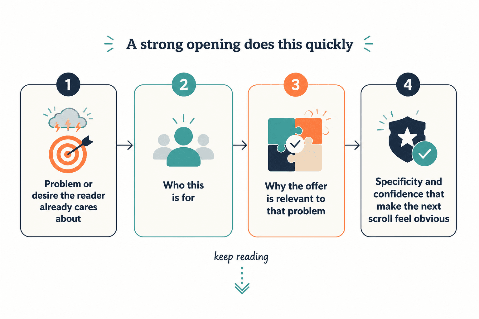
How long should sales pages be in 2026? Use these practical ranges
If you want a useful guideline, here it is. Not a law. A guideline. We are still adults.
| Offer type | Typical page length | What the page usually needs |
|---|---|---|
| Low-ticket digital product | 300–900 words | Clear promise, what’s included, fast proof, direct CTA |
| Workshop or webinar | 500–1,200 words | Outcome, who it’s for, agenda, presenter trust, deadline |
| Template pack or mini-offer | 400–1,000 words | Problem, use case, contents, transformation, examples |
| Course or cohort program | 1,200–3,000 words | Problem, solution, method, modules, proof, objections, CTA |
| Coaching or consulting offer | 800–2,500 words | Fit, process, outcomes, trust, FAQs, next step |
| High-ticket service or premium program | 1,500–4,000+ words | Diagnosis, positioning, proof, process, objections, risk reduction |
These ranges are not there to make you hit a word count target. They are there to stop two common mistakes:
- writing a very short page for an offer that needs explanation
- writing a very long page because you have not made the offer clear enough
Good sales pages do not feel long when they are doing their job well. They feel easy to move through because the structure respects the reader’s attention.
What changed about sales page length in 2026
The basic psychology did not change. Humans still want clarity, confidence, relevance, and evidence. What did change is tolerance for fluff.
Readers are faster at spotting recycled copy patterns now. They’ve seen too many pages padded with melodramatic problem sections, bloated promise stacks, and “imagine if…” paragraphs that could be deleted without harming anything except the writer’s ego.
In 2026, strong sales pages tend to be:
- more modular, with clear sections and skim-friendly subheads
- more specific, with cleaner claims and fewer vague benefits
- more proof-driven, because people trust receipts more than adjectives
- more reader-aware, since buyers expect pages to answer real objections, not just perform persuasion theater
- less indulgent, because nobody needs 11 paragraphs before learning what the thing actually is
That means some long pages still work beautifully. They just cannot be sloppy. Long pages now need strong pacing. Every section has to earn its spot.
Choose page length based on buyer resistance, not your preference
A lot of creators decide sales page length based on what they personally enjoy writing or reading. That’s adorable, but not useful.
Your buyer decides the needed length. More specifically, the buyer’s resistance does.
When buyer resistance is low
You can usually go shorter when:
- the offer is inexpensive
- the outcome is obvious
- the audience already knows and trusts you
- the buyer has urgent intent
- the product category is familiar
Example: a $29 swipe file for people already on your email list probably does not need a mini novel. It needs a sharp promise, what’s inside, a few proof points, and a clean buy button.
When buyer resistance is high
You usually need more depth when:
- the price is high
- the offer solves a complex problem
- the market is skeptical
- the audience is cold
- the buying decision feels risky or emotional
- your method is different from what they have seen before
Example: a $3,000 group program for consultants trying to fix lead generation probably needs more than “get clients without burnout.” People need to understand the process, fit, proof, and why this is worth the money.
Page length should expand to handle resistance. Not to show off your keyboard stamina.
The best way to decide sales page length: map the questions blocking the sale
Here is the easiest practical framework I know for deciding how long your page should be.
List the questions a reasonable buyer needs answered before they act. Then build the page around those questions. The number and weight of those questions will tell you how much page you need.
Common questions include:
- What exactly is this?
- Is it for someone like me?
- What problem does it solve?
- What do I get?
- How is this different from alternatives?
- Why should I trust you?
- Will this work in my situation?
- What happens after I buy?
- What if I am unsure or hesitant?
- What should I do next?
If your offer raises lots of questions, your page needs room. If it doesn’t, forcing long copy often makes the offer look more suspicious, not more valuable.
The right sales page length is the length required to answer the buyer’s real questions in the clearest possible order.
Short sales pages work when the offer is clear and the friction is low
Short sales pages get a lot of praise because they can feel modern, clean, and easy to consume. All true. They can also convert terribly when they leave out the information buyers need.
Short pages tend to work best when:
- the offer is low-ticket or impulse-friendly
- the audience is already warmed up by your content or email list
- the outcome is simple and concrete
- the page is supporting demand that already exists
- the CTA is low-friction, like buying a small product or joining a waitlist
A short page can actually feel more persuasive because it removes drag. It gets to the point. It respects intent. It does not make people hike through four emotional landscapes before showing the deliverables.
If that sounds like your situation, you may want to read when short sales pages beat long ones.
Long sales pages work when they reduce uncertainty better than a short page can
Long-form sales pages are not outdated. Bad long-form sales pages are outdated.
A long page still makes sense when buyers need more proof, more context, more objection handling, or a better explanation of the offer. This is especially true for premium services, complex programs, or offers that ask for serious trust.
Long pages work best when they are structured like a guided decision, not a hostage situation.
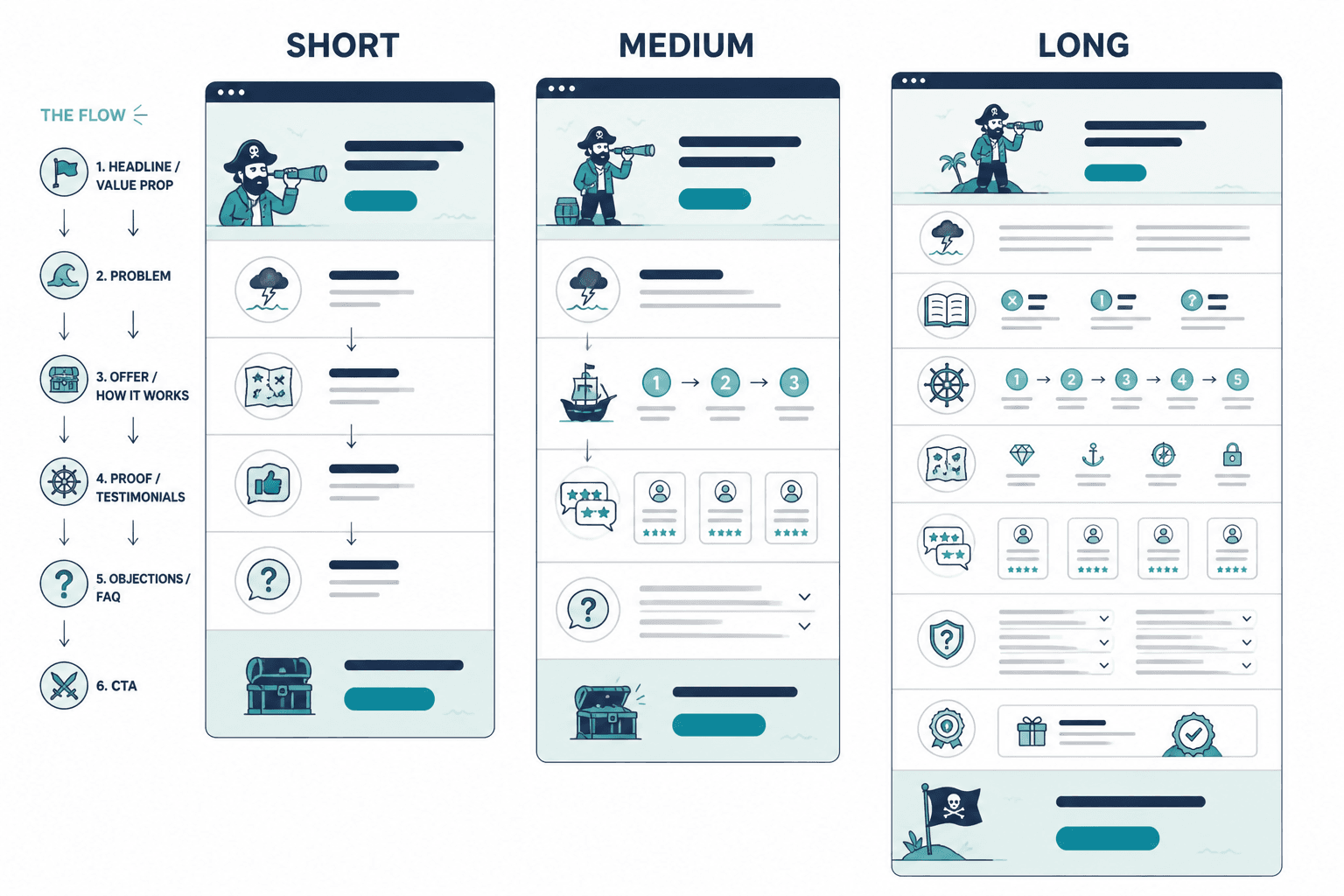
- Lead with the core promise and relevance
- Explain the problem without melodrama
- Show the offer and how it works
- Back it up with proof
- Handle objections cleanly
- Make the next step obvious
When long pages fail, it is usually because the copy repeats itself, rambles, hides the offer details, or tries to manufacture intensity instead of making a solid case.
That is why page structure matters just as much as page length. If you need help tightening the actual copy, read how to write better sales pages.
The real problem is usually not length. It is weak information density.
This is where a lot of sales pages go sideways.
Writers obsess over word count when the actual issue is information density. A 700-word page can feel bloated if it says little. A 2,200-word page can feel tight if every section adds clarity or confidence.
Here is the difference.
| Weak density | Strong density |
|---|---|
| Repeats the same promise five ways | Adds a new insight, detail, or proof point in each section |
| Uses vague benefits | Shows concrete outcomes or use cases |
| Hides specifics behind hype | Names what is included and how it helps |
| Talks about pain too long | Moves efficiently from problem to solution |
| Uses filler transitions and fluff | Keeps momentum and purpose throughout |
If your page is not converting, chopping 40% of the words is not automatically the fix. Sometimes the fix is replacing mush with substance.
A simple structure for medium-length sales pages
For many creators, coaches, consultants, and service businesses, the best answer in 2026 is not ultra-short or extremely long. It is a medium-length page with sharp structure.
That usually looks something like this:
- Headline: clear promise or outcome
- Subhead: who it is for and why it matters
- Problem/Opportunity: show understanding without dragging it out
- Offer overview: what this is and how it helps
- What’s included: specifics, deliverables, modules, scope
- Proof: testimonials, outcomes, examples, case snippets
- Objection handling: common hesitations answered cleanly
- CTA section: what to do next
- FAQ: final friction removal
That structure gives buyers enough substance without asking them to wander through an endless canyon of copy blocks.
If you want more examples of what this can look like in practice, these sales page ideas and examples for creators are worth a look.
How to tell if your sales page is too short
Your page may be too short if readers are asking questions the page should have answered already.
- People message you asking what is included
- Leads seem interested but do not convert
- You get lots of clicks but weak purchase intent
- Prospects need long calls just to understand the offer
- The page sounds sleek but does not build confidence
Short pages often underperform because they assume too much prior trust or understanding. They look clean, but clarity is doing all the heavy lifting and often losing.
How to tell if your sales page is too long
Your page may be too long if it keeps saying things the buyer already accepted several scrolls ago.
- The same idea appears in multiple sections with new adjectives but no new value
- The offer details are buried too far down
- Testimonials are excessive and repetitive
- The page spends forever on pain before introducing the solution
- Readers click around but do not move forward
- You are using copy length to compensate for weak positioning
Long pages become a problem when they create fatigue instead of certainty. If your page feels like it is trying very hard to convince skeptical strangers of something you have not explained well, yes, that is usually noticeable.
Length should match traffic source
This gets ignored a lot, and it matters.
Someone coming from your email list probably arrives with context and trust. Someone clicking from a cold ad or broad search result usually needs more orientation. Someone referred by a client may need less copy but stronger specifics.
Here is a simple way to think about it:
- Warm traffic: often shorter pages can work
- Cold traffic: often needs more proof and explanation
- High-intent search traffic: needs fast clarity and easy navigation
- Referral traffic: may need less persuasion, more confirmation
That is one reason smart creators keep refining their sales page systems instead of chasing one fixed format. If you are building out your broader conversion setup, the sales pages guide for creators who want better results is a useful next read.
What creators and service businesses should do in 2026
If you sell coaching, consulting, services, digital products, workshops, or small programs, here is the sensible default:
- Start with a medium-length sales page
- Make the first screen brutally clear
- Show the offer early
- Add proof before the reader starts mentally objecting
- Use FAQs to clean up remaining friction
- Trim repeated claims and decorative fluff
In other words, do not start tiny because “people do not read.” People read when the thing feels relevant and useful. They also stop reading when your page is self-important and vague. Both can be true.
The bigger point is simple: clearer structure and clearer writing make the piece more useful. That is usually what makes the ending land better too.