
Most CTA length advice is weirdly unhelpful.
One camp says CTAs should be tiny. Two words. Maybe three. “Book now.” “Learn more.” “Get started.” Clean, classic, fine.
The other camp writes CTAs like they are trying to finish a homework assignment. Suddenly the button says something like “Yes, I Want to Start Growing My Audience With Strategic Content Today.” That is not a CTA. That is a cry for editing.
If you are wondering how long should CTAs be in 2026, the answer is not one magic word count. It depends on where the CTA appears, how much trust exists already, how much friction the ask creates, and whether the reader needs clarity more than cleverness.
Here is the practical version: most CTAs should be shorter than people think, but not so short that they become vague, cold, or forgettable.
This article will help you choose the right CTA length for buttons, emails, landing pages, social posts, articles, and lead magnets without defaulting to either robotic minimalism or bloated funnel-speak. We’ll also cover what changes in 2026, what still works, and where longer CTA writing actually beats the short stuff.
To see how this fits into the wider strategy, open the parent guide.
How long should CTAs be in 2026?
In most cases, your CTA should be as short as possible without losing meaning.
That usually looks like this:
- Button CTAs: 1 to 5 words
- Link CTAs inside paragraphs: 3 to 10 words
- Email CTA lines: 5 to 12 words
- End-of-post CTAs: 1 short sentence or 10 to 25 words
- Sales page CTA support copy: 1 button plus 1 short clarifying line
That is the useful baseline. Not a law. A baseline.
In 2026, people are skimming harder, comparing faster, and trusting slower. So the ideal CTA is not just short. It is specific, low-friction, and easy to process in about half a second. Readers should not have to decode what happens next.
A short CTA beats a long CTA when the next step is obvious. A longer CTA beats a short CTA when clarity would otherwise be missing.
That is the whole game, really.
Why CTA length matters more than people admit
A weak CTA does not just lower clicks. It creates hesitation.
And hesitation is expensive. Especially when your reader was already close to acting.
If the CTA is too short, it can feel generic:
- Learn more
- Click here
- Submit
- Continue
Those are not always wrong. They are just often lazy. They leave the reader doing unnecessary mental work.
If the CTA is too long, it can feel needy, overexplained, or strangely desperate:
- Yes, I Want to Finally Build a Profitable Personal Brand Starting Today
- Click Here to Get Instant Access to the Free Guide and Start Improving Your Marketing Results
Now the CTA is carrying too much emotional furniture. It slows down the decision instead of helping it.
Length matters because CTA copy sits at the point of action. This is not the place for throat-clearing, vague wording, or copywriter acrobatics. It needs to answer one quiet reader question: what happens if I click?
The real factors that determine ideal CTA length
If you want to decide CTA length properly, ignore blanket advice and check these five variables instead.
1. The friction level of the ask
The more commitment you are asking for, the more clarity you usually need.
A low-friction CTA can be very short:
- Read the guide
- See examples
- Watch demo
A higher-friction CTA may need a little more explanation:
- Book your strategy call
- Apply for 1:1 coaching
- Get the full pricing guide
You are not writing a mini essay. You are reducing uncertainty.
2. How much context the reader already has
If the surrounding copy already explains the offer, your CTA can stay short.
For example, if a landing page headline clearly says the visitor can download a content calendar template, the button can simply say Download template.
But if the reader lands cold from a post, ad, or referral and has not yet been oriented, you may need a more descriptive CTA like Get the free content calendar.
Short CTAs depend on strong context. Without it, they drift into generic mush.
3. Where the CTA appears
Button copy, email copy, article copy, and post-end CTAs do not play by the same rules.
A button usually needs compression. An article CTA can afford one clean sentence. A social CTA may need to sound more conversational. A sales page often needs a button plus a short support line underneath.
Same job. Different environment.
4. The sophistication of the reader
If your audience already understands the category, they need less explanation.
For an audience of consultants who know what a messaging audit is, Book a messaging audit works fine.
For a broader audience, that might be too insider-ish. You may need See how your messaging is costing you leads in body copy, followed by a cleaner button.
Good CTA length is partly a translation problem.
5. The goal of the page or post
If the goal is speed, short often wins.
If the goal is reassurance, detail may help.
If the goal is authority, the CTA can be quieter and more direct.
If the goal is lead generation from colder traffic, a little extra context around the CTA usually matters more than a clever button label ever will.
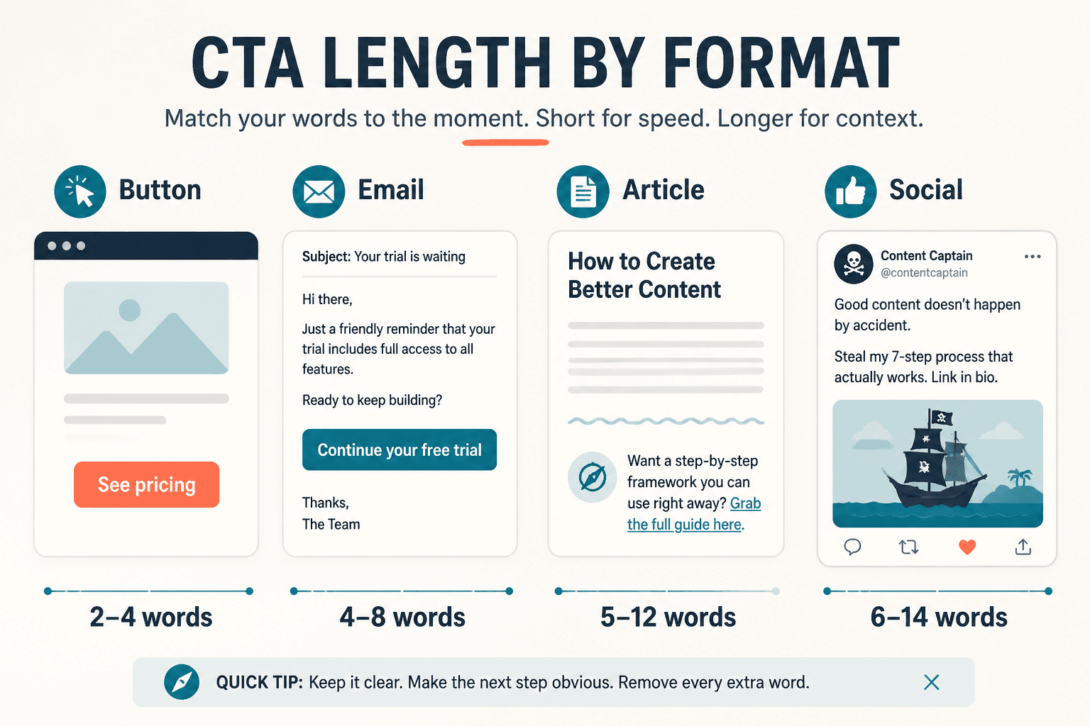
Best CTA length by format
Here is where we stop being abstract and actually make this usable.
| CTA format | Best length range | What usually works best |
|---|---|---|
| Button | 1 to 5 words | Action + outcome or clear next step |
| Text link CTA | 3 to 10 words | Specific destination or benefit |
| Email CTA line | 5 to 12 words | Direct ask with a clear payoff |
| Article or blog CTA | 10 to 25 words | Short sentence with context |
| Social post CTA | 5 to 20 words | Conversational next step |
| Sales page CTA support copy | 1 short sentence below button | Clarify what happens next or reduce risk |
Button CTAs: keep them tight
Buttons work best when they are short enough to scan instantly.
Good examples:
- Book a call
- Get the guide
- See pricing
- Start free
- View examples
Usually too long:
- Yes, I Want to Learn More About Your Services
- Click Here to Get Access to the Full Free Resource
If your button starts sounding like it needs a breath halfway through, trim it.
Article and landing page CTAs: use a sentence when needed
At the end of an article, the CTA often works better as a short sentence plus a link than as a lonely little button phrase floating in space.
For example:
- If your CTAs are getting clicks but not conversions, read how to write better CTA writing.
- Want faster ideas you can swipe and adapt? Start with these CTA writing ideas and examples for creators.
That works because the reader gets the action, the reason, and the destination without a lot of fluff.
Social CTAs: short, human, not pushy
On social platforms, CTA length is partly about tone.
Too short can feel abrupt. Too long can smell like funnel residue.
Better options:
- Want the template? It’s here.
- If you need examples, start with this one.
- Need help tightening your CTA copy? Read this next.
These are not tiny, but they are easy to read and don’t sound like a sales page escaped into your caption.
When short CTAs win
Short CTAs usually perform best when three things are true:
- The offer is already clear
- The reader already has some trust
- The next step is simple
Examples:
- See pricing
- Book now
- Read the article
- Download guide
- Start here
Short CTAs remove friction when the context is doing its job. They feel decisive. Clean. Easy to act on.
This is why button copy often benefits from restraint. If the surrounding page has done the persuasion, the button should not suddenly become a paragraph in tiny clothes.
If you want a deeper breakdown of this, read when short CTA writing beat long ones.
When longer CTAs win
Longer CTA writing wins when brevity would create confusion.
That happens more often in these situations:
- The offer is unfamiliar
- The audience is cold
- The ask feels high-commitment
- The outcome needs clarification
- The CTA appears in body copy rather than on a button
For example, Apply now is short, but it is also vague. Apply for what? Why? What happens next?
A longer CTA line like Apply for a content strategy consult may convert better because it answers more of the reader’s objections before the click.
Same with Learn more versus See how the template works. The second one is longer, but it gives the brain something useful to hold onto.
This is where some marketers get it backward. They assume shorter always means better because shorter feels cleaner. But clean and clear are not always the same thing.
A simple rule: pair a short button with short support copy
If you need clarity but do not want an overstuffed button, split the job.
Use:
- A short button for the action
- A short support line for reassurance or detail
Example:
- Button: Book a call
- Support line: 20 minutes to see if the fit is right. No pressure, no awkward pitch theatre.
Another:
- Button: Get the template
- Support line: Free swipe file for creators who want better CTAs without sounding generic.
This gives you the best of both worlds. The CTA stays compact, and the reader still gets the context needed to act.
Common CTA length mistakes in 2026
Using tiny generic CTAs everywhere
Minimalism is not a strategy. It is just less text.
If every CTA says Learn more or Get started, you are forcing the reader to infer too much. That can work on polished product sites with strong context. It fails on many creator and service pages where the offer still needs framing.
Stuffing benefits into the button itself
You do not need to cram every emotional promise into one line of clickable text.
This kind of CTA usually feels dated fast because it tries too hard to “sell” the click. Readers can feel the strain.
Matching CTA length to trends instead of context
Some years people want punchier copy. Some years they want more warmth and specificity. Fine. But your CTA still needs to fit the page, the audience, and the ask.
Trend-following is how people end up using vague one-word buttons on offers that actually need explanation.
Forgetting that CTA writing includes more than the button
CTA writing is not just button copy. It includes the lead-in sentence, link text, support line, surrounding context, and sometimes the tiny reassurance note under the form.
That means you do not have to make the button do all the work. Thank goodness.
Before-and-after CTA length rewrites
Here are a few practical rewrites to show how length gets better when clarity improves.
Example 1: Too short and vague
- Before: Learn more
- After: See the full CTA guide
The rewrite is longer, but more useful. It tells the reader what they are about to get.
The bigger point is simple: clearer structure and clearer writing make the piece more useful. That is usually what makes the ending land better too.