
Most weak CTAs are not too short. They are too foggy, too polite, or too busy trying to explain themselves.
People love to assume longer CTA writing converts better because it gives more context. Sometimes that is true. A lot of the time, though, long CTAs just drag a simple decision through unnecessary mud. If the reader already gets the value, a shorter CTA usually performs better because it reduces friction, sharpens the action, and stops sounding like a tiny sales letter glued to a button.
That is really what When Short CTA Writing Beat Long Ones comes down to: not word count for its own sake, but decision speed. The best short CTAs work when the offer is clear, the audience is warm enough, and the next step is obvious.
So if your buttons, email prompts, and signup nudges keep getting longer while results stay weirdly average, this is the fix. We’ll look at when short CTAs outperform longer ones, where longer CTAs still earn their keep, and how to tighten yours without turning them into vague little stumps.
For the full path around this topic, head to the parent guide.
Why short CTAs often win
A CTA exists to move someone into action, not to rehearse the entire case again. Once the page, email, or post has done the persuasion work, the CTA should usually stop talking and start directing.
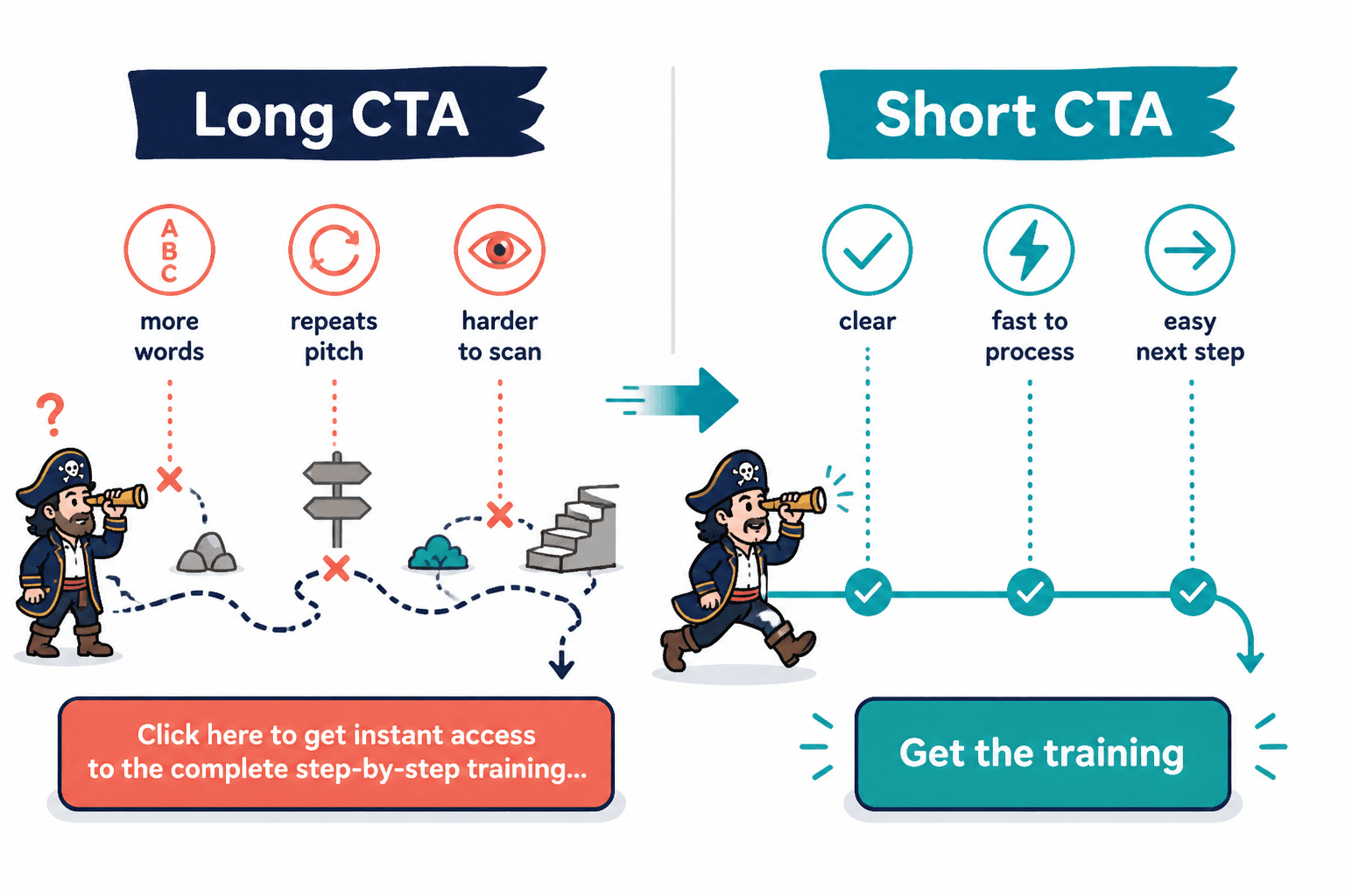
Short CTAs tend to beat long ones when they do three things well:
- Reduce friction: fewer words means less processing before clicking
- Clarify the action: the reader instantly knows what happens next
- Match momentum: they keep the flow moving instead of interrupting it
Think about the difference between these two button lines:
- Long: Click here to get instant access to the complete step-by-step training and start improving your CTA performance today
- Short: Get the training
If the surrounding copy already explained what the training is and why it matters, the short version is cleaner. The long version is not more persuasive. It is just repeating itself in a slightly sweaty voice.
A CTA should usually answer one question: what should I do next? Not six bonus questions it invented for itself.
That is why a lot of high-performing CTA writing feels almost plain. It is not trying to impress anyone. It is trying to make the next step easy.
When short CTA writing beats long ones
Short CTAs do not always win. But they beat longer ones in some very common situations.
1. When the offer is already clear
If your headline, body copy, layout, and proof have already done their job, the CTA does not need to restate the pitch. It just needs to move the reader forward.
Good examples:
- Book the call
- Get the guide
- Start free
- See pricing
- Download the template
These work because the reader is not confused. Long CTA writing in this situation often adds clutter, not clarity.
2. When the audience is warm
Warm readers usually need less explanation. They know your name, your offer, or at least the problem you solve. If someone came from your email list, a nurture sequence, a useful article, or repeated content exposure, they rarely need a button that sounds like a mini webinar registration script.
A short CTA respects that familiarity. It says, in effect, you know why you’re here, so here is the next step.
3. When the action is low friction
The easier the ask, the shorter the CTA can usually be.
- Read more
- Watch the demo
- See examples
- Grab the checklist
- Join free
If the user is not making a major commitment, they do not need a lot of reassurance inside the CTA itself. Save explanation for the surrounding copy if needed.
4. When mobile readability matters
Long CTAs get ugly fast on mobile. Buttons wrap awkwardly. Email prompts become visually noisy. Interface space tightens, and your once-clever CTA starts looking like it cannot fit through the door.
Short CTA writing tends to scan better, look cleaner, and feel easier to tap. That matters more than people think, especially if most traffic is coming from phones.
5. When speed matters more than persuasion
Sometimes the reader is not looking for a fully reasoned invitation. They are looking for a clear next move. This is common in navigation CTAs, inline article CTAs, opt-in prompts after strong educational content, and product pages where intent is already high.
In those cases, concise wins. You are reducing hesitation, not building desire from scratch.
Where longer CTAs still make sense
This is where people get annoying about copy. They hear “short usually wins” and decide every CTA should be one or two words forever. No. That is how you end up with buttons that say things like “Continue” on pages where nobody knows what continuing actually means.
Longer CTAs earn their place when they add important clarity, specificity, or reassurance. Not when they just add extra syllables because someone thought “Get started” felt too plain.
Use longer CTAs when the action needs context
If the reader may hesitate because the next step is unclear or feels risky, a more descriptive CTA can help.
- Get a free website copy audit
- Book your 20-minute strategy call
- See how the template works
- Download the homepage CTA swipe file
These are still fairly short, but they carry more meaning than generic alternatives like “Submit” or “Learn more.”
Use longer CTAs when the offer is unfamiliar
If you are introducing a new framework, niche service, or weirdly named product, a little extra specificity helps people feel less lost.
For example, “Get the kit” is weak if nobody knows what the kit is. “Get the client onboarding kit” is better because it tells the truth faster.
Use longer CTAs when the stakes are higher
The bigger the commitment, the more clarity you need around the next step.
- Apply for coaching
- Book a paid consult
- Request a custom quote
- Start your 14-day trial
Notice the pattern: these are not long because they are fluffy. They are longer because they reduce ambiguity.
Short vs long CTA writing: the real decision test
Instead of asking, “Should this CTA be short or long?” ask this:
- Does the reader already understand the offer?
- Is the next step obvious?
- Is there any important detail missing from a shorter version?
- Would fewer words make the action feel easier?
- Would more words make the action feel clearer?
That is the actual split. Short CTAs beat long ones when extra words do not improve the decision. Once the added words stop increasing clarity, they start adding drag.
It helps to think of CTA length as a tradeoff between speed and specificity. If the page has already handled specificity, make the CTA faster. If the page still leaves questions, add enough specificity to close the gap.
This is also why you should not judge a CTA in isolation. A button is part of a larger conversion path. The same CTA can feel perfect on one page and confusing on another because the surrounding copy changes what the reader needs.
If you want a broader look at CTA length without turning it into numerology, this guide on how long CTA writing should be pairs well with this one.
Before-and-after examples: when shorter worked better
Here are a few common rewrites where shorter CTA writing usually improves performance.
Email opt-in CTA
- Before: Click here to receive weekly conversion-focused writing tips, examples, and practical strategies directly in your inbox
- After: Get weekly CTA tips
Why the shorter version wins: it keeps the value clear without sounding like a brochure trying to escape the page.
Service page CTA
- Before: Schedule your free consultation call to discuss your brand messaging goals and see if we are a fit to work together
- After: Book your free consult
Why the shorter version wins: the page likely already explained the service and fit. The CTA only needs to direct action.
Article CTA
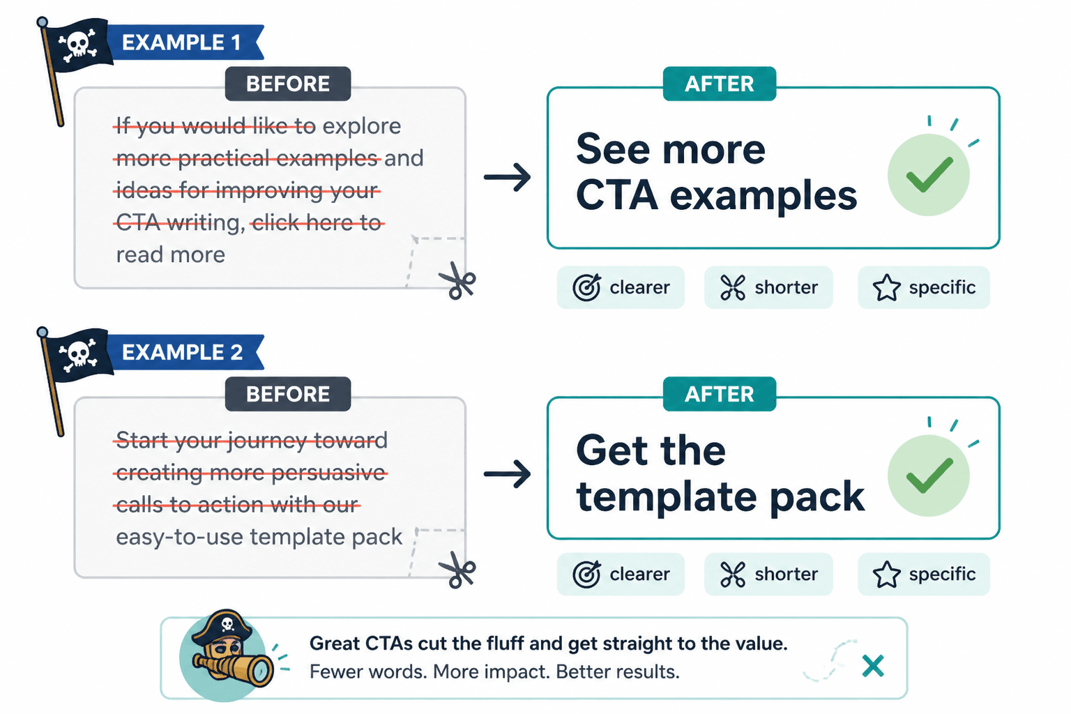
- Before: If you would like to explore more practical examples and ideas for improving your CTA writing, click here to read more
- After: See more CTA examples
Why the shorter version wins: it tells the reader exactly what they get next, with none of the nervous preamble.
Product CTA
- Before: Start your journey toward creating more persuasive calls to action with our easy-to-use template pack
- After: Get the template pack
Why the shorter version wins: “Start your journey” is the kind of phrase that makes perfectly normal people close tabs.
How to shorten a CTA without making it worse
Cutting words is easy. Keeping meaning while cutting words is the actual job.
Use this simple process:
- Find the core action. What do you want the reader to do?
- Remove throat-clearing. Cut phrases like “click here to,” “if you want to,” and “learn more about how to.”
- Keep the clearest noun. Guide, audit, demo, checklist, pricing, consult.
- Add only useful specificity. Free, 15-minute, homepage, email, client onboarding.
- Read it in context. If the surrounding copy already says it, the CTA probably does not need to.
Example:
- Original: Click here to download our complete guide to writing more persuasive homepage calls to action for your business
- Tighter: Download the homepage CTA guide
That rewrite works because it keeps the action, the asset, and the topic. Everything else was verbal bubble wrap.
If you need a broader framework for improving your CTA wording, this article on how to write better CTA writing can help you clean up the rest of the mess too.
Common mistakes people make when shortening CTAs
Shorter is not better if it becomes vaguer, colder, or harder to understand. These are the usual mistakes.
1. Making the CTA generic
- Weak: Learn more
- Better: See pricing
- Better: Read the case study
- Better: Get the checklist
Generic CTAs often underperform because they make the reader do extra guessing.
2. Cutting useful specificity
There is a difference between short and stripped bare.
- Too vague: Get it
- Clearer: Get the swipe file
If the noun matters, keep the noun.
3. Ignoring audience temperature
A cold visitor may need more context than an email subscriber. If a short CTA feels abrupt or unclear, the problem may not be the CTA itself. It may be that the page has not earned simplicity yet.
4. Repeating the same promise everywhere
If your headline, subhead, bullet list, testimonial, and button all say basically the same thing, your page starts feeling heavy. The CTA should complete the sequence, not echo it again in a different hat.
5. Using tiny CTA text to hide weak positioning
Short CTA writing cannot fix an offer nobody wants, a page nobody understands, or a value prop made of abstract fog. Tools, templates, and button tweaks help. They are not miracle workers.
For more examples worth stealing responsibly, check these CTA writing ideas and examples for creators.
Best short CTA formats by use case
| Use case | Short CTA that works | Why it works |
|---|---|---|
| Email opt-in | Get the guide | Clear asset, low friction |
| Service inquiry | Book a call | Direct next step |
| Pricing page | See pricing | Specific and honest |
| Template offer | Download the template | Concrete value |
| Newsletter signup | Join free | Simple and low pressure |
| Case study page | Read the case study | Matches intent exactly |
If you work inside broader conversion copy systems, the parent CTA writing hub is the useful place to keep open in another tab. It also connects naturally with the wider conversion copy section if you are cleaning up more than one button.
And if your problem shows up most obviously in email, read these email CTA mistakes that hurt performance. Email is where overlong CTA wording really loves to embarrass itself.
A quick practical rule for choosing CTA length
Here is the rule that holds up better than most copywriting folklore:
Use the shortest CTA that still makes the next step feel clear, specific, and easy.
That means “Start free” may beat “Start your free 14-day trial today” on one page, while “Book your 20-minute audit” beats “Book now” on another. The winner is the version that gives the reader just enough information to act without adding drag.
The bigger point is simple: clearer structure and clearer writing make the piece more useful. That is usually what makes the ending land better too.