Most email CTA problems are not dramatic. They are not wild copy disasters with five exclamation marks and a red button screaming BUY NOW.
They are usually quieter than that.
A vague line at the end of a good email. A button that says nothing useful. A soft ask buried under too much explanation. A “just checking in” message with no real next step. And then people wonder why the email got opens, maybe even reads, but not clicks.
That is what makes email CTA mistakes so annoying. The rest of the email can be decent. The offer can be solid. The reader can even be interested. But if the call to action is weak, confusing, too early, too generic, or trying way too hard to sound clever, performance drops fast.
This is where Email CTA Mistakes That Hurt Performance actually matters. Not because every email needs some high-converting magic line, but because your CTA is the point where attention is supposed to turn into action. If that handoff is sloppy, everything before it has to work much harder.
Here is how to spot the mistakes that quietly wreck clicks, replies, and conversions, and how to fix them without turning your emails into funnel-scented nonsense.
Want the broader roadmap? Start with the parent guide.
Why email CTAs fail more often than people think
A lot of people treat the CTA like the final sentence they tack on once the email is done. That is backwards.
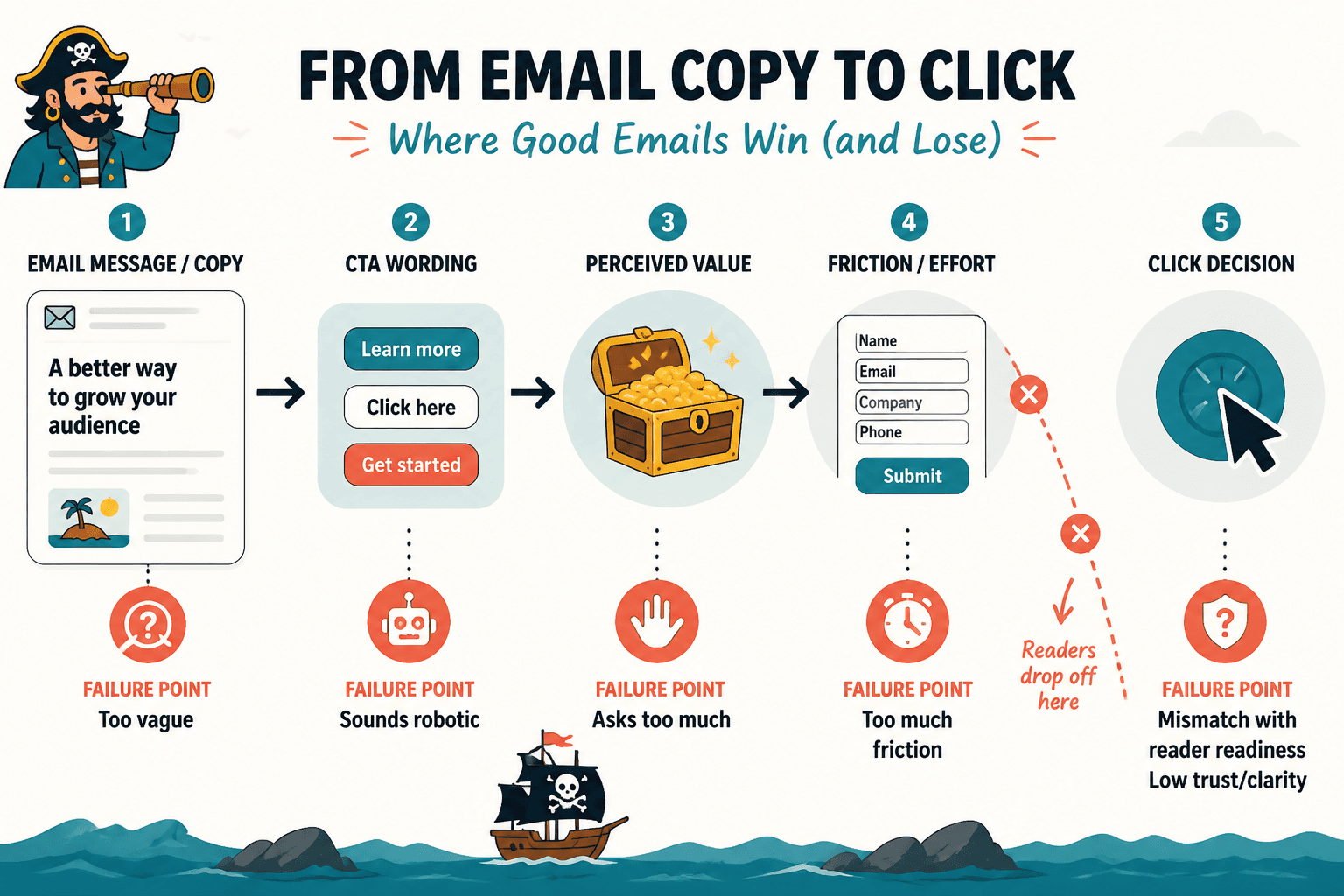
The CTA is not decoration. It is the decision point. It tells the reader what to do, why that next step matters, and how much effort it will take. When that part is fuzzy, the reader hesitates. And hesitation is usually where the click dies.
Bad email CTAs also tend to fail in boring, repeatable ways. They ask for too much. They sound robotic. They create friction. They do not match the stage of awareness the reader is in. Or they act like the reader should already be sold when the email has barely earned that level of commitment.
In other words, most CTA issues are really trust, clarity, and sequencing issues wearing a tiny button costume.
Email CTA mistakes that hurt performance
1. Asking for an action that feels too big for the email
This one is common. The email gives a quick tip, a short opinion, or a light update, and then suddenly asks the reader to book a call, start a paid plan, or make a major decision.
That jump feels bigger to the reader than it does to you.
If the email has not built enough trust, proof, or urgency, a high-commitment CTA will underperform. Not because the offer is bad. Because the next step feels premature.
A good CTA does not just tell people what to do. It matches how ready they are.
Weak example: “Book your strategy call now.”
Better if trust is still low: “See how this works in practice.”
Better if the reader needs a softer step: “Read the full breakdown here.”
If your audience is cold or lightly engaged, aim for lower-friction actions first. Read. Reply. Watch. Browse. Learn more. Then earn the bigger ask later.
2. Using generic CTA copy that says almost nothing
“Click here.” “Learn more.” “Submit.” “Read now.” “Get started.”
These are not always wrong. But most of the time, they are lazy. They force the reader to do extra interpretation work. What am I getting? Why should I care? What happens next?
Specific CTA copy nearly always has a better chance because it reduces uncertainty.
| Generic CTA | Stronger CTA |
|---|---|
| Learn more | See the full template |
| Click here | Read the 5-minute breakdown |
| Get started | Build your first draft |
| Submit | Send your application |
| Read now | See the examples |
You do not need every CTA to be dazzling. You need it to be clear. Clear beats clever very consistently, and with much less drama.
If you want more practical ways to tighten weak calls to action, this guide on how to write better CTA writing is worth reading next.
3. Hiding the CTA under too much explanation
Some people do not write a CTA. They write a nervous little speech before the CTA.
It usually sounds like this: “If this sounds like something you might be interested in, and if it feels relevant to where you are right now, you can maybe check out the link below if you want.”
That is not polite. It is mush.
When you over-explain the ask, you weaken it. The reader should not have to dig through throat-clearing to figure out the next step.
Before: “If you want to explore some ideas around how this could potentially help your business, feel free to take a look here.”
After: “See how it works here.”
Shorter is not always better, but cleaner usually is. If your CTA sounds apologetic, overqualified, or weirdly timid, tighten it.
4. Giving the reader too many CTA options
One email. Four links. Three possible actions. Two asks in the PS. One confused reader.
Yes, there are exceptions. Newsletters can contain multiple links. Roundups can offer several resources. Product emails can have supporting paths. But most conversion-focused emails do better when one action clearly matters most.
Too many competing CTAs split attention and dilute intent. The reader starts scanning instead of deciding.
- If the email is meant to drive a sale, make that the primary CTA.
- If it is meant to drive a reply, do not bury that under three resource links.
- If it is meant to get a click to one article, stop adding side quests.
One email does not need to do your entire business model at once.
5. Writing a CTA that does not match the email body
This sounds obvious, yet people do it constantly.
The email talks about one problem, then the CTA points to something only loosely related. Or the tone of the email is calm and useful, and the CTA suddenly turns into a hard sell. Or the email promises examples, but the CTA sends readers to a generic service page.
That disconnect hurts performance because the momentum breaks. The reader was following one thread, and then your CTA wandered off wearing different shoes.
Your CTA should feel like the natural next step from the email, not an abrupt pivot to whatever you are trying to promote this week.
6. Making the CTA sound more clever than useful
Button copy and email CTAs do not need a personality transplant. They need to help the click happen.
Witty CTA copy can work. Branded CTA copy can work. But when clarity drops so you can sound original, performance often drops with it.
Risky: “Take the scenic route to smarter growth”
Clearer: “See the growth plan”
Risky: “Open the vault”
Clearer: “Get the templates”
If the reader has to decode the CTA, you already lost some of them. Cute is expensive.
For more adaptable options, this collection of CTA writing button copy examples creators can adapt fast can save you from inventing nonsense under pressure.
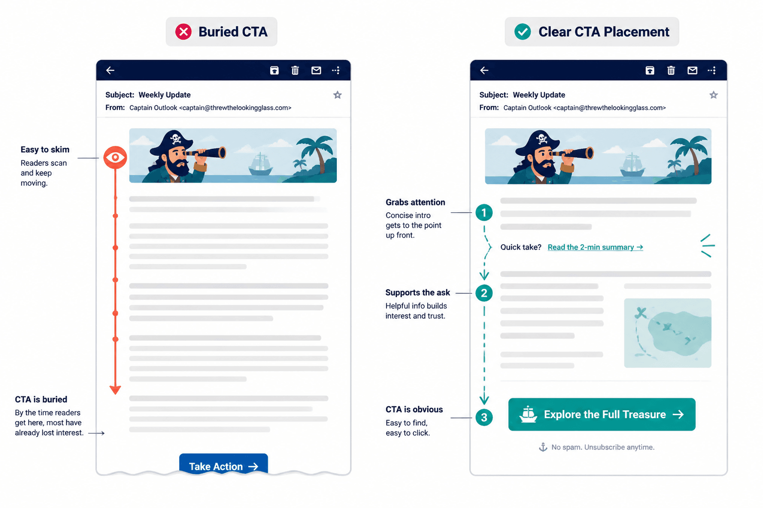
7. Putting the CTA too late in the email
Some emails wander for 600 words before they get to the actual ask. That can work if the email is a story, a sales argument, or a deeper explanation. But in many cases, the CTA is simply buried.
Readers do not always finish emails. They skim. They scan. They get distracted. They open it while walking into a meeting and promise themselves they will come back, which of course they will not.
So if the action matters, do not hide it at the bottom like a secret reward.
- For short emails, one CTA near the end is often fine.
- For longer emails, consider placing a light CTA earlier and the main CTA later.
- For promotional emails, keep the path to action easy to find.
This does not mean cramming buttons everywhere like a desperate ecommerce popup. It means respecting how people actually read email.
8. Using weak verbs that drain energy from the ask
Verbs matter more than people think. A CTA built on limp wording feels easy to ignore.
Compare these:
- “Check this out”
- “View the pricing”
- “See the examples”
- “Book your spot”
- “Download the guide”
- “Reply with your question”
Some verbs create clearer action and stronger intent than others. “See,” “book,” “download,” “reply,” “watch,” “compare,” “review,” and “start” usually do more work than “check,” “explore,” or “discover,” unless the context specifically supports those softer words.
The right verb helps the reader picture the next step. That tiny bit of mental clarity matters.
9. Making the CTA all about you instead of the reader
A lot of weak CTAs reveal the sender’s agenda more than the reader’s benefit.
Things like:
- “Help us hit our goal”
- “Support our launch”
- “Book a call with me”
- “Read my latest post”
Again, not always wrong. But they often put the emphasis in the wrong place.
Try shifting the framing toward what the reader gets:
- “See if this fits your workflow”
- “Get the full breakdown”
- “Find the right option for your team”
- “Use the template here”
Readers are not cruel. They know you want the click. But your CTA works better when it makes the click feel useful for them, not just convenient for you.
10. Forgetting to reduce friction
Sometimes the CTA itself is fine, but the action sounds heavier than it needs to.
Friction is the invisible tax on action. If the next step feels slow, risky, annoying, time-consuming, or unclear, fewer people take it.
You can reduce friction by adding small clarity cues around the CTA:
- How long it takes: “Read the 3-minute guide”
- What happens next: “Book a call and I’ll send the agenda”
- What is included: “Download the checklist and swipe file”
- Who it is for: “See if this fits service businesses”
This is especially useful when the ask involves time, money, or commitment. People are not always resistant. Sometimes they just hate ambiguity.
11. Repeating the same tired CTA in every email
If every email ends with the same line, readers start skimming past it.
This is one reason performance fades even when the list is healthy. The CTA becomes wallpaper. It may still be technically clear, but it no longer feels connected to the email in front of the reader.
You do not need endless novelty. You do need variation that reflects the actual message.
- One email might invite a reply.
- Another might point to a guide.
- Another might ask the reader to compare options.
- Another might make a direct offer.
The best CTA is often not your default CTA. It is the one that fits that specific email best.
12. Treating short CTAs like they are automatically better
Short CTAs can work beautifully. They can also be weirdly empty.
People sometimes trim CTA copy so aggressively that all useful meaning disappears. “Go.” “Now.” “More.” Very sleek. Also, not doing much.
Short is good when the meaning remains obvious. If clarity drops, add the extra word or two. Nobody is handing out medals for minimalist button copy.
This is where context matters. If you are weighing brevity against clarity, read when short CTA writing beat long ones. The answer is not “always shorter.” It rarely is.
How to fix a weak email CTA quickly
If your email CTA is underperforming, you do not need a dramatic rewrite every time. Usually, a fast review catches the issue.
- Name the real next step. What exactly should the reader do?
- Match the commitment level. Is the ask too big for this email?
- Make the benefit visible. What does the click give them?
- Cut extra explanation. Remove any waffle around the ask.
- Check for friction. Can you make the action feel simpler or clearer?
- Make one CTA primary. Stop making the reader choose between five things.
If the line still sounds beige after that, rewrite it until it sounds like a human asking another human to do one clear thing.
And if your CTA copy has that familiar stale, overcooked quality, how to rewrite boring CTA writing will help you sharpen it without sliding into hype.
A simple framework for stronger email CTAs
Here is an easy formula that works for most email CTAs:
Verb + outcome + optional friction reducer
Examples:
- See the full template
- Download the checklist
- Book your intro call
- Read the 5-minute guide
- Reply with your biggest blocker
- Compare the two options
- Watch the short walkthrough
If useful, add one small line around it to reduce uncertainty:
- “It takes about 3 minutes to read.”
- “No opt-in required.”
- “Best if you are already selling a service.”
- “I included real examples, not vague theory.”
Notice what this framework does not require: fake urgency, manipulative scarcity, or one of those CTAs that sounds like it escaped from a bro-marketing bunker.
The bigger point is simple: clearer structure and clearer writing make the piece more useful. That is usually what makes the ending land better too.