
Most boring CTAs are not failing because they are too short.
They fail because they ask for action before they have earned interest, and then they ask in the blandest possible way. “Learn more.” “Get started.” “Contact us.” Fine. Technically a CTA. Also technically wallpaper.
If your call to action sounds like it was approved by six nervous stakeholders and a mildly sedated robot, people skim right past it. Not because they hate CTAs. Because your CTA gave them no reason to care.
How to rewrite boring CTA writing starts with one shift: stop treating the CTA like a button label you tack on at the end. It is not an afterthought. It is the moment where attention either turns into action or quietly dies in a browser tab.
This guide will help you rewrite weak CTAs so they feel clearer, sharper, more specific, and much more clickable without sounding pushy, weird, or funnel-drunk. We’ll break down what makes CTA writing boring, how to fix it, and how to rewrite real examples for buttons, emails, landing pages, articles, and creator offers.
For the main guide behind this topic, visit the parent guide.
Why most CTA writing becomes boring in the first place
Boring CTAs usually come from one of three habits:
- They use generic verbs everyone uses
- They ask for action without explaining the payoff
- They sound safer than useful
That is how you end up with copy like “Submit,” “Click here,” or “Book now” slapped onto pages that need more context, more specificity, or at least a pulse.
And to be fair, sometimes generic CTA writing works well enough. If someone is already highly motivated, “Buy now” can do the job. But most creators, consultants, coaches, and service businesses are not operating in that kind of frictionless certainty. People need a little more help deciding what happens next and why it is worth doing.
A strong CTA reduces friction. A boring one adds it.
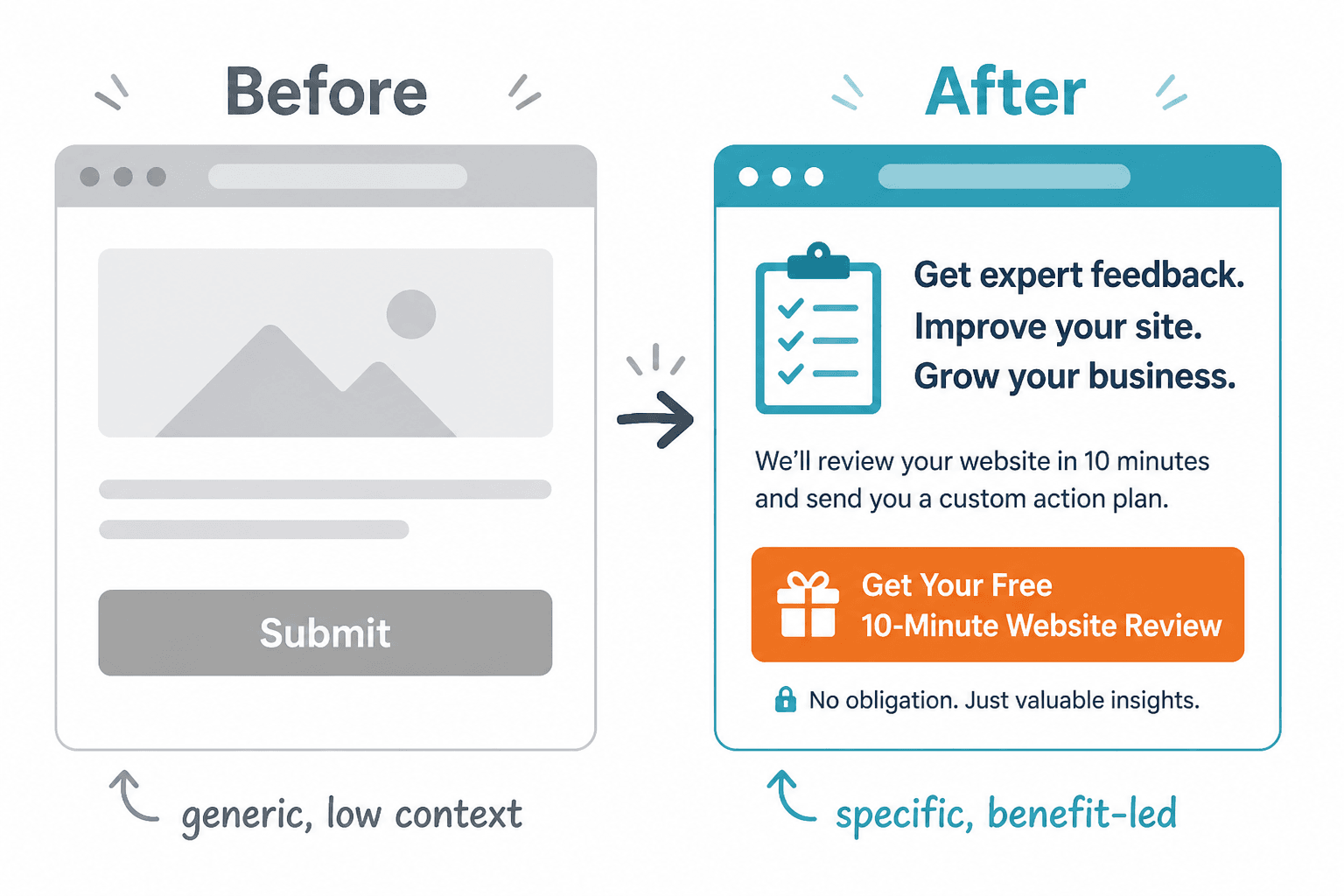
What a stronger CTA actually needs to do
Good CTA writing usually handles four things:
- Clarity: what the reader is supposed to do
- Relevance: why this next step fits what they already care about
- Value: what they get, avoid, improve, or learn
- Ease: how low-friction the action feels
If your CTA misses two or three of those, it probably sounds flat.
This does not mean every CTA needs to become a mini-sales page. Please do not turn one button into a hostage note. It means the next step should feel obvious, useful, and proportionate to the level of trust you have already built.
The best CTAs do not just tell people what to do. They make the next step feel sensible.
How to rewrite boring CTAs: the simple process
If you want a practical way to improve CTA writing fast, use this five-step rewrite process.
1. Find the real action
Start by asking what you actually want the reader to do.
- Read an article?
- Join your email list?
- Book a call?
- Reply to a post?
- Download a resource?
- Start a trial?
Sounds obvious, but plenty of CTAs are vague because the writer is vague. “Learn more” is often code for “we have not decided what matters most here.”
2. Name the payoff
What does the reader get from taking that action?
Not your internal business goal. Their payoff.
- Get the template
- See examples
- Fix the problem faster
- Understand the process
- Compare options
- Save time
Weak CTA writing asks for clicks. Better CTA writing sells the reason for the click.
3. Remove generic filler
Cut dead phrases like:
- Click here
- Learn more
- Read more
- Get started
- Submit
- Contact us
Not because these are always terrible, but because they are usually lazy defaults. A rewrite should earn its place by being more precise.
4. Add specificity or outcome
This is where the CTA becomes more compelling.
Instead of “Download,” try “Get the 5-email nurture template.” Instead of “Book now,” try “Book a strategy call.” Instead of “Read more,” try “See the full breakdown.”
The more specific the action and outcome, the easier it is for someone to say yes.
5. Match the tone to the context
A CTA on a homepage, a CTA in a newsletter, and a CTA under a social post should not sound identical.
If someone is reading a detailed article, a direct but useful CTA works. If they are seeing you for the first time on social, you may need something softer. If they are already on a sales page, you can be clearer and more transactional.
Context matters. The CTA should fit the trust level, not just the copywriter’s mood.
Before-and-after rewrites: boring CTAs turned into useful ones
Here is where CTA writing gets easier. Once you see the pattern, the rewrites stop feeling mysterious.
| Boring CTA | Stronger Rewrite | Why it works better |
|---|---|---|
| Learn more | See how it works | More specific and process-focused |
| Get started | Start your free audit | Adds a clear payoff |
| Read more | Read the full guide | Tells people what kind of content they’re getting |
| Submit | Send my application | Feels human and action-specific |
| Book now | Book your strategy call | Adds context and value |
| Download | Get the CTA swipe file | Names the asset, not just the action |
| Contact us | Ask about your project | Feels more relevant and lower-pressure |
None of these rewrites are wildly clever. Good. CTA writing is not the place to audition for a copywriting circus. Clear beats clever most of the time.
Homepage CTA rewrite example
Before: Get Started
After: See the packages
Why it works: “Get Started” is vague. Started with what? “See the packages” tells the visitor what happens next and helps them self-qualify fast.
Lead magnet CTA rewrite example
Before: Download Now
After: Get the content planning template
Why it works: it names the thing. The more concrete the offer, the less mental effort required.
Service page CTA rewrite example
Before: Contact Me
After: Ask about your launch copy
Why it works: it narrows the purpose and makes the interaction feel more relevant. It also helps repel people who are not a fit, which is useful, not rude.
The four easiest ways to make CTA writing less boring
1. Replace weak verbs with clearer actions
Some verbs are dead on arrival. “Learn,” “submit,” and “click” often feel mechanical unless the surrounding copy is doing a lot of work.
Try stronger action language like:
- See
- Get
- Book
- Browse
- Compare
- Use
- Read
- Steal
- Watch
- Build
Not every brand should use “steal,” obviously. You are writing copy, not a ransom note. But stronger verbs usually make CTA writing feel more alive.
2. Tell people what they get
This is the fastest rewrite move in the book.
Take a generic CTA and add the actual asset, result, or next step:
- Get the checklist
- Read the case study
- See pricing options
- Book your intro call
- Use the free template
People do not love ambiguity when deciding whether to click. They love knowing what they are about to get.
3. Lower the pressure when the ask is early
If your CTA appears early in the relationship, do not write like you are closing a timeshare deal.
For top-of-funnel content, softer CTA writing often performs better because it feels aligned with where the reader is mentally.
- See the guide
- Browse examples
- Take a look
- Get the free version
- Read the breakdown
If the ask is bigger, the trust has to be bigger too.
4. Make the next step feel easy
Sometimes the CTA is not boring. It is intimidating.
That happens when the next step sounds expensive, vague, time-consuming, or emotionally annoying. You can often fix that by adding clarity around what happens next.
- Book a 15-minute fit call
- See a sample report
- Get the one-page version
- Start with the free checklist
That kind of wording lowers perceived friction without getting fake or pushy.
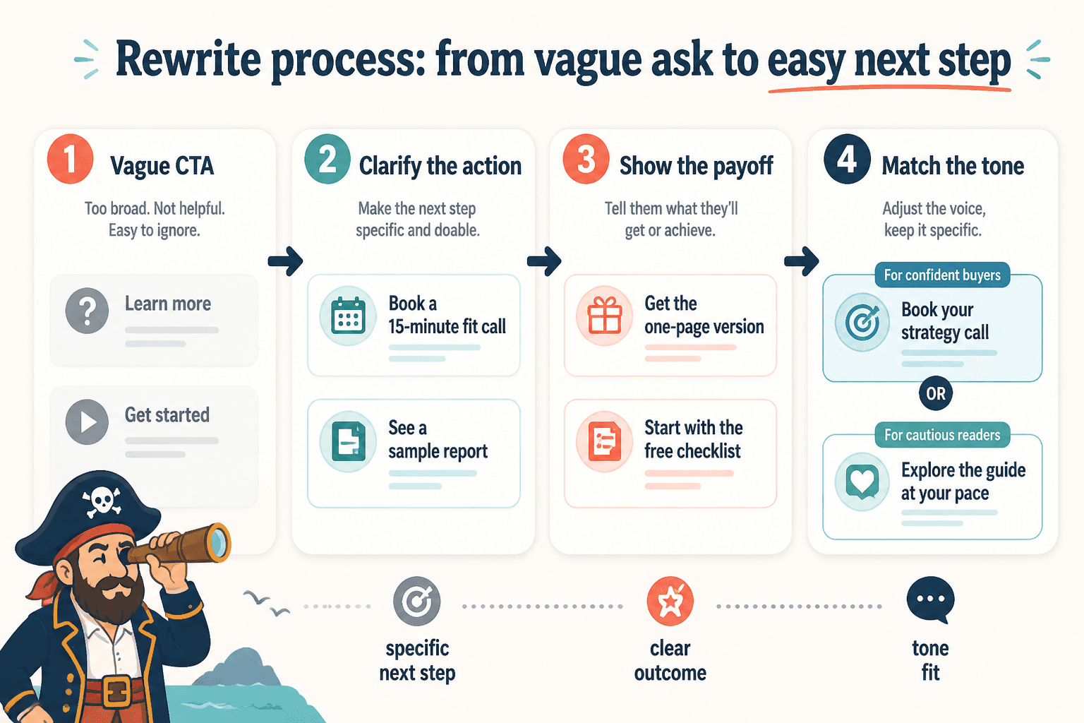
How to rewrite CTA writing for different formats
One reason CTA writing gets dull is that people use the same style everywhere. Bad idea. The best CTA depends on where it appears and what the reader is doing in that moment.
Buttons
Buttons need brevity, but brevity is not the same as vagueness.
- Get the template
- See pricing
- Book a call
- Read the guide
- Start free
If you need more nuance, use supporting text around the button instead of cramming a full sales argument into three words.
Email CTAs
Email gives you more room. Use it.
You can frame the CTA with a sentence that explains why the next step matters.
Weak: Click here to learn more.
Better: If you want the full system, read the breakdown here.
Better still: Want the exact structure? Read the full breakdown and steal the parts that fit your business.
Landing pages
Landing page CTA writing should echo the promise of the page.
If the page is about saving time, the CTA should probably reflect speed or ease. If it is about outcomes, the CTA should hint at the result. Not every CTA must repeat the headline, but it should feel connected to it.
Articles and blog posts
At the end of an article, the CTA should feel like the next logical move, not a sudden lunge for the sale.
If someone just read 2,000 words about improving CTA writing, a hard sell for a high-ticket service might be a bit much unless the article clearly built toward it.
Better article CTAs often point readers toward:
- A related guide
- A template or swipe file
- A service page that matches the topic
- A low-friction next step
For more practical help, readers could continue with how to write better CTA writing, or if the problem is tone more than structure, how to write CTA writing without sounding salesy or robotic.
A quick framework for rewriting any boring CTA
Use this formula:
Action + specific object or outcome + optional friction reducer
Examples:
- Get the swipe file
- Book your intro call
- Read the full case study
- See pricing options
- Start with the free version
If your CTA still sounds flat, run it through these checks:
The bigger point is simple: clearer structure and clearer writing make the piece more useful. That is usually what makes the ending land better too.