Most people pick landing-page tools the way they pick kitchen gadgets: by getting distracted by shiny features they will use twice, then wondering why the meal still tastes bad.
The best landing-page builders and testing tools do not rescue weak offers, fuzzy messaging, or pages that read like a corporate hostage note. What they can do is make it much easier to build faster, test smarter, and improve conversion without turning your workflow into a cursed pile of tabs.
If you are a creator, coach, consultant, solo founder, or service business trying to get more leads or sales from your traffic, the job is pretty simple: pick tools that help you publish clean pages, test meaningful changes, and learn what is actually working. Not tools that bury you in dashboards and make you feel productive while nothing improves.
Here’s how to choose well, what kinds of tools are worth using, and which landing-page builders and testing tools make sense for different needs.
If you want the bigger picture, start with the parent guide.
What actually makes a landing-page tool worth using
Before the tool list, a quick reality check.
A good landing-page setup should help you do five things well:
- Build pages quickly without fighting the editor
- Keep the page focused on one goal
- Test headlines, layouts, CTAs, or proof elements
- See enough data to make a sane decision
- Publish updates without needing a developer for every tiny change
That is the real standard. Not “has 97 integrations” or “uses AI” or “won an award from a software blog nobody reads on purpose.”
If you want a broader strategy for what should go on the page before you start shopping for software, read this guide for creators who want better landing-page results. Tool choice matters, but page strategy matters more.
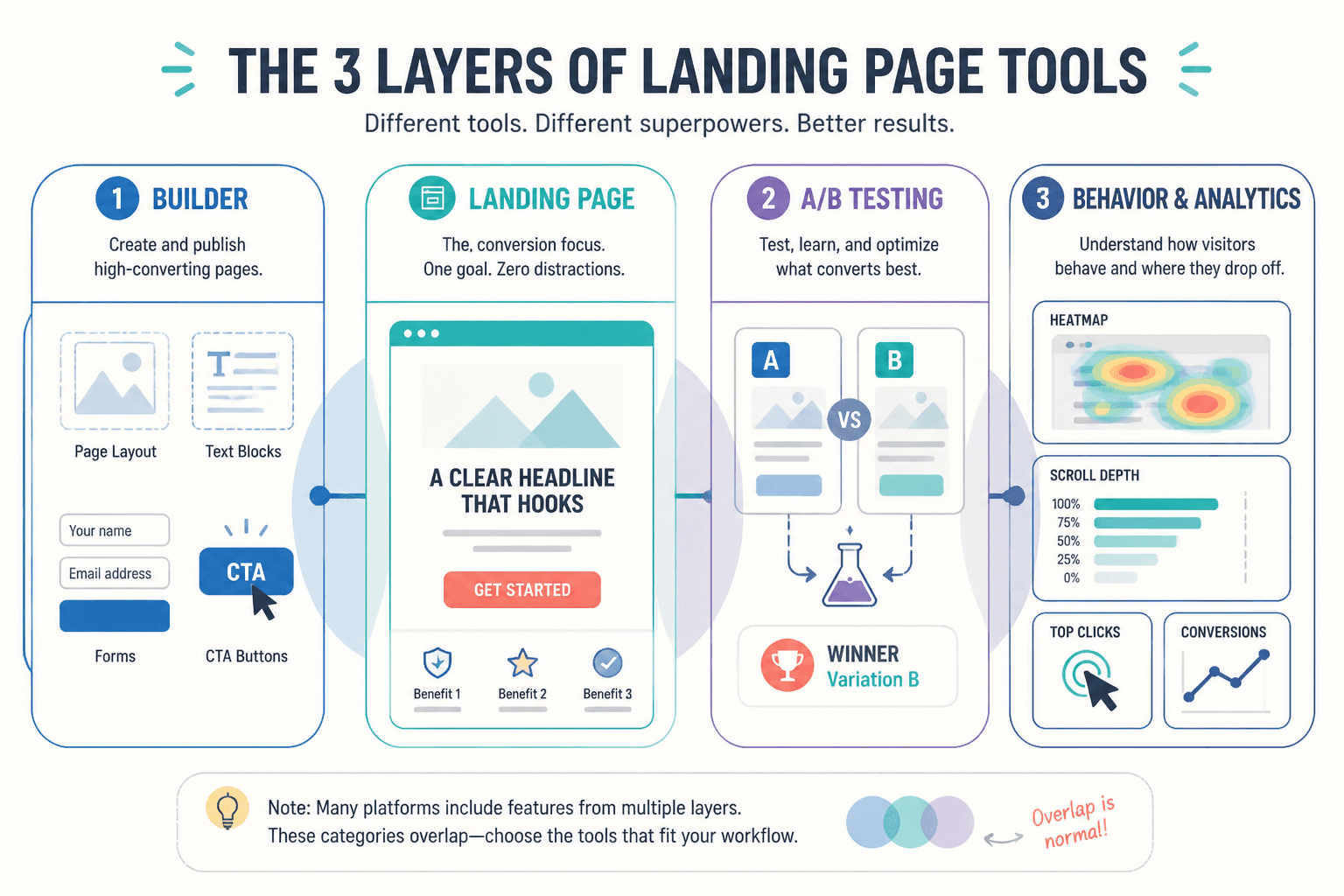
The 3 tool categories you probably need
When people search for the best landing-page builders and testing tools, they often expect one magic platform that does everything perfectly. Usually, that is not how this works.
Most setups fall into three categories:
1. Landing-page builders
These help you create and publish pages without custom coding every section. Good ones give you enough control to make the page look credible and enough speed to not hate your life.
2. A/B testing and experimentation tools
These help you compare versions of a page or page element so you are not making decisions based on vibes and one very opinionated coworker.
3. Behavior and analytics tools
These show what people do on the page: where they click, how far they scroll, where they hesitate, and where they leave. They do not tell you everything, but they can expose obvious friction fast.
Sometimes one platform covers two of these categories reasonably well. Rarely does one cover all three brilliantly.
Best landing-page builders for different needs
The right builder depends on your business model, technical tolerance, design standards, and how often you need to ship new pages. Here are the main options that tend to make sense.
All-in-one funnel and landing-page platforms
These are useful if you want pages, forms, basic automation, and lead capture in one place. They are often a good fit for coaches, consultants, info-product sellers, and smaller businesses that do not want to duct-tape six tools together.
Best for: speed, simplicity, lightweight funnels, smaller teams
Strengths:
- Fast setup
- Built-in forms and CTAs
- Often easier for non-technical users
- Decent for lead magnet pages, webinar pages, waitlists, and service pages
Weaknesses:
- Can feel restrictive if you want precise design control
- Testing features are sometimes basic
- Templates can look suspiciously like everyone else’s
If your current problem is “I need a page live this week,” this category is often enough.
Dedicated landing-page builders
These focus more heavily on page creation, conversion design, and publishing workflows. They are usually better if landing pages are a serious part of your marketing and you expect to build a lot of them.
Best for: marketers, service businesses, agencies, teams running campaigns regularly
Strengths:
- Better page-building flexibility
- More conversion-focused templates
- Stronger testing support in some tools
- Cleaner workflows for multiple page variants
Weaknesses:
- Can cost more
- Might still need separate analytics or CRM tools
- Some editors are “flexible” in the same way flat-pack furniture is “fun”
WordPress-based landing-page builders
If your site already runs on WordPress, staying inside that ecosystem can make sense. You keep more control, avoid another monthly subscription in some cases, and can connect pages more naturally to the rest of your site.
Best for: creators and businesses already using WordPress, content-heavy brands, budget-conscious setups
Strengths:
- Easier content integration with your existing site
- Good for SEO-connected article-to-page paths
- Potentially lower software costs
- More ownership and flexibility
Weaknesses:
- Can get messy with too many plugins
- Performance depends on your broader site setup
- Testing may require separate tools or plugins
If your landing pages are closely tied to your articles, service pages, or long-form content, this route is often more practical than people assume. The broader landing pages hub is a good next read if you are shaping that ecosystem.
Design-first website builders used for landing pages
Some people build landing pages in general site builders because they want strong visual control and do not need a heavy funnel stack. This can work well, especially for personal brands, creatives, and premium services where trust and presentation do real work.
Best for: portfolio-style offers, premium consulting, personal brands, design-sensitive businesses
Strengths:
- Better visual polish
- Flexible page layout
- Good for trust-building and positioning
Weaknesses:
- May lack deeper testing features
- Can encourage overdesign
- Not always built for high-volume campaign workflows
The trap here is making the page beautiful and conversion-soft. A gorgeous page with vague copy is still a weak page. It just fails in nicer typography.
Best testing tools for landing pages
Testing tools matter once you have enough traffic or enough strategic patience to compare versions over time. If you barely get visits, do not sprint into advanced experimentation software like it is your salvation. Start by fixing obvious messaging issues first.
That said, here are the testing tool types worth understanding.
Built-in A/B testing inside page builders
This is usually the easiest starting point. If your builder supports variant pages, split testing, or duplicate-and-test workflows, use that first before adding another platform.
Good for testing:
- Headline changes
- Hero section layout
- CTA wording
- Lead form length
- Social proof placement
Best for: straightforward testing without extra complexity
Dedicated experimentation platforms
These make more sense when you have meaningful traffic, multiple pages, several stakeholders, or a structured conversion program. They tend to offer stronger targeting, cleaner experiment setup, and more reporting depth.
Good for:
- Multi-page testing programs
- Segmentation by traffic source or audience
- Larger teams with ongoing optimization work
- More rigorous experiment tracking
Watch out for:
- Higher cost
- Technical setup
- Testing tiny changes with tiny traffic and drawing huge conclusions anyway
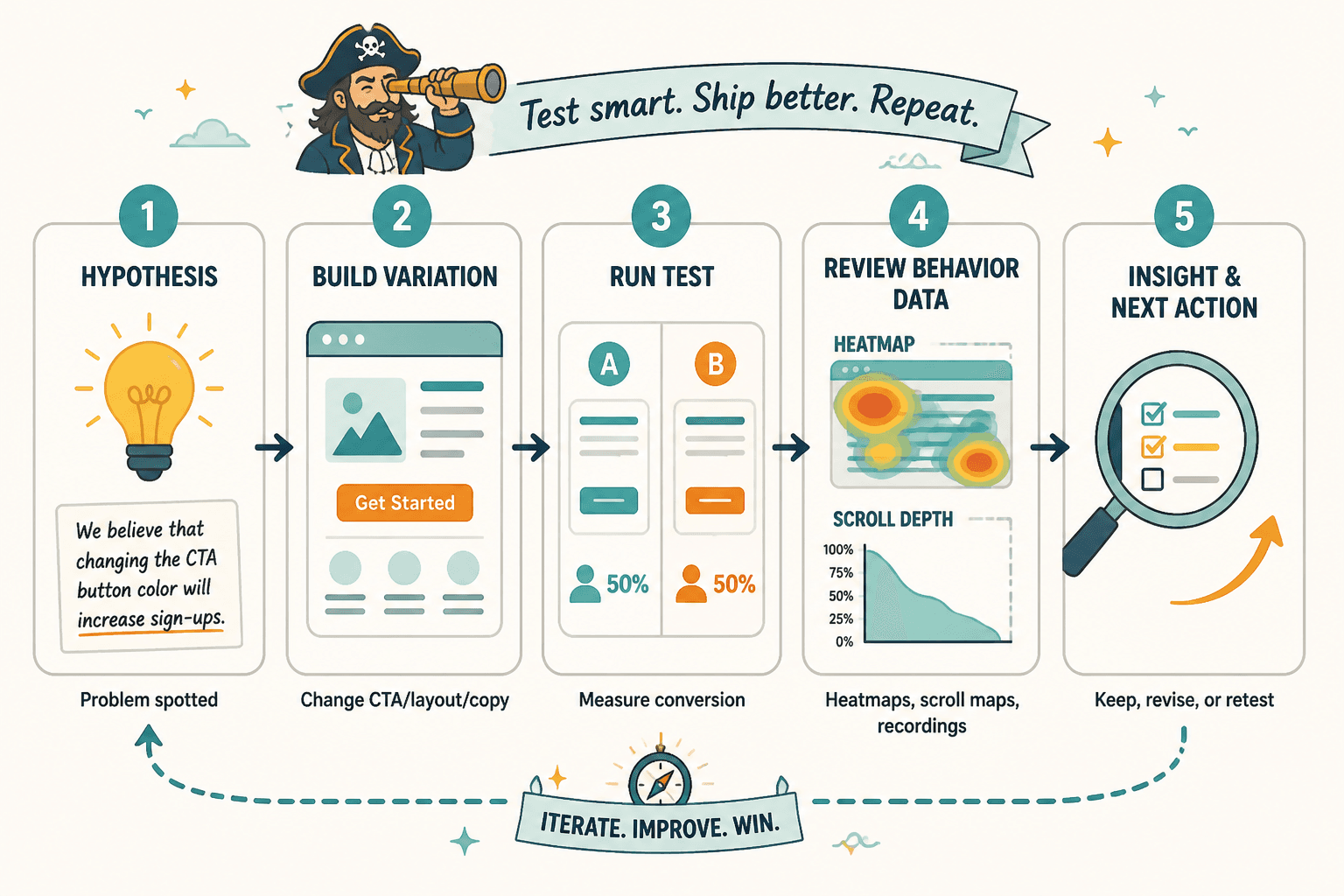
Heatmaps, scroll maps, and session recordings
These are not A/B testing tools, but they are incredibly useful for diagnosing where a page is getting awkward. They help answer questions like:
- Are people seeing the CTA?
- Do they stop before the proof section?
- Are they clicking things that are not clickable?
- Is the page layout creating confusion?
Behavior tools are especially helpful for pages that “should” convert but somehow do not. Sometimes the issue is not the offer. It is the page flow, clutter, or missing clarity.
How to choose the right builder and testing setup
You do not need the “best” tool in the abstract. You need the best tool for your current stage.
Use this simple filter.
If you are a solo creator or small service business
Prioritize speed, clarity, and ease of editing. You probably need:
- A builder with decent templates
- Simple forms or booking integration
- Basic analytics
- Optional built-in A/B testing
You probably do not need an enterprise testing stack. What you need is a page that clearly says what you do, who it is for, why people should trust you, and what to do next.
If you run campaigns regularly
Prioritize repeatability and testing. You likely need:
- Reusable page templates
- Fast cloning and editing
- Built-in or connected A/B testing
- Clear reporting by page or variant
- Integration with CRM or lead workflows
At this stage, publishing efficiency starts to matter a lot. The less friction there is in making and testing a new page, the more likely you are to improve consistently.
If your brand depends heavily on credibility and polish
Prioritize design control and message flow. You need a builder that lets you shape the reading experience properly, not just stack generic blocks and call it strategy.
This is common for consultants, premium coaches, agencies, and founders selling higher-ticket services. On these pages, trust is built through structure, tone, proof, and restraint. Not by throwing twenty widgets at the hero section because the builder offers them.
If you already have low traffic
Do not overinvest in testing software too early. First improve:
- Your headline
- Your offer clarity
- Your CTA
- Your proof
- Your traffic quality
Low traffic plus advanced testing usually creates false confidence. You changed the button color, got three more signups, and now the team is acting like you discovered fire. Calm down. Fix the fundamentals first.
A practical comparison table
| Tool type | Best for | Main advantage | Main caution |
|---|---|---|---|
| All-in-one landing/funnel platform | Solo businesses, simple funnels | Fast setup with fewer moving parts | Can be limiting as needs get more complex |
| Dedicated landing-page builder | Campaign-driven marketing | Better page workflows and testing support | Can cost more and still need extra tools |
| WordPress landing-page setup | Content-led brands, existing WP sites | Flexibility and easier site integration | Plugin sprawl and performance issues |
| Design-first site builder | Premium services, personal brands | Stronger visual control | Easy to overdesign and under-convert |
| Built-in A/B testing | Simple optimization | Easy to start testing quickly | May lack depth or segmentation |
| Dedicated experimentation tool | Higher traffic, structured testing | More robust analysis and targeting | Overkill for small sites |
| Behavior analytics tool | Conversion diagnosis | Shows where users get stuck | Does not replace clear copy or strategy |
What to test first on a landing page
People often test the wrong things because they are easier to change. That is how you end up in endless button-color nonsense while the page headline is still saying almost nothing.
Start with high-impact elements:
- Headline: Does it clearly promise a result or outcome?
- Hero section: Is the value obvious in the first screen?
- CTA: Is the next step clear and low-friction?
- Offer framing: Are you explaining the thing in a way people actually care about?
- Proof: Are testimonials, examples, or outcomes placed where they reduce doubt?
- Form friction: Are you asking for too much, too soon?
If you want examples of stronger page structure and messaging choices, these landing-page ideas and examples for creators will help. And if you need a faster starting point, these templates and tools for landing pages are worth a look.
Features that matter more than people think
A few useful features get ignored because they are less glamorous than “AI generation” and other software peacocking.
Fast page duplication
If you run different offers, audiences, or traffic sources, being able to clone and adjust pages quickly is a real advantage. Speed matters when your best optimization habit is iteration.
Mobile editing and preview control
Many landing pages look fine on desktop and weirdly chaotic on mobile. Since plenty of your traffic will arrive there, mobile-specific control is not a bonus feature. It is basic competence.
Easy proof section management
You should be able to add, swap, and reorder testimonials, logos, examples, and case-study snippets without a miniature engineering project.
Form and CTA flexibility
Different pages need different asks. Download, book, apply, watch, reply, subscribe, start trial. If the tool makes every CTA feel identical, that becomes a real limitation.
Clean analytics visibility
You should be able to answer basic questions without digging through twelve menus:
- How many people visited?
- How many converted?
- Which version performed better?
- Where are people dropping?
Features that are often overrated
Not useless. Just overrated.
The bigger point is simple: clearer structure and clearer writing make the piece more useful. That is usually what makes the ending land better too.
The bigger point is simple: clearer structure and clearer writing make the piece more useful. That is usually what makes the ending land better too.