Most creators with small audiences do not have an image problem. They have a relevance problem dressed up as a design problem.
They spend too long worrying about polished visuals, brand-perfect carousels, or whether an AI image looks “professional enough,” while their actual content is still vague, forgettable, or aimed at everyone. That is backwards. If your audience is small, your visuals should support clarity, trust, and speed. Not become a part-time art project.
That is where AI Image Use Cases for Creators With Small Audiences gets interesting. Used well, AI images can help you explain ideas faster, make your posts easier to notice, package lead magnets better, and create simple visual systems that do not eat your week. Used badly, they make your content look generic, oddly soulless, or like you are trying to cosplay as a massive media brand with 214 followers.
Here is how to use AI images in ways that actually help a small creator grow attention, trust, and leads without producing a pile of visual sludge.
For the broader learning path, visit our parent guide.
What AI images should actually do for small creators
If your audience is small, every piece of content has to work harder. You do not have giant distribution to cover weak packaging. You do not have a brand team smoothing everything out. You need visuals that make your ideas easier to understand and easier to remember.
So the job of AI-generated images is not “look cool.” The job is usually one of these:
- Stop the scroll without looking ridiculous
- Make a concept easier to grasp
- Turn a useful post into a more reusable asset
- Add consistency to your content system
- Help simple offers feel more tangible
- Save time on visuals you should not be custom-building from scratch
That is the frame. If an AI image does not help with one of those, it is probably decoration. Decoration is nice when everything else is handled. Most small creators are not there yet.
The best AI image use cases for creators with small audiences
Not all use cases are equal. Some genuinely improve your content workflow. Some just generate pretty nonsense with suspicious fingers. Start with the practical ones.
1. Simple post visuals that make text content easier to notice
If you write posts on LinkedIn, X, Facebook, or even newsletters, you can use AI images as lightweight support visuals. Not every post needs one, but some ideas land better with a clean image attached.
Good examples:
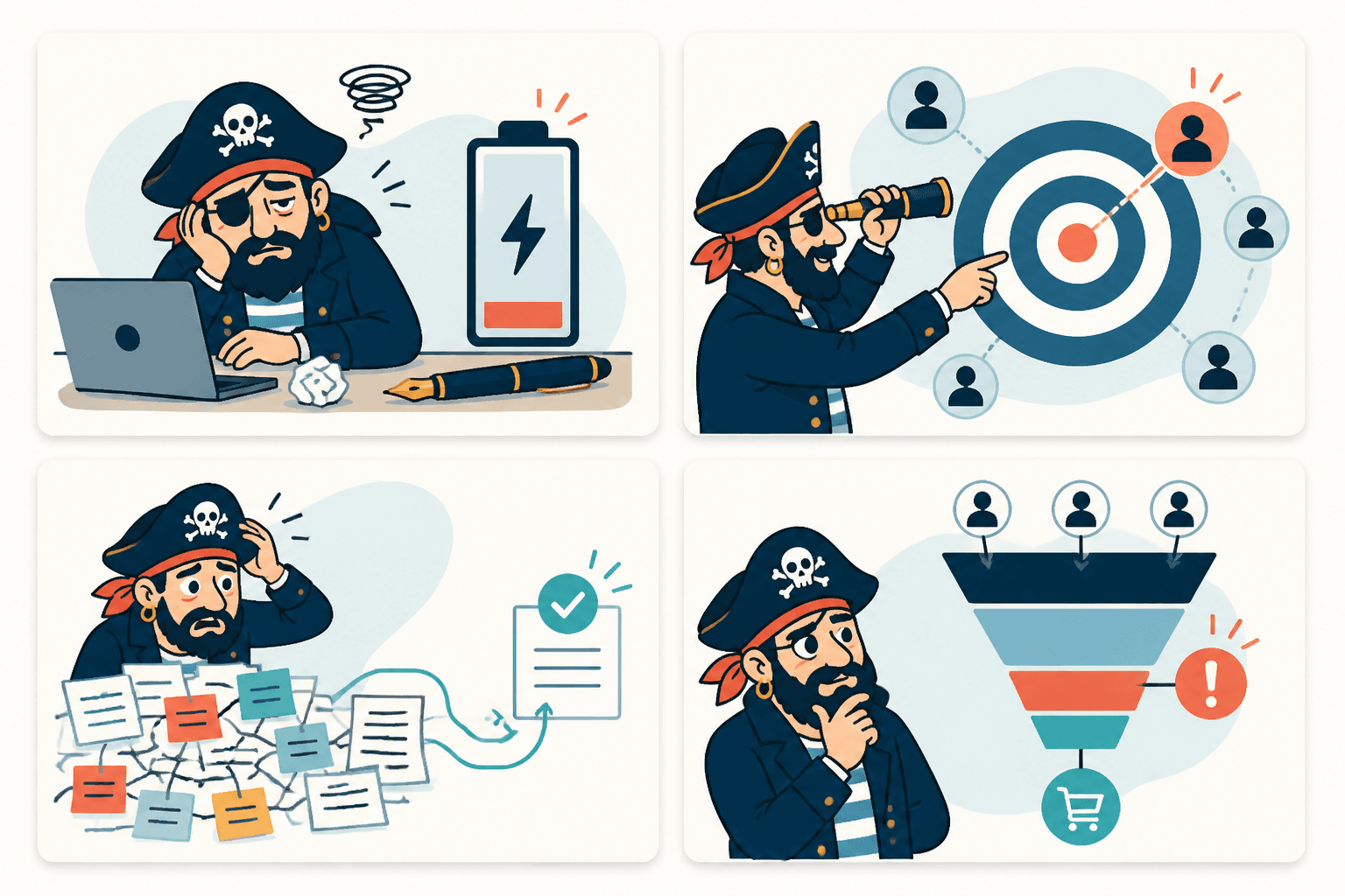
- A conceptual illustration for a post about burnout, positioning, content overwhelm, or sales friction
- A simple branded visual behind a strong quote or framework
- A clean metaphor image that supports the point instead of hijacking it
- A mock visual for a process, workflow, or “before and after” idea
Bad examples:
- Random cinematic portraits because “AI art looks premium”
- Overly dramatic visuals for basic business advice
- Images with so many details they compete with the message
- Visuals that make you look like a crypto wizard from 2022
If your post is sharp, the visual only needs to help it get seen and understood. It does not need to audition for a gallery wall.
2. Lead magnet covers and resource packaging
Small creators often have decent freebies packaged like tax documents. If you are offering a checklist, guide, mini ebook, swipe file, or template pack, a good AI-assisted cover can make it feel more finished.
This matters because people judge usefulness partly by presentation. Not fairly, but still. A cleaner visual wrapper makes the resource feel more real, which makes people more likely to download it.
Use AI images here for:
- Guide covers
- Checklist mockups
- Workbook visuals
- Resource thumbnails for landing pages
- Email opt-in graphics
Just keep it aligned with your positioning. If you help consultants write stronger content, do not slap an abstract neon robot on the front of your PDF because a tool made it in eight seconds. Fast is nice. Relevant is better.
If you want a broader framework for how to think about these kinds of visuals, the parent AI image use cases guide is a useful next read.
3. Content repurposing graphics
This one is underrated. A strong post, article, or thread can usually become two or three visual assets without much extra effort.
For example, you can turn one article into:
- A quote card with the sharpest line
- A diagram-style image with the core framework
- A simple visual summary for a carousel or PDF
- A thumbnail image for reposting the piece later
That is a better use of AI than generating random images first and then trying to build content around them. The idea should come first. The image should help distribute the idea further.
If you need inspiration for that workflow, see AI image use cases ideas that save time and look better.
4. Visual explainers for frameworks, processes, and comparisons
This is probably one of the smartest AI image use cases for small creators because it helps with understanding, not just aesthetics.
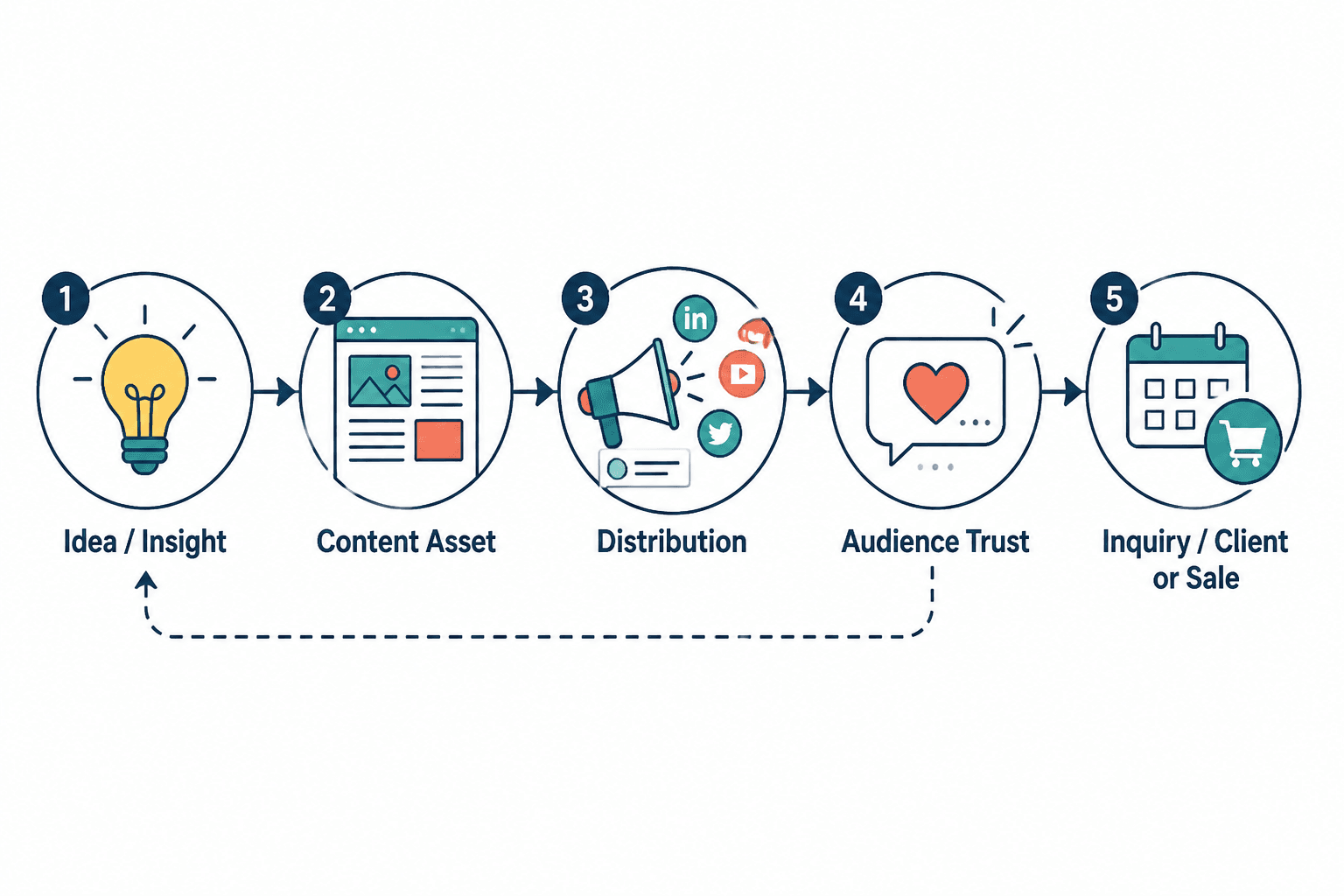
If you teach, consult, coach, or explain anything remotely strategic, visual explainers are useful. A diagram, flow, or concept graphic can make an abstract point feel concrete very quickly.
Especially useful for:
- Funnels
- Content workflows
- Offer ecosystems
- Client journey explanations
- Messaging frameworks
- Brand positioning comparisons
For a small audience, these assets do more than get likes. They build trust. They show you can organize messy ideas clearly. That is a credibility signal.
5. Profile banners, pinned post visuals, and featured section assets
Your profile is one of the few places where visual consistency pays off immediately. If somebody finds you from a post and clicks through, your banner, pinned visual, or featured resource graphic can help them understand what you do faster.
You do not need some elaborate personal brand mood board. You need clean signals:
- Who you help
- What problem you solve
- What resource or next step is available
- That you have your act together
AI image tools can help you create background elements, visual themes, simple iconography, or conceptual support for these profile assets. Then you refine them in a design tool so they look intentional instead of machine-spat.
6. Thumbnail-style graphics for articles, newsletters, and content hubs
If you publish on your own site, Medium-style platforms, LinkedIn articles, or newsletter archives, custom thumbnail graphics help your work feel organized and easier to browse.
This is especially helpful when your content lives in categories. A consistent AI-assisted visual style can make your content library look more like a real body of work and less like a yard sale of disconnected posts.
That is one reason internal hubs matter. If you are building a system around this topic, you could easily connect your content to broader pages like AI writing tools and workflows and more focused resources around image workflows and use cases.
7. Moodboards and concept references before real design work
Here is a less obvious but genuinely useful one: use AI images to think, not just publish.
If you are planning a brand refresh, a course visual system, a launch concept, or a landing page direction, AI images can help you generate rough stylistic references. They are not the final answer, but they are useful for narrowing the vibe, color language, composition, or metaphor before you invest more time.
This is great for creators who do not have a designer on standby and need to explore ideas quickly. Just do not confuse concepting with completion. The first draft from the machine is usually not the polished final. Shockingly, the robot did not nail your brand soul on attempt one.
8. Product mockups for simple offers
If you sell digital products, AI-assisted mockups can make the offer more tangible. Templates, playbooks, strategy kits, mini courses, and workshops all benefit from simple product visuals.
Why this matters: small audiences often buy based on trust and clarity, not hype. A mockup gives shape to something that would otherwise stay abstract.
Use this for:
- Template packs
- Course slide deck previews
- Swipe file bundles
- Consulting frameworks
- Workshop replays
And if you are pairing content with offers, these funnel ideas to pair with AI image use cases can help you make the visuals part of a real conversion path instead of a decorative side quest.
What small creators should not use AI images for
Some uses sound efficient but create more problems than they solve.
- Faking authenticity: AI-generated “behind the scenes” images, fake event shots, or made-up client contexts are a trust problem waiting to happen.
- Replacing proof: If you have real screenshots, real examples, real testimonials, or real process visuals, those usually beat generic generated art.
- Over-branding weak content: Nice visuals cannot rescue mushy positioning.
- Publishing visual clutter: If the image makes the point less clear, it is not helping.
- Copying trends blindly: If everyone is posting glossy AI hero art in your niche, that does not mean it is working. It may just mean people are bored in similar ways.
There is also a practical issue here. Small audiences usually grow through trust, distinctiveness, and useful specificity. Generic AI visuals can accidentally flatten all three if you are not careful.
How to make AI images look more useful and less generic
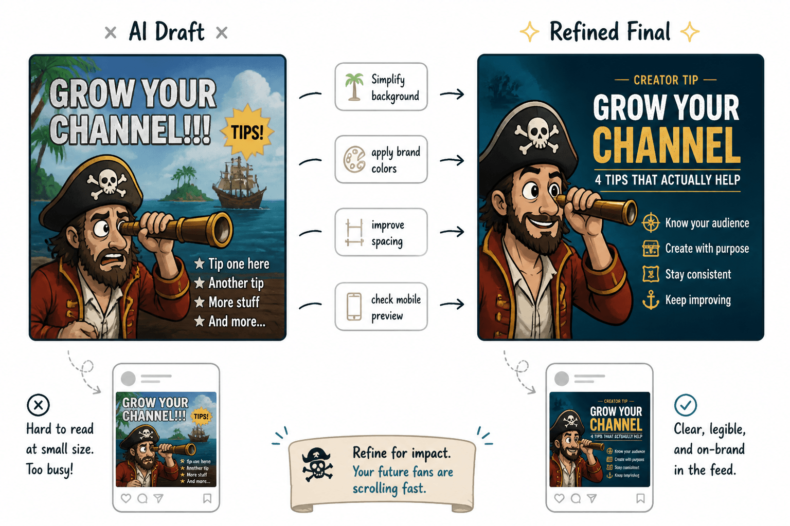
This is where most people go wrong. They use the raw output with minimal editing, then wonder why it feels off. Good AI image workflows usually involve some human taste and light cleanup after generation.
Here is a better process:
- Start with the content goal. Ask what the image needs to do: explain, package, attract, support, or convert.
- Choose one visual style. Keep the look reasonably consistent across assets so your brand does not feel like five different interns made it.
- Generate rough options. Get directions, not perfection.
- Edit in a design tool. Add text, spacing, color correction, cropping, or overlays so the final asset feels deliberate.
- Check for clarity at small sizes. If it becomes visual soup in a feed preview, it is too busy.
- Use real brand language. Your messaging should sound like you, even if the image got AI assistance.
If you want more practical direction on that, read the best ways to use AI image use cases as a creator. It pairs well with this article because it focuses more on execution choices than just ideas.
A simple filter for deciding if an AI image is worth using
Before publishing any AI-generated visual, run it through this quick filter:
- Does it make the idea clearer or more compelling?
- Does it fit my actual audience, not some imaginary giant brand audience?
- Does it look consistent with the rest of my content?
- Would a real screenshot, diagram, or plain text visual work better?
- Does it create trust or just create polish?
If the image only adds polish, be careful. Polish without relevance is one of the fastest ways to look expensive and forgettable at the same time.
Best workflow by creator type
For writers and solo educators
- Use AI images for article thumbnails, framework visuals, and lead magnet covers
- Prioritize clarity over aesthetics
- Repurpose your strongest written ideas into visual summaries
For coaches and consultants
- Use AI images for process graphics, profile assets, and simple funnel visuals
- Avoid fake lifestyle imagery and stock-looking nonsense
- Use visuals to make your thinking look organized and easy to trust
For creators selling digital products
- Use AI images for mockups, bundle covers, promotional graphics, and content upgrades
- Make the product feel tangible
- Keep style consistent across posts, sales pages, and email promos
For personal brands building visibility
- Use AI images sparingly for standout post visuals and banner support
- Do not let the visuals become more “interesting” than the actual viewpoint
- Build a recognisable system, not a random feed
When AI images are worth it for small audiences
They are worth it when they save time, improve comprehension, strengthen packaging, or help your best ideas travel further. They are not worth it when they distract from weak positioning, replace real proof, or push you into spending three hours generating visuals for a post six people will see and none of them will remember.
That may sound blunt, but it is useful. Small creators do not need more content chores. They need leverage. A good image workflow gives leverage. A messy one just adds another place to procrastinate professionally.
If you want a deeper walkthrough of what tends to perform better across this topic, this guide for creators who want better results is the natural next step.
Quick FAQ
The bigger point is simple: clearer structure and clearer writing make the piece more useful. That is usually what makes the ending land better too.
The bigger point is simple: clearer structure and clearer writing make the piece more useful. That is usually what makes the ending land better too.