Most people compare AI image tools the lazy way.
They generate one cool-looking image in each tool, squint at the results, and declare a winner like they’re judging a talent show with no criteria. That is not a comparison. That is vibe-based gambling with a browser tab problem.
If you want to compare AI image tool style quality the smart way, you need a better method than “this one feels nicer.” Style quality is not just about prettiness. It is about consistency, prompt translation, control, visual coherence, range, and whether the tool can actually produce the look you need more than once.
This guide will help you compare tools without getting distracted by flashy outputs, cherry-picked gallery examples, or your own terrible testing habits. You’ll get a practical framework, a scoring system, and a cleaner way to judge style quality based on real use, not random luck.
If you want a broader comparison process first, read how to compare AI image tool comparisons without guessing. If your budget is tight, how to compare AI image tool comparisons on a small budget will save you from spending money just to learn that your test setup was sloppy.
To see how this fits into the wider strategy, open the parent guide.
What style quality actually means
Style quality is easy to misunderstand because people treat it like a single trait. It is not.
A tool can create beautiful images and still have weak style quality for your needs. Maybe it makes everything look glossy and dramatic no matter what you ask. Maybe it nails one aesthetic but collapses when you try to make the style repeat across a series. Maybe it produces cinematic wallpaper and falls apart when you need clean editorial illustrations.
When you compare style quality, you are really asking a handful of more useful questions:
- Can the tool produce the visual style you actually want?
- Can it do that consistently across multiple prompts?
- Does it preserve the style when the subject or scene changes?
- Can you control the style precisely, or does the tool keep freelancing?
- Does the output look intentional, or just accidentally attractive?
That last one matters more than people admit. A lot of AI images look impressive in the same way a movie trailer can look impressive while revealing absolutely nothing. Loud lighting, dramatic texture, hyper-detail, fake depth. Fine. But was the style good, or was it just doing visual push-ups in front of you?
How to Compare AI Image Tool Style Quality the Smart Way
The smart way is simple: test the same style request across multiple scenarios, score what matters, and stop rewarding tools for one-off lucky outputs.
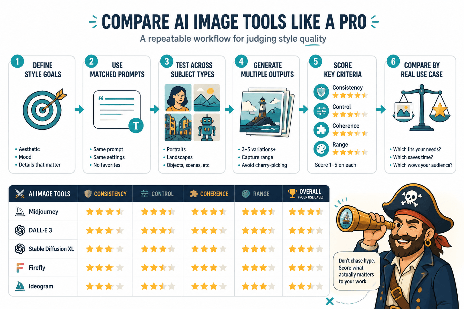
Here is the high-level process:
- Pick a small set of style goals.
- Use matched prompts across every tool.
- Test each style across different subject types.
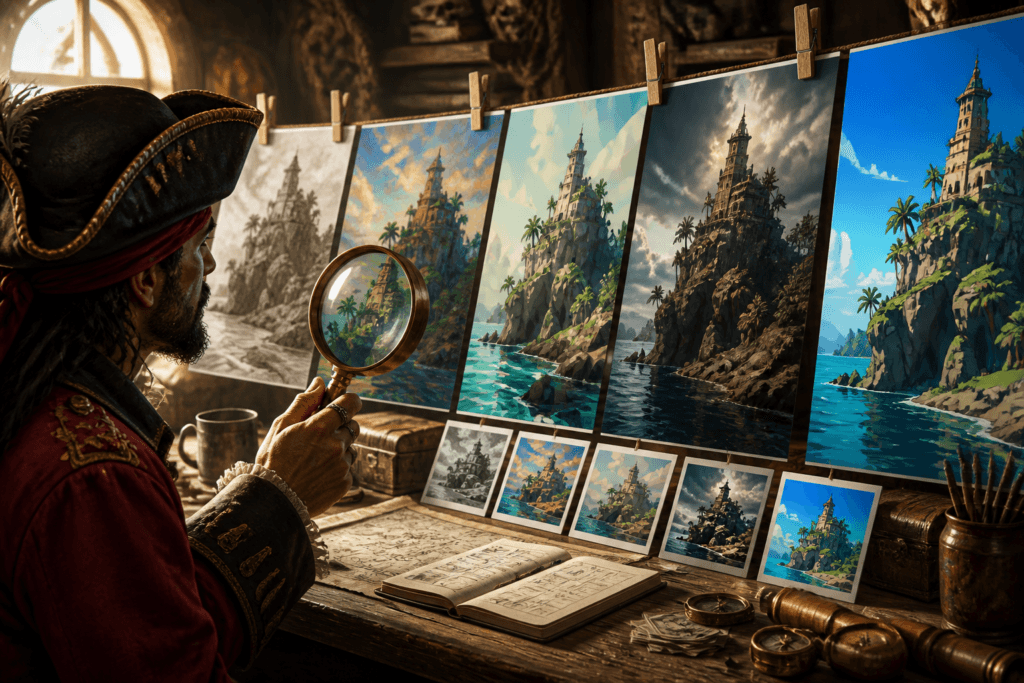
- Generate multiple outputs, not just one.
- Score consistency, control, coherence, and range.
- Compare based on your real use case, not internet hype.
That sounds obvious. Weirdly, it is not how most people test anything.
Step 1: Define the style goal before opening any tool
If your style brief is vague, your comparison will be vague too.
Do not say you are testing for “good visuals” or “nice art style.” That is useless. Pick a style category that reflects the actual work you need done.
For example:
- Minimal editorial illustration
- Luxury product photography
- Painterly fantasy concept art
- Clean flat brand graphics
- Moody cinematic portraits
- Playful children’s book style
- Architectural visualization
- Vintage print poster design
Then define what success looks like for that style. If you skip this part, your brain will reward whichever image feels most dramatic, which is how people end up using the wrong tool for months.
Example style brief for testing:
Create clean editorial illustrations with limited color palettes, strong composition, minimal clutter, readable shapes, and a polished magazine-quality feel.
That gives you something to judge against. “Looks cool” does not.
Step 2: Test one style across multiple prompt types
A tool does not truly understand a style if it only handles one narrow scene well.
For each style you test, use a small prompt set with different content demands. That reveals whether the tool can carry style properly or whether it just has one nice preset hiding under the hood.
A good four-prompt test set might include:
- A person-focused prompt
- An object or product prompt
- A scene or environment prompt
- A more complex composition with multiple elements
Example for editorial illustration style:
- A founder working late at a desk with papers, coffee, and laptop
- A smartphone, notebook, and pen arranged for a productivity article
- A busy city street representing information overload
- A team meeting with abstract visual metaphors for strategy and growth
If the style falls apart when the content changes, that matters. A lot.
Step 3: Keep the prompts as matched as possible
You cannot compare tools fairly if one tool got a polished, highly specific prompt and the other got the prompt equivalent of a shrug.
Use the same base prompt structure across all tools. Adjust only where the tool requires syntax changes or has known prompt handling differences. If one model needs shorter prompts to behave well, keep the meaning constant while adapting the format.
Your prompt template should include:
- Subject
- Scene
- Style description
- Composition cues
- Color or lighting cues if relevant
- Output intent if relevant, like editorial, brand, or concept art
Example template:
[Subject and scene], in a [style] style, with [composition traits], [color or lighting traits], designed to feel [output intent].
What you are trying to remove is testing noise. You want differences in output quality to come from the tools, not from you improvising badly between tabs.
Step 4: Generate multiple outputs per prompt
One image proves almost nothing.
AI image generation has variance. Some tools are better at giving you one stunning output every now and then. Others are better at producing reliable quality repeatedly. If you are a creator or brand, the second thing usually matters more.
Generate at least 3 to 5 outputs per prompt per tool. That gives you enough variation to judge consistency without turning your test into a full-time job.
You are looking for patterns:
- Does the tool keep returning the same visual tricks?
- Does it drift away from the requested style?
- Does quality swing wildly from image to image?
- Does it default to its own taste instead of yours?
Consistency is boring to talk about and very important in practice. Which is why it gets ignored.
The 5 criteria that actually matter
Once you have your outputs, score them against criteria that reflect real-world usefulness. Here are the five I’d use for most creators and teams.
1. Style match
How closely does the output match the requested aesthetic?
This is the obvious one, but be specific. Do not just ask if it looks good. Ask if it looks like the style brief.
- Does it capture the right mood?
- Does it use the right level of detail?
- Does the visual language fit the requested style?
- Does it avoid stylistic contamination from the model’s default habits?
2. Consistency
Can the tool maintain that style across several outputs and different prompt types?
A tool that gives you one gorgeous painterly image and then three plastic-looking cousins of it is not consistent. It is moody.
3. Control
How well does the tool respond when you specify details?
Good style quality includes obeying the prompt. If you ask for a limited color palette, sparse composition, and quiet editorial tone, the tool should not keep throwing lens flares and cinematic chaos at you like it’s auditioning for a poster nobody requested.
4. Coherence
Does the image feel visually intentional?
Coherence is about internal logic. Shapes, lighting, textures, perspective, and composition should feel like they belong in the same image. Some tools can mimic surface style but produce weirdly disconnected results under closer inspection. Nice texture. Strange hands. Confused objects. Random design decisions. Not ideal.
5. Range within the style
Can the tool create variation without losing the style?
This is what separates a genuinely useful tool from one that only has a flattering default look. You want enough flexibility to make a series, campaign, content set, or visual system, not just one decent image for a Tuesday post.
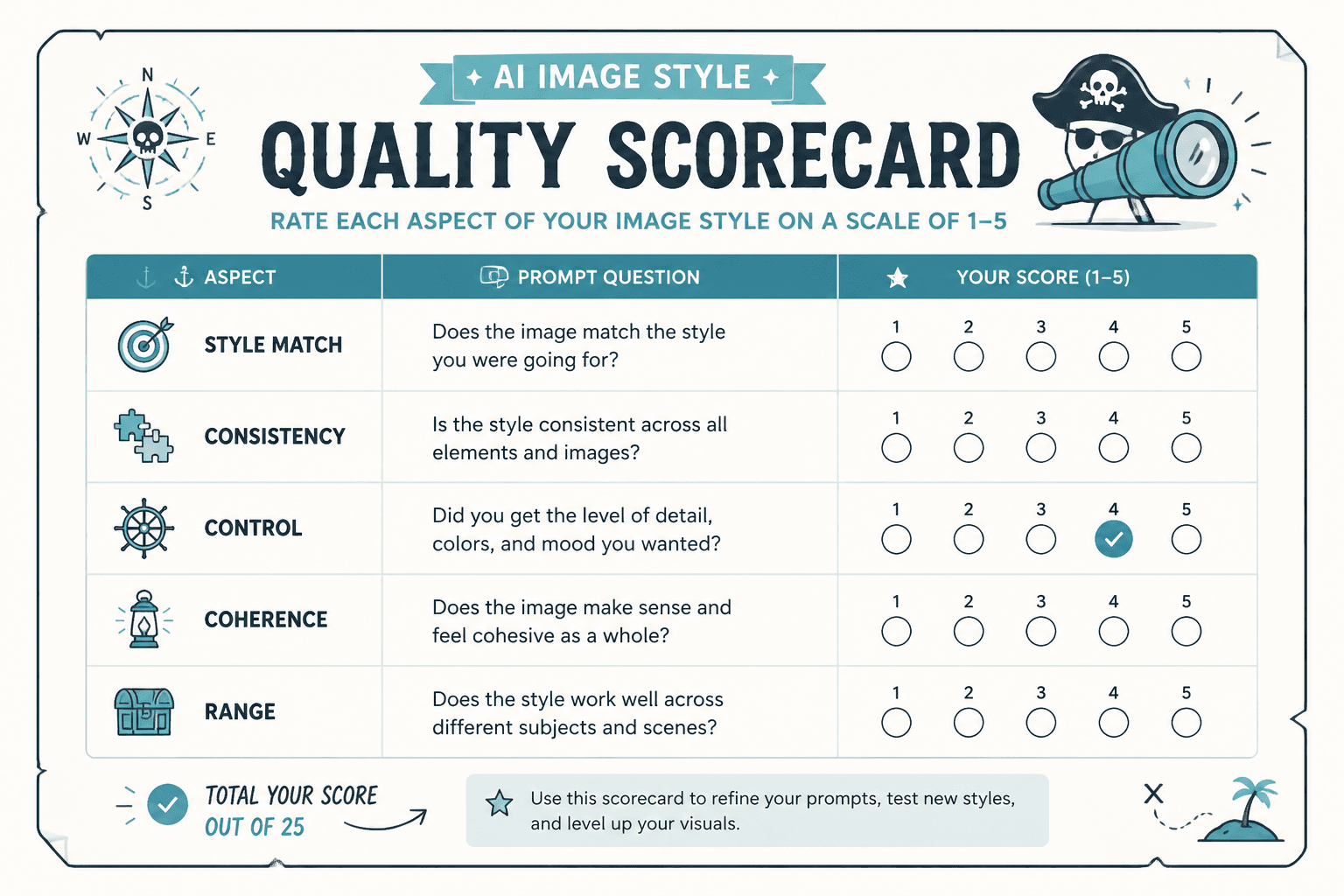
A simple scorecard you can actually use
You do not need a giant spreadsheet that makes you feel like you are evaluating medical equipment. A simple scorecard works fine.
| Criterion | What to ask | Score 1-5 |
|---|---|---|
| Style match | Does it actually look like the requested style? | |
| Consistency | Does it repeat quality across outputs and prompts? | |
| Control | Does it follow style instructions well? | |
| Coherence | Does the image feel internally solid and intentional? | |
| Range | Can it vary the content without losing the style? |
Keep notes beside each score. Numbers alone can flatten the difference between “slightly too glossy” and “completely ignored the prompt and generated stock-photo soup.”
If style quality is your main priority, you can also weight the criteria. For example:
- Style match: 30%
- Consistency: 25%
- Control: 20%
- Coherence: 15%
- Range: 10%
That works especially well if your goal is brand consistency, client work, product visuals, or repeatable content production.
Common mistakes that ruin style quality comparisons
You can have a decent framework and still wreck the test. Here are the mistakes that make comparisons noisy, biased, or basically pointless.
Comparing different styles in different tools
If one tool is being tested on anime poster art and another on luxury product shots, congratulations, you are not comparing anything.
Using only one prompt
This favors luck over reliability. One prompt can flatter a tool unfairly.
Letting visual drama trick you
Many tools can generate dramatic lighting, heavy texture, and cinematic polish that feels expensive at first glance. That does not mean the style quality is better. Sometimes it just means the model is loud.
Ignoring your use case
The best style tool for fantasy key art may be the wrong tool for clean branded illustrations or ad creatives. Compare against the work you actually need, not the work that gets likes in public galleries.
Over-tuning one tool and under-tuning another
If you spend 40 minutes refining prompts in one tool and 5 minutes in another, your comparison is tilted. Either give each tool equal effort or clearly separate “out-of-the-box quality” from “maximum optimized quality.”
Confusing detail with quality
More detail is not automatically better style. In some styles, more detail is actually worse. Minimal, graphic, restrained, and clean visuals get wrecked all the time by tools that insist on adding unnecessary texture and complexity.
How creators should adapt the comparison to their actual work
Not every creator needs the same kind of style test. A consultant making LinkedIn visuals is not evaluating tools the same way as a children’s book illustrator or a founder building product mock campaigns.
Here’s how to adjust the comparison based on what you make.
For personal brands and content creators
- Prioritize consistency and prompt speed
- Test branded illustration styles, thumbnails, social graphics, and simple visual metaphors
- Watch for tools that overcomplicate simple concepts
For designers and creative teams
- Prioritize control and range
- Test whether the tool can stay inside tighter art direction
- Judge how well outputs support iteration, not just first-pass beauty
For marketers and ad creatives
- Prioritize style match to campaign tone
- Test product scenes, branded compositions, and conversion-focused visuals
- Look for tools that can produce clean, usable assets without visual clutter
For illustrators and concept-driven creators
- Prioritize coherence, range, and style fidelity
- Test how the tool handles narrative scenes, character consistency, and stylized environments
- Pay attention to where outputs start feeling derivative or mechanically over-rendered
If you need more examples of what a clear winner looks like in practice, check AI image tool comparisons examples for creators who need a clear winner.
When speed and budget should influence style quality decisions
Style quality should not be judged in a vacuum. If one tool produces slightly better style but takes three times longer to get there, that changes the decision. Same if one tool burns through credits while you are still trying to find a stable output pattern.
This does not mean quality does not matter. It means quality lives inside workflow.
A practical winner is often the tool that gives you 85 to 90 percent of the style quality you need with less fuss, lower cost, and better repeatability. Chasing perfection is fun until your content calendar or client deadline arrives and asks you to act like an adult.
For that side of the comparison, see best AI image tool comparisons speed tests questions for creators and how to compare AI image tool comparisons on a small budget.
A practical test workflow you can run this week
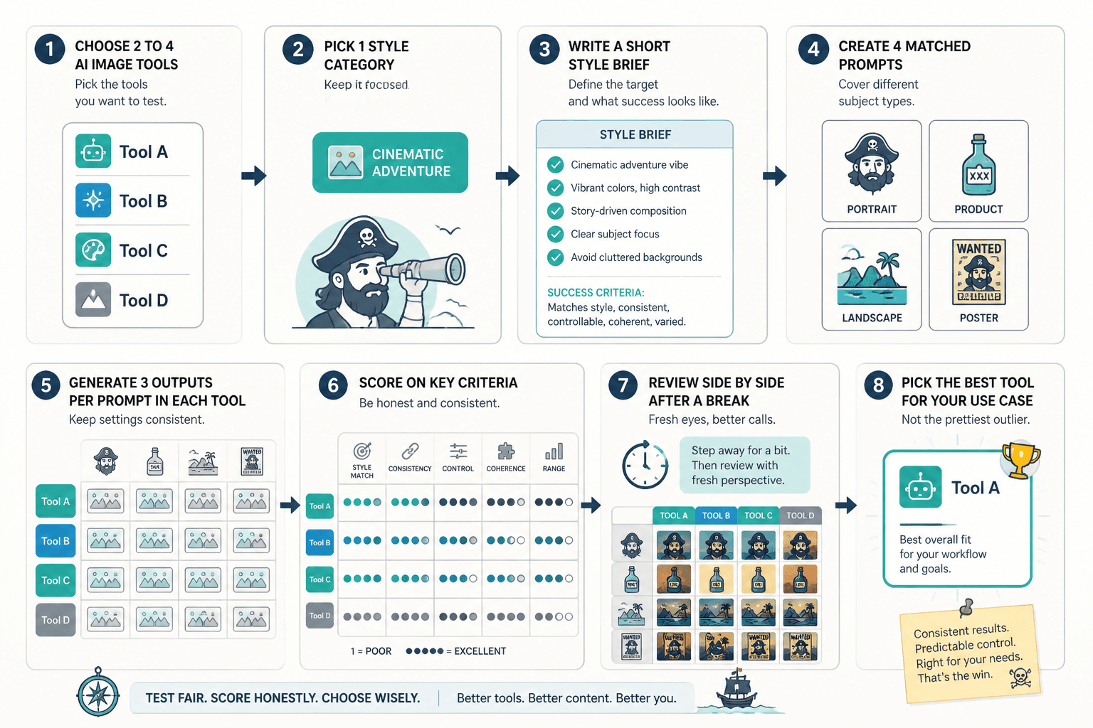
If you want a fast version, use this workflow:
- Choose 2 to 4 AI image tools.
- Pick 1 style category that matters to your work.
- Write a short style brief with success criteria.
- Create 4 matched prompts covering different subject types.
- Generate 3 outputs per prompt in each tool.
- Score style match, consistency, control, coherence, and range.
- Review outputs side by side after a break so you do not get dazzled by the first shiny thing.
- Pick the best tool for your use case, not the one with the prettiest outlier.
If you are building a fuller workflow around image testing, the main AI image tool comparisons page is the best place to continue. You can also browse the broader AI writing tools and workflows section if you are comparing tools as part of a larger creator system rather than a one-off experiment.
FAQ
The bigger point is simple: clearer structure and clearer writing make the piece more useful. That is usually what makes the ending land better too.
The bigger point is simple: clearer structure and clearer writing make the piece more useful. That is usually what makes the ending land better too.