
Comparison pages age in quiet, irritating ways. A feature that used to be a selling point turns into a footnote, a pricing note goes stale, and a “best for” label keeps living in the past like it never got the memo. The result is not usually a broken page. It is a page that still looks usable while slowly becoming less trustworthy.
That is the real maintenance job for AI image tool comparisons: not rewriting everything every time a model changes, but updating the parts that shape reader decisions. A good refresh keeps the comparison honest, current, and readable without turning the article into a permanent renovation zone.
What tends to go stale first
AI image tools change in uneven bursts. Some updates are cosmetic. Others quietly rewrite the whole comparison. The trick is spotting the categories that matter before a reader does.
- Pricing and plan limits: free tiers, credits, and monthly allowances shift often.
- Model access: a tool may add or drop access to a newer image model, which changes quality and control.
- Editing features: inpainting, background removal, upscaling, and style controls are frequent differentiators.
- Workflow changes: export formats, batch generation, and collaboration features can make a tool better or worse for a specific use case.
- Interface changes: even when the feature list is the same, the speed and friction can change enough to affect the recommendation.
In other words, a comparison is not stale just because the wording is old. It is stale when the decision signals are old.
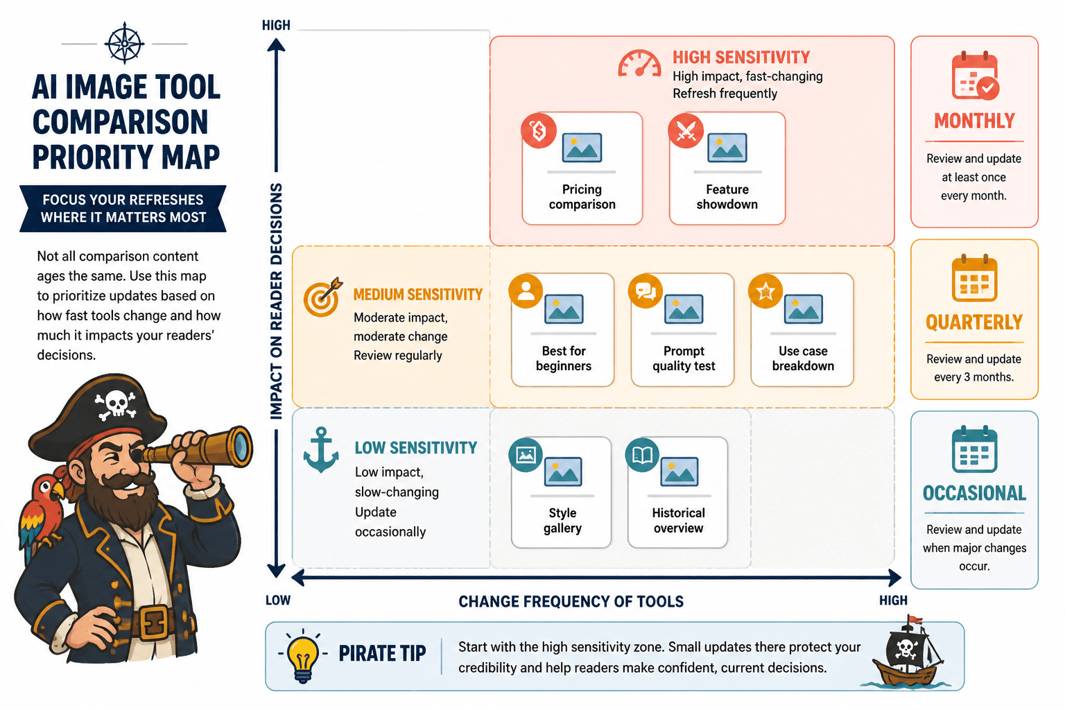
Start with the highest-sensitivity sections
Not every section needs equal attention. A fast refresh should begin with the parts readers rely on to decide.
1. Comparison table
This is usually the first place drift shows up. Update the rows that affect purchase or adoption decisions:
- pricing
- image quality or model access
- editing depth
- commercial usage terms
- workflow speed
- export or integration support
If a table is still mostly right, do not rebuild it from scratch. Refresh the columns that changed and add a brief note where the shift matters. A clean table with one or two updated cells is better than a fully rewritten table that now looks suspiciously like it was assembled under fluorescent light and deadline pressure.
2. Best-fit labels
Phrases like best for beginners, best for marketing teams, or best for control can age quickly. Recheck whether the tool still earns the label after product changes. If not, adjust the label or narrow it.
This is where the comparison should stay specific. “Best for creative control” means one thing if the tool offers fine-grained prompt control and another if it mainly offers attractive defaults with decorative knobs.
3. Examples and use cases
Any examples in the page should match what the tool can still do now. If the article shows a workflow that depends on a feature the tool no longer emphasizes, swap in a new example or rewrite the explanation. Composite examples are fine as long as they are clearly illustrative rather than claimed as firsthand casework.
Refresh the table, not the entire universe
Table updates work best when they are surgical. The goal is to keep readers oriented, not to turn the page into a museum of revision notes.
A practical approach:
- Check the current product page and help docs.
- Mark every table row as unchanged, partially changed, or outdated.
- Update the rows that affect the recommendation first.
- Remove any feature claims you cannot verify.
- Shorten notes that have become too detailed for their own good.
The before-and-after pattern is often the clearest way to see whether the comparison still works.
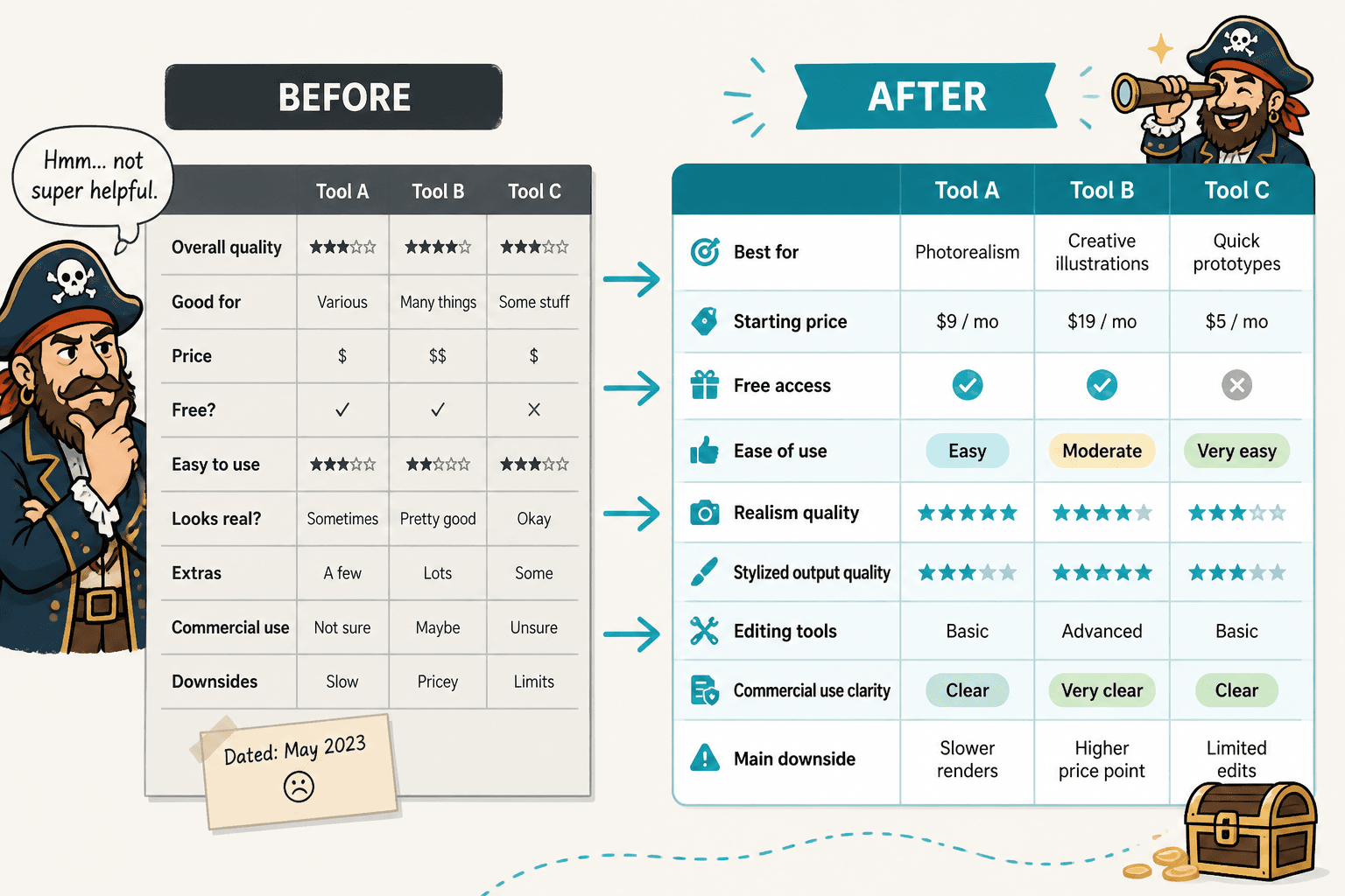
If the article already uses a comparison grid, keep the structure stable unless the update requires a real change in logic. Readers benefit from consistency, especially when they are comparing tools side by side and trying not to lose their place.
Recheck the scoring logic
If the page uses scores, ratings, or weighted categories, the refresh should verify the method as well as the numbers. A stale score is worse than no score because it suggests precision without proof.
Ask a few blunt questions:
- Did the tool’s feature mix change enough to alter the scoring?
- Does the scoring still reflect what readers care about now?
- Are older penalties or bonuses still justified?
- Did a new feature make the old “winner” less clearly winning?
When a score changes, explain why in one short sentence. Readers do not need a courtroom transcript, but they do need to know the basis for the shift.
Update screenshots and metadata together
Refreshing only the body copy while leaving old screenshots in place can make the page feel split-brained. If the interface changed, the visuals should match. If the visuals still reflect the current product, keep them. Do not swap in images just for freshness.
Also check the supporting metadata:
- Title: make sure it reflects the current comparison angle.
- Meta description: keep it aligned with the updated recommendation and feature set.
- Published/updated dates: if your site shows them, they should not imply a freshness the article has not earned.
- Internal links: point readers to the most relevant current cluster pages, such as the AI image tool comparisons guide, the tool stack page, and the best-fit examples page.
Use authoritative sources for verification
For a maintenance refresh, primary sources matter more than roundup posts. Check official product pages, docs, and help centers first. A few stable references can cover most updates:
If a claim affects commercial use, licensing, or output restrictions, verify it directly in the source docs rather than relying on memory or older notes that have begun to smell faintly of optimism.
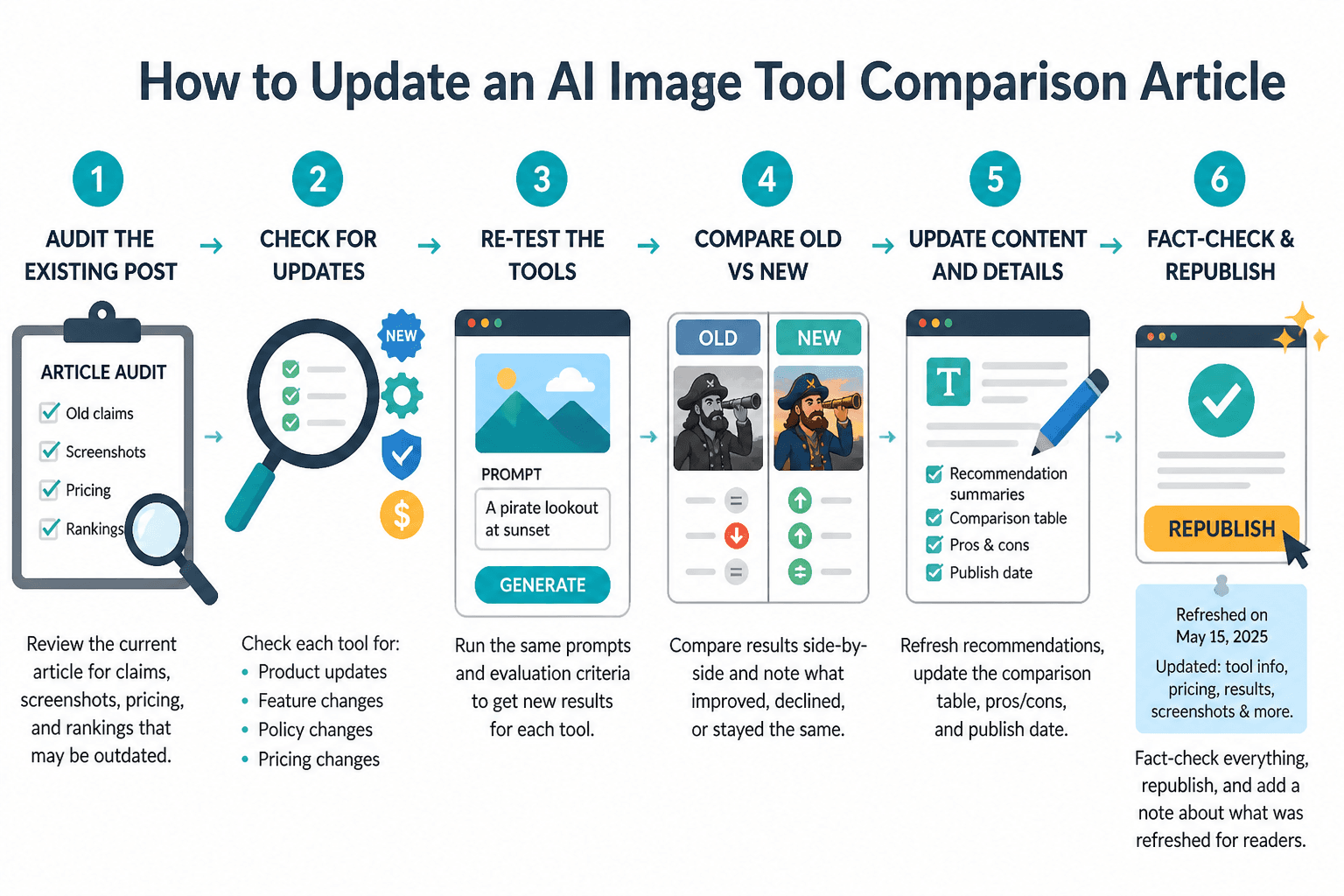
A simple refresh workflow that does not waste the afternoon
A recurring maintenance pass works better than emergency rewrites. The workflow can stay light:
- Scan the tools: note any pricing, feature, or model changes.
- Flag the impact: decide whether the change affects the table, labels, examples, or summary.
- Update the comparison: edit the minimum necessary section first.
- Check consistency: make sure the intro, table, and conclusion still agree.
- Link forward: point readers to the parent guide or a sibling page if they need a narrower decision path.
This keeps the article from turning into a periodic rewrite project. It also makes it easier to refresh multiple comparison pages in the same cluster without reinventing the process each time.
When to refresh and when to retire
Some pages can be saved with a tidy update. Others have crossed into “the structure itself is now wrong” territory.
Retire or rebuild the page if:
- the tool set on the page no longer reflects the market you are covering
- the comparison criteria have changed so much that the old table no longer helps
- the article depends on obsolete workflows or discontinued features
- the page has become a pile of patches instead of a coherent comparison
If the article still has a useful frame, refresh it. If the frame is the problem, a lighter edit will only preserve the wrong shape a little longer.
Quick checklist for a comparison refresh
- Verify pricing, model access, and feature availability.
- Update the comparison table first.
- Recheck “best for” labels and scores.
- Replace outdated screenshots only when the interface changed meaningfully.
- Trim or rewrite examples that no longer match the tool.
- Confirm internal links still point to the current comparison cluster.
- Use primary sources for any claim that affects trust or buying decisions.
For the broader cluster context, keep the article aligned with the parent guide and any adjacent pages that help readers narrow a choice, especially the buyer intent page. The goal is not to say everything again. It is to make the existing comparison earn its place on the shelf.
For related reading, the guide page is the best place to start, while the best-fit examples page and tool stack page handle more specific decisions.