
Weak landing pages waste trust, stall sales, and turn otherwise useful traffic into expensive busywork. The page gets the click, the visitor starts reading, and then the whole thing becomes a vague little tour of your business instead of a decision. That is the conversion tax nobody enjoys paying.
The fix is usually not “make it prettier.” It is make it easier to understand, easier to believe, and easier to act on. A landing page converts when the offer, the proof, and the call to action all point in the same direction. That sounds obvious until you look at how many pages politely disagree with themselves.
If you want the broader system behind this, start with the landing pages parent guide. For examples and supporting tactics, the landing pages guide and landing pages examples page are useful companions.
What a landing page needs to convert
A landing page does not need more ideas. It needs fewer competing ones.
- One audience so the page feels relevant.
- One promise so the visitor knows why they should care.
- One primary action so the next step is obvious.
When those three things line up, the page feels fast, even if the reader takes their time. When they do not, the page gets busy in all the wrong places. A clever line here and a shiny button there will not rescue that.
Match the page to the traffic source
A landing page should not try to do the same job for every visitor. Someone arriving from a blog post is usually at a different level of readiness than someone clicking a high-intent ad or a webinar invite.
That is why funnel fit matters. The page should match the temperature of the traffic and the complexity of the offer.
- Warm traffic can usually handle a direct offer faster.
- Cold traffic often needs more context, proof, or a smaller first step.
- Higher-friction offers usually need more reassurance before the ask.
If the match is off, the page can still get clicks and still underperform. That is not a traffic problem. It is a mismatch problem.
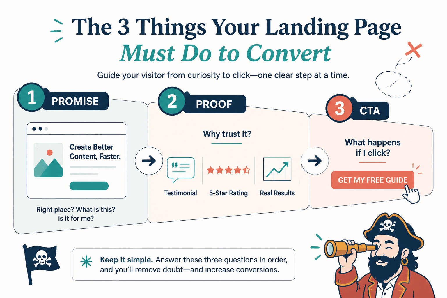
Build the page in the order people decide
Good landing pages tend to follow the same basic psychology: first the promise, then the proof, then the friction removal, then the ask. The order matters because visitors do not read like a checklist. They scan for relevance, then credibility, then risk.
A practical flow looks like this:
- Headline: say what the page helps the visitor do.
- Support: explain the result, not the mechanism.
- Proof: show why the claim is believable.
- Objection handling: answer the obvious “yes, but…” questions.
- CTA: make the next step specific and low-friction.
That structure keeps the page moving. It also stops the common mistake of burying the useful part under half a page of throat-clearing.
Improve the headline before you polish anything else
The headline is not there to sound smart. It is there to help the right visitor stay on the page.
A good headline usually does at least one of these things:
- names the outcome clearly
- signals who it is for
- makes the offer feel concrete
Vague headline copy often creates vague conversions. If the page cannot explain what is being offered in plain language, the rest of the page has to work too hard. And pages, like people, resent carrying someone else’s sentence.
Use proof that makes the claim easier to believe
Proof does not have to be dramatic. It has to be specific.
Useful proof can include:
- brief testimonials
- before-and-after results
- numbers that mean something
- logos only when they actually matter to the audience
- screenshots, samples, or process details that reduce uncertainty
According to Nielsen Norman Group, people often scan pages rather than read them line by line, which is one reason proof needs to be easy to spot and easy to parse. Nielsen Norman Group on web reading patterns is still a helpful reminder that visibility matters almost as much as wording.
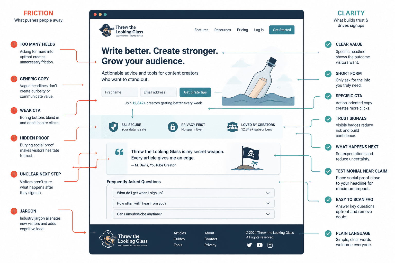
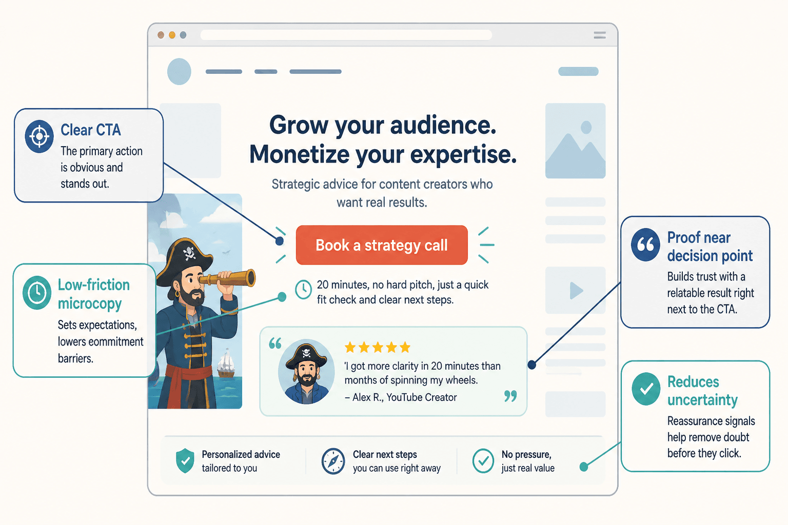
Reduce friction around the CTA
The CTA is where interest either turns into action or evaporates into polite hesitation. Small wording choices matter here because the button is carrying more than button duty. It is carrying expectation.
Strong CTA sections usually do a few things well:
- say exactly what happens next
- keep the action low effort
- answer the risk question before it becomes a no
- surround the button with just enough reassurance
That reassurance might be a short privacy note, a brief promise about what happens after the click, or one sentence that removes a common objection. The goal is not to stuff the page. It is to prevent the reader from having to guess.
Make the offer specific enough to believe
Landing pages lose conversions when the promise is too broad to trust. “Grow your business,” “get better results,” and “transform your workflow” all sound nice until a reader tries to imagine what actually happens.
Specificity earns attention because it creates a believable mental picture. That does not mean overpromising. It means naming the outcome in a way a real person could recognize.
Google’s own guidance on useful, people-first content is not landing-page-specific, but the principle holds: make the page helpful, clear, and written for humans first. Google Search Central on creating helpful content is a reasonable reference point here.
Use trust signals without bloating the page
Trust signals should lower uncertainty, not clutter the layout.
Good trust builders include:
- clear explanations of what the visitor gets
- short answers to common objections
- proof placed near the claim it supports
- simple language instead of inflated marketing noise
If the page needs a lot of defensive copy to feel believable, that usually means the promise is too vague or too ambitious. It is better to tighten the offer than to wallpaper the problem with reassurance.
For a deeper look at the trust side of the equation, see the landing pages guide and the related discussion of best AI tools for landing pages when you need a faster drafting or testing workflow.
Choose the right funnel pairing
Not every landing page should try to close the sale on the spot. Some pages should collect interest, qualify leads, or move people into a better next step.
Here is the practical version:
- Content to lead magnet to nurture sequence works well when the audience is early-stage.
- Content to sales page to checkout works better when intent is already high.
- Content to webinar or workshop registration is useful when the offer needs more education.
- Content to application page to sales call fits higher-ticket or higher-touch offers.
- Content to booking page to consultation works when direct conversation is the conversion goal.
- Ad to quiz or assessment to segmented landing page can help when the audience needs a more tailored path.
The point is not to make the funnel fancy. It is to make the next step match the visitor’s readiness. A good page is often just a good handoff with better manners.
For more on pairings and path selection, the upcoming sibling piece on funnel structure is a natural companion to this one, and the parent guide stays the best place to keep the broader map in view.
A quick landing page conversion checklist
- Does the page make one clear promise?
- Is the audience obvious within a few seconds?
- Is the proof specific and easy to scan?
- Does the page answer the main objection before the CTA?
- Is the next step clear, simple, and believable?
- Does the page match the traffic source and offer level?
If the answer to any of those is no, the page probably has a conversion issue. Not a dramatic one. Just enough of one to leak leads, sales, and patience.
Fix the mismatch first. Then tighten the wording. Then test. That order will usually get you farther than rearranging button colors and hoping for a better mood.