
The bad assumption is that landing pages fail because the design is not sleek enough. It is a comforting theory, because it points at fonts, colors, and button shades instead of the messier truth: the page is often unclear, out of order, or trying to do three jobs with one sentence. A prettier page can still be a confusing one. That is how you end up with something polished enough to admire and weak enough to ignore.
Better landing pages are usually not more “creative.” They are clearer, more specific, and easier to move through. They tell the visitor what this page is for, why it matters, what happens next, and why the next step is worth taking. That is the real job. Everything else is supporting cast.
If you want the broader framework for conversion-focused pages, start with the parent guide on landing pages. This article focuses on the writing itself: what to say, in what order, and how to keep the page from sounding like it was assembled by committee.
What a landing page is actually supposed to do
A landing page is not a brochure. It is not a homepage in disguise, and it is not a place to include every interesting fact you know about the offer. It has one practical job: move a specific visitor toward a specific action.
That action might be:
- joining a list
- booking a call
- buying a product
- downloading a resource
- starting a trial
The page does not need to convince everyone. It needs to help the right person understand the offer quickly enough to say yes. That means every section should reduce friction, not add ceremony.
As Google’s guidance on helpful content puts it, pages should be created for people first, with usefulness and clarity as the goal rather than performance theater. See Google Search Central’s helpful content guidance for the underlying principle. Same logic here, just with a more obvious button at the end.
Start with one clear goal
Before you write a headline, decide what the page is supposed to accomplish. Not “support the business.” Not “explain the offer.” One action.
A useful way to frame it:
- Who is this page for?
- What action should they take?
- What must they believe before taking it?
- What is the biggest reason they might hesitate?
If the answer to those questions is fuzzy, the page will drift. Landing page copy gets vague fastest when the goal is vague first.
A short example: a creator launching a workshop does not need a page that talks equally about the workshop, the newsletter, the podcast, the origin story, and the “brand journey.” They need a page that helps the right visitor understand what the workshop solves and why registering now makes sense.
Know which kind of landing page you are writing
Not every landing page has the same job. A good page for a warm email audience will not look exactly like a page for cold traffic from search or social. A simple lead magnet page also behaves differently from a high-friction sales page.
Useful distinctions:
- Lead capture page: built to earn an email signup or similar lightweight action
- Product or sales page: built to explain and sell an offer
- Event or webinar page: built to drive registration
- Service page: built to qualify interest and prompt contact or booking
The page type changes how much proof you need, how much explanation you need, and how much commitment you can ask for upfront. A high-trust, high-intent audience can usually move with less copy. A colder audience often needs more context before the button stops looking like a trap.
The core parts of a landing page that actually convert
Most landing pages are built from the same basic parts. The difference is not the ingredients. It is whether the ingredients are doing a job.
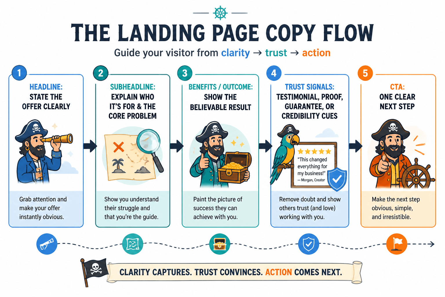
1. Headline: make the promise clear, not clever
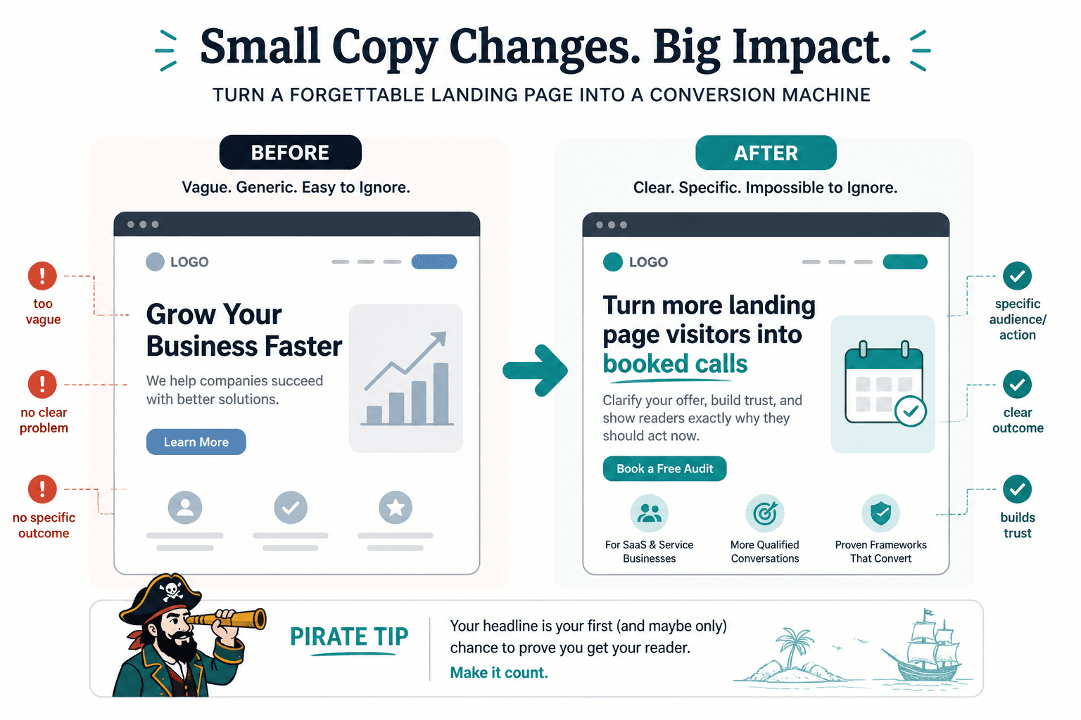
The headline should tell the visitor what they are looking at and why it matters. Clever is optional. Clear is mandatory.
Good headlines usually answer one of these things:
- what the offer is
- what outcome it helps create
- what problem it solves
- who it is for
Weak headline: “A better way to grow.”
Stronger headline: “A simple email course that helps freelance designers get more discovery calls.”
If you need help sharpening openings specifically, the sibling guide on starting landing pages without a weak opening covers this stage in more detail.
2. Subhead: add context and reduce confusion
The subhead is where you clarify what the headline means. Think of it as the sentence that keeps the reader from guessing.
It can do a few useful things:
- name the audience
- explain the format
- spell out the main result
- lower the stakes if the offer feels risky
Example:
Headline: Learn to write landing pages that convert.
Subhead: A practical guide for creators, consultants, and small businesses that need clearer messaging and fewer lost clicks.
That is not poetry. It is orientation. Useful pages do a surprising amount of orientation.
3. CTA: say what happens next
The call to action should sound like a next step, not a bureaucratic mystery. “Submit” is not a strategy. Neither is “Get Started” if nobody knows what they are starting.
Good CTA labels often describe the action and, where helpful, the outcome:
- Download the guide
- Reserve my spot
- Get the checklist
- Book a discovery call
- Start the free trial
For a deeper pass on button placement and timing, use the sibling article on CTA placement mistakes. Wording matters, but placement matters too. A good button in the wrong place is still a bad handoff.
4. Proof: show why the claim is believable
Proof can be testimonials, metrics, examples, logos, outcomes, screenshots, process details, or before-and-after evidence. The form matters less than the credibility.
The goal is not to inflate the page with social proof confetti. It is to answer the reader’s quiet question: why should I believe this?
Specific proof usually works better than vague proof.
- Vague: “Loved by customers everywhere.”
- Specific: “Used by 1,200+ newsletter writers to plan monthly issues faster.”
If you are revising proof blocks, the sibling guide on better landing page mistakes for personal brands is especially useful for fixing the common “proof in a sad little corner” problem.
Section order matters more than people think
Landing page writing is not only about individual blocks. It is also about sequence. The page has to answer the reader’s questions in a sensible order, or the copy starts fighting the visitor’s attention instead of guiding it.
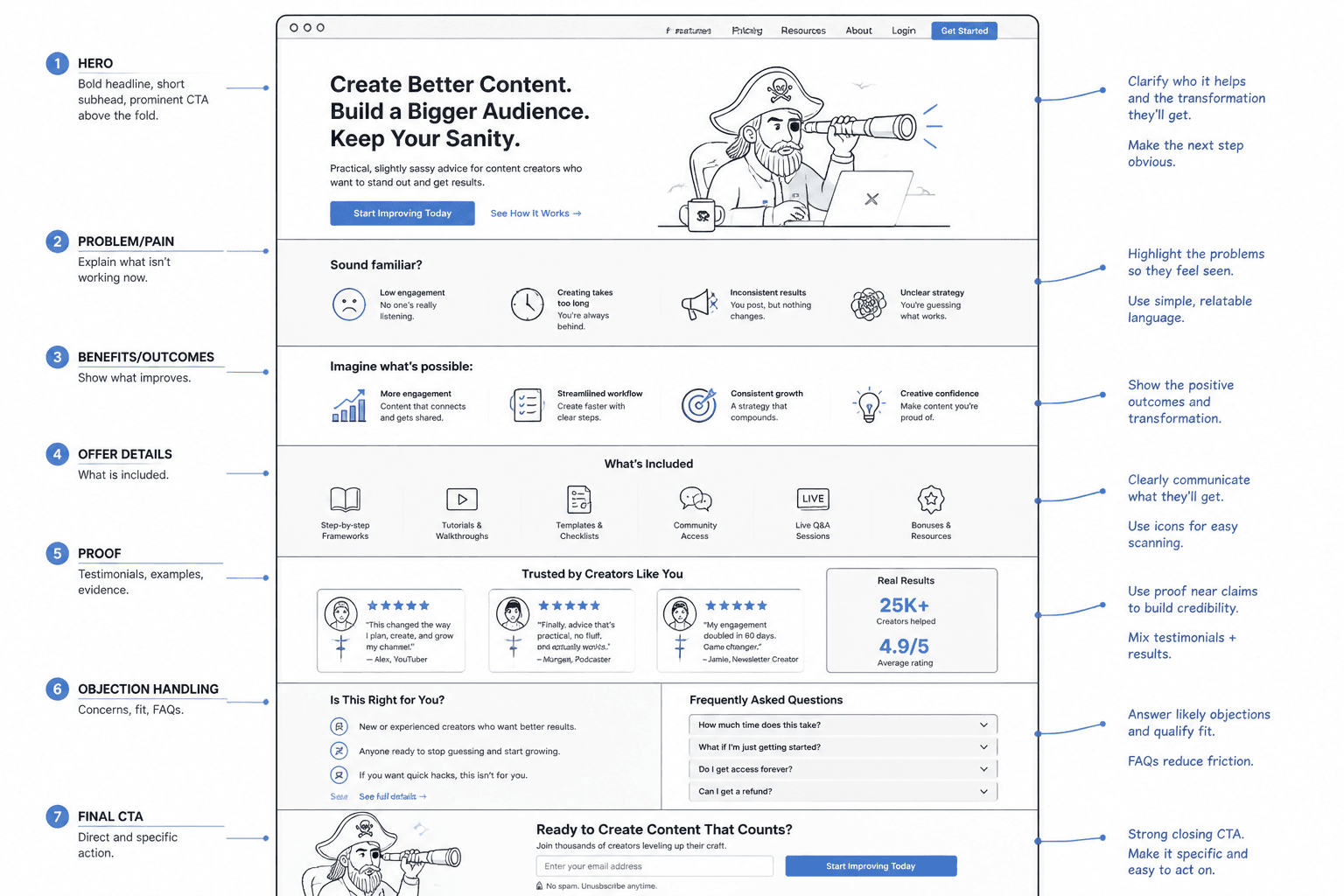
A practical order for many pages looks like this:
- Hero: name the offer and the promise
- Problem or friction: show you understand the current mess
- Offer explanation: say what the thing actually is
- Benefits or outcomes: translate features into useful change
- Proof: reduce skepticism before it gets loud
- CTA: make the next step obvious
This does not mean every page needs the same layout. But it does mean the page should feel like a sequence of answers, not a pile of sales blocks. If the reader has a question at each stage, the page is working with them instead of talking over them.
For a structural deep dive, the sibling article on section order covers how to move from a vague layout to one that matches reader psychology.
How to write landing pages without sounding salesy or robotic
Landing pages get awkward when they start sounding like marketing copy pretending to be marketing copy. That usually happens when the page uses abstract language, inflated claims, or phrases nobody has ever said out loud without a deadline attached.
Better move: write from the reader’s reality first.
Compare:
- Robotic: “Unlock your potential with a world-class solution.”
- Clearer: “A practical system for turning one idea into a landing page people can actually understand.”
Specific language helps. So does concrete outcome wording.
- Instead of “boost your results,” say what changes
- Instead of “elevate your brand,” name the benefit
- Instead of “transform your workflow,” explain what gets faster or easier
It also helps to cut the phrases that make readers brace for nonsense:
- revolutionary
- game-changing
- world-class
- unleash
- take your business to the next level
The sibling guide on writing without sounding salesy is a good companion if your first draft feels like it came out wearing a tie it did not earn.
As a general standard, the Nielsen Norman Group’s research on how users read on the web is still useful here: readers scan, they do not lovingly decode your brand fog. Write for scanability and comprehension, not admiration.
How long should a landing page be?
The honest answer is: long enough to do the job, short enough not to waste anyone’s afternoon.
Length should follow decision complexity. A simple, low-risk offer often needs less explanation. A high-trust or high-consideration offer may need more detail, more proof, and more objection handling.
Use a shorter page when:
- the audience already knows you
- the offer is simple
- the decision is low stakes
- the action is quick and familiar
Use a longer page when:
- the offer is new or unfamiliar
- the stakes are higher
- the buyer needs more reassurance
- the page must answer serious objections
The point is not page count. The point is whether the reader has enough clarity to proceed. If you want a deeper framework, the sibling article on landing page length breaks down when short pages win and when long pages earn their keep.
Common landing page mistakes to fix
Most landing page problems are not mysterious. They are usually some combination of vague messaging, weak hierarchy, and too much self-congratulation.
1. Leading with cleverness instead of clarity
If the visitor has to decode the headline, the headline has already lost.
2. Talking about yourself before talking about the reader
The page is not a bio. The visitor came for a reason. Respect the reason.
3. Making the offer too vague
“We help you scale” is not enough. Scale what? For whom? Toward what?
4. Asking for too much too soon
A page that demands commitment before earning trust has poor manners and worse math.
5. Hiding proof
Proof should not be buried where only the most determined reader will find it.
6. Sounding “professional” instead of human
Professional does not have to mean flat. Human copy usually converts better because humans are the ones reading it.
If you want a more surgical rewrite process, see the sibling guide on rewriting boring landing pages. That one is useful when the page is technically fine and still somehow has all the charisma of a tax form.
A simple workflow for revising a landing page
Here is a practical way to revise a draft without turning it into a week-long identity crisis:
- State the goal in one sentence. What should the page make the reader do?
- Write the headline again. Make it clearer, not louder.
- Check the subhead. Does it reduce confusion or add more of it?
- Review section order. Does each block answer the next logical question?
- Replace vague claims with concrete details. Specificity earns trust.
- Move proof where hesitation appears. Do not hide the evidence.
- Rewrite the CTA as a real next step. Say what happens when the button gets clicked.
If you are pulling from old material, you can also recycle strong phrases from existing content instead of inventing everything from zero. The sibling guide on turning old content into better landing pages is built for that kind of reuse.
Use the page to reduce friction, not decorate the offer
Good landing pages do not try to impress the reader into action. They make the action easier to understand and easier to trust. That is the quieter job, but it is the one that actually pays rent.
If the page is clearer, tighter, and better ordered than the draft you started with, it is probably already much better than it was. Landing pages rarely need a personality transplant. They usually need a more honest sentence in the right place.
For the bigger system around this page, return to the landing pages parent guide. The guide gives you the map; this article gives you the writing moves that keep the map from looking decorative.