
Most paid Substack posts do not underperform because the writing is bad.
They underperform because the angle is off.
The writer picks a paid post angle that feels important, serious, or “premium,” but it does not actually match why someone would pay to read it. So the post lands with a quiet thud. Existing subscribers skim. free readers do not convert. the piece may even be good, but good is not the same as paid-worthy.
If you are publishing paid content on Substack, the angle matters more than most people think. Not just the topic. The angle. The frame. The reason this specific post deserves to sit behind a paywall instead of out in public with the rest of your ideas.
Here is how to spot the Substack Paid Post Angle Mistakes That Hurt Performance, fix them, and choose angles that make readers feel, “Yes, that is worth paying for,” instead of, “Why is this one locked?”
If you want the bigger picture, start with the parent guide.
What a paid post angle actually needs to do
A paid post angle has one job: make the reader feel they are getting access to something sharper, deeper, more useful, more specific, or more valuable than the free layer.
That does not mean every paid post needs to be longer, denser, or stuffed with “exclusive insights.” That phrase alone has done enough damage. It means the angle needs to create a clear value jump.
Good paid angles usually do at least one of these:
- Save the reader time
- Show the behind-the-scenes logic
- Offer usable specificity
- Curate what matters and cut what does not
- Give frameworks, examples, breakdowns, or decisions they can apply
- Deliver access, not just opinion
Bad paid angles usually do the opposite. They hide vague thoughts behind a paywall and hope the word “premium” does the lifting.
If your free content builds trust and your paid content rewards trust, you are in decent shape. If your free content is clearer than your paid content, you have a problem.
For a broader foundation on structuring your Substack content mix, it helps to review the main Substack posts and series guide.
Mistake 1: Making the paid angle too broad
Broad paid angles feel lazy fast.
Titles and angles like these tend to underperform:
- My thoughts on building a brand
- What I have learned about creativity
- A deep dive into content strategy
- The future of marketing
None of these tell the reader what they are really buying. They sound polished, sure. They also sound like free internet filler wearing a velvet rope.
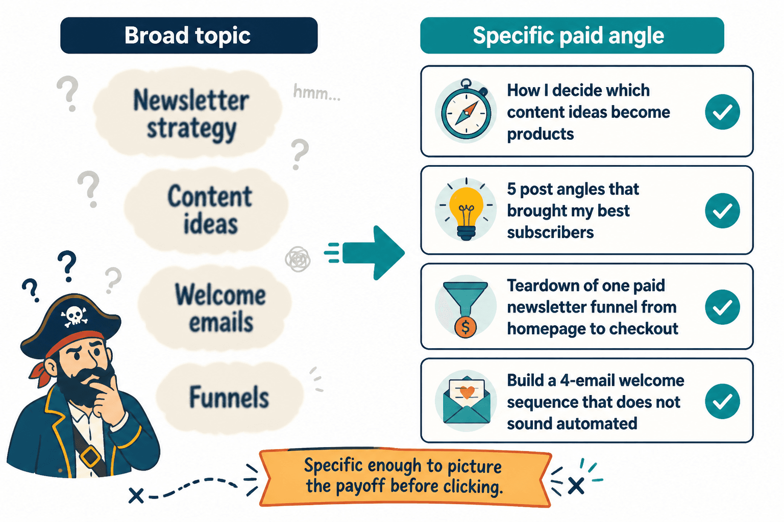
Paid content usually performs better when the angle is narrower and more outcome-driven. Not tiny for the sake of tiny. Specific enough that the reader can picture the payoff before clicking.
For example:
- How I decide which content ideas become products and which get cut
- The 5 post angles that brought my best subscribers, and why the rest flopped
- A teardown of one paid newsletter funnel from homepage to checkout
- How to build a 4-email welcome sequence that does not sound automated to death
That is the difference between a cloudy “topic” and a strong paid angle. One sounds like homework. The other sounds useful.
How to fix it
Before publishing, ask:
- What exact question does this paid post answer?
- What does the reader understand or do better after reading it?
- Could someone summarize the value in one sentence without sounding vague?
If not, the angle is still too broad.
Mistake 2: Confusing personal access with actual value
Some writers assume a post is worth paying for because it is more personal, more confessional, or more honest.
Sometimes that works. Often, it does not.
Readers are not automatically paying for intimacy. They are paying for meaning, relevance, perspective, usefulness, or a stronger connection to work they already value. A paid post that says “more of me” is not enough unless “me” is the thing people clearly came for.
This is where a lot of personal-brand newsletters wobble. The writer locks a reflective diary-style piece because it feels vulnerable or substantial. The reader opens it and finds mood, texture, and a few decent sentences, but not much they can use, think with, or return to.
Personal writing can absolutely work as paid content. But the angle still needs shape. It needs a reason to matter beyond access itself.
Stronger ways to frame personal paid posts
- What changed my business model this year, and what I would do differently now
- The creative habit I dropped because it was quietly ruining my output
- What burnout looked like in my calendar before I admitted it was burnout
- A behind-the-scenes breakdown of one decision that cost me time, money, and focus
The personal element is still there. But now the angle gives the reader something to grab.
Mistake 3: Hiding your best practical ideas behind weak framing
Sometimes the post itself is useful. The angle is just presented badly.
This usually happens when the writer labels a piece with soft, abstract framing instead of telling the reader what is actually inside.
Weak framing:
- Some thoughts on consistency
- Notes on audience building
- A few ideas about writing online
Better framing:
- The consistency system I use when I do not have enough time to publish properly
- 3 audience-building tactics I stopped using because they brought the wrong readers
- How I turn one sharp idea into a week of Substack posts without making them repetitive
Same general territory. Much better angle.
A lot of performance problems that look like monetization issues are really packaging issues. The paid post is not failing because people hate paying. It is failing because the value is foggy on arrival.
If your openings are part of the problem, read how to improve Substack post openings without sounding generic. A weak angle and a weak opening are a grim little duo.
Mistake 4: Using paid posts as a dumping ground for leftovers
Readers can tell when the paid section feels like the attic.
This happens when creators use paid posts for:
- Half-finished ideas
- Loose notes that were not strong enough for free posts
- Random updates with no clear purpose
- Overlong posts that should have been edited, not monetized
It is a quiet trust leak. Not dramatic enough to spark unsubscribes overnight, but enough to make people wonder if paid means better or just hidden.
Your paid content should not feel like unused scraps. It should feel intentional. Readers should sense that the angle was chosen because it fits the paid relationship, not because you did not know what else to do with it.
A simple filter for paid post ideas
Ask these three questions:
- Is this more useful, more specific, or more valuable than the average free post?
- Would a paying reader feel rewarded by this, not merely allowed to see it?
- Does the angle feel intentional enough to justify the paywall?
If the answer is shaky, keep refining.
Mistake 5: Treating “deep” as automatically premium
Depth is good. False depth is not.
Many paid newsletter writers assume the premium version of a free post is simply a longer one. So they add more context, more explanation, more side roads, more examples, more scene-setting, and somewhere in the middle the point dies of exhaustion.
A paid angle should not just promise more. It should promise better.
Sometimes the highest-value paid post is compact and concrete:
- A teardown
- A decision memo
- A framework with examples
- A worked case study
- A specific lesson with receipts
Paid readers do not need bloat. They need signal.
If your paid post angle can be summed up as “the longer version,” that is probably the problem.
Mistake 6: Choosing angles that are interesting to you but not useful to the subscriber
This one stings because the writing may be sincere, clever, and well-observed.
It still may not perform.
Paid subscribers usually want one or more of these:
- Insight they can apply
- Thinking they can borrow
- Access to process, decisions, systems, or examples
- Perspective that sharpens their own work
- A stronger sense that following you pays off
If the angle is mostly satisfying for you but thin for them, it will struggle.
This does not mean every paid post must be tactical. It means you need reader relevance. A cultural essay, a creative reflection, a media breakdown, or a personal note can all work if the angle connects to what the subscriber values from you.
That connection is the whole thing. Without it, you are just charging admission to your internal monologue.
For more idea development help, see better Substack post and series ideas and examples for creators.
Mistake 7: Locking the conclusion instead of designing a paid experience
Some writers use a free intro and then put the rest behind the paywall as if the lock itself creates value.
Sometimes that works, especially if the setup is strong and the payoff is clear. But often the structure feels mechanical. The free part teases a topic. The paid part simply continues talking. There is no meaningful shift in value, just a paywall dropped in the middle like a toll booth.
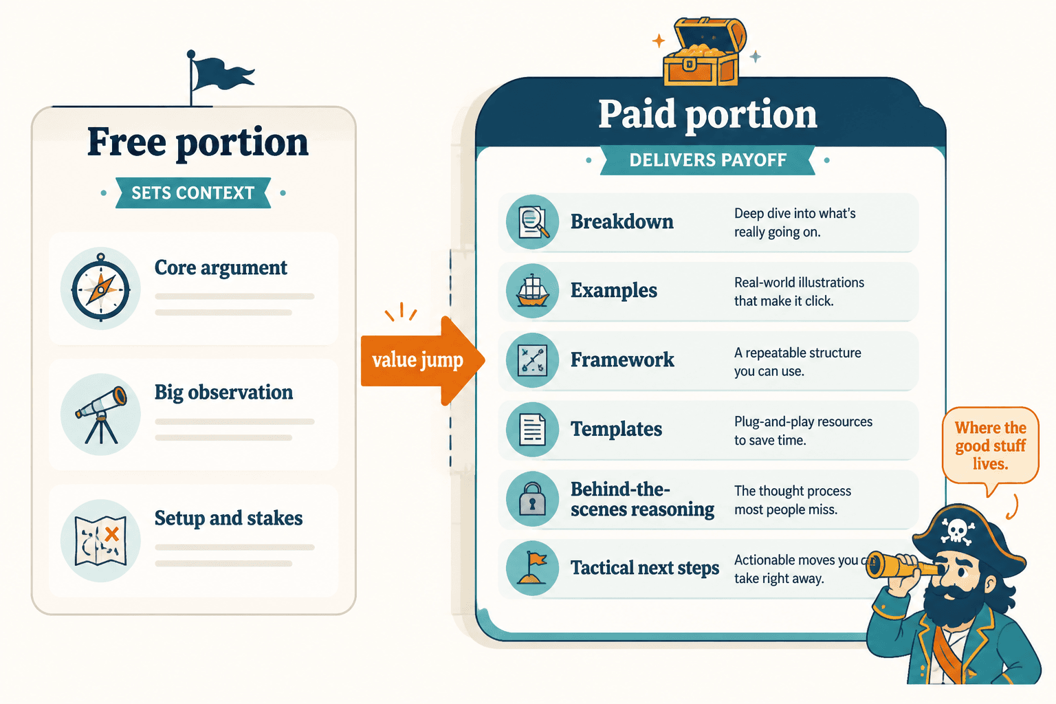
A stronger approach is to design the paid section around what the subscriber actually wants next.
For example, the free portion might cover:
- The core argument
- The big observation
- The setup and stakes
Then the paid portion delivers:
- The breakdown
- The examples
- The framework
- The templates
- The behind-the-scenes reasoning
- The tactical next steps
That feels like a paid experience. Not a ransom note.
Mistake 8: Repeating the same paid angle until it goes stale
Even a good paid angle can wear out.
If every locked post is a behind-the-scenes reflection, a monthly roundup, a hot take, or a process note with the same emotional temperature, readers start to predict the shape. Predictable is not always bad. But predictable and low-variation usually leads to lower curiosity, lower urgency, and weaker retention.
This is especially common in series. A writer finds one paid format that works a bit, then keeps reusing it long after the edge is gone.
You do not need chaos. You do need range.
Useful paid angle categories to rotate
- Breakdowns and teardowns
- Case studies
- Decision memos
- Behind-the-scenes systems
- Commentary with implications
- Tools, templates, or swipe files
- Annotated examples
- Reader Q&A with substance
A series gets stronger when the reader knows the standard is high but the delivery is not stale.
If retention is getting soft, read how to improve Substack reader retention for personal brands. Weak paid angles often show up there first.
Mistake 9: Not matching the angle to the stage of your newsletter
The bigger point is simple: clearer structure and clearer writing make the piece more useful. That is usually what makes the ending land better too.
Stronger Substack posts usually come from a clearer point, tighter structure, and a more deliberate series flow. Better pacing often matters more than more volume.