
Most advice about sales pages quietly assumes you have one thing many creators do not: traffic.
It assumes lots of clicks, lots of eyeballs, and enough audience volume to survive a page that is a bit vague, a bit overlong, or a bit too obsessed with “brand story” instead of conversion. Small-audience creators do not get that luxury. If 40 people visit your page this week, the page has to do its job. Nicely. Without theatrics.
Sales Pages for Creators With Small Audiences are not about writing louder copy. They are about reducing doubt, increasing clarity, and making the next step feel obvious for the right person. That means less fluff, fewer empty claims, and a much better grip on what your buyer actually needs to see before they say yes.
If your audience is small, your sales page cannot afford to be pretty nonsense. Here’s how to build one that converts better without pretending you are launching to a stadium.
If you want the bigger picture, start with the parent guide.
What small-audience creators usually get wrong
The biggest mistake is acting like a low-traffic sales page should copy a high-traffic one.
Big creators can sometimes get away with broad messaging, thin proof, and dramatic copy because their audience already trusts them. Their sales page is often just a final nudge. Yours probably has to do more work. It has to sell the offer and strengthen trust at the same time.
That changes the page.
- You need more specificity, not more hype.
- You need stronger proof, not louder promises.
- You need cleaner structure, not more sections copied from some launch template from 2019.
- You need the reader to think, “This is for me,” not “This person seems very excited about themselves.”
Small audiences are usually warmer, more niche, and more context-aware. That is good news. It means you do not need manipulative copy tricks. You do need to answer the right questions fast.
With a small audience, conversion usually improves when the page feels more useful, more precise, and less like it was assembled from borrowed internet sales jargon.
What a sales page for a small audience actually needs to do
A good sales page does not need to impress everyone. It needs to help the right person make a decision with less friction.
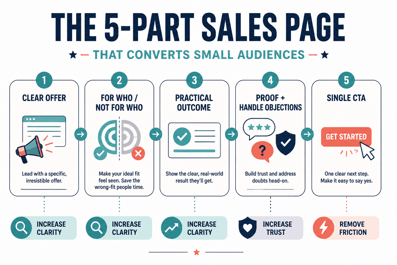
For creators with small audiences, that usually means the page has five jobs:
- Make the offer instantly clear
- Show who it is for and who it is not for
- Explain the outcome in practical terms
- Handle doubts before they stall the sale
- Give the reader a simple next step
That is it. Not 37 emotional arcs. Not a founder memoir. Not six different CTAs all asking for slightly different things.
If you want a broader foundation for page structure, this sales pages guide is a useful companion. But for small audiences, the strategy gets tighter: every section should either increase clarity, increase trust, or remove friction.
Start with a headline that is specific enough to matter
Your headline is not there to sound premium. It is there to tell the right person they are in the right place.
Weak headlines usually fail in one of two ways:
- They are too vague: “Grow your business with aligned content”
- They are too inflated: “The ultimate revolutionary system for limitless creator growth”
Neither helps the reader understand what you actually sell.
A better headline formula
Try this:
- What it is
- Who it is for
- Main outcome
Example:
A messaging and sales page package for coaches and consultants who want clearer positioning and more qualified leads.
That is not dazzling. Good. Dazzling is overrated. Clear sells better than clever when trust is still being built.
Add a subheadline that lowers uncertainty
Your subheadline can do one of three useful things:
- Explain how the offer works
- Clarify what makes it different
- Add a realistic outcome without sounding like a carnival barker
For example:
Get a focused page strategy, conversion copy, and objection handling built around your offer, audience, and actual sales process, not generic launch fluff.
Lead with the buyer’s problem, not your biography
One of the strangest habits on creator sales pages is making the top half of the page all about the creator. Credentials matter, yes. But early on, the reader wants to know if you understand their problem clearly enough to solve it.
Start by naming the friction they are dealing with now. Be concrete. Be recognizable. Show them you get the mess before you start pitching the fix.
Good problem language sounds like this
- Your offer is solid, but your page is too vague to convert cold or warm traffic well.
- People click through, skim, and leave because the value is buried under long explanations and soft claims.
- You know what you do is valuable, but the page is not making the decision easy.
That kind of copy creates recognition. Recognition creates attention. Attention gives the rest of the page a chance.
Then, after the problem is clear, you can bring in who you are and why your approach is worth trusting.
Make the offer feel concrete
Small audiences are often full of thoughtful buyers. That sounds nice until you remember thoughtful buyers ask questions. A lot of them. Your page should answer those questions before they have to open five tabs and become suspicious.
The easiest way to increase conversions is to make the offer more tangible.
Spell out what they get
- What is included
- What format it comes in
- How long it takes
- What support exists
- What happens after purchase
Instead of:
You will receive a complete transformation of your sales messaging.
Try:
You’ll get a full sales page rewrite, a sharper offer positioning section, 10 objection-handling blocks you can reuse, and a final CTA sequence designed to increase qualified inquiries.
Specifics reduce buyer fatigue. Vague promises create it.
Show the shape of the process
When buyers understand how something works, they trust it more. Not because process is sexy, but because confusion is expensive.
- Book or buy
- Complete a short intake form
- Get strategy review and copy draft
- Receive revisions
- Publish with a clearer, stronger page
This matters even more if your audience is small and your offer is service-based, high-trust, or custom.
Use proof that matches your audience size
If you do not have 127 testimonials, welcome to real life.
Creators with small audiences often sabotage themselves here. They think weak proof is better than no proof, so they add vague praise like “Amazing to work with!” and hope for the best. That is not proof. That is politeness.
What works better is specific proof. Even in smaller amounts.
Good proof options for small creators
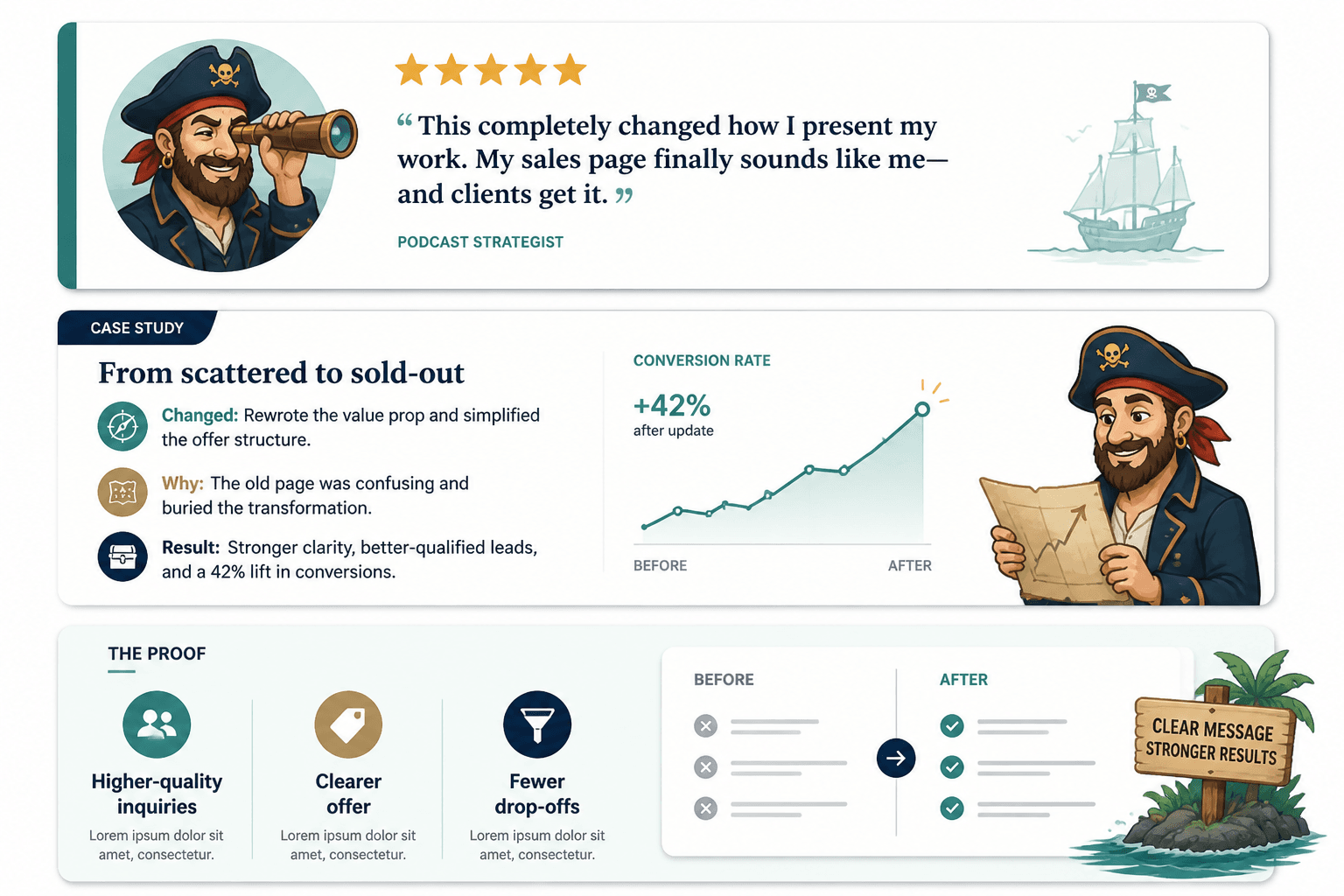
- Detailed client testimonials with a before-and-after result
- Mini case studies
- Specific outcomes from your own projects
- Concrete examples of what changed
- Relevant experience, even if it came from freelance, in-house, or smaller engagements
For example, this is weak:
Sarah was incredible and totally transformed my business.
This is stronger:
Before this rewrite, people were visiting the page but not booking. After clarifying the offer, adding stronger proof, and fixing the CTA flow, inquiries became more qualified and conversions improved within the first few weeks.
Notice the difference. One is nice. The other is useful.
And if you do not have many testimonials yet, use proof in other forms. Show your thinking. Break down what you changed on a page. Include a short rationale. Thoughtful expertise is a form of trust signal when it is concrete enough.
For more inspiration, see best sales pages ideas and examples for creators.
Handle objections before they become exits
Small audiences usually mean fewer chances. So if someone is interested but hesitant, your page should help them move forward instead of making them do all the emotional admin alone.
Objection handling is one of the highest-leverage parts of a sales page, and it is usually underwritten or dumped into a lazy FAQ.
The common objections are predictable:
- Is this for someone like me?
- Will this be worth the price?
- What if I am not ready?
- What makes this different from cheaper alternatives?
- Will this actually help with my specific problem?
Do not answer these defensively. Answer them clearly.
Simple objection-handling examples
- “I have a small audience too. Is this too early?”
This is designed for creators who need better conversion before they scale traffic. If people are seeing your offer but not moving, fixing the page now usually makes more sense than waiting. - “What if my offer is still evolving?”
If the core offer is there, the page can still be built around your current positioning. It does not need to be frozen forever. It just needs to be clear enough to sell now. - “Why not just use a template?”
Templates can help with structure. They do not know your buyer, your objections, your proof, or the exact language your audience trusts.
If you want more practical language for this section, these objection-handling templates can help.
Do not bury the CTA under a pile of feelings
A lot of creator sales pages build decent momentum and then ruin it with a weak CTA.
The CTA gets vague. Or needy. Or weirdly passive. Or it asks the buyer to “step into their next level” which is usually where everyone should close the tab and go outside.
Your CTA should answer three things:
- What should they do now?
- What happens next?
- Why should they do it now rather than later?
Examples of stronger CTAs
- Book your sales page audit and get a clear plan to fix the sections losing conversions.
- Apply for the package if you want a sharper page, stronger objections handling, and cleaner offer messaging.
- Buy the template bundle and start rewriting your page today instead of guessing your way through another draft.
Notice these CTAs are plain. That is a feature, not a flaw.
If your page goal is leads instead of direct sales, shape the CTA around that. This guide on turning sales pages into more leads or sales is worth reading if you are deciding between booking, applying, subscribing, or buying.
A simple structure that works well for small-audience sales pages
You do not need a wildly original page structure. You need one that helps people make sense of the offer fast.
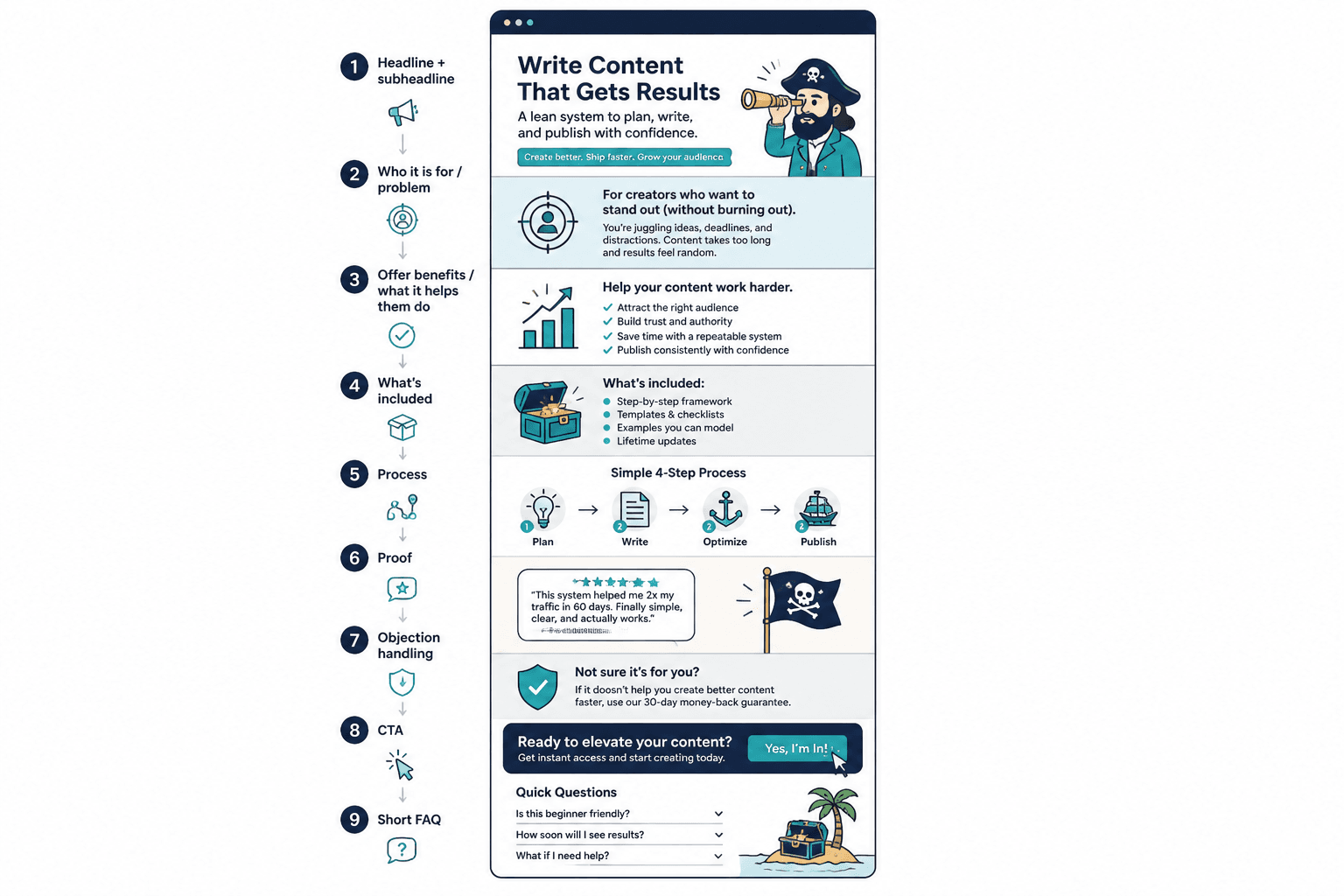
Here is a practical structure for Sales Pages for Creators With Small Audiences:
- Clear headline — what it is, who it is for, key result
- Subheadline — how it works or what makes it different
- Problem section — describe the current frustration in useful language
- Offer overview — what the offer is and what it helps them do
- What’s included — tangible deliverables or features
- Process — how it works from purchase to result
- Proof — testimonials, examples, mini case studies, credibility
- Objection handling — answer likely concerns cleanly
- CTA — direct next step
- Short FAQ — only if it removes real friction
That structure is enough for most creators. If your page is not converting, the issue is often not missing sections. It is weak messaging inside the sections you already have.
For a more complete walkthrough, see sales pages guide for creators who want better results.
What to cut from your page immediately
If your page feels long but not persuasive, it probably has too much low-value copy.
Here is what small-audience creators should usually cut or tighten:
- Overwritten founder story unless it clearly supports trust or relevance
- Generic emotional language like “finally step into alignment and visibility”
- Bloated feature lists without context or outcomes
- Weak testimonials that say nothing useful
- Multiple offers on one page if they compete for attention
- Fake urgency when there is no real reason to act now
- Long FAQ sections doing the job your main copy should have done already
The bigger point is simple: clearer structure and clearer writing make the piece more useful. That is usually what makes the ending land better too.