
Most landing pages do not have a monetization problem. They have a trust problem wearing a monetization hat.
The page is trying to sell, sure. But it is also overselling, overexplaining, overpromising, or generally acting like a stranger who wants your credit card before they have made eye contact. That is where things go sideways.
If you want to know how to monetize landing pages without wrecking trust, the answer is not “be less salesy” in some vague, incense-burning way. It is to make the page feel credible, clear, and proportionate to what you are asking the reader to do.
That means the promise matches reality. The CTA matches buyer intent. The proof is believable. The page does not sound like it was assembled by three marketers and one panic attack.
Here is how to build landing pages that actually make money without making people feel trapped, manipulated, or mildly insulted.
For the main guide behind this topic, visit the parent guide.
Why landing pages lose trust so fast
Landing pages are fragile. Unlike a homepage, they do not have much room to recover from a bad first impression. A homepage can wander a bit. A landing page cannot. It exists to move someone toward one specific action, which means every weird sentence, inflated promise, and awkward CTA has more weight.
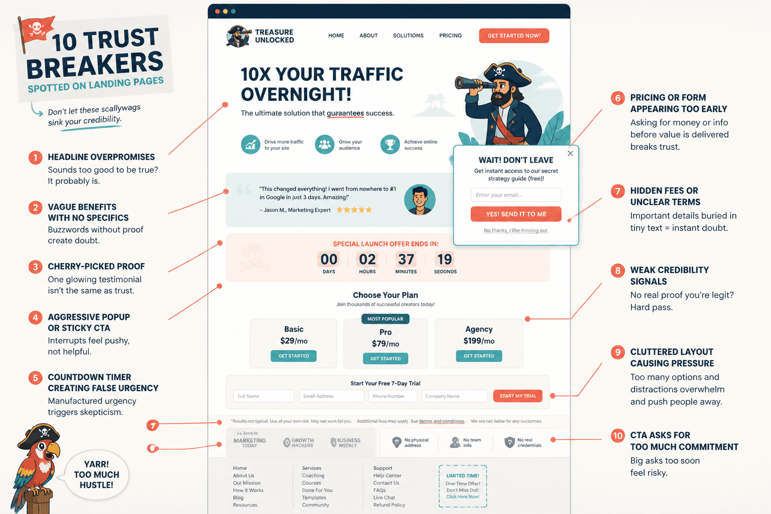
People usually stop trusting landing pages for a few predictable reasons:
- The promise is too big for the offer
- The page sounds templated and impersonal
- It hides important details until late in the page
- The CTA jumps ahead of buyer readiness
- The proof feels cherry-picked, vague, or suspiciously glossy
- There is too much pressure and not enough clarity
In other words, the page does not feel like a helpful sales conversation. It feels like conversion copy trying to hit its numbers.
That is why so many pages technically “follow best practices” and still underperform. They are optimized for persuasion tactics but not for reader confidence. Those are not the same thing.
If you want a broader foundation for building better pages in the first place, it helps to understand the basics of landing page conversion copy and what makes a page persuasive without becoming unbearable.
Monetization is not the part that breaks trust
This is the useful distinction: charging money does not wreck trust. Asking for too much, too soon, with too little credibility does.
People are fine being sold to when the offer is relevant and the page feels honest. They are not fine being pushed through a funnel that acts like every visitor is one countdown timer away from enlightenment.
A trustworthy monetized landing page usually gets four things right:
- It makes a clear promise people can evaluate quickly
- It gives enough proof to reduce skepticism
- It respects the reader’s stage of awareness
- It makes the next step feel reasonable, not loaded
That is the whole game. Not tricks. Not urgency glitter. Not seven bonus stacks and a blood oath.
Match the ask to the trust level
One of the biggest mistakes on landing pages is asking cold readers to make warm-reader decisions.
If someone just discovered you, a direct “Buy now” can work for a low-friction offer, but it often fails for services, higher-ticket offers, consulting, coaching, retainers, or anything that needs trust, context, and proof. In those cases, your page should monetize in a way that fits where the reader actually is.
Good trust-to-ask matches
| Reader trust level | Better monetization move |
|---|---|
| Cold traffic | Lead magnet, workshop, newsletter, low-ticket product |
| Warm audience | Consult call, application, paid audit, tripwire offer |
| High intent visitor | Direct purchase, booking page, checkout CTA |
| Returning visitor | Case study CTA, product comparison, objection-handling CTA |
If your monetization method ignores trust level, the page gets pushy fast. It is not because selling is bad. It is because the sequence feels wrong.
This is also where a lot of creators and consultants go wrong. They send cold traffic from social posts straight to “Book a call” pages with almost no proof, no process, and no reason to believe the conversation will be worth having. Then they blame the traffic.
Sometimes the fix is as simple as changing the next step. A paid diagnostic, a short workshop, or a focused guide can monetize attention while building trust instead of demanding it upfront.
Make the offer specific enough to believe
Vague offers always need more hype because they are harder to trust.
“Grow your brand.” “Scale with confidence.” “Create more freedom.” Fine. Lovely. Means nothing. When the landing page promise is fluffy, the copywriter usually compensates with louder language, bigger claims, and more urgency. That is when trust starts leaking all over the floor.
Specificity is calmer. It lets you sell without sounding desperate.
Weak promise vs believable promise
- Weak: Transform your content strategy and attract dream clients
- Better: Build a repeatable content system that helps consultants turn expertise into weekly posts, email ideas, and lead-generating landing page copy
- Weak: Finally get clarity and confidence in your business
- Better: Leave with a sharper offer, cleaner messaging, and a homepage headline that does not sound like everyone else in your niche
Believable copy earns more trust because it gives the reader something solid to assess. They can think, “Yes, I want that,” or “No, that is not for me.” Both are useful. A vague page keeps everyone floating in uncertainty and then tries to monetize the confusion. Not ideal.
If your page still sounds polished but slippery, this is worth reading next: how to write landing pages without sounding salesy or robotic.
Do not hide the business model
Trust drops when readers feel like the page is withholding obvious commercial intent.
You do not need to lead with “hello, citizen, this is a sales page,” but you do need to be clean about what is being sold, what happens next, and what the visitor is opting into.
This matters a lot on pages monetized through:
- Consultation bookings
- Discovery calls
- Free trainings that lead to an offer
- Lead magnets tied to nurture sequences
- Low-ticket entry offers
- Application funnels
If the page says “free strategy session” but the real structure is “30-minute sales call with a lightly disguised script,” people can smell it. Maybe not in those exact words, but close enough.
Instead, be direct:
- Say who the offer is for
- Say what they will get
- Say what happens after they opt in
- Say if the next step may include a paid recommendation or offer
Clarity lowers resistance because the reader does not have to keep scanning for the catch.
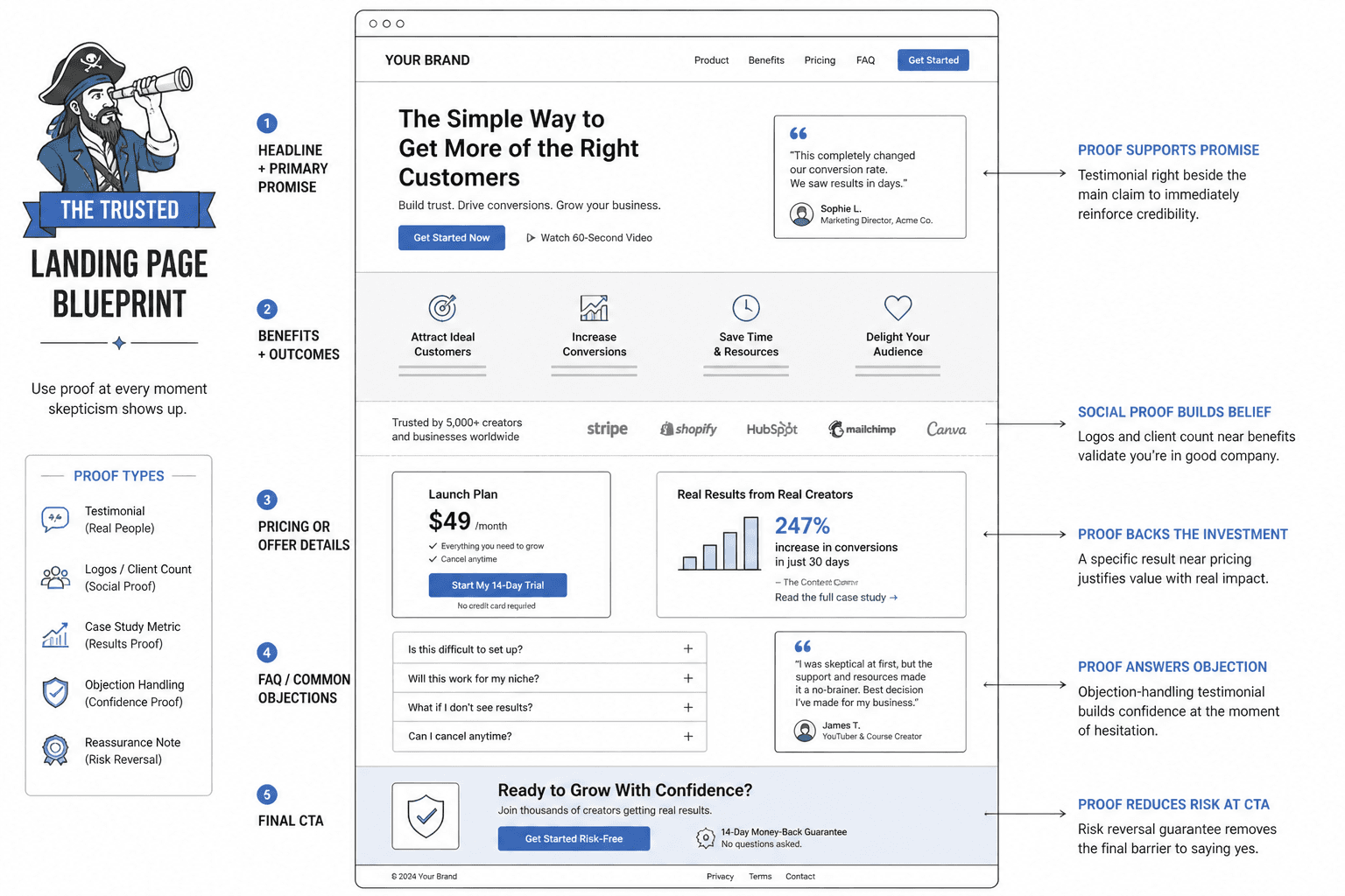
Use proof that sounds human, not curated in a lab
Proof builds trust, but bad proof does the opposite.
If your landing page is packed with generic testimonials like “Amazing experience!” and “Highly recommend!” you are not building confidence. You are decorating.
The best proof helps the reader connect outcomes to reality. It should feel concrete, relevant, and close to the actual buying decision.
What stronger proof looks like
- Specific client result with context
- Before-and-after messaging examples
- Short case studies
- Screenshots of relevant wins or feedback
- Testimonials that mention the process, not just the outcome
- Evidence that addresses likely objections
For example, compare these:
- Weak testimonial: “This was amazing. So much clarity!”
- Better testimonial: “Within two weeks of rewriting the page, I stopped getting vague inquiry emails and started getting leads who actually understood what I offer and were ready to talk numbers.”
The second one is more trustworthy because it sounds like a person remembering a useful business result, not a testimonial generator wearing lipstick.
And no, you do not need 47 testimonials. You need a few solid pieces of proof placed where skepticism naturally shows up.
Write CTAs that feel proportionate, not pushy
A lot of trust gets wrecked in the CTA.
The page can be solid all the way down, then suddenly end with something like “Claim your breakthrough now” and the whole thing slips into infomercial cosplay.
Your CTA should match the tone of the offer and the seriousness of the decision. It is not there to perform excitement. It is there to help someone take the next sensible step.
Better CTA approaches by offer type
- For services: Book a consultation, See if we are a fit, Request a proposal
- For audits or strategy sessions: Get your audit, Reserve your session, Start with a paid review
- For low-ticket products: Get the template, Buy the workshop, Download the toolkit
- For lead magnets: Get the guide, Send me the checklist, Access the training
Notice what is missing: miracle language, fake urgency, and CTAs trying very hard to sound life-changing.
Also, your CTA should answer the little unspoken question in the reader’s head: What exactly happens if I click this?
Sometimes one extra line under the button does more for trust than another 300 words of persuasion copy.
- “You will answer a few quick questions before booking.”
- “This takes about 2 minutes.”
- “No sales call. Just the template.”
- “If it looks like a fit, we will send next steps within one business day.”
That kind of plain guidance reduces friction because it removes ambiguity. Friction loves ambiguity.
Sell the next step, not the entire future
Another common trust-killer is asking the landing page to carry too much emotional weight. The copy tries to sell not just the offer, but a whole new identity, business transformation, and inner peace package by paragraph three.
That can work in some niches. It can also make normal adults close the tab.
A more trustworthy page sells the next step clearly and lets the bigger transformation sit in the background as context. It does not need to scream.
For example:
- Do not sell “a six-figure reinvention” if the immediate offer is a paid messaging audit
- Do sell a sharper landing page, clearer conversion path, and more qualified inquiries
- Do not sell “complete business freedom” if the immediate offer is a template bundle
- Do sell saved time, cleaner workflows, and faster publishing
Big promises create big skepticism. The tighter the step, the easier it is to trust.
Do not force urgency where there is none
Urgency is not always bad. Fake urgency usually is.
If you genuinely have limited seats, a deadline, a cohort start date, or a temporary bonus, say so plainly. But if your evergreen landing page has been warning me that enrollment closes tonight since February, we both know what is happening.
Manufactured urgency damages trust because it makes the monetization feel more important than the fit.
Better urgency sounds like this:
- “I only take four client projects per month.”
- “This round starts on June 10.”
- “Bonus review support is included through Friday.”
- “Applications close when the cohort fills.”
It is factual. Calm. Specific. Not trying to elbow the reader into a panic click.
Make the page easier to trust visually and structurally
Trust is not only copy. It is also pacing, layout, and how quickly the visitor can make sense of what they are seeing.
A monetized landing page gets harder to trust when it is cluttered, dense, chaotic, or weirdly dramatic. If every section is yelling, none of it feels stable.
Structural choices that help trust
- A clear headline and subhead that explain the offer fast
- Logical section order: problem, offer, proof, objections, next step
- Generous spacing and readable paragraph length
- Buttons that are easy to understand
- Pricing or process details where relevant
- FAQ that answers real hesitation, not fake objections
If the page feels visually slippery, people assume the offer may be slippery too. Harsh, but useful.
For examples of pages that handle structure better, see landing pages examples for coaches, consultants, and personal brands and better landing pages: landing page mistakes for personal brands.
Give buyers enough information to make a sane decision
Some pages try to increase conversions by withholding details. The thinking is that less information creates curiosity. Sometimes it just creates suspicion.
When people are being asked to spend money, book time, or join a process, they usually need enough detail to decide if the offer is worth pursuing. Not every detail, but enough.
That often includes:
- What is included
- Who it is for and not for
- How the process works
- What kind of result is realistic
- Price or pricing starting point, if appropriate
- Timeline or delivery expectations
You are not weakening the sale by giving useful information. You are pre-qualifying the right people and reducing the wrong kind of friction.
This becomes even more important if your goal is not just clicks, but actual leads or sales quality. If that is your next problem, read how to turn landing pages into more leads or sales.
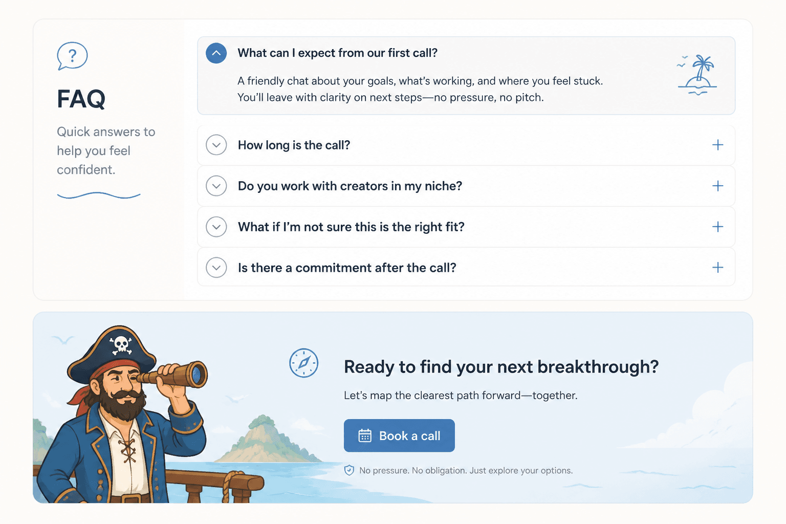
Use FAQs to remove tension, not dump leftovers
FAQ sections can quietly save trust when they answer the exact questions people are too polite or too skeptical to ask.
They can also become a junk drawer for random details the page forgot to explain earlier. Do not do that.
A good FAQ handles friction near the end of the decision process:
- Is this right for someone at my stage?
- What happens after I book or buy?
- Is this customized or templated?
- Do I need an audience, team, or existing funnel?
- What if I am not sure I am ready?
Keep the answers concise. Clean. Human. Not mini sales sermons.
A simple trust-first monetization framework
If you want something practical to use on your next page, here is a simple framework:
The bigger point is simple: clearer structure and clearer writing make the piece more useful. That is usually what makes the ending land better too.