If you are asking how long LinkedIn hooks and formatting should be in 2026, the annoying but correct answer is: long enough to earn the next line, short enough not to waste it.
That is the real game. Not hitting some magical character count. Not copying creators who post like every sentence just survived a minor electrical fire. And definitely not stretching a weak point across 14 lines because “short form performs better.”
Most LinkedIn hooks do not fail because they are too short or too long. They fail because they are vague, padded, dramatic for no reason, or formatted like a ransom note. The first line does not need to be clever. It needs to make a relevant person want the second line.
So here is how to think about hook length, body formatting, line breaks, and post structure in a way that actually helps your posts get read by humans who might become clients, leads, peers, or followers worth having.
To see how this fits into the wider strategy, open the parent guide.
How long should LinkedIn hooks and formatting be in 2026?
For most posts, your hook should usually land in 1 to 3 short lines. Your formatting should make the post easy to scan without looking chopped into dust.
A practical default looks like this:
- Hook: 8 to 25 words is often enough
- Opening section: 2 to 5 lines before the reader clearly knows where this is going
- Body paragraphs: 1 to 3 sentences per paragraph
- Line breaks: frequent enough for readability, not so frequent that every phrase feels over-dramatized
- Total post length: as long as the idea deserves
That last part matters most. A strong hook can be one clean sentence. A strong hook can also be two or three lines if the idea needs contrast, specificity, or a little setup. The point is not brevity as a religion. The point is momentum.
If the first line says something clear and relevant, formatting simply helps the reader continue. If the first line says nothing, no amount of dramatic spacing is going to rescue it.
The better question is not “how long” but “how much friction”
People obsess over length because it feels measurable. Friction is the thing that actually decides whether someone keeps reading.
A hook creates friction when it is unclear, self-important, too abstract, too slow, or too theatrical. Formatting creates friction when the post is one giant wall of text or, in the opposite direction, broken into so many tiny lines that it reads like a motivational fridge magnet had a networking event.
Good LinkedIn formatting reduces friction. It does not become the main event.
Low-friction hook
- Gets to a real point quickly
- Uses plain English
- Signals relevance
- Creates interest without clickbait fog
- Makes the next line easy to read
High-friction hook
- Starts with throat-clearing
- Tries too hard to sound profound
- Hides the point
- Uses vague suspense
- Feels inflated compared to the payoff
This is why short is not automatically better. A five-word hook can still be useless. “Something changed for me.” Great. Chilling. Nobody knows what that means.
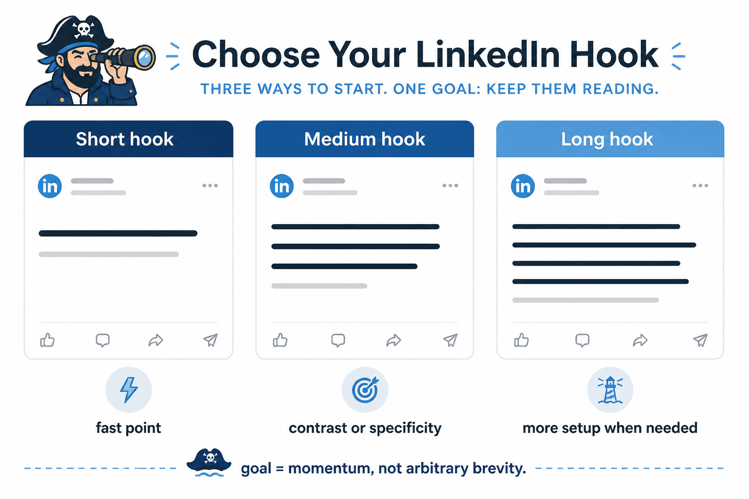
What actually works for LinkedIn hook length
If you want a reliable default, use one of these three hook lengths.
1. The one-line hook
Best when the idea is already sharp and specific.
Your LinkedIn posts are probably too polite to be memorable.
Most consultants do not need more content. They need better positioning in the first line.
This works when the claim is clear enough to stand on its own. No warm-up lap needed.
2. The two-line hook
Best when you need a little contrast or context.
Short LinkedIn posts are not automatically better.
They are just harder to hide weak ideas inside.
A lot of “thought leadership” is just recycled advice with cleaner spacing.
Formatting cannot save a blurry point.
This is a strong middle ground. It gives you room to sharpen the point without dragging.
3. The three-line hook
Best when you are building tension, making a surprising claim, or setting up a useful payoff.
You do not need a “viral” LinkedIn style.
You need a readable one.
Those are not the same thing.
If people keep ignoring your posts, the problem may not be your expertise.
It may be your opening.
Most hooks arrive wearing fog.
Once you go past three short lines, you are no longer writing a hook. You are writing the opening section. That is fine, but call it what it is. Do not confuse “more setup” with “better hook.”
When short hooks win
Short hooks usually work best when the reader can understand the point instantly and the benefit of continuing is obvious.
- Strong opinion posts
- Clear how-to posts
- Simple contrarian points
- Quick credibility-based insights
- Clean before/after observations
Example:
Your CTA is probably too needy for the value of the post.
That works because the tension is immediate. Anyone who writes posts and asks for comments, DMs, calls, or clicks can instantly see the relevance.
If you want more on this, it helps to read when short LinkedIn hooks and formatting beat long ones. Some posts really do improve when you stop decorating them and get to the point.
When longer hooks earn their keep
Longer hooks can work well when the idea needs a little setup, but they only earn their keep if each line increases interest.
- You are challenging a common belief
- You need to frame a nuanced mistake
- You are opening a story with a relevant business lesson
- You are creating contrast before a practical takeaway
- You need one extra line to make the claim land clearly
Example:
A lot of people think LinkedIn rewards polished writing.
It does not.
It rewards readable writing with a point.
That is longer than a one-liner, but each line adds something. It does not just stall for attention.
The mistake is writing hooks that keep “setting up” the point without getting there. If your hook needs five lines to say something that could have been said in one and a half, trim it. The reader is not waiting breathlessly for your reveal.
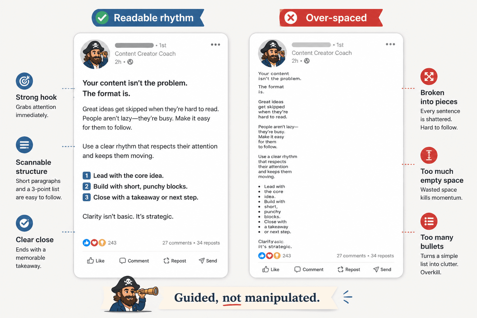
How LinkedIn formatting should look in 2026
LinkedIn formatting still needs to be scannable. That has been true for years, and it is not changing because people suddenly became eager to read dense blocks of business prose on a feed.
But there is a difference between readable formatting and performative formatting.
A solid default format
- 1 strong hook line, or 2 to 3 short setup lines
- Short paragraphs of 1 to 3 sentences
- Line breaks between distinct points
- Lists only when they genuinely improve clarity
- A closing line that lands the point or moves to a clean CTA
Formatting that usually hurts readability
- Breaking every sentence into 6 micro-lines
- Using empty spacing to fake intensity
- Writing giant blocks nobody wants to decode in-feed
- Stuffing 11 bullet points into a post that should have been 4
- Making every line look equally important
The best formatting creates rhythm. The reader should feel guided, not manipulated.
A simple rule for line breaks
Start a new line when one of these happens:
- You are introducing a new point
- You want to slow the reader for emphasis
- You are moving from claim to example
- You are switching from setup to takeaway
- You are improving scanability in a longer post
Do not start a new line just because you can. White space is useful. White space is not content.
Before and after: hook length and formatting fixes
Example 1: too vague
Before
I learned something important recently.
Something I think many people need to hear.
Especially on LinkedIn.
After
Most LinkedIn posts do not fail because the advice is bad.
They fail because the opening gives nobody a reason to care.
The rewrite is longer in meaning, not fluff. It says something.
Example 2: too chopped up
Before
Your content
is not the problem.
Your positioning is.
And until you fix it,
nothing changes.
After
Your content may not be the problem.
Your positioning probably is.
Cleaner. Faster. Less theatre.
Example 3: too dense
Before
One of the biggest mistakes I see professionals making on LinkedIn is that they spend a significant amount of time trying to optimize their content for reach when in reality their messaging lacks the degree of specificity required to resonate with the right audience and generate meaningful engagement.
After
A big LinkedIn mistake is optimizing for reach before relevance.
If your message is vague, more views do not help much.
The after version is easier to read, easier to remember, and much easier to continue from.
How to choose the right hook length for your post
Use this quick decision filter.
- If the point is obvious and strong: use 1 line
- If the point needs contrast: use 2 lines
- If the point needs setup and payoff: use 3 lines
- If you need more than that: your idea may be too muddy, or the opening needs editing
Then ask one more question: does each line make the next line more likely to be read?
If not, cut it.
What creators keep getting wrong about LinkedIn formatting
A lot of people are still writing for a fake version of LinkedIn where every post must sound polished, spaced out, and mildly heroic. That version should be retired.
Good formatting on LinkedIn is not about looking like a “creator.” It is about making your thinking easy to follow. Coaches, consultants, founders, writers, and service businesses do better when their posts feel clear and grounded, not algorithmically moisturized.
- Do not make every line dramatic
- Do not confuse spacing with substance
- Do not bury your point under “scene-setting”
- Do not copy a viral formatting style that does not fit your voice
- Do not write tiny hooks with giant bodies that wander off
If your post sounds like a person with something useful to say, formatting supports you. If it sounds like a content template trying on a blazer, formatting only makes the problem more visible.
A practical LinkedIn formatting template
Use this when you want a clean default:
The bigger point is simple: clearer structure and clearer writing make the piece more useful. That is usually what makes the ending land better too.