
Most LinkedIn formatting advice is weirdly dramatic or painfully shallow.
You get one camp screaming that every sentence needs its own line like the post is recovering from a mild collapse. Then you get the other camp posting dense grey bricks that look like contract law with a profile photo.
Neither helps.
Better LinkedIn Formatting Fixes for Personal Brands are not about making your posts look “engaging.” They are about making your ideas easier to notice, easier to follow, and easier to trust. That is the real job. Formatting is not decoration. It is delivery.
If your posts are decent but underperforming, formatting might be one of the quieter problems. Weak layout can flatten a strong idea. Bad line breaks can make you sound breathless, vague, or strangely theatrical. And if your first few lines are muddy, the rest of the post barely matters.
This piece will help you clean that up. We’ll cover how to format LinkedIn posts so they read like a sharp human wrote them, not a content machine trying to simulate conviction. You’ll also see what personal brands keep doing wrong, how to fix common formatting problems, and how to make your hooks and post structure work together instead of fighting in public.
For the main guide behind this topic, visit the parent guide.
Formatting is not separate from the hook
People talk about hooks and formatting like they live in different rooms. They do not.
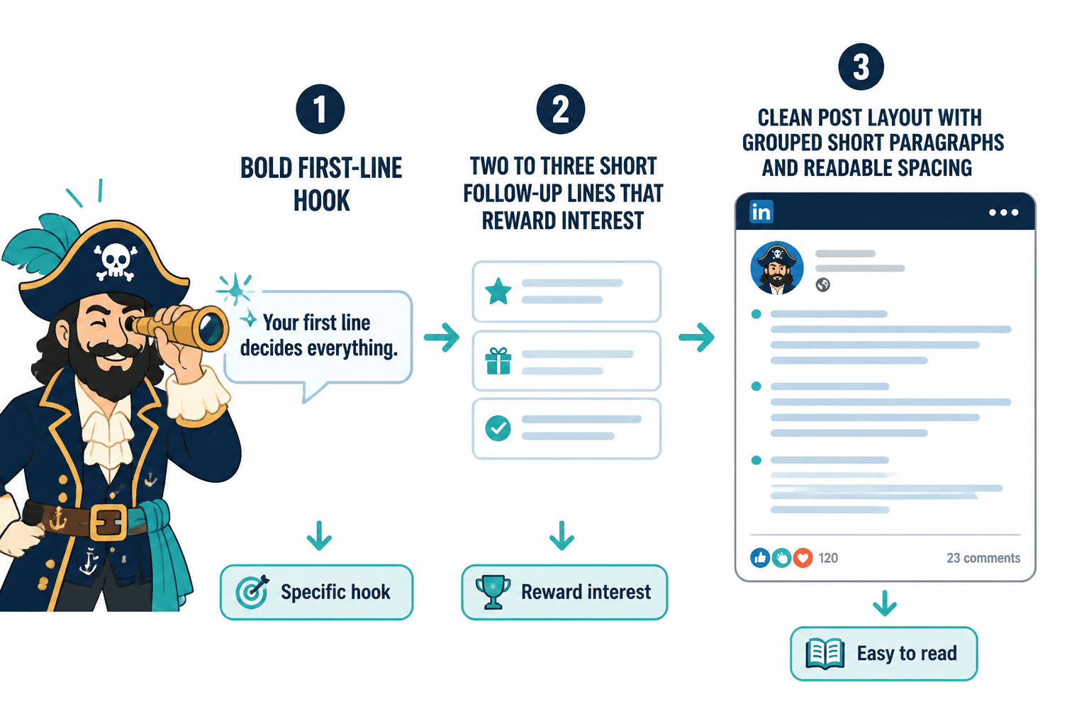
Your first line gets attention. Your formatting decides whether that attention survives long enough to reach your point.
A good hook with bad formatting still struggles. A clean format with a boring hook still loses. The best LinkedIn posts usually do three things well right away:
- The first line says something specific enough to create interest
- The next few lines reward that interest instead of stalling
- The layout makes the post feel easy to read, not like work
That is why formatting fixes matter for personal brands. You are not just trying to get skimmed. You are trying to sound credible, clear, and worth paying attention to.
If you want a broader foundation for this, the main LinkedIn hooks and formatting hub is worth bookmarking. It pairs nicely with this post if you are rebuilding your overall post style.
The biggest LinkedIn formatting mistakes personal brands keep making
1. Treating line breaks like a personality trait
Yes, whitespace helps. No, that does not mean every sentence deserves its own lonely apartment.
When every line is broken apart, your post starts to feel overperformed. It can read like you are trying to force intensity into an idea that does not naturally have any. It also slows readers down in the wrong way.
Use line breaks to group thoughts, not to cosplay urgency.
2. Posting giant walls of text
This one is simpler. If your post looks exhausting, many people will not start.
LinkedIn is not hostile to longer posts. It is hostile to friction. A longer post can work beautifully if it is broken into clear, readable chunks. But if it lands as one giant slab, even a strong point gets buried.
3. Writing a hook that promises tension, then opening with fluff
A lot of posts lose momentum in line two.
The first line says something interesting. Then the next two lines wander into throat-clearing, vague setup, or weirdly generic “context.” That gap kills trust fast.
Your formatting should support momentum. The lines after the hook need to move, not hover.
4. Using formatting to fake substance
Neat spacing does not make a weak idea stronger. It just makes the weakness easier to notice.
This is where a lot of AI-assisted LinkedIn content falls apart. The post looks polished. The rhythm seems familiar. But nothing meaningful is being said. Formatting can improve readability. It cannot rescue emptiness.
5. Ending with a CTA that sounds imported from a funnel dungeon
You do not need to end every post with “Comment GUIDE and I’ll send it over” unless that actually fits the post and your audience.
Formatting matters here too. If your post is clean, useful, and human, a stiff or manipulative CTA at the end feels even worse. The contrast is not flattering.
What better LinkedIn formatting actually looks like
Good formatting makes a post feel easy to enter and easy to continue. It gives shape to the idea without making the structure too obvious. Think less “template” and more “controlled readability.”
For most personal brands, that usually means:
- A sharp first line
- A second and third line that deepen the point fast
- Short paragraphs, usually 1 to 3 lines
- Clear shifts between sections or examples
- Lists only when they improve clarity
- A close that lands instead of lingering
That is the baseline. Not flashy. Just readable.
A simple structure that works for most posts
- Hook: Say the actual interesting thing
- Expansion: Explain why it matters
- Proof or example: Show the idea in action
- Takeaway: Make the lesson clear
- CTA or close: Give the reader a natural next step, or simply end cleanly
If you want more first-line help specifically, this companion piece on simple LinkedIn hooks and formatting first-line hooks templates for busy creators is useful when your openings keep sounding flat.
How to fix common formatting problems in real posts
Problem: every sentence is on its own line
Before
Your content is not underperforming because you are bad at writing.
It is underperforming because your positioning is unclear.
And unclear positioning creates weak content.
Which creates weak trust.
Which creates weak sales.
After
Your content might not be underperforming because you are bad at writing.
It might be underperforming because your positioning is unclear. And when positioning is vague, the content gets vague too. So does trust. So do sales.
The second version feels more grounded. It still breathes, but it does not gasp.
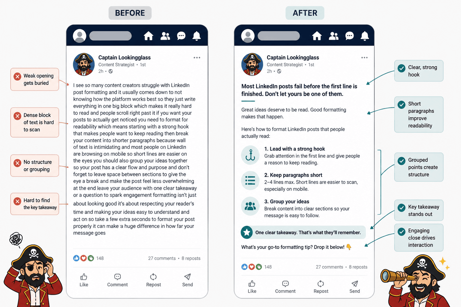
Problem: the post opens well, then loses shape
Before
Most LinkedIn advice is bad.
I have been thinking about this a lot recently because there are so many different perspectives and approaches and some of them can be useful depending on what you are trying to do and who you are trying to reach.
After
Most LinkedIn advice is bad.
Not because it is wrong in every case. Because it is too generic to help anyone make a better post tomorrow.
The fix is not just shorter text. It is tighter thinking.
Problem: one giant block with no pacing
Before
People say consistency is the key to LinkedIn growth but that advice is incomplete because consistency without a clear point of view just creates more average content and average content does not build trust very well especially if your audience has seen the same recycled tips dozens of times already so instead of focusing only on posting more often it makes more sense to improve your positioning your hooks your examples and your post structure first.
After
People love saying consistency is the key to LinkedIn growth.
That advice is incomplete.
Consistency without a clear point of view just creates more average content. And average content does not build much trust, especially when your audience has already seen the same tip fifty times.
Before you obsess over frequency, fix your positioning, hooks, examples, and post structure.
Now the argument has shape. The reader can follow it without needing a machete.
If you want more before-and-after help, read LinkedIn hooks and formatting examples for coaches, consultants, and personal brands. It gives you more rewrites you can steal the logic from without copying the voice.
The formatting rules that actually help on LinkedIn
There are no sacred rules here, but there are useful patterns.
Keep most paragraphs short
On LinkedIn, short paragraphs lower friction. That usually means 1 to 3 lines per paragraph. Not because the platform demands it, but because readers are scanning in a crowded feed.
That does not mean every post should look clipped. A slightly longer paragraph can work when you are developing an idea or telling a short story. The point is variation, not rigid formatting theater.
Group related thoughts together
Each paragraph should feel like one unit of meaning. If two sentences belong together, keep them together. If the idea shifts, break the paragraph.
This sounds obvious, but a lot of weak formatting comes from breaking by sentence instead of by idea.
Use lists when they truly improve scannability
Lists work well when you are naming steps, mistakes, examples, or criteria. They do not work well when you are forcing a list into a post that should just be written like a normal human thought.
If the list makes the post clearer, use it. If it just makes the post look more “contenty,” skip it.
Do not waste the lines after the hook
The first three lines carry a lot of the post’s momentum. Do not spend them on background clearing, vague setup, or self-important suspense.
If your hook says something bold, the next lines should clarify it, sharpen it, or support it. Fast.
Use emphasis sparingly
Bold, all caps, dramatic line breaks, arrows, emojis, numbered frameworks, mini-headlines, weird punctuation stacks. Pick your poison carefully.
Too much emphasis is the same as no emphasis. It all starts shouting at once.
A practical formatting checklist for personal brands
Before you publish a LinkedIn post, run through this:
- Is the first line specific, not vague?
- Do the next two lines deepen the point quickly?
- Are paragraphs grouped by idea, not by random sentence length?
- Is there enough whitespace to make it easy to read?
- Is there too much whitespace making it feel overperformed?
- Have you removed filler setup?
- Does the post build logically from opening to takeaway?
- Is the CTA natural, optional, and relevant?
- Could a smart reader skim it and still get the point?
- Does it sound like you, or like polished generic sludge?
That last one matters more than people admit. A clean format cannot save a dead voice.
How personal brands should format different kinds of LinkedIn posts
Opinion posts
Lead with the opinion clearly. Then support it fast.
Do not bury your actual view under 6 lines of careful diplomacy. If you believe something is overrated, say that. Then explain why without drifting into performative arrogance.
Story posts
Keep the setup short. Most story posts drag because the writer thinks every detail matters. It does not.
Format the story around movement:
- What happened
- Why it mattered
- What changed
- What the reader should take from it
If the lesson only appears at the very end, the formatting probably needs tightening.
The bigger point is simple: clearer structure and clearer writing make the piece more useful. That is usually what makes the ending land better too.