
Most creator funnels do not fail because the offer is terrible. They fail because the signup path is weird, vague, too early, or stuffed with friction people did not ask for.
A personal brand can get away with a lot in content. A slightly rough post? Fine. A casual profile? Usually survivable. But if the path from attention to signup feels clunky, trust drops fast. People do not want to solve a puzzle just to join your list, book a call, or grab your free resource.
Better Creator Funnel Signup Paths for Personal Brands means building a cleaner route from content to action. Not a bigger funnel. Not a louder CTA. A better path. One that matches intent, feels natural, and gives people a next step that actually makes sense for where they are.
This is where a lot of personal brands get it wrong. They post helpful content, earn attention, maybe even build some trust, then send people into a signup experience that feels like it was assembled during a mild panic. Too many fields. No context. Generic landing copy. A lead magnet nobody really wants. Then they wonder why “traffic isn’t converting.”
It is converting exactly as well as the path deserves.
For the full path around this topic, head to the parent guide.
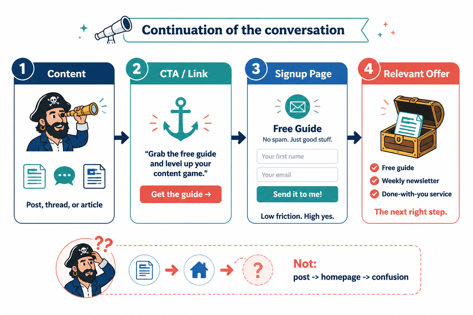
What a good signup path actually does
A good signup path does three things:
- It matches the promise of the content that brought someone in
- It makes the next step feel easy and relevant
- It builds trust instead of spending it all at once
That sounds obvious. It apparently is not, because plenty of creators still run this move:
- Post about a specific pain point
- Tell people to click the link in bio
- Send them to a homepage
- Hope they somehow find the newsletter, the free guide, the services page, and the meaning of life
That is not a funnel. That is abandonment with extra steps.
If you want better results, your signup path needs to feel like a continuation of the conversation, not a hard swerve into “enter your email to unlock my framework.”
Start with intent, not with the form
Before you build a landing page or write a CTA, ask one question: what does this person want right now?
That answer should shape the path.
Someone reading a tactical post about fixing their LinkedIn bio is usually not ready for a strategy call. Someone reading a detailed case study about funnel performance may be much closer to buying. Someone enjoying your hot take thread may only be ready to follow, not join anything.
Intent matters because signup friction feels very different depending on timing. A quick email field can feel easy when the offer is relevant. The same field feels annoying when the pitch came out of nowhere.
So do not begin with “What asset should I make?” Begin with “What next step fits the moment?” That usually gives you better signup paths and fewer dead-end freebies.
Common intent levels inside creator funnels
- Cold attention: they noticed one post, one thread, one article, one clip
- Warm interest: they want more useful ideas from you
- Active problem-solving: they want a tool, checklist, template, or guide
- Evaluation: they are comparing solutions or considering working with someone
- Buying intent: they are ready for a call, consult, audit, or product page
Each level deserves a different path. One of the easiest wins in Better Creator Funnel Signup Paths for Personal Brands is simply not asking cold readers to take hot-buyer actions.
The 5 signup paths that work best for personal brands
You do not need twelve options in your funnel. You need a few paths that match your content, audience, and offer.
1. Content to newsletter signup
This is one of the cleanest paths for personal brands because it asks for a low-friction commitment. The person likes your thinking, wants more, and joins a list that keeps the relationship going.
Best when your content already teaches, challenges assumptions, or gives useful perspective.
- Content promise: useful ideas, commentary, expertise
- Signup page promise: get more of this, regularly and clearly
- Weak version: “Join my newsletter for updates”
- Better version: “Get one sharp weekly email on content, funnels, and trust-based growth for personal brands”
If your newsletter signup page sounds like every other newsletter signup page on earth, do not act shocked when no one cares.
2. Content to lead magnet signup
This path works when the resource is tightly connected to the content and solves a real next-step problem.
Not “free ebook.” Not “ultimate guide.” Something actually useful.
- A checklist after an educational article
- A template after a strategy post
- A swipe file after a copy breakdown
- A workbook after a teaching thread
The mistake here is making the resource broader than the content. If your post is specific and your signup offer is generic, conversion usually drops. Specific attention wants a specific next step.
3. Content to application or booking page
This path is stronger for warm audiences and high-intent content. Think case studies, strong opinions backed by proof, process breakdowns, or posts aimed at buyers who know they have a problem.
Here the signup path should screen lightly, not interrogate people like a federal agency.
- Keep forms short
- Ask only what helps you qualify
- Explain what happens next
- Make the offer and audience clear before the form appears
If you ask for seventeen details before someone can book a 20-minute intro call, the issue is not “lead quality.” It is your inability to chill.
4. Content to low-ticket signup
For some personal brands, the best signup path is not email-first. It is offer-first. A paid template pack, workshop, mini-course, or audit can work beautifully when the content already demonstrates the value and the price feels proportional.
This path works especially well when your audience wants speed and implementation more than nurturing.
5. Content to soft DM or reply path
Not every signup path has to start with a landing page. Sometimes the cleanest route is a soft conversation path that leads into signup later.
Examples:
- “Reply with ‘guide’ and I’ll send it”
- “If you want the checklist, comment and I’ll point you to it”
- “If this is your situation, message me and I’ll send the details”
This works best when you can handle the volume and when the conversation adds trust rather than acting as a fake “manual funnel” for vanity engagement.
How to choose the right signup path
You do not need the “best” funnel in the abstract. You need the right path for your audience, content, and business model.
| If your content does this | Best next step | Why it works |
|---|---|---|
| Builds trust and authority over time | Newsletter signup | Low friction, strong long-term nurture |
| Solves a clear practical problem | Lead magnet signup | Strong content-to-offer relevance |
| Shows proof and buyer readiness | Booking or application | Captures higher intent |
| Demonstrates immediate value | Low-ticket offer | Monetizes without long delay |
| Starts conversation well | Reply or DM path | Adds human trust before redirecting |
That is the real filter. Not trend, not what some larger creator is doing, not whatever funnel tool currently has the loudest affiliates.
If you need more models, it helps to review different creator funnel examples for coaches, consultants, and personal brands and compare which signup paths fit different buying journeys.
Fix the handoff between content and signup
A lot of funnel advice focuses on landing page optimization. Fine. Useful sometimes. But many signup paths break before the landing page ever gets a chance.
The handoff is the problem.
Your post says one thing. Your CTA says another. Your page says a third thing. That mismatch creates doubt.
The better the handoff, the easier the signup.
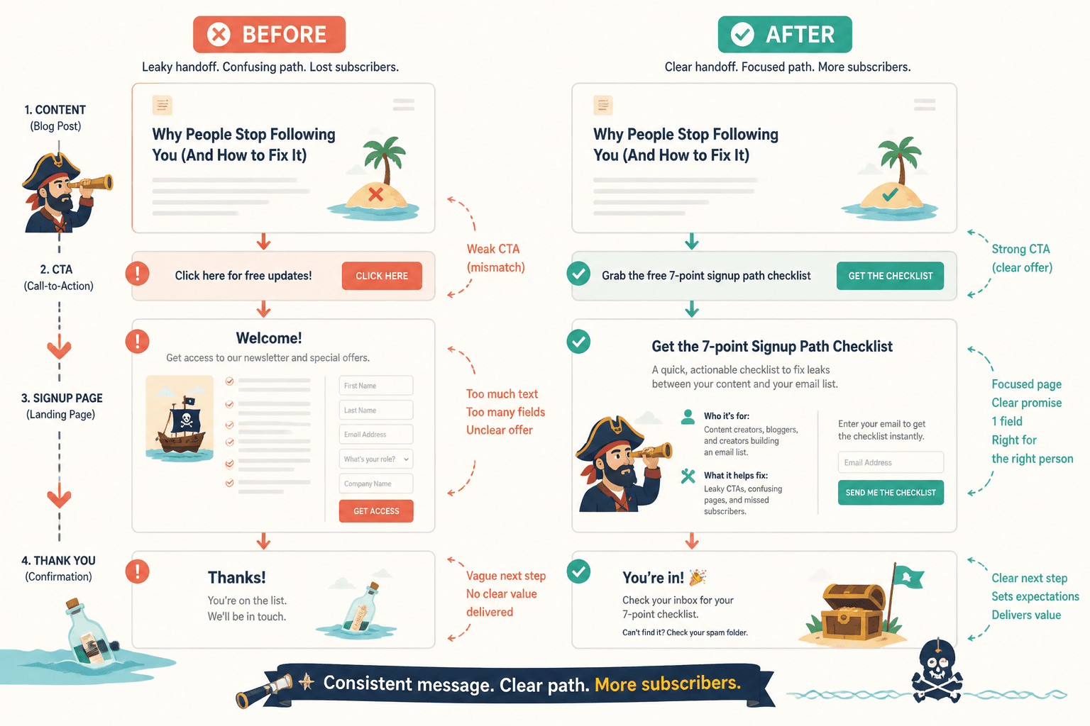
What a strong handoff looks like
- The content names a specific problem
- The CTA offers the logical next step
- The signup page repeats and sharpens the promise
- The form asks only what is necessary
- The thank-you step tells people what happens next
Simple example:
Post topic: Why personal brand funnels lose people between content and signup
CTA: Want the 7-point signup path checklist? Grab it here.
Landing page: A short page promising the checklist, who it is for, what it helps fix, and a simple email field.
That works because the journey feels continuous. No weird jump. No bait-and-switch. No “actually, book a call.”
Reduce friction without removing trust
Some creators hear “reduce friction” and turn the whole thing into a one-click blur with no explanation. That can backfire too. Easy is good. Confusing is not.
Your signup path should feel light, but it still needs enough context to answer basic questions:
- What is this?
- Why should I care?
- Who is it for?
- What happens after I sign up?
If your landing page hides all of that in the name of “minimalism,” you are not reducing friction. You are removing reasons.
Good friction to remove
- Too many form fields
- Vague buttons like “submit”
- Slow-loading clutter
- Generic copy that says nothing
- Multiple competing CTAs
- Sending people to a homepage instead of a direct page
Good trust signals to keep
- Specific benefit
- Short explanation of what they will get
- Who it is best for
- Proof, examples, or credibility markers where relevant
- Clear next-step expectations
Personal brands especially need this balance because the audience is often buying into both the expertise and the person. The path should feel human, not corporate, but still clear enough that nobody has to guess what they are signing up for.
Signup page copy that usually works better
You do not need a long sales page for every signup path. But you do need copy that carries its weight.
A simple signup page structure
- Headline: name the thing and the outcome
- Subhead: explain who it is for or why it matters
- Bullets: what they get or what it helps solve
- Form: keep it short
- Button: action-focused and specific
- Optional proof: who you are, results, or audience relevance
Example:
Headline: Get the Creator Signup Path Checklist
Subhead: A practical checklist for coaches, consultants, and personal brands who want more people moving from content to email, call, or offer.
Bullets:
– Spot friction in your current signup flow
– Match the CTA to audience intent
– Fix pages that are losing interested readers
– Build a cleaner path without adding funnel nonsenseButton: Send me the checklist
That is enough. Clear beats ornate.
If you are building from scratch, you might also want to review simple creator funnels, offer paths, and templates for busy creators so the signup step connects to a broader system instead of sitting there alone like an abandoned kiosk.
The most common signup path mistakes personal brands make
- Using one path for every kind of content. Not every post should lead to the same thing.
- Sending people to a link hub with ten choices. Choice overload kills momentum.
- Pitching too early. Attention is not the same as readiness.
- Offering irrelevant freebies. If the free thing does not match the content, trust drops.
- Hiding the outcome. “Join for updates” is weak because nobody wants more updates.
- Forgetting the thank-you step. Confirmation pages and welcome emails matter. They shape what happens next.
- Optimizing copy before fixing alignment. Better words cannot rescue a bad path.
That last one matters more than people think. Creators often rewrite the CTA five times when the real problem is that they are offering the wrong next step entirely.
Better Creator Funnel Signup Paths for Personal Brands with small audiences
If your audience is still small, this gets easier in one sense: you can be more direct, more specific, and more personal.
You do not need a sprawling funnel map. You need a tight path that helps the right people take the next step. Small audiences usually respond better to relevance than scale tricks. A focused signup path connected to a sharp piece of content can outperform a much “bigger” funnel built for imaginary volume.
For smaller creators, a strong setup often looks like this:
- One clear content theme
- One core signup goal
- One relevant free resource or newsletter
- One warm next step after signup
If that sounds almost too simple, good. Simple is underrated because it does not look impressive in a screenshot.
More on that here: creator funnels for creators with small audiences.
Build the path after signup too
Creator funnels get better when the path feels simpler and the writing makes each next step obvious. A cleaner message usually fixes more than extra funnel complexity ever will.
Creator funnels get better when the path feels simpler and the writing makes each next step obvious. A cleaner message usually fixes more than extra funnel complexity ever will.