
The bad assumption is that homepage copy fails because it needs more polish, more buzzwords, or one of those suspiciously confident conversion tricks that always seem to arrive wearing a blazer. In practice, homepage copy usually loses because it makes the reader work too hard to figure out what the business does, why it matters, and what happens next. That is not a style problem. It is a clarity problem.
A strong homepage does a few plain but important jobs: it tells the right visitor they are in the right place, explains the offer without making them decode it, shows enough proof to feel safe, and points them toward one sensible next step. Not glamorous. Very useful. The good news is that useful copy is easier to write than vague copy pretending to be strategic.
What homepage copy is actually supposed to do
A homepage is not a brochure, a diary entry, or a place to prove you have read the correct number of branding books. Its real job is to help visitors orient themselves fast enough to keep going.
That usually means four things:
- Identify the audience. Who is this for?
- Explain the outcome. What changes when someone works with you?
- Build enough trust. Why should the visitor believe this is worth their time?
- Guide the next step. What should they do now?
If a homepage does those four things well, it can be short or long, minimal or detailed. The format matters less than whether the page is actually doing its job.
For a bigger structural view, the parent guide on homepage copy covers how this page fits into a broader conversion system.
The core sections every strong homepage usually needs
Not every homepage needs every section, but most strong homepages have some version of the same sequence. The trick is not to cram everything in. It is to order the pieces so the reader never has to guess what is happening.
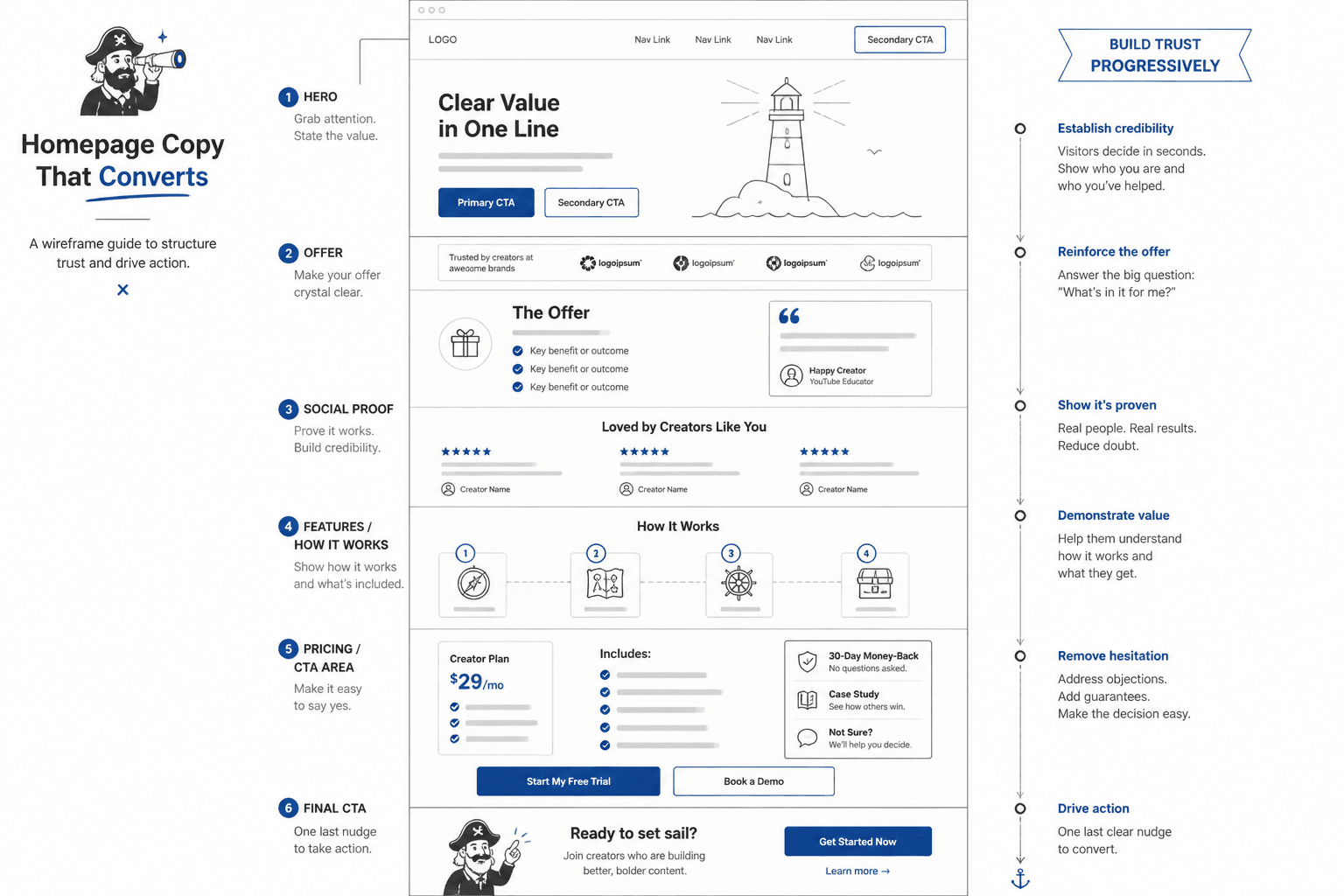
1. A clear hero section
The hero is the part that does the first heavy lift. It needs a headline that says something real, a subheadline that adds context, and a call to action that does not hide behind polite fog.
Weak hero copy usually sounds broad because it is trying to be universally appealing. Strong hero copy does the opposite: it narrows the field. It names who the page is for and what result matters.
For example, a weak headline says something like “Strategic solutions for modern brands.” A stronger version says what the offer is, who it helps, and why the visitor should care. Less perfume. More information.
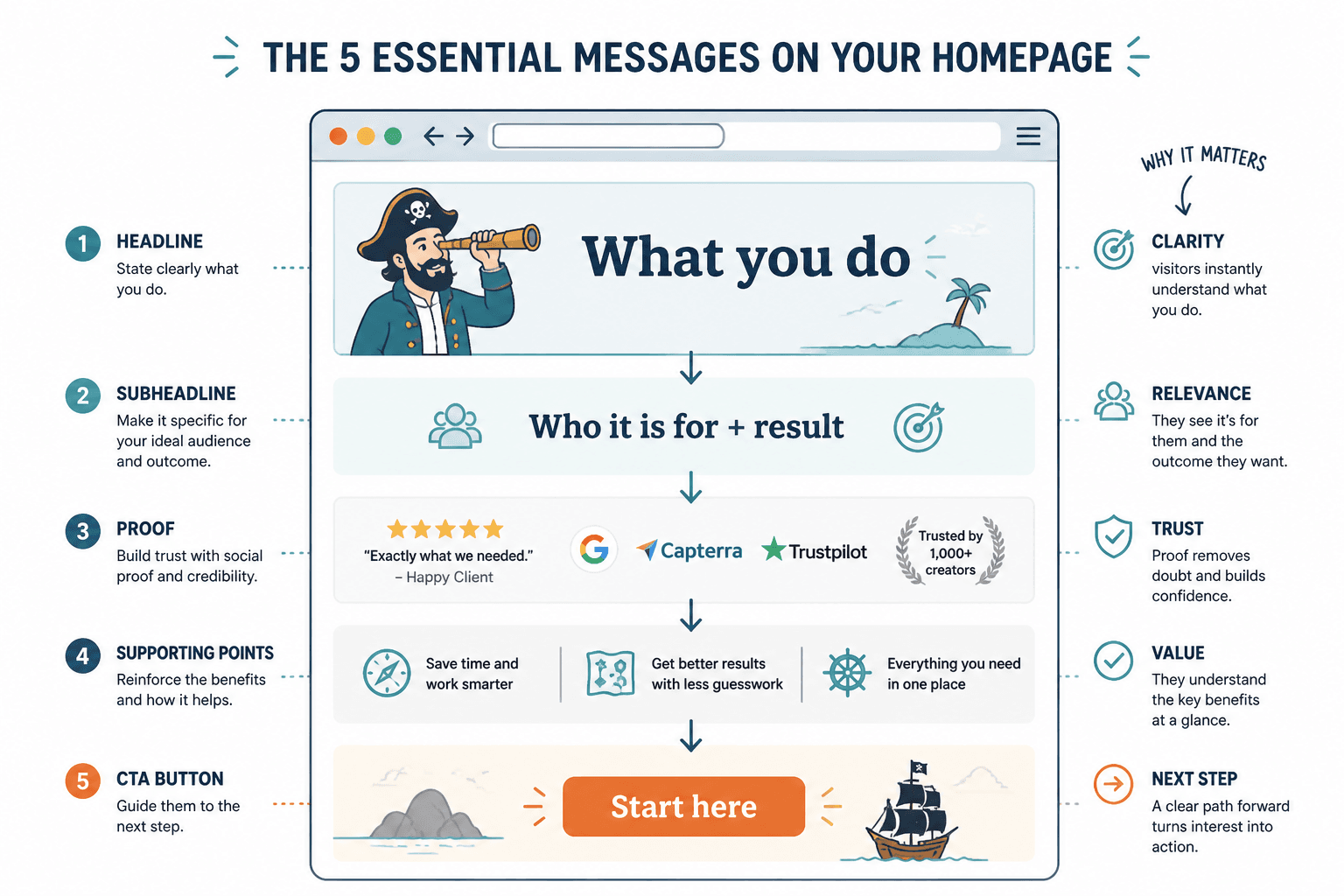
2. A quick value proposition section
After the hero, many homepages need a short section that explains the core value in plain language. This is where you answer the reader’s silent “okay, but what do you actually do?”
Keep this tight. You do not need a mission statement here. You need a clean explanation of the problem you solve, the outcome you create, and why your approach is worth attention.
A useful test: if a stranger skimmed this section for ten seconds, would they understand what makes the offer different enough to remember?
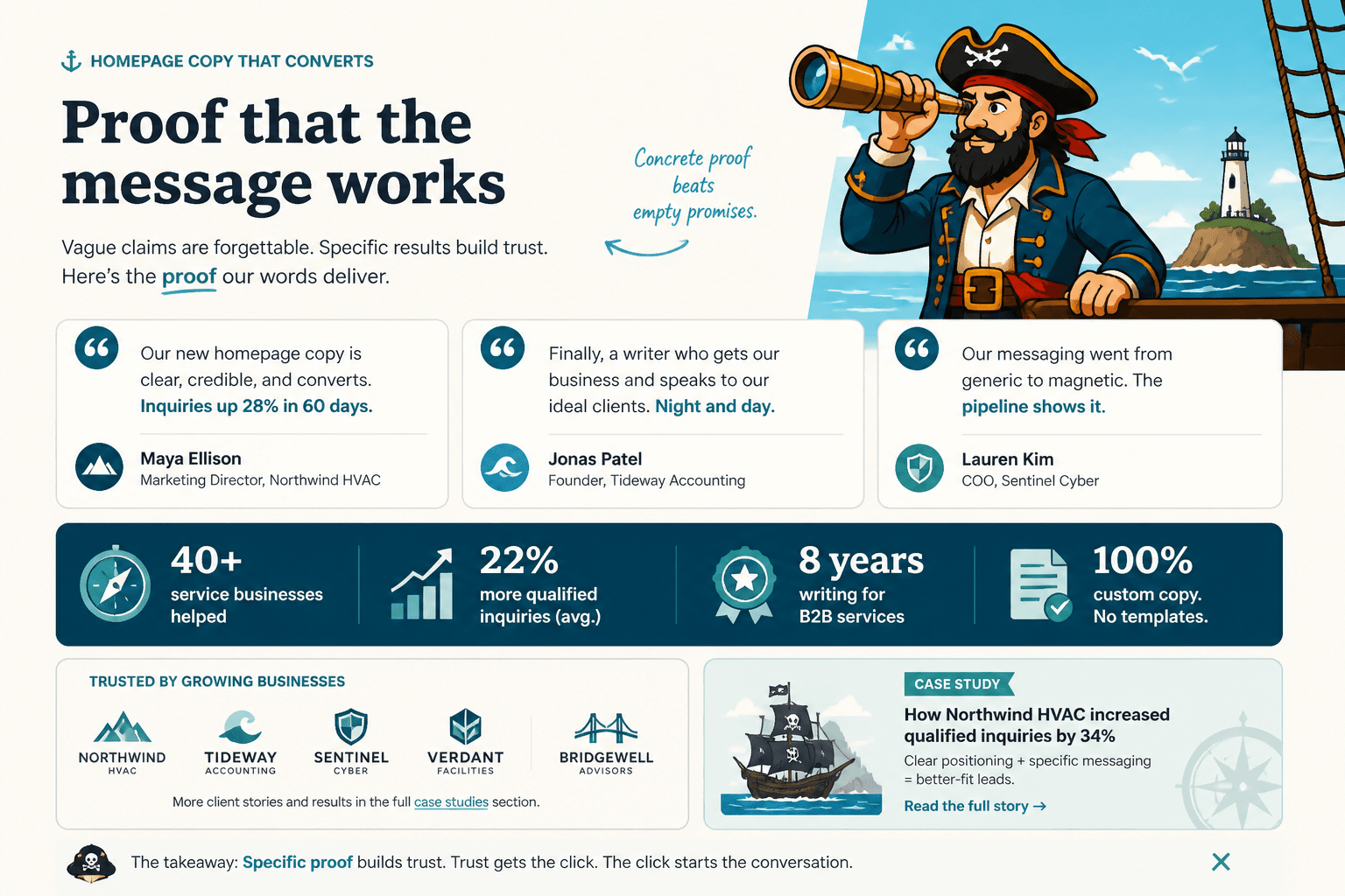
3. Proof or credibility
Proof does not have to mean giant client logos and a wall of testimonials that read like they were written by a committee in a hurry. It can include results, qualifications, recognisable experience, process credibility, media mentions, or specific evidence that your claim is grounded in reality.
The key is specificity. “Trusted by hundreds of clients” is a shrug in sentence form. “Helped 42 service businesses improve homepage clarity before launch” gives the reader something to hold onto.
If you want a cleaner proof layout, the article on homepage copy guide for creators later in the cluster goes deeper into how proof can be positioned without taking over the page.
4. A section that explains your offer
Once the reader understands the value, spell out the offer. What are they actually buying, booking, joining, or downloading?
This section is where homepage copy often gets vague again. The page says the work is “custom,” “strategic,” or “tailored,” which is lovely, but not especially useful. Better copy describes the shape of the offer in practical terms: what is included, how it works, and what the visitor can expect.
If the homepage is for a service business, this section should help the reader answer:
- What do I get?
- How does this work?
- What makes this different from the other options I’m comparing?
5. A friction-reducing section
The last important job is lowering hesitation. This can take the form of FAQs, a short process section, a “who this is for / who this is not for” block, a simple comparison, or a final reassurance before the CTA.
Think of this as the part that handles objections before they harden into tab-close energy.
How to write a stronger hero section
The hero section should not try to do everything. It should do the first useful thing.
That means:
- name the audience or situation
- state the outcome in clear language
- add context in the subheadline
- make the next step obvious
A useful pattern looks like this:
- Headline: the main outcome or promise
- Subheadline: who it is for, or how it works, or what makes it different
- CTA: the smallest sensible next action
The mistake is stuffing the hero with extra claims because the page feels “too simple.” Simplicity is not the enemy. Confusion is.
If you want a deeper breakdown of openings specifically, see how to write homepage copy without sounding salesy or robotic.
How to make proof actually prove something
Proof works best when it matches the claim the page just made. If the homepage says “we help you get clearer messaging,” the proof should show clarity outcomes, not just generic enthusiasm.
Better proof tends to have one or more of these features:
- specific result
- specific context
- specific role or industry
- specific before/after change
That can be a testimonial, a mini case study, a metric, a short quote, or a concise credibility callout. The format matters less than whether the evidence feels earned.
And no, “We deliver exceptional results” is not proof. That is a compliment pretending to be strategy.
How section order changes the whole page
Section order matters more than many writers expect. A homepage can have decent blocks and still feel off if the sequence makes the reader do extra mental housekeeping.
Common order problems include:
- leading with a vague hero and “explaining later”
- putting the full origin story before the offer makes sense
- describing the process before the outcome
- asking for action before enough trust exists
- burying proof too far down the page
- stacking too many “about” sections before the service section
A better homepage usually moves from orientation to relevance to trust to action. The reader should feel guided, not trapped in a scavenger hunt.
For section sequencing, the related article homepage copy section order mistakes that hurt performance is the companion piece that gets more specific about layout logic.
How long should homepage copy be?
There is no magic word count for homepage copy. Some homepages should be lean. Others need more room because the offer is complex, the audience is less familiar, or the page has to do more educational work before the visitor is ready to act.
A better question is: how much copy does the visitor need before they can make a decision?
Shorter copy tends to work when:
- the offer is simple
- the audience already knows the category
- the homepage is mostly a routing page
- traffic is warm
- mobile readability is a priority
Longer copy tends to work when:
- the offer needs explanation
- the visitor is colder
- the price or commitment is higher
- there are more objections to handle
- trust has to be built from scratch
In other words: length should follow the job, not the mood board.
A practical homepage editing checklist
When revising a draft homepage, check these points in order:
- Can a visitor tell what this business does in five seconds?
- Does the headline say something concrete?
- Does the subheadline add context instead of repeating the headline?
- Is the offer explained without jargon?
- Does the proof match the claim?
- Does the page answer likely objections before the CTA?
- Is the next step obvious?
If the answer to any of those is no, fix that before polishing line-level style. Smooth prose cannot rescue a page that is still making the reader decode the plot.
Useful sources for tightening homepage copy
A few primary sources are worth keeping nearby when you are writing or reviewing homepage copy:
- Nielsen Norman Group on how users read on the web – useful for understanding scan behavior and why clarity beats decorative copy.
- W3C WAI headings tutorial – useful for structuring page sections so the hierarchy is easy to follow.
- Google Search Central on creating helpful content – useful as a reminder that helpful, specific content tends to serve real readers better than filler.
Conclusion
Better homepage copy is not about sounding more polished. It is about making the right visitor understand the page quickly enough to trust it. That means clearer headlines, cleaner section order, proof that actually proves something, and a CTA that behaves like it has a job.
If you want the broader strategy around this page, start with the homepage copy parent guide. Then come back and tighten the sections that are doing too much work with too little clarity. That is usually where the conversions went wandering.