
Most newsletter resource blocks are not bad because they exist. They are bad because they feel stapled on.
You know the kind: “Here are 3 useful resources.” Then a bland link, a vague label, and a limp one-line description that tells me nothing except that the writer has seen other newsletters do this and wanted one too.
If you want to know how to improve newsletter resource blocks without sounding generic, the fix is not making them fancier. It is making them more intentional. A good resource block should feel curated, specific, and connected to the reader’s actual problem. It should sound like a person with taste made a recommendation, not like a content machine populated a template.
Here’s how to make your newsletter resource blocks sharper, more useful, and far less likely to get skimmed like expired salad mix.
If you want the bigger picture, start with the parent guide.
Why most newsletter resource blocks feel generic
Generic resource blocks usually fail for one of four reasons:
- They are too broad
- They do not connect to the newsletter’s main point
- The descriptions say nothing specific
- They sound like placeholders instead of recommendations
A lot of creators treat resource blocks like filler. A little “helpful extras” section. A few links tossed at the bottom so the newsletter feels more substantial. That is exactly why the section underperforms.
Readers do not want random “resources.” They want a shortcut, an example, a tool, a template, or a next step that actually helps with the thing they just read about.
If the main newsletter is about writing better welcome emails, your resource block should not suddenly recommend a podcast episode, a Canva app, and a generic article about productivity. That is not curation. That is digital pocket lint.
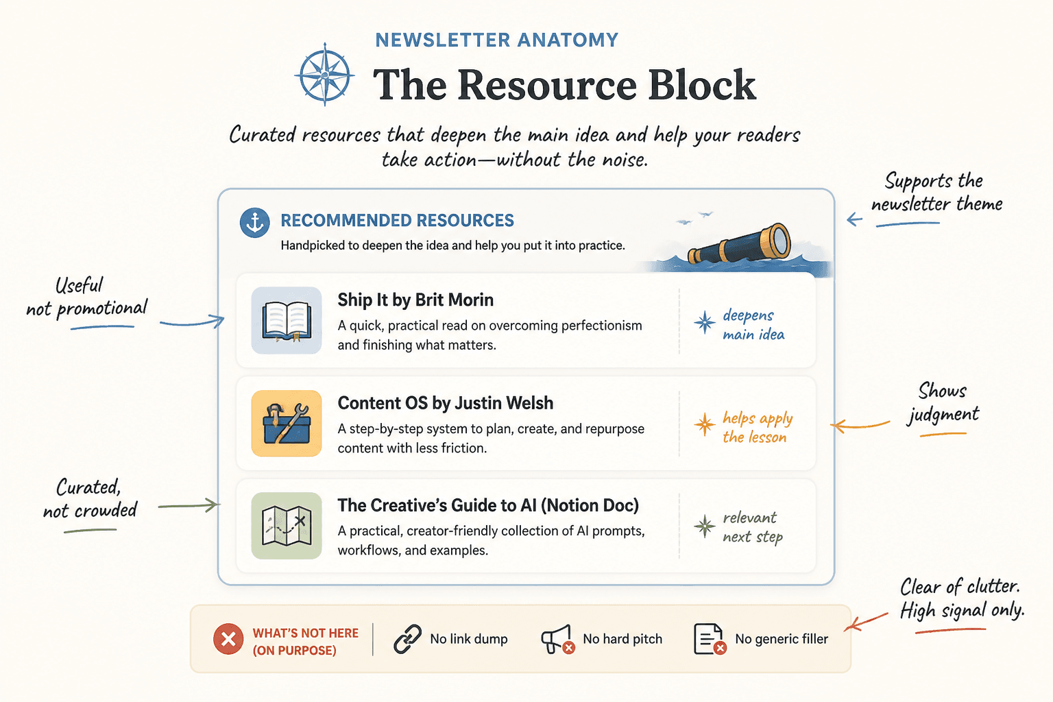
What a strong resource block is actually supposed to do
A strong resource block should do at least one of these jobs:
- Deepen the main idea from the newsletter
- Help the reader apply what they just learned
- Offer a relevant next step without turning into a hard pitch
- Show your taste, judgment, and point of view
- Increase trust by being genuinely useful
Notice what is missing: “include links because newsletters are supposed to have links.” No one is awarding points for section compliance.
The best resource blocks feel like a smart aside from someone who knows what matters. They say, in effect, “If this topic matters to you, here are the two or three things worth your time.” That is very different from “here is a pile of stuff I needed to place somewhere.”
Start by fixing the strategy, not the wording
Before you rewrite a single line, decide what the resource block is for in that specific newsletter.
Pick one job for the block
Resource blocks get muddy when they try to do five things at once. Choose one primary purpose:
- Expansion: Give readers a deeper article, example, or framework
- Application: Give them a template, checklist, or prompt to use immediately
- Proof: Show a case study, example, or breakdown that backs up your point
- Bridge: Move readers naturally toward a related offer, article, or CTA
That one decision cleans up a lot. The section becomes tighter, the recommendations become more relevant, and the copy gets easier to write.
Match the block to the newsletter’s topic
Your resource block should feel like an extension of the issue, not a bonus room with mismatched furniture.
For example, if your newsletter issue is about improving CTA copy, your resource block could include:
- A related article on writing cleaner newsletter CTAs
- A swipe file of CTA examples
- A template the reader can adapt this week
That is coherent. It rewards the reader for caring about the topic. It also makes your newsletter feel better structured overall, which matters more than people think.
If you need a broader foundation for building cleaner sections, it helps to review newsletter sections and formats and the wider email newsletter writing category, especially if your issue structure still feels a bit improvised.
How to write resource block copy that does not sound like everyone else
This is where most of the generic smell creeps in.
Writers lean on dead phrases like:
- Useful resource
- Worth checking out
- Helpful article
- Great tool
- Interesting read
- Thought you might enjoy
None of those phrases are evil. They are just empty. They tell the reader almost nothing about why the resource matters.
Use this simple formula instead
For each resource, write:
- What it is
- Why it matters here
- Who it is especially useful for if relevant
That gives the recommendation shape.
Weak vs stronger examples
Weak: Template: A useful framework for writing newsletter CTAs.
Stronger: CTA template: If your newsletter endings keep drifting into “hope this helped” territory, this gives you three cleaner ways to turn attention into action without sounding pushy.
Weak: Article: Great read on improving newsletter structure.
Stronger: Newsletter structure guide: A practical breakdown of how to build sections that feel intentional instead of stacked on top of each other like content leftovers.
Weak: Tool: Helpful for content planning.
Stronger: Content planning tool: Best when your ideas are fine but your publishing workflow is a mess. This helps you turn scattered notes into something you’ll actually send.
The difference is not “better adjectives.” It is relevance, specificity, and a bit of judgment.
Give the block a point of view
One easy way to stop sounding generic is to stop pretending all recommendations are neutral.
Good curators have opinions. Not loud, theatrical opinions. Just useful ones. If a resource is best for beginners, say that. If something is dense but excellent, say that. If a template works better for consultants than ecommerce brands, say that too.
This kind of framing makes the recommendation feel chosen. Readers can tell when you are filtering for them versus dumping links in their lap and sprinting away.
Try phrases like:
- This is especially useful if…
- Best for readers who…
- I like this because…
- This is not for everyone, but it is strong if…
- If you want the practical version, start here
- If you want the deeper strategy behind it, read this next
That is enough personality to sound human without turning the section into a diary entry.
Choose fewer resources and make them better
Too many newsletter resource blocks are trying to impress readers with volume.
Five to seven links can work if the newsletter is built around curation. But for most creator newsletters, three strong resources will outperform a bigger pile of mediocre ones.
Why? Because fewer resources force clearer choices. They also reduce skim friction.
A short, well-framed block says, “These are the next best places to go.” A crowded one says, “I was afraid this issue looked thin, so now we all have homework.”
A useful rule of thumb
- 1 resource: best for a focused “next step” block
- 2 to 3 resources: best for most creator newsletters
- 4+ resources: only when curation is the point and each item earns its place
Use labels that say something
Small detail, big effect.
Labels like “Article,” “Tool,” “Resource,” and “Link” are technically accurate and emotionally useless. They do not help the reader decide what deserves a click.
Instead, use labels that preview the payoff.
| Weak label | Better label |
| Article | Structure guide |
| Template | CTA swipe template |
| Tool | Idea organizer |
| Resource | Weekly content planner |
| Example | Before-and-after rewrite |
The reader should be able to glance at the block and understand what each item will help them do.
Structure the block so it is easy to scan
Even strong recommendations get ignored if the formatting is sloppy.
Good resource blocks are clean. Not sterile. Clean.
A simple structure that works
- Short block heading
- One-line setup explaining why these resources are here
- 2 to 3 items with clear labels and useful descriptions
Example:
If you want to go further:
These will help if today’s issue made you realize your newsletter has good ideas but weak structure.Before-and-after rewrite — A breakdown of how to turn a flat newsletter section into something sharper and more readable.
CTA swipe template — Three simple closing blocks you can adapt when your endings feel vague or awkward.
Section ideas for creators — Practical formats that make newsletters easier to write without making them feel assembled from spare parts.
That is straightforward, readable, and clearly connected to the topic.
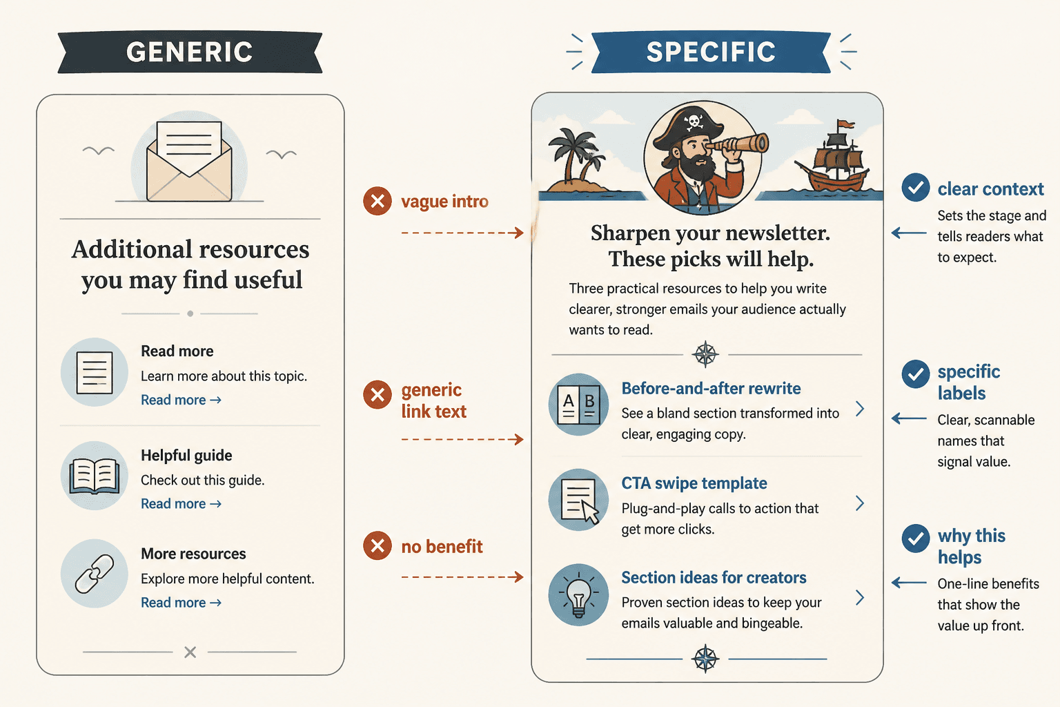
Make the resource block sound like your newsletter, not a plugin
One reason resource blocks feel tacked on is that the voice changes. The main issue sounds like you. The resource block suddenly sounds like software-generated furniture instructions.
Keep the same voice you used in the rest of the newsletter. If your writing is dry and direct, let the block be dry and direct. If your style is warmer and more conversational, keep that too. Just do not let the tone collapse into generic “helpful content” mode.
For example:
Too bland: Here are some additional resources you may find useful.
Better: If this issue hit a nerve, start with these.
Too bland: You can also explore the following related content.
Better: If your newsletter still feels a little bolted together, these will help.
Too bland: Check out these helpful links.
Better: A few genuinely useful next reads, not just decorative links.
You do not need to be cute. You do need to sound awake.
Use internal links like a guide, not a dumping ground
If the resources you are linking are your own articles, great. That can build depth, authority, and time on site. But the same rule still applies: the links have to earn their place.
For this topic, a smart internal resource block could naturally point readers to related pieces like how to write newsletter sections and formats without sounding salesy or robotic, how to rewrite boring newsletter sections and formats, simple newsletter CTA block templates for busy creators, and newsletter section ideas and examples for creators.
Notice the logic there. Each link solves a related but distinct problem:
- One helps with tone
- One helps with rewriting
- One helps with CTAs
- One helps with idea generation
Newsletter structure works best when each section has one clear job and supports the main point of the issue. Simpler formats usually outperform busier ones when the writing stays sharp.