
Most newsletters do not have a writing problem. They have a structure problem.
For the broader learning path, visit our parent guide.
You can have solid ideas, decent voice, and useful expertise, then still send emails that feel oddly forgettable. Why? Because the sections are random, the format changes for no reason, and the reader has to work too hard to figure out what matters.
That is usually the real issue behind weak newsletter performance. Not “the algorithm.” Not your font. Not some magical send-time theory from a guy with a screenshot and too much confidence.
If you want to know how to write better newsletter sections and formats, the answer is not to make your newsletter longer, prettier, or more “content-rich.” It is to build sections that do distinct jobs, then arrange them in a format your readers can follow without getting lost or bored.
Here’s how to make your newsletter easier to read, more useful, and much more likely to earn clicks, replies, trust, and the rare honor of being remembered.
What most people get wrong about newsletter sections
A lot of creators treat a newsletter like a bucket.
They dump in a thought, a story, three links, a soft pitch, an update, a quote, a podcast mention, and a vague question at the end. Technically, yes, that is a newsletter. In the same way a kitchen drawer full of batteries, receipts, and old chargers is technically a storage system.
Good newsletter sections are not just chunks of content separated by bold text. Each section should have a clear role. It should answer one of these questions:
- What should the reader pay attention to first?
- What is the main idea or lesson?
- What extra value supports that idea?
- What action should they take next?
- Why should they keep opening future emails?
When your sections do not have jobs, your newsletter turns into a mildly organized wall of stuff. Readers feel that instantly, even if they cannot explain it.
What a good newsletter format actually does
A strong format is not about forcing every email into the exact same mold forever. It is about creating enough consistency that readers know how to move through the email, while still giving yourself room to keep it interesting.
A useful format should do four things:
- Orient the reader quickly so they know what this email is about
- Prioritize the best material instead of burying it halfway down
- Create rhythm so the email feels easy to read
- Support your goal, whether that is replies, clicks, trust, sales, or simple consistency
If your format makes the reader hunt for the point, it is not clever. It is annoying.
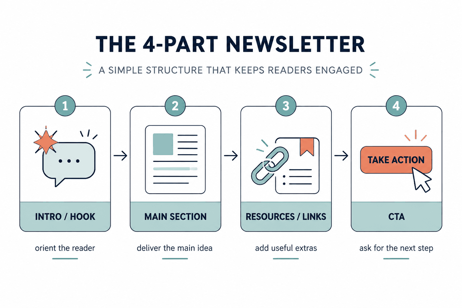
The core newsletter sections worth using
You do not need all of these in every email. In fact, you probably should not use all of them in every email. But these are the main building blocks that make newsletters feel intentional instead of improvised.
1. The opening hook
This is the part that gets the reader into the email itself. Not the subject line. The first few lines after the email opens.
Your opening should answer: why should they care about this email right now?
Good opening hooks often do one of these:
- Name a common mistake
- Raise a tension point
- Challenge an assumption
- Promise a practical payoff
- Open a story that clearly leads somewhere
Weak opening: “Hope you’re having a great week. Today I wanted to share some thoughts on content strategy.”
Better opening: “A lot of newsletters lose readers in the first 20 seconds because the opening says nothing except ‘I sent an email.’”
The second version has a point. The first version is polite wallpaper.
2. The main lesson or feature section
This is the meat of the email. The thing people would still remember a day later if the newsletter did its job.
Usually, this section should focus on one main idea. Not five medium-sized ones pretending to be a theme. A newsletter gets stronger when it is built around a single useful point with a clear takeaway.
This section can take different shapes:
- A short lesson
- A breakdown
- A story with a practical point
- A framework
- A case-study mini analysis
- A contrarian opinion with evidence
If the section starts drifting, cut it back to one sentence: What is the actual thing I want the reader to understand, believe, or do after this?
3. The proof or example section
Advice gets stronger when readers can see it working.
You do not need a giant case study every time, but your newsletter gets more convincing when you include examples, comparisons, tiny rewrites, screenshots later if you use visuals, or even a quick “before/after” explanation.
For example, if you are teaching email hooks, do not just say “make them more specific.” Show a weak one and a sharper one. That closes the gap between theory and use.
This section is especially useful if your audience is made of creators, consultants, coaches, freelancers, and founders. These readers usually do not need more abstract wisdom. They need help seeing what better actually looks like.
4. The resource or link block
This is where people often get messy.
A resource section can work beautifully, but only if it feels curated. Too many newsletters treat links like they are emptying their pockets at airport security.
A strong resource block might include:
- One related article
- One tool
- One example
- One previous newsletter issue
- One relevant offer or next step
Notice the word one. The goal is not volume. It is relevance.
If this is an area you want to tighten up, it helps to study sharper examples and specific fixes. You can build on the ideas in best newsletter sections and formats ideas and examples for creators and how to improve newsletter sections and formats resource blocks without sounding generic.
5. The CTA section
Your call to action should fit the weight of the email.
If you spent 700 words teaching something useful, then abruptly yell “BOOK A CALL,” the shift feels weird. A good CTA should feel like a natural continuation of the email, not a trap door into your funnel.
Common newsletter CTAs include:
- Reply with a question or opinion
- Read a related article
- Download a resource
- Check out an offer
- Share the newsletter
- Visit a booking or sales page
The softer and more relevant the CTA, the more likely it is to work over time.
Weak CTA: “If you want to 10x your business, click here now.”
Better CTA: “If your newsletter has useful ideas but still feels structurally messy, I put together a deeper guide on sections and formats here.”
6. The recurring signature section
This is optional, but underrated.
A recurring signature section gives your newsletter identity. It can be something small and consistent, like:
- A “one thing to try this week” prompt
- A quick teardown
- A “worth stealing” example
- A short opinion box
- A single recommended resource
- A reader question section
This kind of repeatable section helps readers build familiarity with your format. It also makes writing easier because not every issue has to be invented from scratch.
How to choose the right newsletter format
The best format depends on your goal, your audience, and the kind of material you usually send. Not every newsletter should look like a tiny magazine. Not every newsletter should feel like a founder memo either.
Here are a few practical formats that work well.
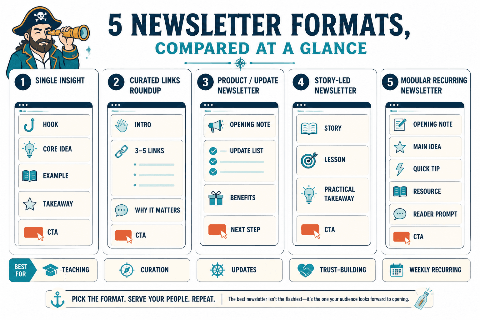
Format 1: The single-idea newsletter
Best for: educators, writers, consultants, coaches, and personal brands with useful opinions or frameworks.
- Hook
- Main lesson
- Example or proof
- Simple CTA
This is often the strongest format if you want clarity, consistency, and easier writing. One email. One sharp idea. No clutter.
Format 2: The lesson plus links newsletter
Best for: creators who want a core editorial voice but also want to share curated resources.
- Hook
- Main lesson
- 2–3 curated links with a sentence of context each
- CTA
This format works well when the links support the lesson instead of distracting from it. The context matters. Raw links are lazy. Tell people why each one is worth their time.
Format 3: The roundup newsletter
Best for: niche curators, researchers, industry commentators, and people whose value comes from filtering a noisy space.
- Quick intro
- 3–5 categorized resources or updates
- Short commentary on each
- One featured takeaway
- CTA or reply prompt
This format can work, but only if your curation is genuinely useful. If you are just forwarding internet leftovers with no taste, people will stop caring fast.
Format 4: The story-led newsletter
Best for: creators with strong voice, coaches, consultants, and founders who can turn lived observations into practical lessons.
- Story opening
- Tension or turning point
- Lesson pulled from the story
- Practical takeaway
- CTA
This format is good when the story earns its place. If the story exists only to make the email feel “authentic,” readers can smell the performance.
Format 5: The modular recurring newsletter
Best for: weekly newsletters with repeatable sections.
- Opening note
- Main idea
- Quick tip
- Recommended resource
- Reader question or prompt
- CTA
This format can be excellent if your audience likes predictability. Just do not let the sections become stale. Repeating a structure is smart. Repeating dead energy is not.
A simple framework for building better newsletter sections
If your newsletter currently feels loose, use this process before you draft the next issue.
Step 1: Decide the one thing this email is doing
Pick the primary job:
- Teach something
- Build trust
- Drive clicks
- Start conversation
- Sell softly
- Curate useful material
If you try to do all six at once, the email usually gets muddy.
Step 2: Choose 2 to 4 sections max
Most newsletters improve when they get simpler. You do not need eight sections unless you are publishing something intentionally magazine-style.
A clean issue often looks like this:
- Opening
- Main section
- Proof/example
- CTA
Or this:
- Opening
- Main section
- Resource block
- Reply prompt
Step 3: Make each section earn its space
Ask of every section:
- What job is this doing?
- Would the email be stronger without it?
- Is this clear in under a few seconds?
- Does this support the main point, or distract from it?
If a section is only there because newsletters are “supposed” to have one, cut it.
Step 4: Order sections by reader interest, not your writing process
A lot of people write in the order they thought of things. That is not the same as the order readers should experience them.
The most interesting or useful material usually belongs earlier than you think. Stop burying the good part under housekeeping, throat-clearing, and “a few quick updates.”
Step 5: Tighten transitions
Sections should feel connected, not stapled together.
Simple transition lines help:
- “Here’s where this goes wrong.”
- “A quick example makes this easier to see.”
- “If you want to use this right away, start here.”
- “Now for the part people usually overcomplicate.”
Little lines like that make the whole newsletter feel more intentional.
Before and after: fixing messy newsletter formatting
Here is a common weak structure:
Hey everyone, hope you’re doing well. I have been thinking a lot lately about content, consistency, and brand voice. There are so many lessons in this area. Also, I published two new posts, did a podcast, and updated my offer. Here are four links. Let me know what you think.
The problem is not just the writing. The format is doing nothing to help the reader.
Here is a stronger version:
A lot of creators think their newsletter needs more content. Usually, it needs better structure.
When an email tries to be lesson, life update, resource dump, and sales pitch all at once, readers skim the whole thing and remember none of it.
This week’s idea: give each section one clear job.
For example, if your opening hook is about weak newsletter structure, your next section should show the mistake, not wander into three unrelated updates.
One practical fix: use this order in your next issue: hook, main lesson, one example, one CTA.
Worth reading: I also put together a deeper guide to newsletter sections and formats for creators who want better results.
If you want, reply with your current newsletter format and I’ll tell you where it is getting bloated.
Same general topic. Much better shape. Now the reader knows what matters, what to do with it, and where to go next.
Formatting choices that make newsletter sections easier to read
Good format is not just section order. It is also presentation.
Most newsletter readability problems are plain visual friction. Too much text packed together. Too many section labels. Not enough white space. Or the opposite problem: every sentence broken onto its own line like it is trying out for dramatic theater.
Here is what tends to work best:
- Short paragraphs
- Clear subheads when the email is longer
- Bold used sparingly for anchors, not decoration
- Lists for steps, options, or examples
- Enough spacing between sections to create rhythm
- Consistent section labeling if you use recurring segments
And here is what usually hurts:
- Huge walls of text
- Five different formatting styles in one email
- Too many links in a row
- Over-designed section headers
- Every sentence trying to sound profound
- A format that changes so much readers cannot build familiarity
If your newsletter reads like a polite avalanche, trim it.
How to keep recurring sections from getting stale
Recurring sections are useful because they reduce decision fatigue. They are dangerous because they can become robotic.
The trick is to keep the function stable while letting the content breathe.
For example, maybe you always include a “one thing to try” section. Great. But that section can rotate between:
- A writing prompt
- A formatting test
- A subject line challenge
- A CTA rewrite
- A content repurposing idea
Same slot. Different expression. That keeps the format familiar without becoming dead on arrival.
This is also where repurposing helps. If you have old posts, threads, outlines, or client explanations sitting around, they can often become sharper newsletter sections with some editing. If that is your situation, how to turn old content into better newsletter sections and formats is a useful next read.
Common newsletter section mistakes
- Too many sections: More parts does not mean more value. It often just means more friction.
- Weak section labels: “A few thoughts” is not a useful signpost.
- No hierarchy: Everything looks equally important, so nothing feels important.
- Buried CTA: If the action matters, do not hide it under six unrelated links.
- Random curation: Links without context feel lazy.
- Repetitive structure with no freshness: Predictable is fine. Stale is not.
- No clear main idea: Readers should be able to say what the issue was about in one sentence.
A practical newsletter template you can steal
If you want a simple format that works for a lot of creator newsletters, start here:
- Opening hook: 1 to 3 short paragraphs naming the real problem
- Main lesson: 3 to 6 paragraphs explaining the core idea
- Example or application: one quick example, rewrite, or scenario
- Resource block: 1 to 2 relevant links with context
- CTA: one next step, reply prompt, or offer
Filled-in example:
Opening hook: Most newsletters do not need more sections. They need fewer sections doing clearer jobs.
Main lesson: If your email tries to teach, curate, update, and sell all at once, readers usually skim past the best part. A better approach is to decide the one thing the issue is doing, then build the sections around that.
Example: Instead of writing ?Here are a few things on my mind,? give the issue one clear job and let every section support it.
That is usually what makes a format feel better. Not more decoration. Just clearer jobs for each part of the email.