Most newsletters do not have a writing problem. They have a structure problem.
The creator behind the newsletter usually knows plenty. They have opinions, stories, links, offers, half-finished drafts, maybe a mild addiction to overexplaining. But when it is time to send, everything gets dumped into one floppy email with no shape, no rhythm, and no reason for the reader to keep going.
That is why a good newsletter is not just “write something valuable and hit send.” The sections matter. The format matters. The order matters. And yes, the wrong structure can make smart ideas feel forgettable.
This Newsletter Sections and Formats Guide for Creators will help you build emails people can actually follow, enjoy, and act on. We are covering what sections to include, which newsletter formats work best for different goals, what creators keep doing wrong, and how to choose a layout that does not feel like a recycled internet handout with your logo slapped on top.
If you want a broader foundation first, the main newsletter sections and formats hub is a solid place to start. But if you are here because your newsletter feels messy, bland, or strangely exhausting to write, good. That is fixable.
If you want the bigger picture, start with the parent guide.
Why newsletter sections matter more than most creators think
People do not open newsletters hoping to admire your formatting choices. They open because they want something: insight, entertainment, perspective, practical help, a useful link, a sharp take, a reason to trust you more, or a nudge toward the next step.
Sections help deliver that clearly. They give your email a predictable shape without making it boring. They also make your newsletter easier to skim, easier to write consistently, and easier to improve over time.
Without sections, creators tend to do one of three things:
- Write rambling emails with no real payoff
- Stuff five different ideas into one issue and call it “value”
- Default to vague updates no one asked for
That last one is especially common. A lot of newsletters read like this: “Here’s what I’ve been thinking about lately…” followed by 900 words of light drifting. Not illegal. Just not very effective.
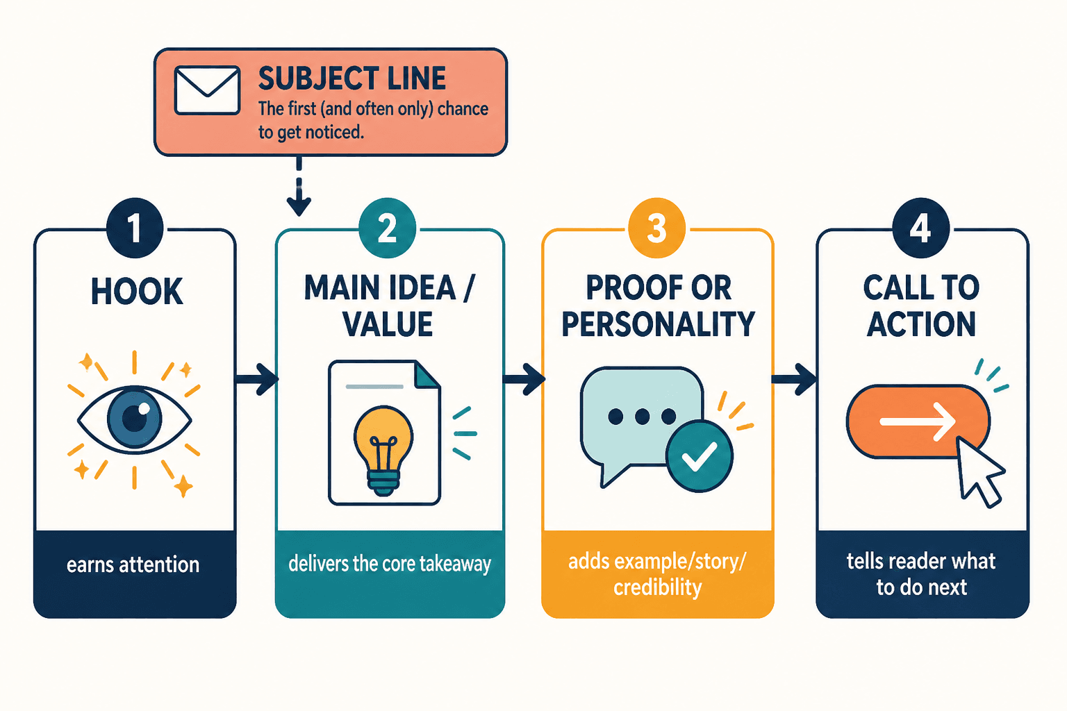
A good sectioned newsletter gives each part a job. One part earns attention. One part delivers the main idea. One part adds proof or personality. One part creates action. That is a newsletter people remember.
The core newsletter sections most creators should know
You do not need every section in every email. Please do not turn that into a checklist obsession. But you should know the common parts, what they do, and when they are worth using.
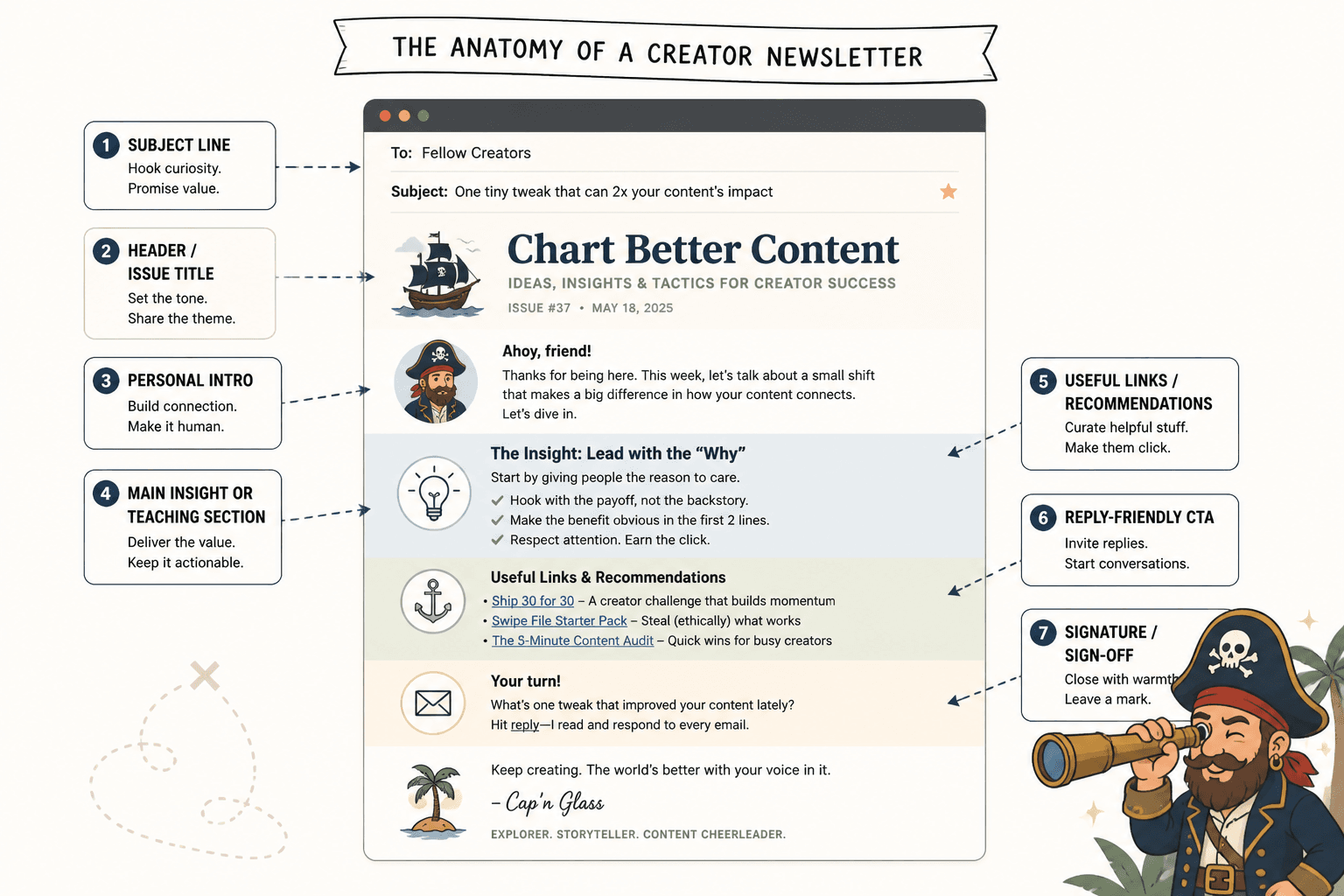
1. Subject line
This is technically outside the email body, but it still counts. If the subject line is weak, the rest of your carefully arranged sections are basically performing in an empty room.
Good subject lines are usually one of these:
- Specific and useful
- Curiosity-driven without sounding like a scam artist
- Opinion-based
- Benefit-led
- Simple and clear
Examples:
- Why most creator newsletters feel forgettable
- 3 newsletter sections I would keep if I had to start over
- A better format for low-effort weekly emails
- The easiest way to make your newsletter easier to read
2. Opening line or intro
This is where most creators waste momentum. They thank the reader, apologize for being late, mention the weather, or start with throat-clearing that says nothing.
Your opening should do one of three things quickly:
- Name the problem
- Make an interesting claim
- Set up the lesson or story
Weak opening:
Hope you’re having a great week. I wanted to share a few thoughts about newsletters and consistency.
Stronger opening:
A lot of creator newsletters are not underperforming because the ideas are bad. They are underperforming because the email has no shape.
3. Main idea section
This is the heart of the issue. If your newsletter has one thing readers should remember, it lives here.
Common options:
- A lesson
- A breakdown
- A short essay
- A story with a clear point
- A framework
- A curated insight with commentary
One warning: “main idea” does not mean “largest blob of text.” It means the part carrying the value. Keep it focused. If your main section contains three unrelated ideas, you do not have one strong newsletter. You have a group project.
4. Supporting section
This adds depth without dragging the issue into the swamp. It might be:
- An example
- A quick case study
- A personal observation
- A reader question
- A “what to do instead” list
- A resource or tool recommendation
The supporting section is useful because it helps your newsletter feel fuller without making it chaotic. It is the side dish, not the table.
5. Curated links or resources
This section works well for creators who want a repeatable format and a reason to email consistently. But do not just dump links into the issue like a bookmarks folder in public. Add a sentence on why each link matters.
Bad:
Here are 5 links I liked this week.
Better:
3 things worth your time this week: one smart article on audience trust, one tool that makes idea capture less annoying, and one example of a creator welcome email that actually sounds human.
6. Personal note or behind-the-scenes section
This can work beautifully if it has a point. It fails when it becomes diary sludge.
A useful personal section usually does one of these:
- Shows how you think
- Reveals a lesson from your work
- Adds personality to an otherwise practical issue
- Builds trust through specificity, not oversharing
You do not need to be emotionally naked to be memorable. In fact, please relax on that front.
7. Call to action
Every issue does not need a hard sell. But most newsletters should have some kind of next step.
That could be:
- Reply to the email
- Read a related article
- Check out an offer
- Book a call
- Share the newsletter
- Browse a resource
The CTA should match the email. If the issue is soft, reflective, and useful, a sudden “BUY NOW” at the end feels like someone flipped the lighting and started yelling.
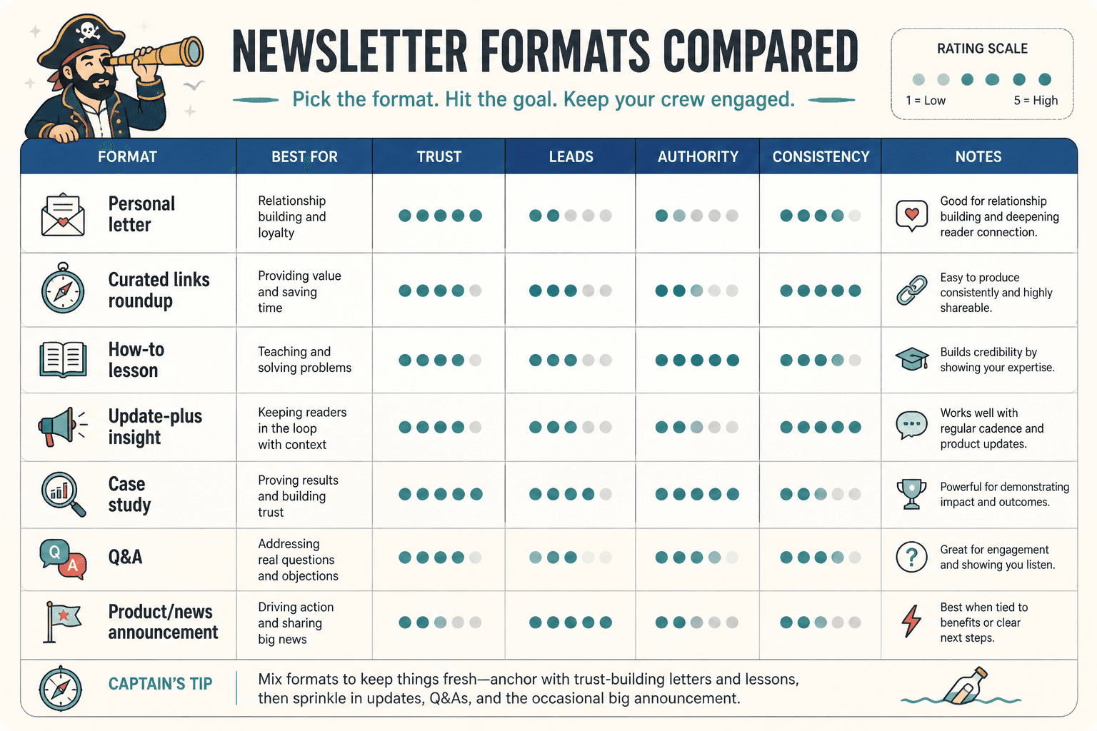
The most useful newsletter formats for creators
The best newsletter format depends on what you are trying to do. Grow trust? Build authority? Drive clicks? Stay consistent without making your weekly send feel like unpaid emotional labor? Different goal, different format.
The single-idea format
This is one of the best newsletter formats for creators because it is simple, focused, and easy to read. You pick one useful idea and explore it properly.
Basic structure:
- Strong opening
- Main lesson or argument
- Example or application
- CTA
Best for:
- Coaches
- Consultants
- Writers
- Educators
- Creators building trust through expertise
This format works because readers know what they are getting: one clear point, well delivered. No buffet tray of random thoughts.
The roundup format
This is the classic “3 links, 2 lessons, 1 recommendation” style. It can work well if your audience likes curation and your commentary adds value.
Basic structure:
- Quick intro
- Curated items with commentary
- Optional mini takeaway
- CTA
Best for:
- Curators
- Industry observers
- People with a lot of good source material
- Creators who want a lower-friction weekly format
The trap here is becoming a link pile. If your audience could get the same value from scrolling social feeds, your roundup is not doing enough.
The story-plus-lesson format
This format starts with a short story, observation, or moment, then pulls out a practical takeaway.
Basic structure:
- Scene or anecdote
- Tension or insight
- Lesson
- Action step or CTA
Best for:
- Personal brands
- Coaches
- Writers
- Founders with a point of view
This works when the story actually earns its place. If the lesson is tiny and the anecdote is doing gymnastics to justify itself, readers can feel that.
The tactical format
This one is all about immediate usefulness. Think checklists, steps, templates, examples, before-and-after rewrites, mini frameworks.
Basic structure:
- Name the problem
- Give the process
- Add examples
- Close with next step
Best for:
- Service providers
- Consultants
- Educators
- B2B creators
- Anyone selling expertise
This format is great for authority. It gives people something they can use right away, which is usually more convincing than six paragraphs about your philosophy.
The update-plus-insight format
This combines a business or creator update with a useful takeaway. It is a nice option for founders and personal brands who want to share progress without sounding self-absorbed.
Basic structure:
- Quick update
- What it taught you
- Why it matters to the reader
- CTA
The key line there is why it matters to the reader. Leave that out, and you just emailed people your week.
How to choose the right newsletter format for your goals
If your format changes every week based on your mood, your newsletter gets harder to write and harder to follow. Some variety is good. Format chaos is not.
Choose based on these five questions:
1. What is this newsletter mainly supposed to do?
- Build trust
- Show expertise
- Drive clicks
- Start conversations
- Sell gently
- Keep your audience warm
One issue can do more than one thing, sure. But it should still have a main job.
2. How much complexity does the idea need?
Some ideas need 300 tight words. Some need a fuller breakdown. If the idea is small, do not force it into a grand six-section experience. Short can be excellent when the point is sharp.
3. What can you realistically sustain?
A lot of creators pick formats based on what looks impressive, not what they can keep doing. Then they burn out trying to produce a tiny digital magazine every week.
The best format is often the one you can repeat without resentment.
4. What does your audience actually respond to?
Look at replies, clicks, saves, and conversations. Which issues earn attention? Which ones get polite silence? That tells you more than newsletter theory ever will.
5. Where does the newsletter fit in your wider content system?
Your email should not exist in a vacuum. It can connect to your broader email newsletter writing content, your article strategy, your lead magnet flow, or your offer ecosystem.
For example:
- A single-idea newsletter can become a LinkedIn post, article, or thread
- A roundup can link to your best recent resources
- A tactical issue can lead into a service, workshop, or template
- A story email can deepen trust before a soft pitch
If you want to build that system more deliberately, this broader newsletter writing section can help tie the moving parts together.
A simple newsletter structure that works for most creators
If you are overthinking all this, start here. This is a reliable format for a weekly creator newsletter that wants to be useful without becoming a production.
- Opening: one sharp line that frames the issue
- Main section: one lesson, idea, or argument
- Support: one example, story, or resource
- CTA: one clear next step
That is enough. Seriously.
You can make this more specific by naming repeatable sections. For example:
- This week’s idea
- What to try
- Worth a look
- Reply if…
Named sections create familiarity. Readers know the rhythm. You know what to write. Everyone wins.
What creators keep getting wrong with newsletter sections
A few mistakes show up again and again, and they quietly wreck otherwise decent newsletters.
Too many sections
If your email has seven sections, three emojis, a quote, a meme, two asks, and a product mention, that is not “packed with value.” It is crowded.
More sections do not automatically mean more substance. Sometimes they just make the issue feel fragmented.
No hierarchy
Everything cannot be equally important. If every section is introduced like a major event, the reader has no clue where to focus.
Your main point should feel like the main point.
Sections with no real purpose
Do not include “quote of the week” or “random thought” or “what I’m up to” just because newsletters seem to have those. Every section should earn its place.
Writing the same way in every section
If the intro, lesson, story, and CTA all sound identical, the email gets flat. Good newsletters have movement. A little change in pace helps.
This is where more human variation matters. A strong newsletter is not just efficient. It has texture. One section might be blunt and tactical. Another might breathe a little more and give the idea room. You do not need to turn every paragraph into a clipped little bullet-shaped object.
Sometimes a concept needs a bit of space. If you are explaining a shift in thinking, unpack it. If you are making an argument, let it build. Readers are not allergic to paragraphs. They are allergic to pointless ones.
Bad CTAs at the end
A surprisingly common move is writing a thoughtful email, then ending with a CTA that sounds like it escaped from a funnel template pack.
Instead of this:
If you’re ready to transform your business, click here to unlock the next level.
Try this:
If your newsletter still feels messy after this, I put together more practical examples here: best newsletter sections and formats ideas and examples for creators.
Or this:
Want help tightening your actual email structure? Read how to write better newsletter sections and formats.
Sample newsletter section combos that actually make sense
You do not need infinite creativity here. You need a few smart combinations you can repeat.
| Goal | Section combo | Why it works |
|---|---|---|
| Build trust | Sharp intro + lesson + example + soft reply CTA | Shows expertise without overselling |
| Drive clicks | Hook + curated picks + commentary + link CTA | Makes resource-based issues more useful |
| Sell gently | Problem + insight + case example + offer CTA | Earns interest before asking |
| Stay consistent | Short intro + one idea + one resource + quick CTA | Low friction and repeatable |
| Show personality | Story + lesson + practical takeaway + reply prompt | Feels human without drifting into fluff |
Newsletter formats for creators with small audiences
If your audience is still small, do not copy the giant “media newsletter” model unless you deeply enjoy unnecessary work.
Small-audience creators usually do better with:
- Tighter emails
- Clearer positioning
- More direct usefulness
- Reply-friendly CTAs
- Stronger personality
You do not need a massive production to get results. You need relevance. A small list of the right readers is far more valuable than a bigger list full of ghosts, freebie collectors, and people who subscribed during a temporary lapse in judgment.
For that specific angle, read newsletter sections and formats for creators with small audiences.
Tools and templates can help, but they will not save a weak format
Templates are useful when they reduce friction. Tools are useful when they help you draft faster, organize ideas, save repeatable structure, and keep the issue focused.
But they still cannot rescue a weak format. Clear sections and a clear purpose matter more than fancy tooling every time.