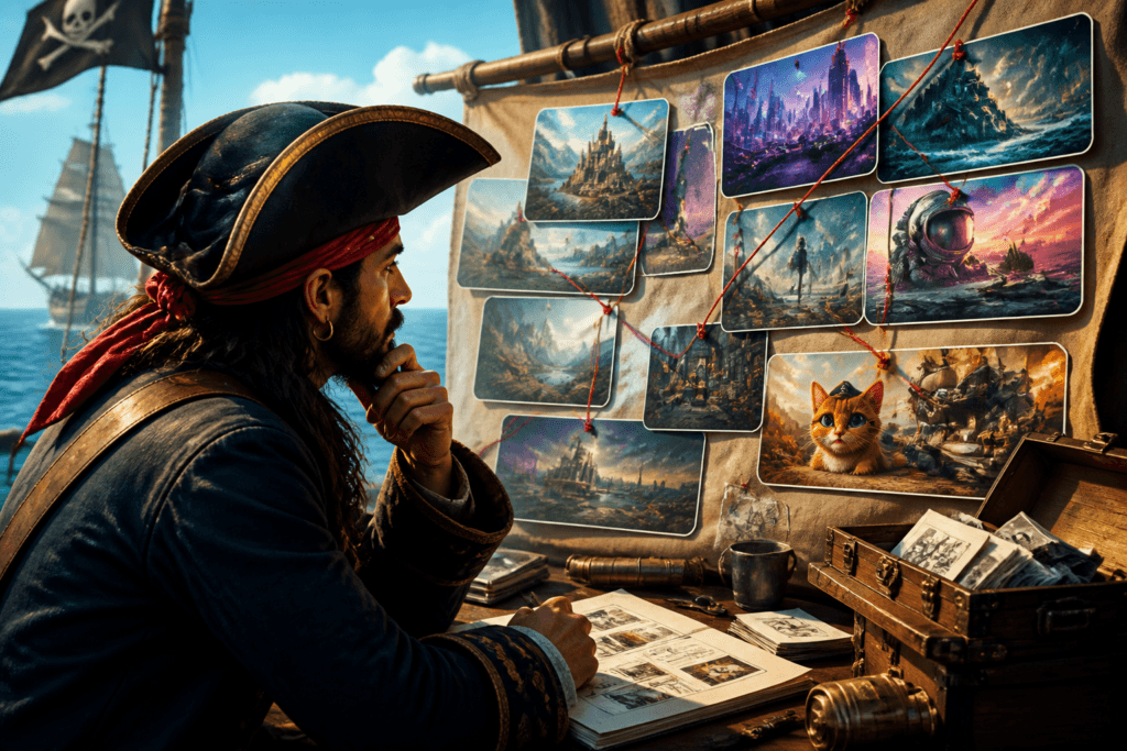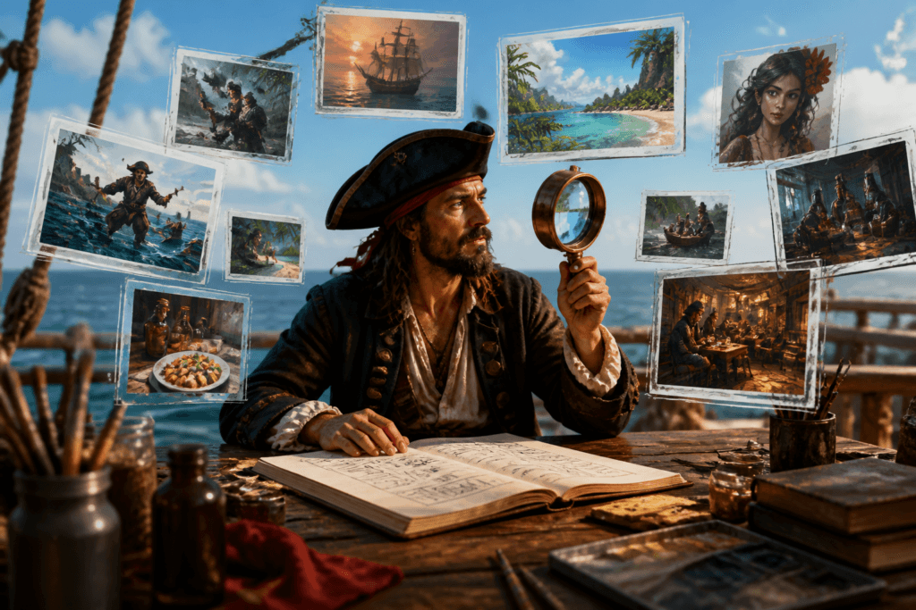
A blog post is half written, the newsletter still needs a header, the promo graphic looks like it was assembled during a weather event, and the lead magnet cover is somehow both blank and overdesigned. That is the sort of content mess where AI images either become a time saver or a waste of perfectly good attention. The useful question is not whether to use AI at all. It is which visual job needs doing, and whether AI is the right tool for that job.
This article is a practical tour of AI image use case examples for creators: where the format helps, what it is good for, and where it quietly makes life worse. For the broader planning side, the AI image use cases guide is the companion piece that covers the decision layer in more detail.
What AI images are actually good for
AI images are most useful when the goal is not fine art, but a content asset that needs to be useful, on-brand, and quick to produce. That usually means one of four things:
- Speed: you need something publishable without a long design pass.
- Consistency: the same visual format needs to work across posts, issues, or products.
- Clarity: the image should help explain an idea, not compete with it.
- Iteration: you want to test several options before settling on one.
That is why AI images tend to work better as repeatable content pieces than as one-off masterpieces. The win is not “look at this astounding image.” The win is “this asset got the post out the door and still looks intentional.” Not glamorous, but very on-brand for actual work.
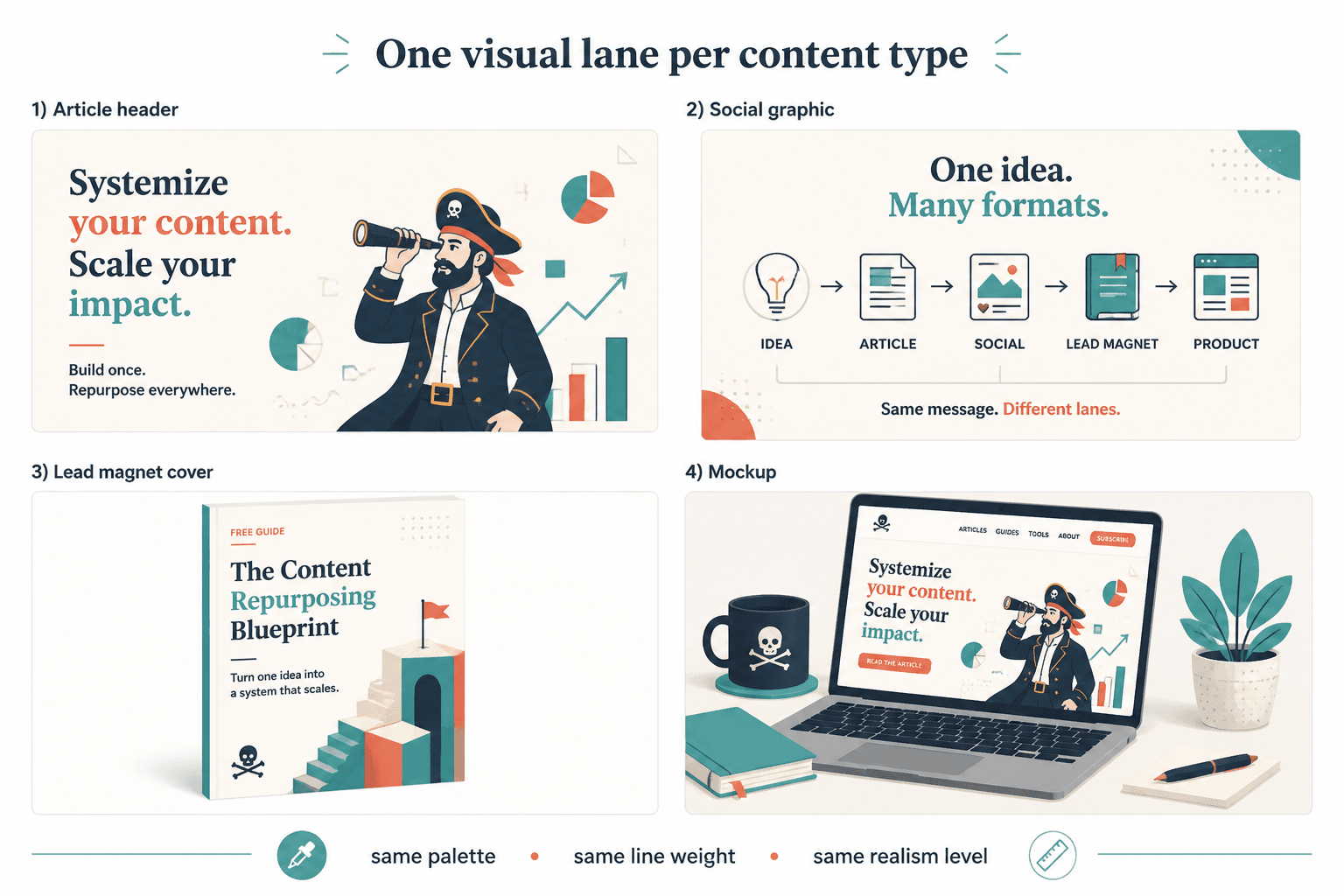
1. Blog header graphics
Blog headers are one of the cleanest AI image use cases because they need to do a specific job fast: signal the topic, match the article mood, and not distract from the title. AI works well here when the format is standardized and the visuals are more conceptual than literal.
Good blog header examples include:
- abstract scenes that reflect a topic such as planning, systems, or visibility
- editorial-style visuals that match a brand palette
- simple conceptual illustrations instead of highly detailed scenes
- reusable header formats for a series or content category
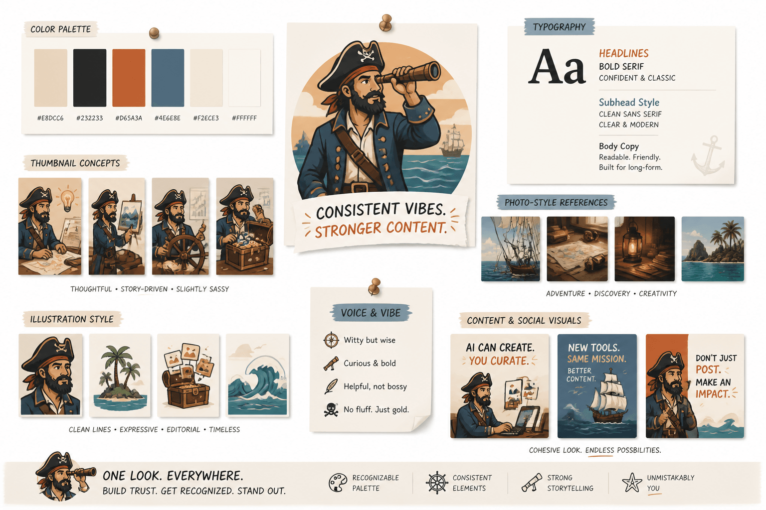
This is where reusable design beats novelty. A grid of repeatable blog graphic types will usually serve you better than a fresh experiment every week. If you are building that kind of workflow, the parent guide has the broader framework, and the sibling post on AI image use cases contextually belongs in the same planning bucket.
2. Newsletter header templates
Newsletter headers are another strong fit because they need consistency more than drama. A good header gives the issue a recognizable identity without forcing a different visual language every week. AI can help generate themed background scenes, branded textures, or simple concept images that stay aligned with the newsletter’s tone.
Useful newsletter header use cases include:
- branded background textures
- topic-based conceptual illustrations
- minimal scene-setting visuals for issue mood
- stylized objects tied to the newsletter’s niche
If the header looks clever but not coherent, it is probably doing too much. Newsletter visuals should feel like a stable frame around the writing, not a rival act.
3. Social graphics and carousel backgrounds
Social graphics are where AI images can either save time or create a small pile of visual noise. The sweet spot is background treatment: abstract shapes, thematic scenes, or visual metaphors that make the slide readable and branded without trying to narrate the whole post.
This works especially well for:
- carousel covers
- quote cards
- announcement graphics
- idea slides with a strong title
For these formats, the image is support. The writing still has to carry the point. That is good news, because it keeps the visual work contained and makes reuse much easier.
4. Lead magnet covers and worksheet covers
Lead magnets need to look useful before anyone opens them. A cover that feels generic can make the whole thing feel less credible, even if the content is strong. AI images can help create polished covers for checklists, workbooks, mini-guides, and templates when the visual needs to suggest a topic clearly and quickly.
Good examples include:
- a worksheet cover with a clean conceptual illustration
- a workbook cover that matches a campaign palette
- a mini-guide cover with a simple, legible focal point
- a bundle cover that looks cohesive across multiple assets
If you want the cover to imply structure, AI is useful. If you need exact product photography, precise brand compliance, or a real-world object that must be accurate, the tool gets less interesting fast.
5. Visual metaphors for abstract ideas
Some topics are easy to explain in text and awkward to show visually. That is where AI image use cases become genuinely handy. A visual metaphor can make a concept feel concrete without pretending to be literal documentation.
Examples:
- “content system” as a tidy assembly line or workflow map
- “creative momentum” as a moving set of connected pieces
- “brand consistency” as matching asset types in one style
- “decision fatigue” as a cluttered desk or overloaded branching path
The trick is to keep the metaphor readable. If the image needs a paragraph of explanation before it makes sense, it is no longer helping.
6. Product mockups and offer previews
Product pages, sales pages, and offer promos often need visuals before the polished final asset exists. AI can help produce mockups that show the shape of an idea: a digital workbook, a course cover, a template bundle, or a downloadable resource presented in a realistic context.
That is especially useful when you are testing an offer or building a page before final production materials are ready. The image is not there to fake the product. It is there to help the page function while the real asset is being developed.
For product and offer visuals, consistency matters more than cleverness. A simple set of matching mockups usually beats a single dramatic image with no system behind it.
7. Framework, checklist, and comparison visuals
When content has structure, AI images can help make that structure visible. Framework diagrams, checklist graphics, and comparison visuals are all strong use cases because the image is doing organizational work, not artistic heavy lifting.
These formats are useful for:
- how-to articles
- content strategy explainers
- step-by-step tutorials
- comparison posts
- resource roundups
AI is especially helpful when the visual can be built from repeating elements: steps, columns, cards, labels, or blocks. That makes the asset easier to understand and easier to reuse.
When AI images make the most sense
A simple way to choose the right use case is to ask what problem the image is solving.
- If the problem is speed: use AI for quick draft visuals, headers, or promo assets.
- If the problem is consistency: use AI to create repeatable templates and branded formats.
- If the problem is clarity: use AI for diagrams, metaphors, and structured visuals.
- If the problem is testing: use AI to compare concepts before committing to one.
That logic lines up with guidance from NIST’s AI Risk Management Framework, which emphasizes managing AI use with context and purpose instead of assuming one tool fits every task.
When AI images are the wrong answer
Not every visual should be synthetic. AI images are a poor fit when the content depends on real-world accuracy, documentary trust, or highly specific brand and product detail.
Be careful with AI when you need:
- real product photography
- true likenesses of people or places
- brand-critical visual systems with strict rules
- editorial imagery where authenticity matters more than style
For those cases, the better use of AI may be planning, not generation. Using the tool to speed up ideation is one thing; using it to impersonate reality is where the trouble starts.
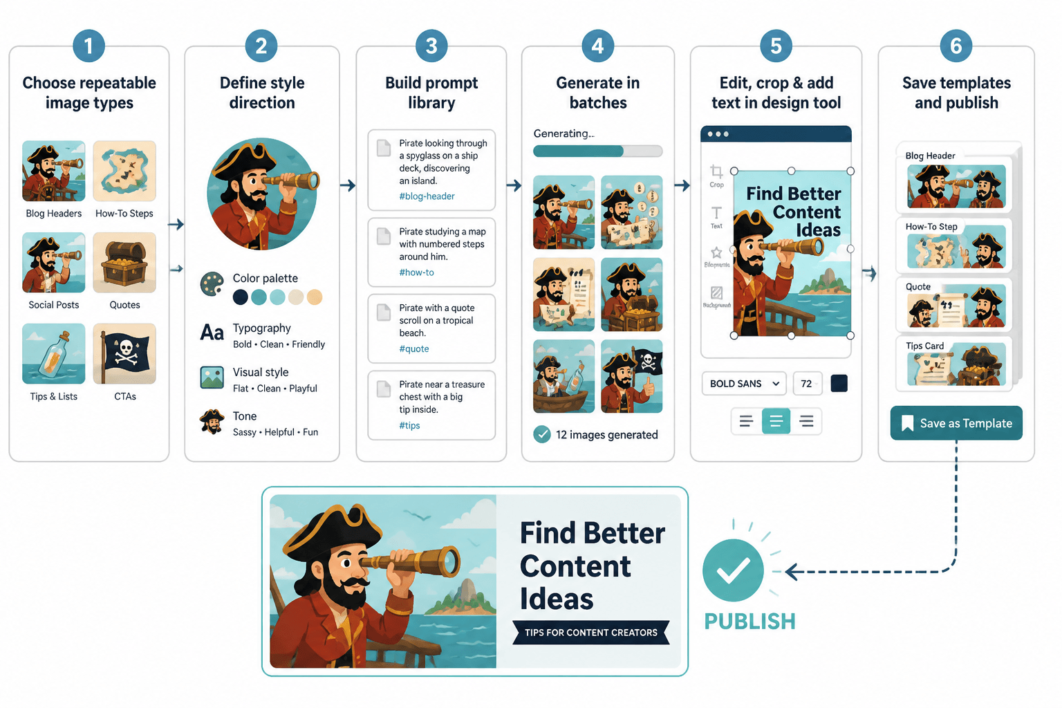
A simple workflow for better AI image use cases
The strongest results usually come from a short, repeatable workflow:
- Define the job: header, cover, diagram, mockup, or background.
- Set the format: dimensions, composition, and brand style.
- Generate a few options: not one, because first drafts are often overeager.
- Edit for clarity: remove anything that confuses the message.
- Save the pattern: turn a good result into a reusable template.
That last step matters most. The real payoff from AI image use cases is not a single polished asset. It is a system you can use again without starting from scratch every time.
Examples by creator task
For blog posts
Use AI for article headers, section dividers, and process visuals that reinforce the topic. Keep the style consistent across a category so the page feels organized rather than improvised.
For newsletters
Use AI for simple themed headers and issue mood visuals. The image should support the issue identity and not compete with the subject line.
For social promotion
Use AI for background art, quote card framing, and carousel cover graphics. The goal is a quick asset that makes the content easier to notice and easier to trust at a glance.
For lead magnets
Use AI for cover concepts, worksheet visuals, and bundle mockups. If the offer is structural and informational, AI can help it look finished sooner.
For digital products
Use AI for preview imagery, category graphics, and offer visuals that help people understand what the product is before they open it.
Bottom line
AI image use cases are most useful when they reduce friction in the content process without making the result feel generic. Blog headers, newsletter banners, social graphics, lead magnet covers, visual metaphors, mockups, and structured diagrams are all solid examples because they solve real publishing problems.
The best approach is usually not more image generation. It is better judgment about where the image belongs, what job it should do, and how often it can be reused before anyone starts building another small museum of “almost right” assets.
For the broader workflow and decision framework, see the AI image use cases guide. For adjacent creator-focused examples, the sibling articles on blog graphics, newsletter headers, and coach/personal-brand use cases fit naturally next in the cluster.