
Bad CTAs usually do not fail because they are too short. They fail because they ask for an action before the reader is ready, or because the wording explains everything except the one thing that matters: what happens next. A CTA is not decorative copy at the end of a paragraph. It is the handoff. If that handoff is fuzzy, the whole page loses a step.
The useful framing is simpler than most CTA advice makes it sound. A strong CTA matches the reader’s context, gives them a clear next move, and removes just enough friction that the next click, reply, or sign-up feels obvious rather than heroic. That is the job. Everything else is garnish.
What a CTA is actually supposed to do
A call to action tells the reader what to do next. That sounds obvious, but plenty of CTAs stop at the noun and forget the job. “Learn more,” “Get started,” and “Click here” technically count as CTAs, but they often do very little persuasion work unless the context around them is already doing the heavy lifting.
A better CTA does three things at once:
- Names the action clearly
- Signals the value of taking that action
- Fits the reader’s level of intent or trust
That last point matters more than copywriters like to admit. A CTA is not good in isolation. It is good because it matches the moment.
Why most CTAs underperform
Most weak CTAs are not broken in dramatic ways. They are just vague, misaligned, or asking for too much too soon. That is how otherwise solid pages end up with little conversion pull. The copy may be fine. The CTA may be the weak joint.
Common reasons CTAs underperform:
- The ask is too big. A reader who barely knows you is not ready for a high-commitment move.
- The wording is generic. “Submit” and “Continue” say almost nothing.
- The CTA is buried. If the reader has to hunt for the next step, many will not bother.
- The message and CTA do not match. A warm, helpful page should not end with a cold, abrupt command.
- The CTA tries to sound clever. Clever is fine. Confusing is expensive.
The underlying issue is usually not creativity. It is fit. A CTA should feel like the natural next move after the reader has absorbed the page.
The 4 parts of a strong CTA
A useful CTA has four parts: the action, the value, the fit, and the friction remover. You do not need all four in every button line, but you should know whether each one is present somewhere nearby.
1. The action
The action should be obvious. Read, download, book, reply, compare, subscribe, request, buy. The more abstract the verb, the more likely the CTA will feel weak.
“Get started” can work when the surrounding context is strong. Outside that, it often behaves like corporate fog with a button attached.
2. The value
The reader should get a sense of why the action is worth taking. Value does not always need a full sentence, but it should be visible.
Examples:
- Download the checklist
- Read the full guide
- Book a 15-minute review
- See the examples
When the value is missing, the CTA feels like work with bad lighting.
3. The fit
Fit means the CTA matches the page, the reader, and the moment. A CTA on a product page should behave differently from a CTA in a newsletter, a blog post, or a landing page. A warm audience can tolerate more directness. A cold audience usually needs more context.
Use the parent guide for the broader conversion framework if you want the CTA tied to page structure as well: website conversion copy and CTA writing.
4. The friction remover
Sometimes the CTA is right, but the hesitation is still there. That is where friction reducers help: a short qualifier, a micro-promise, or a plain-language explanation of what happens next.
Examples:
- No signup required
- Takes about 2 minutes
- Includes examples
- You can unsubscribe anytime
These are not magic. They are just the copy equivalent of not slamming the door on your own foot.
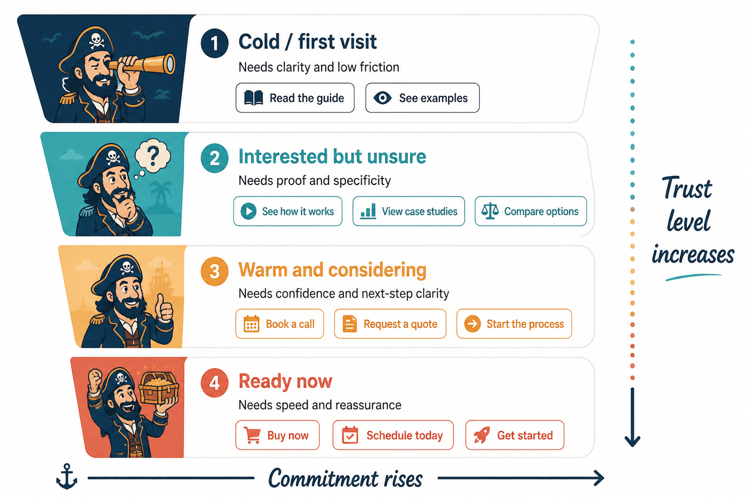
Match the CTA to the stage of trust
One of the easiest ways to improve CTA writing is to stop treating every reader as if they are equally ready. They are not. Some people are just learning who you are. Others have been around long enough to know exactly why they are here.
A CTA should reflect that difference.
- Low trust: offer a small, low-friction next step like reading, watching, or browsing examples.
- Medium trust: ask for a slightly stronger action like downloading a resource, joining a list, or comparing options.
- High trust: use direct CTAs like booking, buying, or requesting a service.
That is the same basic logic behind trust-ladder thinking in conversion copy: the more the reader already believes, the more direct your CTA can be. When the trust level is low, the CTA should feel like a helpful next step, not an ambush.
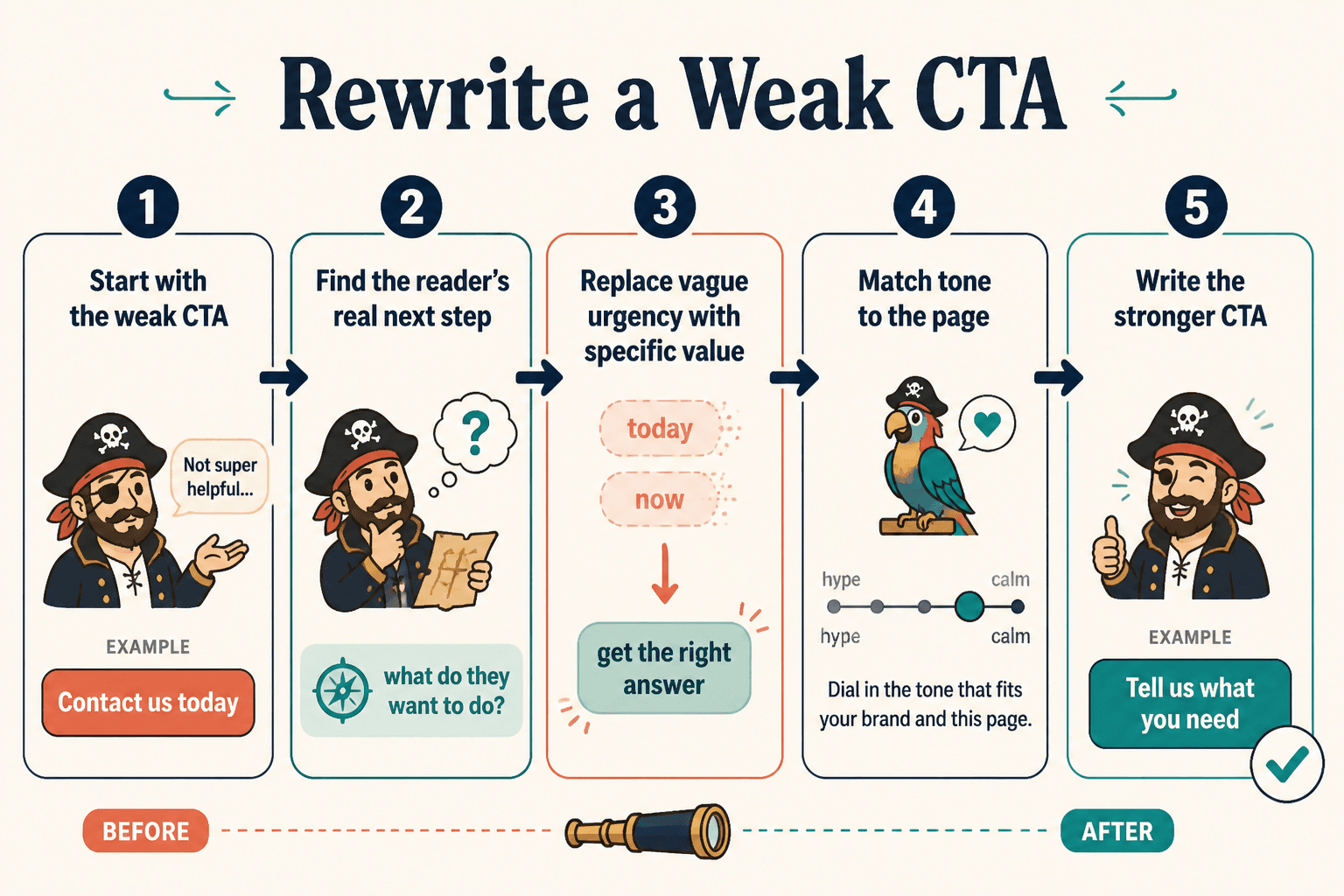
How to rewrite weak CTAs
Start by finding the actual action, then layer in the payoff. That is usually enough to turn a limp CTA into something usable.
- Replace vague verbs. Swap “submit” for “get the guide” or “book your call.”
- Cut filler. Words that sound official often just slow the reader down.
- Add one useful detail. Time, format, outcome, or scope can make a CTA feel safer.
- Match the tone. If the page is practical, the CTA should not suddenly become theatrical.
- Check the expectation. The CTA should promise what the next click actually delivers.
Here are a few plain rewrites:
- Weak: Learn more
Better: Read the full pricing breakdown - Weak: Get started
Better: Start your free trial - Weak: Contact us
Better: Book a 15-minute intro call - Weak: Download
Better: Download the checklist
Notice the pattern: the stronger versions do not just sound better. They reduce uncertainty.
Common CTA mistakes to avoid
Some CTA problems show up so often they deserve a small public shaming.
- Too many choices: Three buttons where one clear path would do.
- Too much explanation: The CTA is so over-explained that it loses shape.
- Wrong intensity: Asking for a sale when the reader is still deciding whether to care.
- Mismatch with the body copy: The article builds one expectation and the CTA asks for something else.
- Fake urgency: “Act now” is not persuasive just because it is shouting.
If a CTA sounds like it was written by committee after a disappointing lunch, revise it until a real person would say it without blinking.
CTA formula patterns that usually work
You do not need a different formula for every page. You need a handful of reliable patterns you can adapt fast.
- Action + value: Download the guide
- Action + specific outcome: Book a strategy call
- Action + context: Read the full breakdown
- Action + friction remover: Join the list, no spam
- Action + next step: See the examples
If you want a broader set of CTA strategies for different content types, the sibling guide on CTA writing in conversion copy is the best place to expand from here.
A simple CTA editing checklist
Before you publish, run the CTA through this pass:
- Does it name a real action?
- Does it fit the reader’s likely trust level?
- Does it make the value of clicking obvious?
- Does it remove at least one point of friction?
- Does it match the tone and promise of the page?
If the answer to any of those is no, the CTA probably still needs work.
Final pass
A better CTA is usually not a louder CTA. It is a clearer one. The best versions do less guessing and more guiding. They tell the reader what happens next, why it matters, and why this moment makes sense for that step.
That is the whole game: make the next move feel obvious enough that the reader does not need to be persuaded into understanding it.