
Most newsletters do not sound robotic because the writer used AI. They sound robotic because the structure is doing all the talking.
You can feel it when you read one. A stiff intro. A fake-friendly transition. A “valuable resource” section that reads like a brochure in khakis. Then a CTA that suddenly sounds like it was copied from a funnel doc called Final_Final_UseThisOne.
If you want to learn how to write newsletter sections and formats without sounding salesy or robotic, the fix is not “be more authentic.” That advice is lazy. The fix is building sections that actually match how humans read, think, and decide. Your newsletter needs shape, yes, but it also needs a pulse.
Here’s how to make your newsletter format feel clearer, more useful, and much less like a polite machine trying to nurture a lead.
For the full path around this topic, head to the parent guide.
Why newsletter sections start sounding fake in the first place
The problem usually is not that you have sections. Sections are good. They help readers know what they’re getting, help you stay consistent, and make the newsletter easier to write.
The problem is that too many writers treat sections like boxes to fill instead of jobs to do.
That is how you end up with newsletters built from dead phrases:
- “This week’s insight…”
- “Here are some exciting updates…”
- “I wanted to share a valuable resource…”
- “If you’re ready to take your business to the next level…”
Nothing is technically wrong with those lines. They are just painfully non-specific. They carry no personality, no tension, and no real reason to care.
A good newsletter section earns its place. It gives the reader one clear kind of value: a useful idea, a perspective shift, a practical resource, a story with a point, or a next step that makes sense. A bad section just performs the role of “newsletter part” and hopes nobody notices.
Readers notice.
Start with the job of each section, not the label
Before you worry about format, ask a better question: what is this section supposed to do for the reader?
That sounds obvious, but it cuts through a lot of fluff. A section title like “Main Insight” is fine. But the real point might be:
- Challenge a common bad assumption
- Teach one practical tactic
- Show a mistake and a better option
- Share a useful resource with context
- Move the reader toward a relevant action
When you know the job, the writing gets sharper. You stop stuffing a section with filler just because the format says there should be three paragraphs and a button.
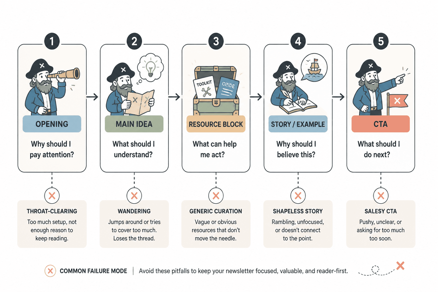
A cleaner way to think about newsletter sections is this:
| Section type | Its real job | What goes wrong |
|---|---|---|
| Opening | Earn attention fast | Too much throat-clearing |
| Main idea | Teach, reframe, or persuade | Wanders or overexplains |
| Resource block | Recommend something useful | Reads like generic curation |
| Story/example | Add proof and texture | Feels self-indulgent or shapeless |
| CTA | Suggest the next logical move | Turns weirdly salesy |
If the section does its job, the format feels natural. If it does not, no amount of “warm tone” will save it.
Use formats that sound like a person, not a content machine
You do not need some sacred newsletter architecture. You need a format you can repeat without sounding copy-pasted. Usually, that means using a simple structure with enough flexibility to let your voice breathe.
Here are a few formats that work well because they are useful, readable, and hard to over-corporatize.
Format 1: One idea, one takeaway, one next step
- Open with a sharp problem or observation
- Explain the idea clearly
- Give one practical takeaway
- End with a relevant CTA or reply prompt
This is great for coaches, consultants, writers, and creators with a strong point of view. It keeps the newsletter focused and stops you from dumping four half-baked ideas into one send.
Example structure:
- Opening: “A lot of newsletters sound smart but still get skimmed. Usually because they take too long to say one simple thing.”
- Main section: Explain why clarity beats complexity
- Takeaway: Give a 3-step editing filter
- CTA: Invite the reader to check a related article or reply with a question
Format 2: Opinion, example, application
This format works when you want to sound more human and less instructional. You lead with a perspective, back it up with a concrete example, then show the reader how to use it.
It avoids the robotic “teaching mode” trap because it starts with something you actually think.
Example:
- Opinion: “Most newsletter intros are too polite. They spend two paragraphs warming up to a point nobody asked them to avoid.”
- Example: Show a weak intro and why it drags
- Application: Give a cleaner rewrite formula
Format 3: Quick sections with a clear rhythm
This is useful if your audience likes a digest style newsletter. The trick is making each section distinct enough to feel intentional, not assembled.
A strong rhythm might look like:
- One sharp idea: a short insight with a clear point
- One useful resource: a tool, article, template, or example with context
- One action: something small the reader can do this week
The context matters. “Here’s a resource” is weak. “If your resource block keeps sounding like a bland recommendation list, this will help you make it more useful” is stronger.
If you want to tighten that kind of section specifically, this piece on how to improve newsletter sections and formats resource blocks without sounding generic is worth reading next.
How to make each section sound less robotic
This is where most newsletters either start feeling alive or flatten into polished sludge.
1. Cut the transition phrases that add nothing
Writers often use section transitions to sound smooth, but they usually just sound padded.
Weak: “Now, without further ado, let’s move into this week’s main insight.”
Better: “Here’s the part most people get wrong.”
Weak: “I also wanted to take a moment to share a resource I think you’ll find valuable.”
Better: “If you’re stuck here, use this.”
Shorter is not always better. Clearer is better. But a lot of robotic writing survives by hiding in transition fluff.
2. Write section intros with a point, not a label
Do not rely on the heading to do all the work. The first line under the heading should create interest on its own.
Bland: “Tool of the week: A scheduling app that helps improve efficiency.”
Better: “If content keeps dying in your notes app because your workflow is chaos, this kind of tool helps more than another idea board.”
The second version has tension. It names the problem first. That is what human writing does. It starts where the reader’s annoyance already lives.
3. Use more specific language than “help,” “valuable,” and “insight”
These words are not banned. They are just overused and lazy when unsupported.
Compare:
- “A valuable lesson about email strategy”
- “Why your newsletter CTA feels pushy even when the offer is solid”
One sounds like a content bucket. The other sounds like a real idea.
4. Let your opinion show up where it matters
You do not need to turn every newsletter into a manifesto. But if every section sounds neutral and sanitized, the whole thing starts reading like auto-generated client-safe mush.
A little judgment helps. Not random hot takes. Clear editorial taste.
For example:
- “Most ‘newsletter templates’ are too rigid to sound human for more than two sends.”
- “A resource section is not useful just because it contains a link.”
- “Your CTA does not need to pretend it is doing the reader a favor by existing.”
That kind of line gives your writing a spine.
How to write newsletter sections that sell without getting salesy
Here is the thing people keep messing up: being non-salesy does not mean avoiding offers. It means making the offer feel proportionate, relevant, and earned.
A newsletter gets salesy when the reader feels the shift from “this is useful” to “ah, so this was just the setup.” That is the problem. Not the existence of a CTA. The clumsy tonal whiplash.
To avoid that, your promotional sections should do three things:
- Connect naturally to the idea that came before
- Explain why the thing matters right now
- Sound like a recommendation, not a script
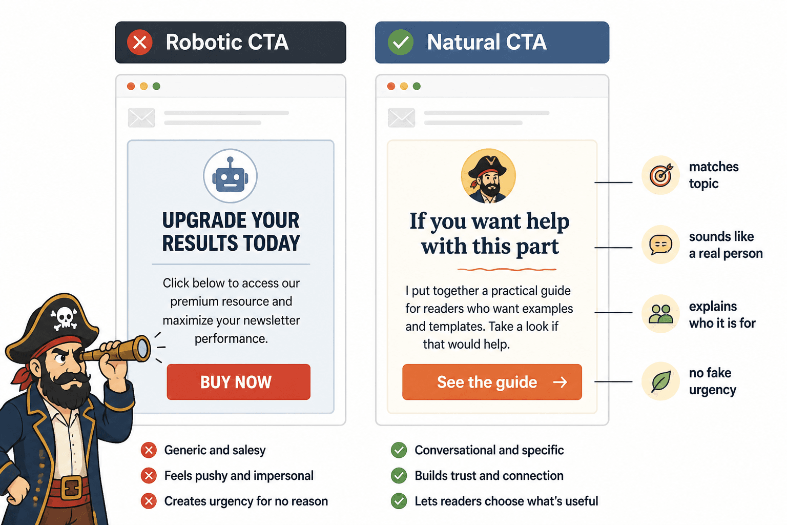
Too salesy: “If you’re ready to transform your newsletter performance, click here to work with me today.”
Better: “If this is the part you keep getting stuck on, I help clients tighten their newsletter structure and voice without sanding off their personality. You can check that out here.”
The second one works because it stays in the same conversation. It does not suddenly put on a headset and become a closer.
It also helps to treat CTAs as section endings, not tone changes. The offer should feel like the next logical step for the subset of readers who want more.
A simple CTA filter
- Does this CTA match the topic I just covered?
- Does it sound like something I would actually say?
- Does it explain who it is for?
- Does it avoid fake urgency and inflated promises?
If the answer is no to two or more of those, the CTA probably needs a rewrite.
Strong section examples and weak rewrites
Sometimes the fastest way to fix a newsletter format is to see what changed on the page.
Example 1: Opening section
Weak: “Welcome back to this week’s newsletter. Today I want to talk about newsletter formatting and why it matters for audience engagement.”
Better: “If your newsletter sounds stiff, the problem might not be your writing. It might be the way you’re packaging every section like a tiny corporate memo.”
Why it works: it starts with the actual pain, not ceremony.
Example 2: Resource section
Weak: “This week’s resource is a helpful article on improving newsletter writing.”
Better: “If your sections are technically clear but still flat, read this guide on how to write better newsletter sections and formats. It is especially useful when your structure is fine but the voice still feels beige.”
Why it works: it gives the link a job and tells the reader why they should care.
Example 3: Intro-to-main-section transition
Weak: “Now that we have covered the basics, let’s discuss how to improve your opening section.”
Newsletter structure works best when each section has one clear job and supports the main point of the issue. Simpler formats usually outperform busier ones when the writing stays sharp.