
A buyer is usually not looking for a polished victory lap. They are looking for relief: which tool fits, which one does not, and what tradeoff is worth tolerating without regret three weeks later. The difference between a helpful review and a decorative one is simple enough to say and annoyingly easy to miss in practice. Helpful examples reduce uncertainty fast. They show the shape of the decision before the reader has to do the math alone.
This page collects review examples that do actual decision work. The point is not to make every review sound identical. The point is to make each example answer a real buyer question, with enough context that the reader can move from “interesting” to “yes, probably this one.” For the broader system around that job, see the tool reviews parent guide and the related page on how to compare tool reviews by buyer questions without bias.
What a useful tool review example actually does
A useful example is not defined by length, star count, or how cheerful the tone is. It is useful because it helps a buyer make a choice faster. That usually means it does at least three things well:
- Names the best fit. Not just “this is good,” but “this is good for a buyer who needs X and can live with Y.”
- Shows the tradeoff. Every tool has one. Pretending otherwise is how readers end up annoyed, then suspicious, then gone.
- Answers the next question. A helpful review anticipates what a cautious buyer will ask after reading the headline claim.
Google’s guidance on helpful content and product review quality points in the same direction: specificity, evidence, and original value beat vague summarizing. The review has to earn its keep. It cannot just wear a blazer and call itself analysis. See Google’s helpful content guidance and product reviews guidance.
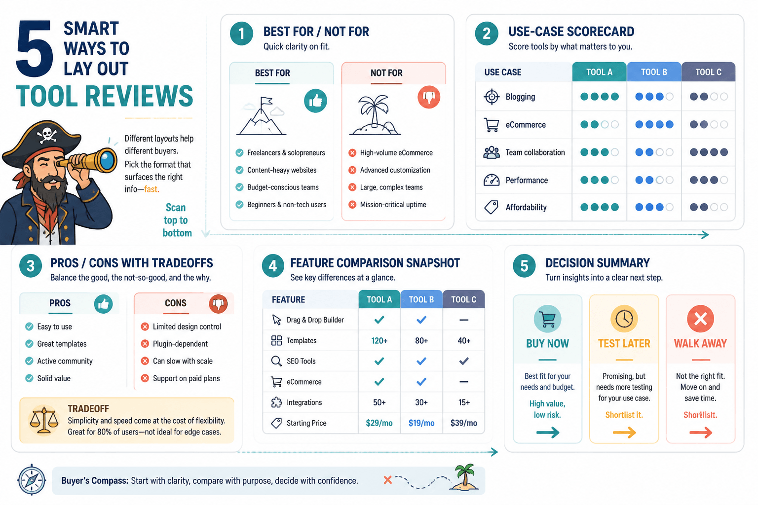
Five review layout patterns buyers can compare at a glance
Different buyers need different kinds of reassurance. The layout should match the decision, not just the writer’s habit. These five patterns cover most useful tool review examples.
- Direct recommendation review. Best when one tool clearly fits a defined buyer.
- Comparison review. Best when the reader is choosing between close alternatives.
- Problem-first review. Best when the buyer cares more about the outcome than the tool category.
- Use-case review. Best when the tool works differently for different roles or workflows.
- Updated review. Best when the product has changed enough that old opinions no longer hold.
None of these is automatically “better.” The wrong pattern creates friction. A comparison review written like a confession becomes mushy. A direct recommendation without a clear fit feels pushy. A use-case review that never states the use case is just a long walk through product features.
Example 1: direct recommendation with clear fit and clear limits
This is the simplest useful format: lead with the recommendation, then prove it. It works when one tool is the obvious pick for a specific buyer profile.
Strong version:
Tool X is the best choice for solo creators who want a clean onboarding flow, simple automation, and minimal setup time. It is not the most customizable option, and that is the point. If your priority is getting a working system live this afternoon instead of rebuilding it all weekend, this is the safer choice.
That example helps because it does not hide the constraint. The buyer learns who it is for, what it gives up, and why that tradeoff matters.
Weak version:
Tool X is an amazing platform with powerful features, a great interface, and lots of flexibility.
That sounds nice and tells the reader almost nothing. It could describe half the market and still be vague enough to annoy everybody equally.
Example 2: comparison review that separates similar tools without mushy scoring
Comparison reviews work when the tools are close enough that buyers need a reason to choose one over the other. The mistake is turning every comparison into a scoreboard no one believes.
Better comparison approach:
- Tool A: Best for buyers who want ease of use and a fast launch.
- Tool B: Best for buyers who need more control and are willing to trade speed for flexibility.
- Decision rule: Choose A if setup time is the bottleneck. Choose B if workflow depth matters more than first-day simplicity.
This format works because it gives the buyer a rule, not just a ranking. It says what changes the answer. That is the useful part.
For a deeper framework on avoiding bias in comparisons, link readers to how to compare tool reviews by buyer questions without bias.
Example 3: problem-first review organized around buyer questions
Some readers do not care what category the tool belongs to. They care about a problem: “I need to collect leads without building a monster workflow,” or “I need a review tool that actually makes a decision easier.” A problem-first review is built around those questions instead of around product specs.
Structure example:
- What problem does this tool solve?
- Who is it best for?
- Where does it fall short?
- What setup effort should a buyer expect?
- What is the closest alternative if this is not the right fit?
This kind of review keeps the reader oriented. It also makes skimming work properly, which is a feature, not a failure.
Example 4: use-case review for a specific workflow or role
A tool can be excellent in one workflow and clumsy in another. Use-case reviews make that plain. They are especially useful for creator tools, marketing tools, and anything with more than one legitimate audience.
Good use-case framing:
For a creator who publishes one paid newsletter, repurposes clips for social, and needs basic automation, Tool Y is enough without becoming a second job. For a team that needs approval workflows and multi-step routing, it will feel undersized fast.
That sentence does two important things: it names the workflow and it names the ceiling. Buyers need both.
If you want the cluster’s broader publishing strategy, the related page on how to use tool reviews in a creator funnel fits naturally here.
Example 5: updated review that reflects current product behavior
Some reviews age badly because the product changes, pricing shifts, or the setup experience gets quietly rewritten. An updated review is useful when it says, in plain language, what is current now rather than what used to be true.
Example of an update note that helps:
Since the last version of this review, onboarding has become easier, but the reporting panel still hides the most useful data one layer deeper than it should.
That kind of update matters because readers do not buy legacy opinions. They buy the current product. A review that ignores changes is basically giving directions to a store that moved last year.
Step-by-step framework for writing a useful tool review
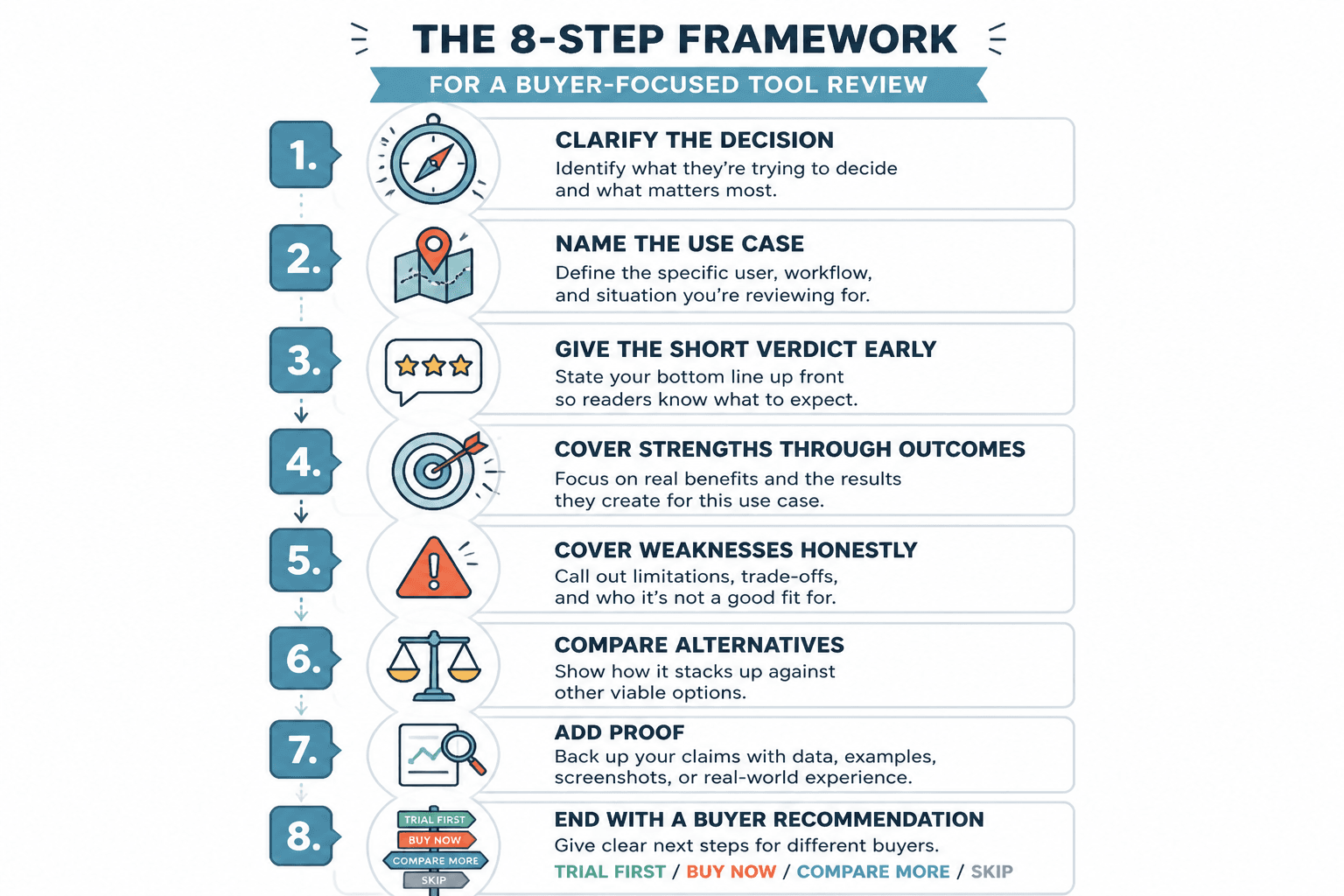
Here is a lean framework you can use when turning examples into a full review.
- State the decision. What is the buyer trying to choose between?
- Define the best fit. Who should care about this tool first?
- List the strongest reason to choose it. One reason, not seven.
- State the main limitation. The honest one, not the decorative one.
- Show a use case. A concrete scenario makes the recommendation feel testable.
- Offer the fallback. If this is not the fit, what should the buyer look at next?
This framework works because it keeps the article from wandering into product-tour territory. Buyers do not need every feature. They need enough structure to decide whether to keep reading or move on.
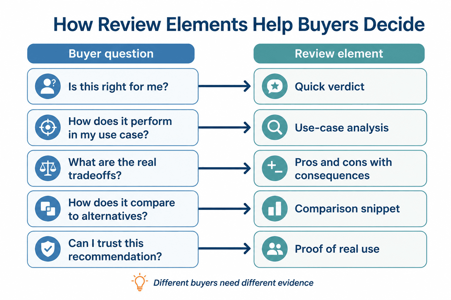
How to map buyer questions to review sections
The easiest way to improve a review is to match each section to a real question the buyer would ask in order.
- What is this tool best for? Lead with fit.
- What does it do better than alternatives? Cover the differentiator.
- Where does it struggle? Explain the tradeoff.
- How hard is it to set up? Address time and effort.
- What should I choose instead if this is not right? Give the fallback.
That question sequence is often more useful than feature order. Features matter, but only after the reader knows why the tool belongs in the conversation at all.
Common mistakes that make examples less useful
- Leading with hype instead of fit. “Best ever” is not a decision.
- Hiding the downside. Readers trust reviews that admit limits.
- Comparing tools without a rule. A list of differences is not the same as a decision path.
- Writing for every buyer. That usually means writing for no one.
- Using stale details. An outdated review is worse than no review because it sounds confident while being wrong.
For a broader set of buying-oriented examples, the sibling page best tool reviews for creators in 2026 is a useful companion. It sits closer to the recommendation layer, while this page stays focused on structure and decision help.
Quick checklist: is this review example actually helping?
- Does it tell the reader who the tool is for?
- Does it explain the main tradeoff plainly?
- Does it answer the next likely question?
- Does it give a buyer a reason to choose or reject the tool?
- Does it avoid empty praise and generic summaries?
If the answer to most of those is yes, the example is doing real work. If not, it is probably just occupying space in a nicer font.
For the larger cluster strategy and content architecture around this topic, return to the tool reviews parent guide or move to the sibling page on best tool reviews: tools for creators in 2026.
Bottom line
The best tool review examples do not try to impress the reader with volume. They help the reader decide faster, with less second-guessing. That means clear fit, honest limits, and a structure that maps to actual buyer questions. Everything else is decoration, and decoration does not convert a cautious buyer.