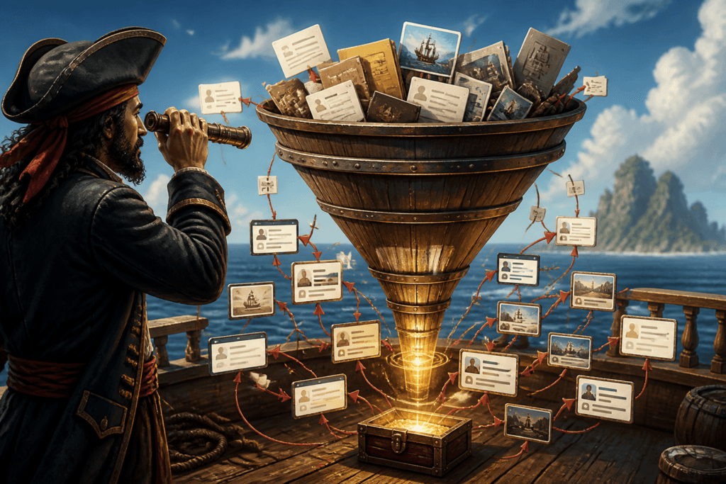
Weak visuals do not just look bland. They waste trust, blur the offer, and make every click harder to earn. When an AI image use case sits on a page without a conversion plan, it becomes expensive busywork: the image gets made, the post gets published, and the leads stay politely elsewhere.
The fix is not to make the image “salesy.” It is to give the image a job inside a simple funnel. That might mean helping a reader understand the offer faster, moving someone from a social post to a lead magnet, or supporting a sales page without turning the whole thing into a billboard in a blazer.
Why AI image use cases need a funnel
An AI image is usually the attention device, not the whole business case. The image earns the glance. The page, offer, or signup flow earns the result. If those two pieces are disconnected, the visual may still get likes, but likes are famously bad at paying invoices.
A better setup is simple: use the image to create a reason to care, then send that attention to the next logical step. If you want a broader map of use cases before narrowing into conversion work, the AI image use cases guide is the place to start. For more examples, the examples page is useful too.
Start with the use case, not the funnel fantasy
The fastest way to overcomplicate this is to begin with the funnel and then hunt for an image to decorate it. Start with the actual content job instead.
- Need attention? Use an image that makes the topic easier to notice or understand.
- Need trust? Use an image that shows process, comparison, or clarity.
- Need action? Use an image that supports the next step instead of competing with it.
That order matters. The image should support the reader’s decision, not audition for the role of hero asset.
Where AI images help leads and sales
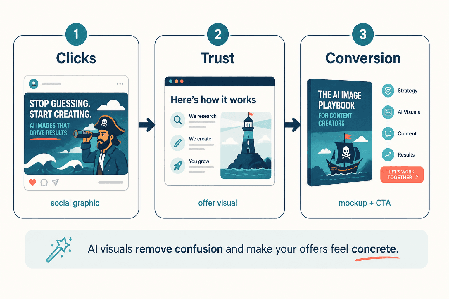
1. Social posts that point to a lead magnet
A social graphic can do more than fill a feed slot. Used well, it can create just enough curiosity to move a reader toward a checklist, template, email series, or other useful opt-in.
Keep the promise specific. Show one pain point, one outcome, and one next step. A vague “learn more” post is usually conversion wallpaper.
2. Educational carousels that earn newsletter signups
Educational image sequences work because they do two things at once: they teach something useful and make the next step feel obvious. That makes them a natural fit for newsletter growth, especially when the signup offer continues the lesson instead of interrupting it.
If a carousel explains the difference between three common approaches, the signup should extend that clarity. The reader should feel, “Good, now I want the checklist.” Not, “Why did that end with a hard sell?”
3. Blog visuals that support a sales page
Sales pages get harder to trust when they are text-heavy and visually thin. A few well-placed images can reduce friction by clarifying the process, showing what is included, or reinforcing the main benefit without forcing the reader to decode a wall of paragraphs.
That is where an AI image use case can quietly lift conversions. Not by shouting. By making the page easier to understand.
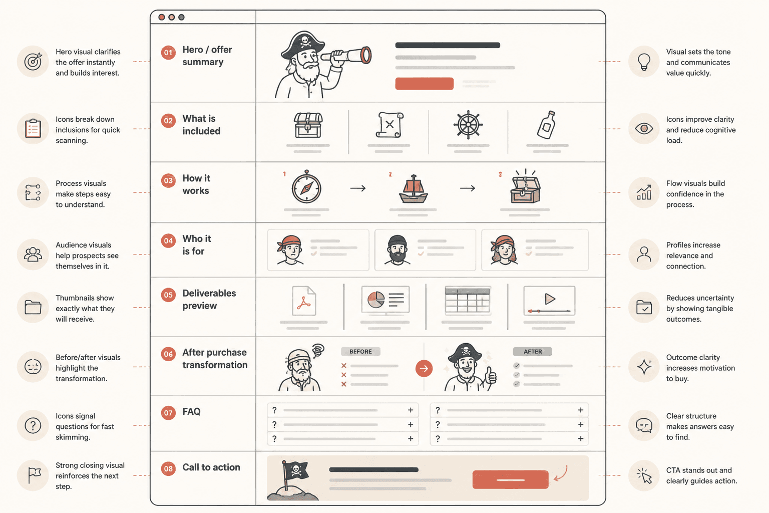
4. Product and process visuals that remove hesitation
When an offer is abstract, the buyer has to do extra mental work. Visuals can reduce that load. A process diagram, a comparison graphic, or a simple flow can answer the question behind the question: “What happens next, and why should I believe this will work?”
That is especially useful for services, workflows, and digital offers where the value is real but not immediately visible.
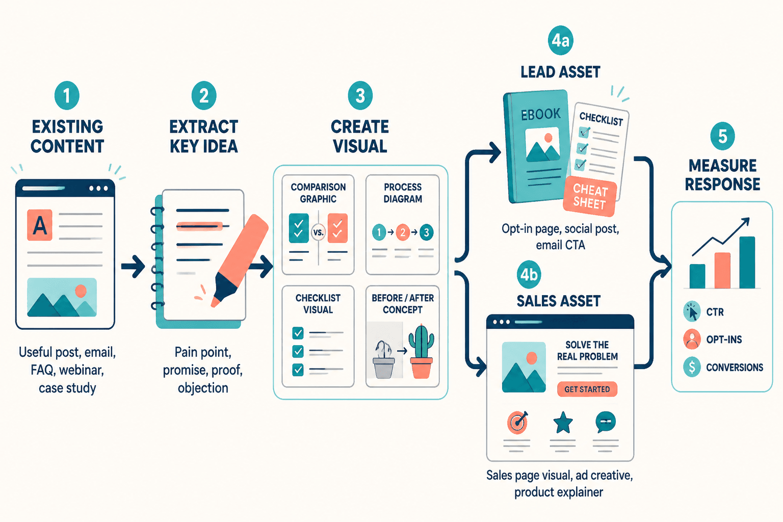
How to turn one AI image use case into a conversion path
1. Define one reader problem
Do not ask the image to solve visibility, trust, persuasion, and brand consistency all at once. Pick one problem.
- Need more clicks? Make the image easier to notice.
- Need more signups? Make the next step obvious.
- Need more sales? Make the offer easier to understand.
2. Make the image do one job
A strong conversion image usually has one clear purpose. It might explain a process, preview an outcome, or frame a comparison. It should not also try to be the entire marketing strategy. That is how pages become visually busy and strategically sleepy.
3. Add one next step
Every useful image should point somewhere. That next step can be:
- a lead magnet
- a newsletter signup
- a service page
- a product demo
- a checkout page
The simpler the path, the less likely the reader is to drift away to “think about it,” which is often internet language for never returning.
4. Keep the educational part complete
Monetized content loses trust when the useful part is incomplete on purpose. Give enough value that the reader feels respected. Then make the offer the natural next step.
That balance matters. If the page teaches well, the CTA feels like a continuation. If the page withholds too much, the CTA feels like a trap door.
Trust rules that keep monetization from backfiring
The goal is not just leads or sales. It is leads or sales without making the audience suspicious. A few basic rules help:
- Be clear about what the image is for. If it supports a signup, say so.
- Do not fake precision. Claims should be grounded, not inflated.
- Show tradeoffs when relevant. Buyers trust pages that acknowledge limits.
- Keep incentives obvious. A soft sell is fine. A sneaky one is not.
This aligns with broader guidance on transparent advertising and endorsements from the FTC. If you use AI-assisted visuals in marketing, it is also worth keeping an eye on the NIST AI Risk Management Framework for a more structured way to think about risk, trust, and deployment.
A simple workflow for conversion-focused AI image use cases
- Pick the business goal: leads, sales, or qualified clicks.
- Pick the content type: social post, carousel, blog visual, or sales page asset.
- Write the one-sentence job for the image.
- Build the image to support that job only.
- Place a clear CTA directly after the value section.
- Check whether the image improves understanding, not just decoration.
If you are choosing tools to support that workflow, the best AI tools for AI image use cases page can help with the practical side of picking the right software.
What good conversion content looks like in practice
A solid AI image use case for leads and sales usually has three traits:
- It is clear. The reader understands what the image is saying.
- It is useful. The image helps the page do its real job.
- It is honest. The offer is present, but not shoved into the reader’s face.
That combination is boring in the best way. It converts without making the audience feel like they accidentally opened a sales trap in a trench coat.
Related reading
If you want the wider strategy before the conversion layer, start with the parent guide and then branch into the specific use case that matches your business goal.