
Weak sales pages waste trust, stall sales, and turn useful traffic into expensive busywork. The page gets the click, the reader keeps moving, and the offer ends up sounding like it was assembled to impress a committee instead of help a buyer decide. That is the conversion leak: not always bad design, just a page doing too many jobs with too little clarity.
The useful fix is not “make it prettier” or “add more hype.” It is to make the page earn one specific result: a lead, a sale, or a tightly defined next step. Once that job is clear, the structure gets simpler, the copy gets sharper, and the page stops wandering around like it forgot why it was published.
Sales pages do two jobs, but not equally well
A sales page can either push for the sale now or set up the sale by capturing a lead and continuing the conversation. Those are related jobs, but they are not the same job. Confusing them is where pages start sounding vague, pushy, or weirdly half-finished.
If the visitor is already close to buying, the page should make the decision easy. If the visitor is interested but not ready, the page should earn the lead and move the buyer into a better follow-up path. That is why the best page is not the longest page. It is the page matched to the decision in front of it.
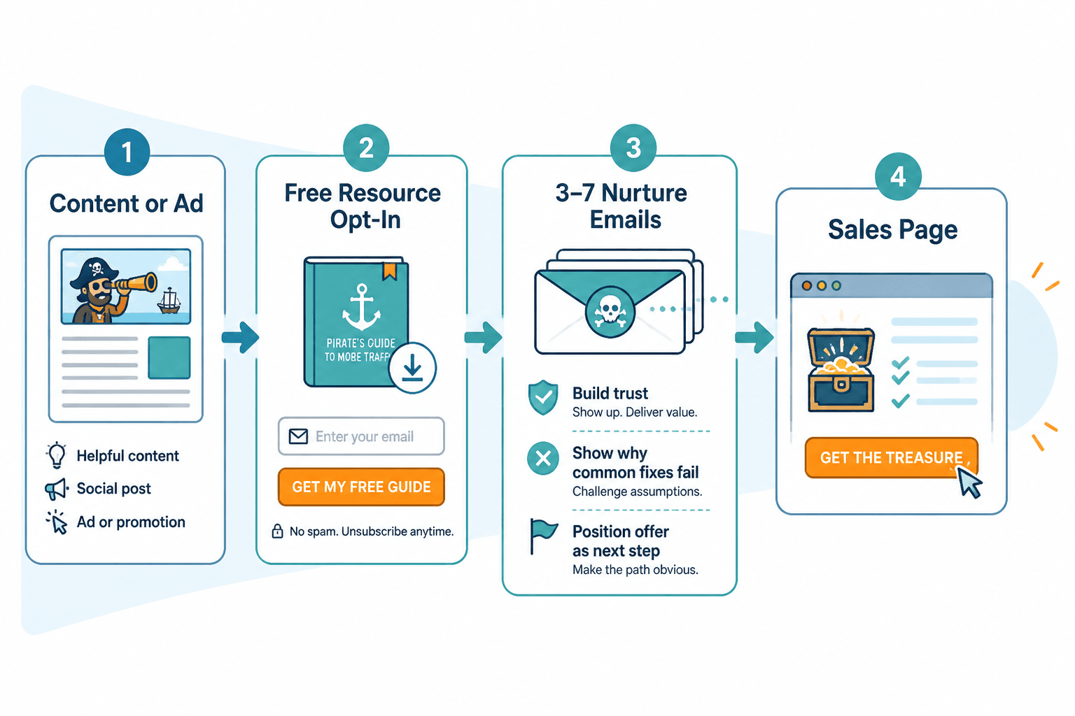
If you want the broader structure of the content system around this page, start with the sales pages guide. For examples and format ideas, the sales pages examples page is the better companion.
Start with the buying decision, not the page length
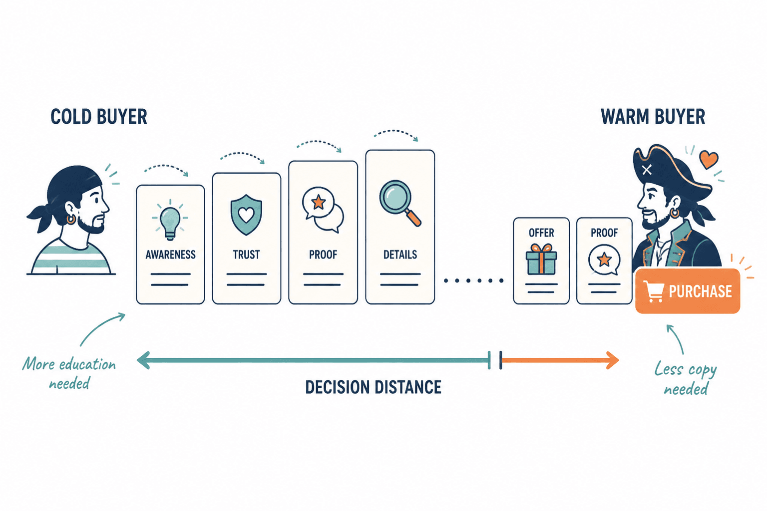
People love arguing about sales page length like there is one correct answer and everyone else is committing copy malpractice. In reality, length is a consequence of the decision, not the strategy.
Short sales pages win when the reader already understands the offer, trusts the source, and only needs a clean reason to act. Longer pages make more sense when the offer is complex, the stakes are higher, or the buyer needs proof before they will believe the promise. The page length should follow the amount of doubt, not the mood of the writer.
When short sales pages beat long ones
- The audience already trusts you.
- The offer is simple to understand.
- The price is relatively low or moderate.
- The buyer already knows the problem hurts.
- The traffic source does some of the selling before the click.
- The next step is small and specific.
That is the basic pattern: if the decision is already close, do not bury it under a parade of sections. A concise page can be more convincing because it feels focused instead of over-explained.
When longer pages are justified
- The audience is cold or unfamiliar.
- The offer has moving parts.
- The buyer must compare options.
- The price or commitment is high enough to trigger hesitation.
- The page must handle objections the traffic source did not already answer.
Longer does not mean bloated. It means the page has more work to do before the reader feels safe enough to move. That difference matters. Nobody wants a page that “says more” when it should have said less, and nobody wants a page that says less when trust is still fragile.
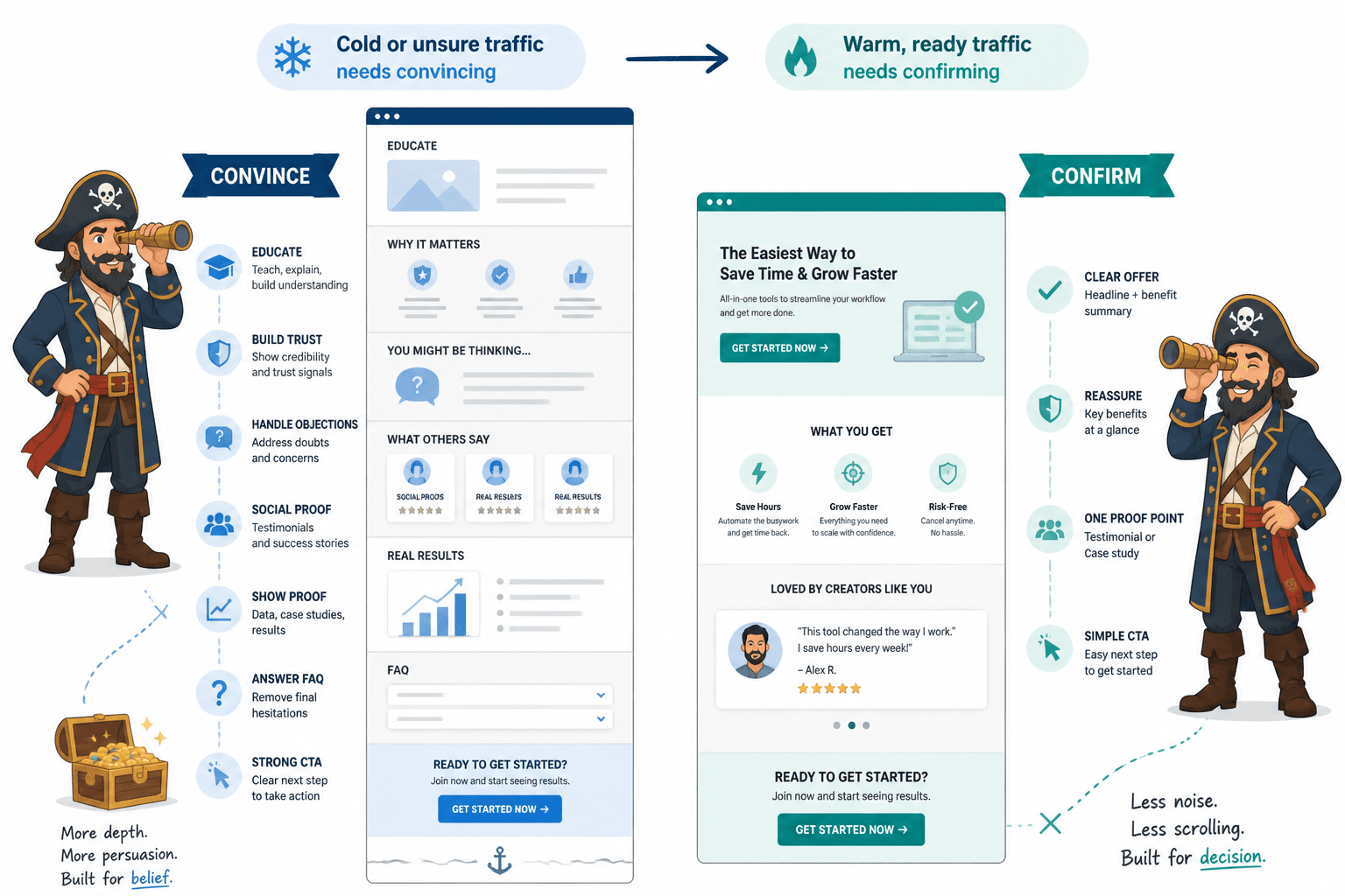
Match the page to the traffic source and audience warmth
A page for warm traffic can be blunt and efficient. A page for cold traffic usually needs more context, more proof, and a better bridge from interest to action. This is why the same offer can perform well in one funnel and fall flat in another.
For example, a lead magnet, newsletter mention, or webinar invitation may bring in visitors who already know the topic. Those readers may only need a focused sales page plus a clear CTA. A cold search visitor, on the other hand, may need more explanation before the page can credibly ask for a lead or a sale.
That is also why the funnel around the page matters. If the page is only one step in a larger path, use the right support instead of forcing the page to do everything. The companion article on best AI tools for sales pages can help with drafting and revision, but the funnel logic still has to be human.
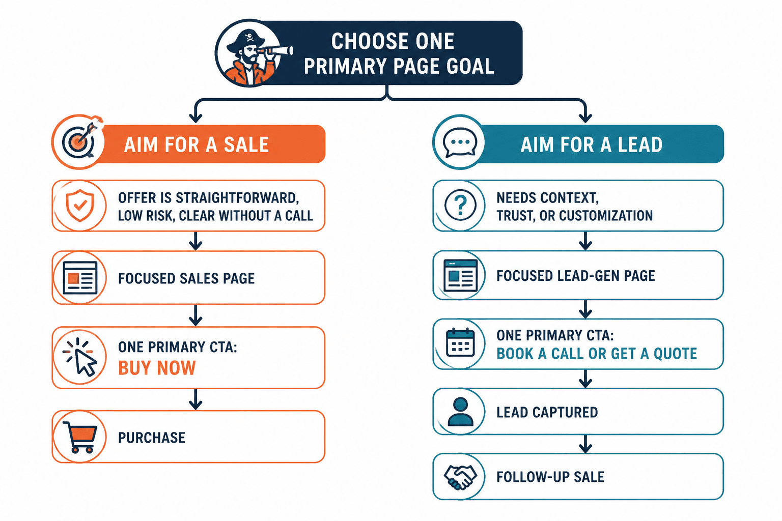
Choose the right conversion goal before you write
A page that tries to get a purchase, a lead, and a booking all at once usually weakens all three. Pick the primary conversion goal first.
1. Direct sale
Use this when the visitor is ready, the offer is straightforward, and the page can answer the obvious questions without a full court case. The CTA should be unmistakable. No interpretive dance, no button poetry.
2. Lead capture
Use this when the visitor needs more time, more proof, or more follow-up before buying. In that case, the page should make the value of opting in obvious and immediate. The lead is not a consolation prize. It is the right next step.
3. Call booking
Use this when the sale requires customization, consultation, or a higher-trust conversation. The page should frame the call as a decision step, not a vague “let’s chat” trapdoor.
4. Email follow-up
Use this when the page can earn interest but not the final decision. The sales page should then feed a sequence that handles objections, shows proof, and reintroduces the offer with less friction.
If you are trying to pair the page with the rest of the path, the companion piece on sales pages guide gives the broader framework, while sales pages examples is useful when you want to compare formats.
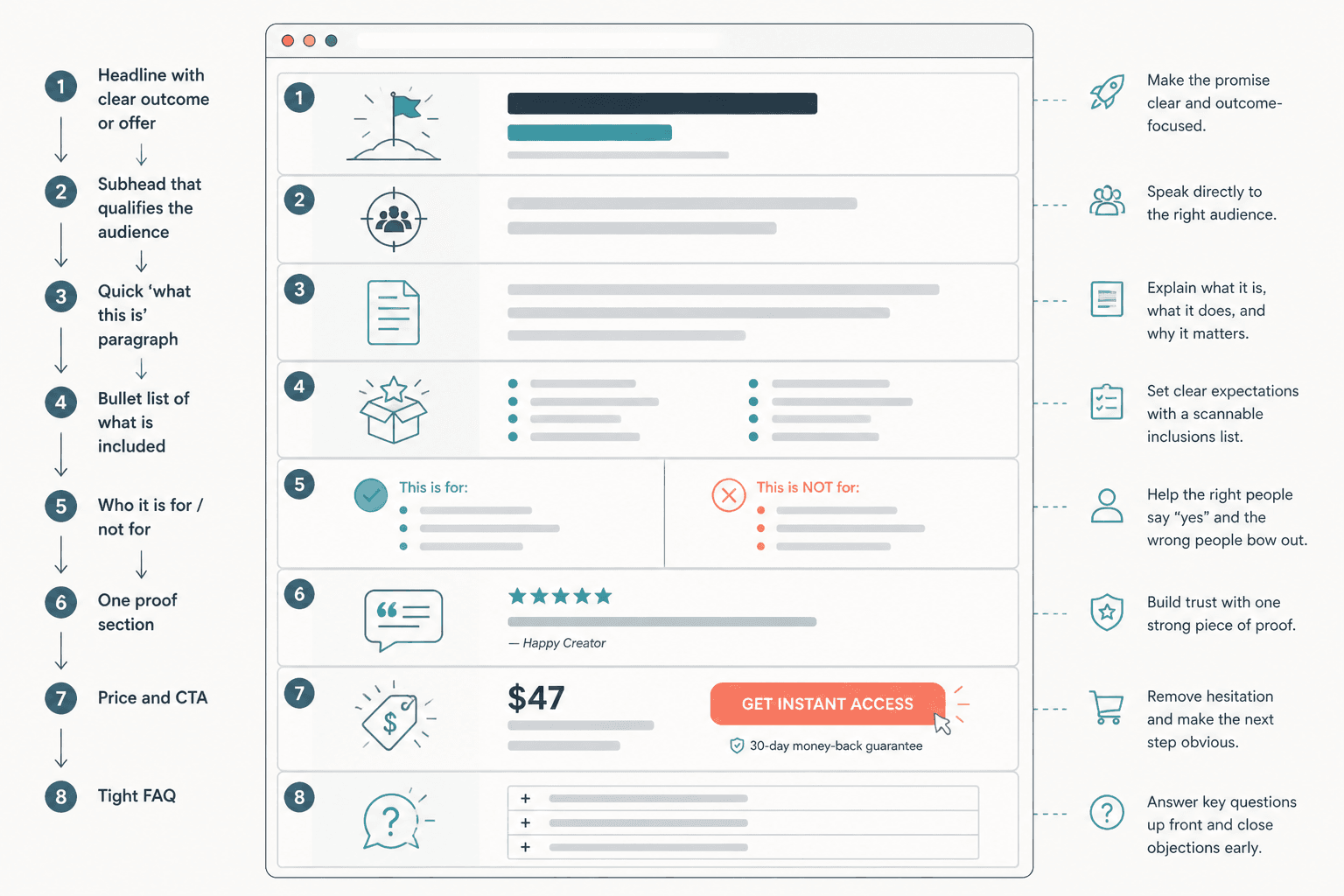
Build the page around clarity, proof, and mechanism
Sales pages lose trust when they start performing. They win when they are clear about what is being offered, why it matters, and how it works. That sounds obvious, which is usually how conversion basics sneak past people and get ignored.
Make the offer painfully clear
Say what the reader gets, who it is for, and what changes if they buy or opt in. The first job of the page is not persuasion by atmosphere. It is understanding.
Lead with the problem the buyer actually feels
The page should reflect the problem in the buyer’s language, not the seller’s internal vocabulary. If the page names the wrong pain, the rest of the copy has to work twice as hard.
Replace hype with proof
Proof can be testimonials, data, examples, case details, screenshots, demonstrations, or clear before-and-after comparisons. The point is to reduce doubt without turning the page into a museum of bragging.
For trust-friendly positioning, see the companion piece on how to monetize sales pages without wrecking trust.
Show the mechanism, not just the outcome
People usually want to know not only what the offer does, but how it does it. The mechanism is what makes the result feel plausible. Without it, the page starts to sound like wishful thinking in a nice font.
Make the CTA do one job
The call to action should match the conversion goal. Buy, book, subscribe, download, or continue. Pick one. If the button has to explain itself, the page is already in trouble.
Use supporting funnel steps when the decision is not ready
Not every visitor is ready for the page’s main ask. That is normal. The mistake is to treat hesitation as failure instead of a signal to add the right step.
Useful support can include:
- a lead magnet before the sales page
- a nurture email sequence after the visit
- a case study or authority article before the page
- a webinar or workshop that handles deeper objections
- a booking step for offers that need conversation
This is where the article on sales pages and the future companion on funnel pairing belong together in practice: the page is one part of the buying path, not the whole machine.
Keep trust intact while monetizing
Monetizing a page does not require pressure theater. It requires enough clarity and evidence that the reader feels respected. Trust is not the soft part of conversion. It is the part that lets conversion happen without friction becoming hostility.
That means avoiding overblown promises, fake urgency, and proof that sounds like it was assembled by a committee of enthusiastic punctuation marks. It also means being honest about fit. A page that filters the wrong people out is doing useful work.
For primary-source guidance on ad and endorsement disclosure, the U.S. Federal Trade Commission’s Disclosures 101 for Social Media Influencers is a useful reference for clear, honest disclosure language. It is not a copy template, but it is a very good reminder that transparency beats cleverness when money changes hands.
Practical checklist before you publish
- Does the page have one primary conversion goal?
- Is the offer clear in the first pass?
- Does the page match the audience’s level of trust?
- Is the length justified by the decision, not by habit?
- Is the proof near the claims it supports?
- Does the CTA match the actual next step?
- Does the funnel support the page, instead of asking the page to do everything?
- Would a skeptical reader understand why this is worth attention without needing a guided tour?
If the answer to that last one is yes, the page is probably doing its job. If not, it may still be busy, but busy is not the same as effective.
One page, one main job
The best way to turn sales pages into more leads or sales is not to stuff more persuasion into them. It is to match the page to the decision, the traffic source, and the level of trust already in the room. When the page has one clear job, the copy tightens up, the proof lands better, and the next step starts feeling obvious instead of forced.
That is the difference between a page that collects clicks and a page that converts them.