
A draft sales page can look almost finished right up until the headline starts wandering, the proof section feels bolted on, and the call to action behaves like it forgot why it was invited. The page has all the right ingredients in theory. In practice, it is still making the reader do extra work. That is where examples help: they show the shape before the polish, so you can see what a sales page is actually supposed to do.
If you want the broader strategy behind these examples, start with the sales pages guide. This article is the practical companion: structure, sections, offer stacks, objection handling, and a few clean ways to turn vague page copy into something a buyer can follow without squinting.
What good sales page examples actually do
Strong sales pages do not win because they sound mystical or unusually enthusiastic. They work because they make the decision easier. The best examples tend to do four things well:
- Make the offer legible fast. The reader can tell what is being sold, who it is for, and what changes after buying.
- Show the value stack clearly. The page does not just list features; it explains the result, support, and risk reduction.
- Handle likely doubts before the button. Time, fit, price, and proof are usually addressed somewhere on the page.
- Lead to one obvious next step. The CTA is specific enough that the page does not end with a polite shrug.
That is why examples are useful. They show not only what to say, but where each piece belongs. A good sales page is partly persuasion and partly sequence. Mess up the sequence and the writing has to work much harder than it should.
The core sections behind most strong sales page examples
Most effective sales pages use the same basic parts, even if the style changes. The details differ, but the job of each section stays surprisingly steady.
- Headline: says what the offer is or what result it helps create.
- Subhead: adds context, audience, or a short promise.
- Problem framing: names the pain or friction the buyer already feels.
- Offer explanation: describes what they get and how it works.
- Benefits or outcomes: translates features into practical value.
- Proof: examples, testimonials, results, or credibility markers.
- Objection handling: clears up hesitation before the final CTA.
- Call to action: tells the reader exactly what happens next.
If you want a section-by-section way to think about this, the parent guide is the better place for the strategic overview. Here, we are looking at examples of how those sections actually show up on the page.
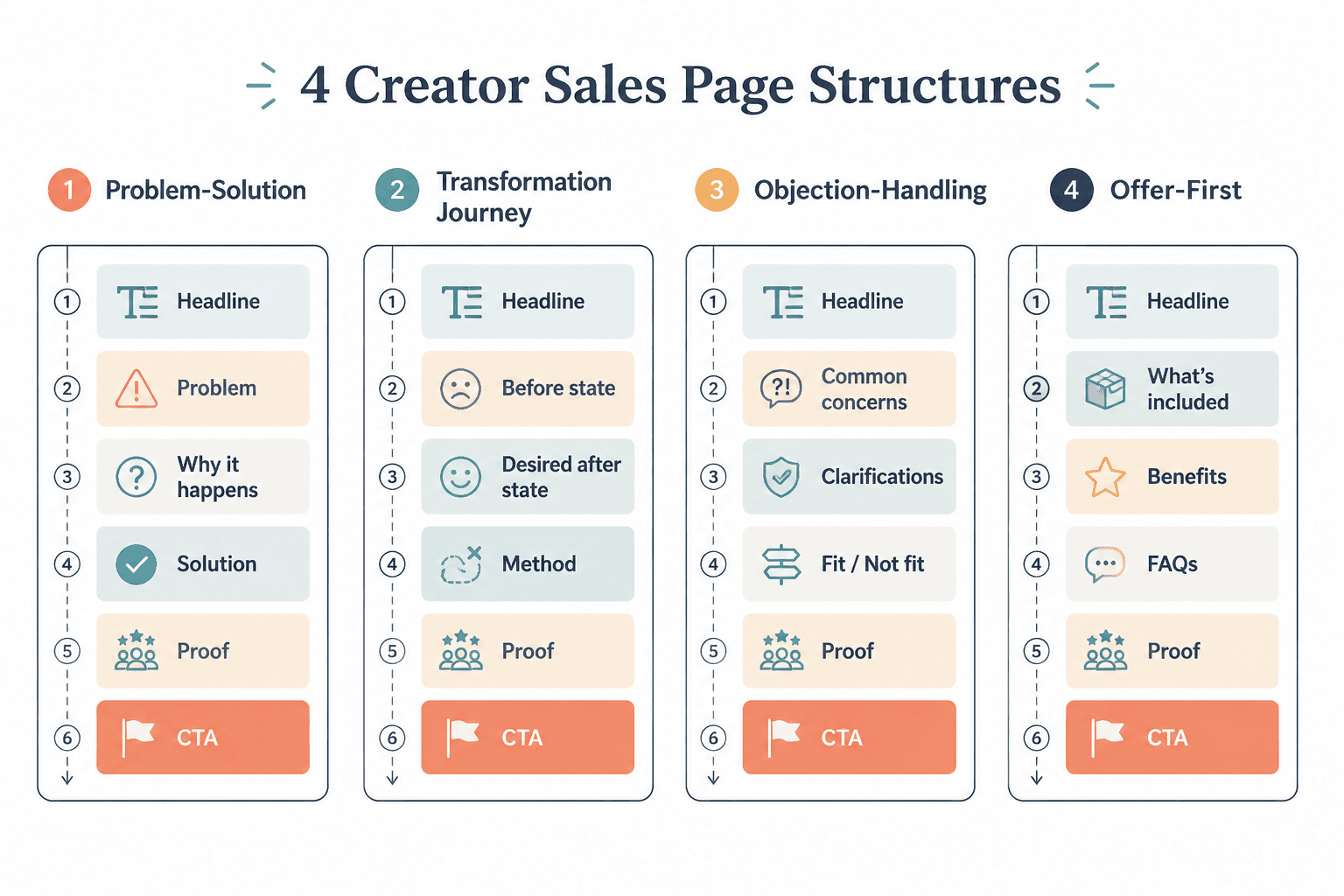
Sales page structure examples creators can adapt
Different offers need different emphasis, but the underlying structure usually falls into a few reliable patterns. These are not sacred templates. They are practical layouts you can steal the rhythm from without copying the words.
1. Direct-response style structure
This version is built for clarity and speed. It works well when the offer is easy to describe and the buyer already knows they need help.
- Headline with the result or transformation
- Short subhead that narrows the audience
- Problem section
- Offer breakdown
- Benefits
- Proof
- FAQ or objections
- CTA
This structure is especially useful for digital products, workshops, and low-friction services where the page needs to move without dawdling.
2. Service or coaching structure
Service pages usually need more explanation because the buyer is not just purchasing a deliverable. They are buying judgment, process, and trust. That means the page often needs a stronger “how this works” section and a little more reassurance.
- Result-driven headline
- Who it is for
- What problem it solves
- How the service works
- What is included
- Proof or experience markers
- Common objections
- CTA
If you are building something like consulting, coaching, or a done-for-you package, this is the structure that keeps the page from sounding airy and underbaked.
3. Product or template structure
Product pages often need to show scope without turning into a feature dump. The page should make it obvious what is inside, what the buyer can do with it, and why it saves time.
- Clear product name and outcome
- What it helps with
- What is included
- How it saves time or reduces effort
- Preview or example section
- Proof or credibility
- FAQ
- CTA
Templates and digital resources need this especially. Buyers want to know whether they are purchasing a useful shortcut or a pretty file with ambitions.
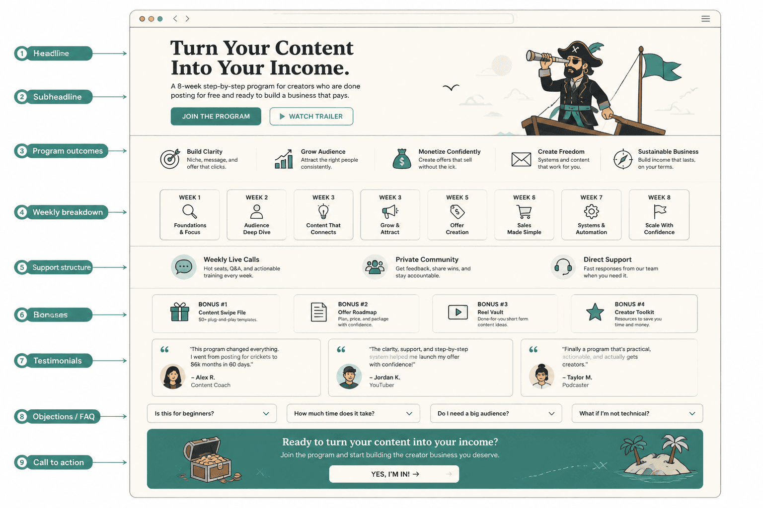
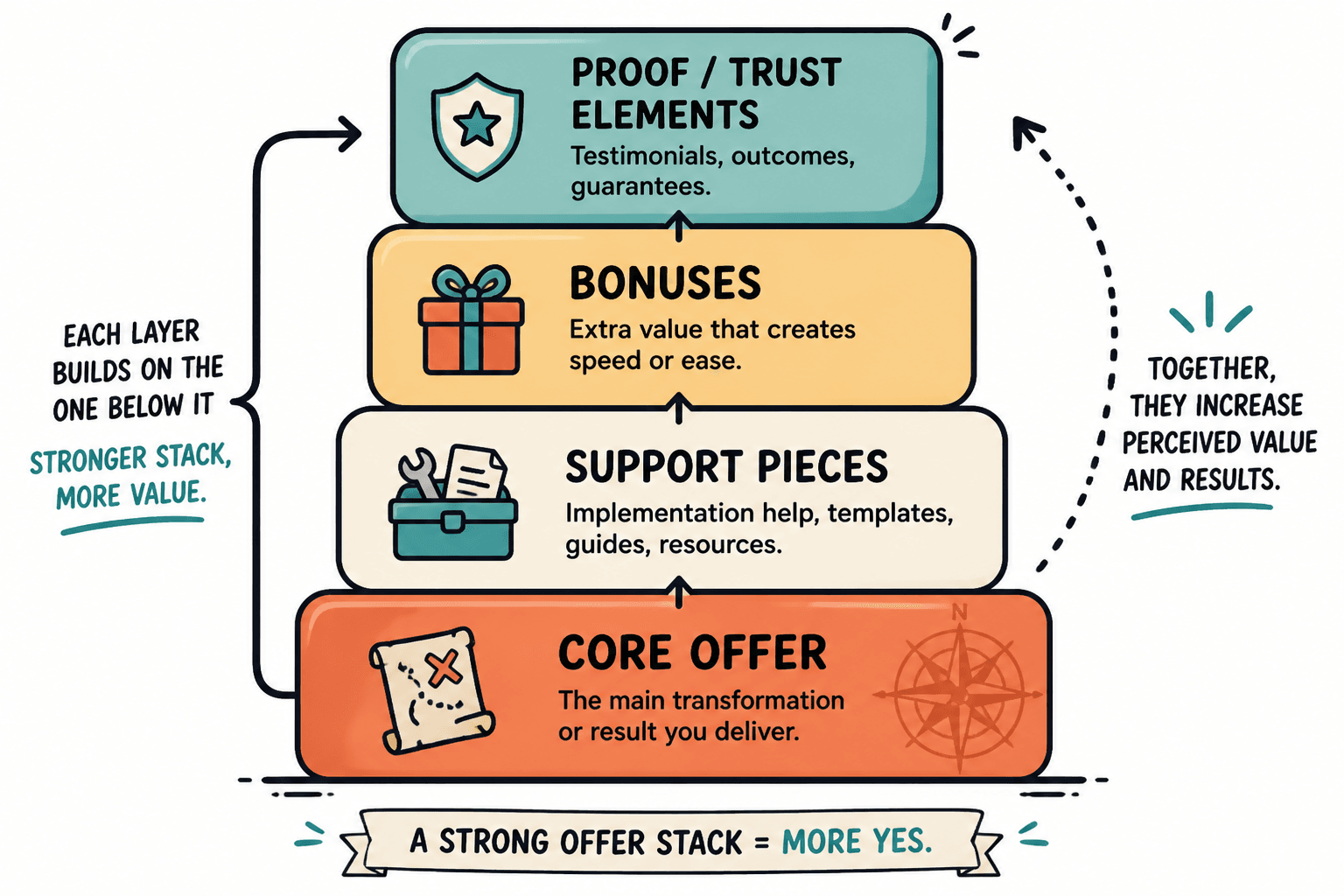
Offer stack examples creators can adapt fast
An offer stack is the part of the page where you make the value feel concrete. It is not a junk drawer for bonuses. It is the place where the buyer sees the core result, the support pieces, and the friction removers all lined up in plain language.
A strong stack usually includes four parts:
- The core result: the main thing the offer helps the buyer achieve.
- The support pieces: modules, sessions, templates, or steps that make the result possible.
- The friction removers: shortcuts, guidance, checklists, or done-with-you elements that reduce effort.
- The confidence builders: proof, guarantees, examples, or process clarity.
Here is a simple way to write one:
- Core result: Get a clear, conversion-focused sales page draft.
- Support piece: Use a section-by-section outline so you are not inventing the structure from scratch.
- Friction remover: Follow example blocks for headlines, proof, and CTA copy.
- Confidence builder: See what each section is supposed to do before you start polishing.
That is a useful pattern because it stops the page from reading like bonus confetti. The buyer does not need more stuff. They need a reason the stuff belongs together.
Simple objection handling examples for sales pages
Most sales pages lose the sale quietly. Not because the offer is bad, but because a reader hits a doubt and finds no help getting past it. Good examples do not argue with the buyer. They acknowledge the hesitation and answer it in the page’s own rhythm.
Common objections to address:
- “Is this for me?”
- “Will this take too much time?”
- “Why is this worth the price?”
- “What makes this different?”
- “Will this actually work for my situation?”
Example templates:
- Time objection: “This is built to reduce setup time, not add another long project to your week.”
- Fit objection: “If you already have the offer but need the page to explain it clearly, this is the right kind of help.”
- Proof objection: “You can see the structure, the examples, and the logic before you buy.”
- Price objection: “The value comes from what the page helps you sell, not from the page itself.”
That last one matters more than people want to admit. A sales page is rarely selling the page. It is selling what the page makes possible.
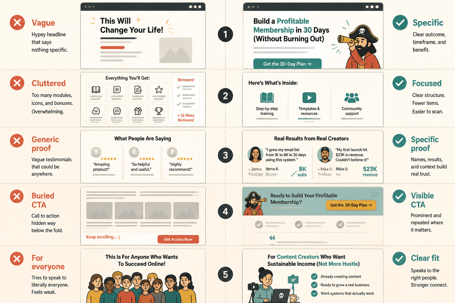
Before-and-after examples of weak sales page sections
Sometimes the fastest way to improve a page is to stop asking whether it sounds good and ask whether it actually says something useful. A few weak-to-strong examples make the difference obvious.
Headline
Weak: A better way to grow your business
Stronger: Build a sales page that explains your offer clearly and gets more qualified clicks
Problem section
Weak: Your current setup may not be working as well as it could.
Stronger: If the page is vague, the offer is buried, and the CTA feels generic, readers have to do too much decoding before they buy.
Offer description
Weak: You get a complete package of helpful resources.
Stronger: You get a section-by-section sales page outline, example copy, and practical prompts for writing the parts that usually stall.
CTA
Weak: Learn more
Stronger: See the sales page examples
Small changes like these matter because they reduce interpretive work. Readers should not need a flowchart to understand a sales page. That is a deeply overqualified job for a paragraph.
How to adapt examples without copying them
Examples are tools, not costumes. The goal is to borrow the structure, level of specificity, and section order without recycling someone else’s language or pretending your offer has the same shape.
A simple adaptation process:
- Identify the job: Is the page selling a service, product, course, workshop, or template?
- Map the sections: Look at what each part of the example is doing.
- Translate the language: Replace generic benefits with your actual offer details.
- Keep the sequence: Preserve the logic if it helps the buyer move forward.
- Strip out filler: If a section does not help the decision, cut it.
The strongest pages usually feel specific, not elaborate. Specificity does more conversion work than decorative enthusiasm ever will.
Practical sales page checklist
Before you publish, check whether your page answers these basics clearly:
- What is the offer?
- Who is it for?
- What result does it help create?
- What is included?
- Why should someone trust it?
- What objections are left hanging?
- Is the CTA specific enough to feel real?
If the answer to any of those is fuzzy, the page is still doing too much guessing. That is usually the signal to revise, not to decorate.
Further reading
For the broader framework around writing and organizing the page, see the sales pages guide. If you are working through adjacent conversion-copy topics, the same structure-first approach applies there too.
Sales page examples are useful because they turn an abstract persuasion problem into a visible one. Once you can see the sections, the stack, the objections, and the CTA in the right order, the page gets much easier to write. Not perfect. Just easier. Which, in conversion copy, is often the whole game.