
The bad assumption is that a sales page fails because it needs more polish, more hype, or one of those suspiciously universal “conversion tricks” that always seem to arrive wearing a blazer. In practice, sales pages usually lose because they make the reader work too hard to understand what is being sold, why it matters, and what to do next. That is not a style problem. It is a clarity problem.
A useful sales page does three things in order: it helps the right reader recognize themselves, it explains the offer in a way that feels concrete, and it builds enough belief to make the next click feel obvious. Everything else is supporting material. Pretty, maybe. Optional, often.
For the broader framework behind that thinking, see the parent guide to sales pages.
What a sales page is actually supposed to do
A sales page is not a pamphlet about your business. It is a guided decision page. That means every section should answer a specific buyer question, not just add more sentences to the pile.
The simplest useful test is this: after each section, does the reader know a little more about one of these?
- Who the offer is for
- What problem it solves
- What changes after buying
- Why they should trust it
- What happens after they click
If a section does not move one of those questions forward, it is probably decoration. Decoration is allowed, but it should not be carrying the conversion load.
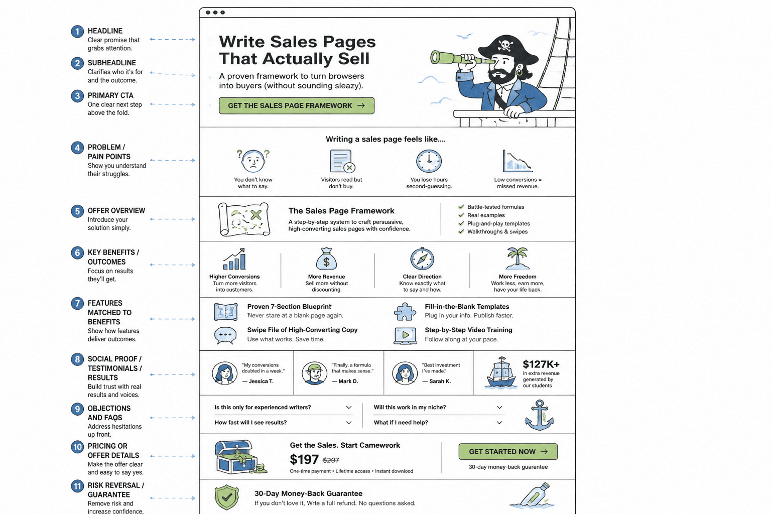
A simple sales page structure that works
Sales pages do not all need the same length or the same exact modules, but the order usually matters more than the copywriter’s favorite adjective. A dependable structure looks like this:
- Opening: state the problem, audience, and promise clearly.
- Context: explain why this offer exists and what it changes.
- Offer details: describe what is included, in plain language.
- Benefits and outcomes: translate features into results.
- Proof: show evidence that the claims are believable.
- Objections: answer the doubts that would stop a purchase.
- CTA: make the next step unmistakable.
That is the backbone. It can be compressed, expanded, or rearranged slightly depending on price, complexity, and audience warmth, but the page should still feel like a decision path rather than a pile of assets.
The biggest sales page mistakes creators keep making
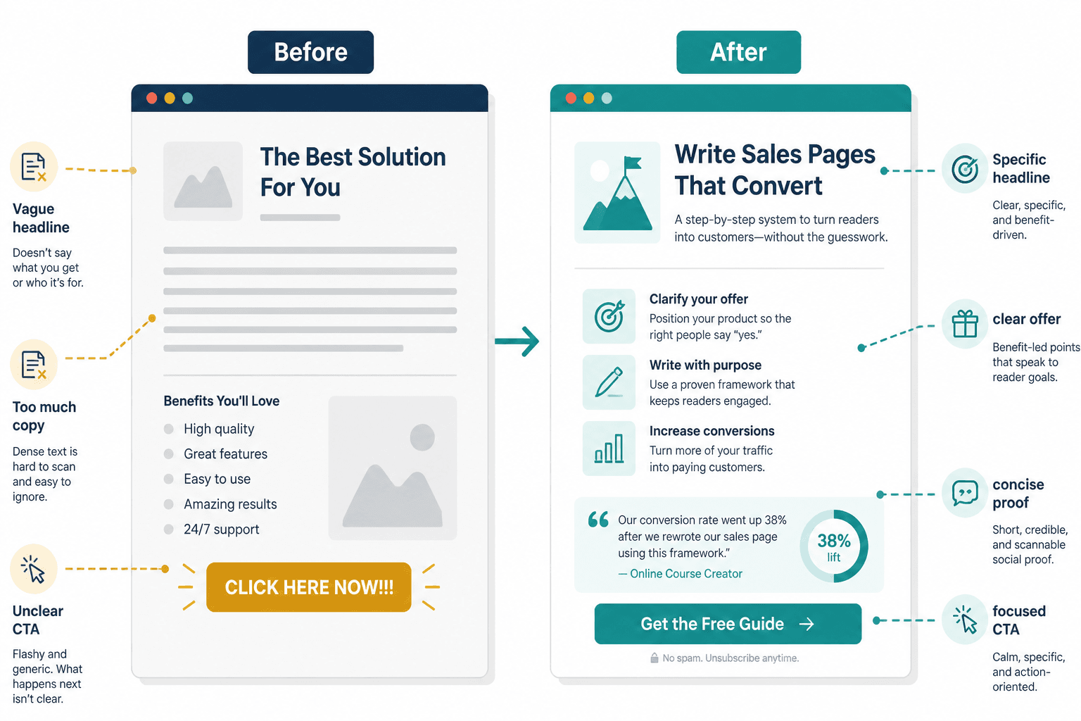
1. Leading with themselves instead of the buyer
One of the fastest ways to weaken a sales page is to open with your origin story before the reader has any reason to care. The reader is not browsing for your autobiography. They are asking a sharper question: Is this for me, and will it help?
That does not mean never mentioning yourself. It means earning the right to do so. Lead with the buyer’s situation first, then bring in your credibility where it supports the decision.
2. Using broad promises that mean very little
“Transform your business” sounds grand right up until you try to picture the actual Tuesday it improves. Vague promises age badly because they ask the reader to supply the meaning. Stronger promises are specific enough to be checked against reality.
Instead of floating above the offer, name the concrete outcome, the audience, and the kind of change the page is selling.
3. Explaining features without translating them into outcomes
Features are not useless. They are just not the finish line. A feature says what is included. An outcome says why it matters. The copy gets stronger when it makes that translation explicit.
For example, a feature like “3 live feedback sessions” is clearer when the page explains what that actually does for the buyer: quicker decisions, fewer dead-end drafts, and less guessing about what to fix next.
4. Throwing proof in randomly
Proof should not feel like a loot drop. It works best when it answers the objection the reader has right then. If the page says the offer is practical, show proof that it helped someone apply it. If the page says it is fast, show evidence that the process is manageable. If the page says it works for a specific type of buyer, prove that match.
That is also why generic testimonials often underperform. They praise the offer in a way that sounds pleasant but not especially useful. For a deeper pass on that problem, see how to improve sales page proof sections without sounding generic.
5. Making the CTA weirdly dramatic or weirdly passive
A CTA should not sound like a stunt, and it should not sound like a shrug. “Buy now and change your life forever” is overcooked. “Submit” is legally alive but emotionally absent. The better version says what happens next in plain language and matches the confidence level of the page.
Think handoff, not flourish.
Why sales page flow matters so much
A lot of weak pages do have the right ingredients. They are just in the wrong order. The page asks for trust before it earns relevance. It explains the offer before the reader understands the problem. It dumps the pain all at once, then acts surprised when the reader gets tired.
Good flow does not feel flashy. It feels easy. The page moves from recognition to belief to decision without making the reader backtrack.
If you want a separate deep dive on structure problems, the companion piece on sales page flow mistakes that hurt performance is the natural next stop.
How to start a sales page without a weak opening
The opening section has one job: make the right person feel understood quickly enough that they keep reading. That usually means four things in some form:
- A clear reader signal
- A real problem, not a misty “struggle” cloud
- A credible promise
- A reason to keep scrolling
Openings get weak when they try to sound polished instead of useful. “We’re excited to introduce…” is not an opening strategy. It is a throat-clear with branding.
For a more focused breakdown, see how to start sales pages without a weak opening or the version aimed at personal brands: better sales page openings for personal brands.
How to make proof sections less generic
Proof sections get generic when they only say, “people liked this” or “the results were great.” That kind of praise is not wrong; it is just thin. Real proof works harder. It shows context, change, and relevance.
A stronger proof section usually mixes a few forms:
- Short testimonial snippets
- Mini case studies
- Specific metrics
- Before-and-after comparisons
- Objection-based proof tied to common concerns
The key is not to stack every testimonial in one long procession like a digital award banquet. The key is to place proof near the claims it supports.
For a more detailed rewrite approach, use the companion guide on proof sections that sound like evidence.
How long should a sales page be?
There is no magic word count. A short page can convert well when the offer is obvious and the audience is warm. A long page can convert well when the offer is bigger, the stakes are higher, or the buyer needs more reassurance before acting.
So the real question is not “How long should it be?” It is “How many questions does the reader need answered before they are ready?”
- Low friction offers: a shorter page may be enough
- Higher trust or higher price offers: more depth is usually necessary
- New audiences: expect more explanation
- Warm audiences: you can often move faster
If you want a fuller framework for deciding page depth, see how long sales pages should be in 2026.
A practical sales page rewrite checklist
When a page is underperforming, do not start by rewriting everything. Start by checking whether the page is doing the boring-but-important jobs properly.
- Can the reader tell who the offer is for within the first screen?
- Does the headline say something specific enough to matter?
- Does the opening identify a real problem, not just a vague desire?
- Does each section move the buyer toward a decision?
- Are features translated into outcomes?
- Does proof answer the objections the reader actually has?
- Does the CTA clearly say what happens next?
If the answer to several of those is “not really,” the page is probably not suffering from a copy style issue. It is suffering from a message order issue.
When to go deeper on a specific problem
This guide is the broad map. If you are fixing one part of the page, the more focused sibling articles are where the sharper tools live:
- How to Write Sales Pages Without Sounding Salesy or Robotic
- How to Rewrite Boring Sales Pages
- How to Turn Old Content Into Better Sales Pages
That is usually the sensible way to work: use the guide to diagnose the page, then use the narrower piece to fix the bottleneck. Revolutionary, I know. The page gets clearer. The reader stops doing interpretive dance. The button starts earning its rent.
Final takeaway
Better sales pages are not built by stacking more persuasion on top of confusion. They are built by making the decision easier to understand. Lead with the buyer, explain the offer in plain language, place proof where it answers real objections, and keep the CTA calm and obvious. That is not glamorous work, but it is the kind that tends to move numbers instead of just rearranging them.
Helpful sources: for advice on writing with clarity and usability in mind, the Nielsen Norman Group has long-running guidance on web writing and scanning behavior, and Google’s helpful content guidance is a good reminder to prioritize usefulness over filler. For practical CTA language and consent-aligned action wording, see the UK Government Service Manual.