
A draft is open, the hook is half decent, the button copy is doing that cheerful little nothing it always does, and the page still has no obvious next step. That is the part of CTA writing nobody enjoys admitting: the line at the end is often carrying the whole conversion job on one badly chosen verb. Examples help because they show the shape before the polish. They make the next step visible.
This guide collects CTA writing examples that creators can actually use: soft CTAs, button copy, lead magnet prompts, booking lines, newsletter signups, and sales-page handoffs. If you want the strategy behind the wording, start with the CTA writing guide. If you want usable lines and patterns, you are in the right place.
What makes CTA examples actually useful
Good CTA examples do more than sound polished. They show:
- what action the reader should take
- how much commitment that action requires
- what the reader gets next
- how the wording changes depending on intent
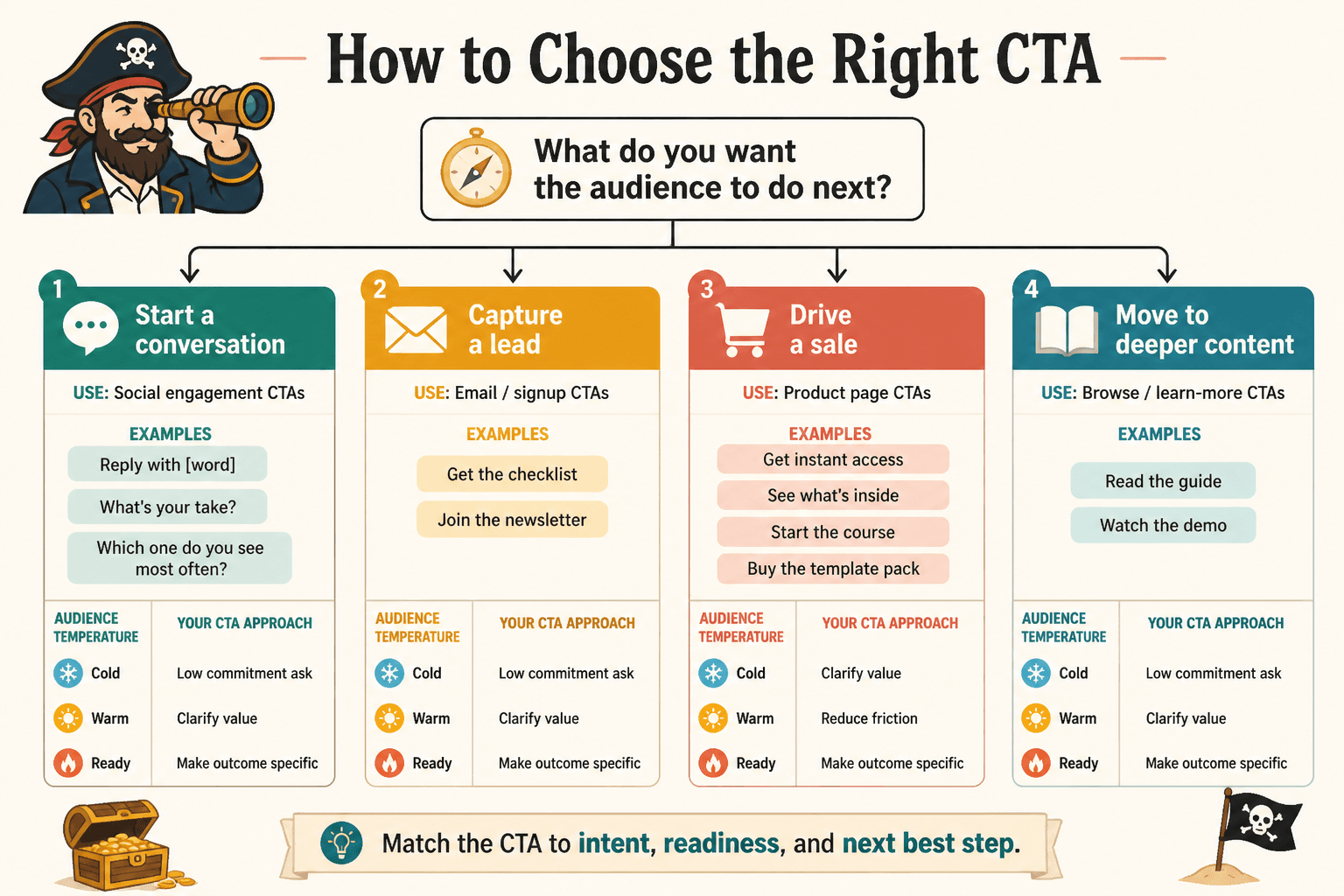
That last part matters. A CTA that works for a warm inquiry page will usually flop on a casual blog post. Same with a newsletter signup versus a booking call. The job is not to find one magical sentence and recycle it forever like a tiny conversion fossil. The job is to match the ask to the moment.
How to choose the right CTA before you write the line
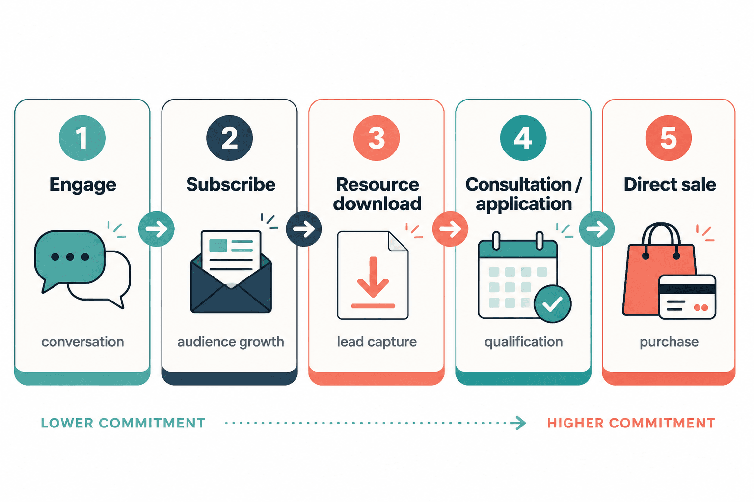
Before you write the button or closing sentence, decide what kind of commitment you are asking for. A good CTA usually fits one of these levels:
- Low commitment: comment, reply, save, read, share
- Medium commitment: download, subscribe, join, request
- High commitment: book, apply, buy, start, schedule
That choice should track with audience readiness. A cold reader does not need a hard sell. A warm lead may be ready for something direct. If you want a fuller breakdown of CTA structure and placement, the parent CTA writing guide covers the strategy side in more depth.
Soft CTA examples for posts that build conversation
Soft CTAs work best when the goal is engagement, discussion, or simple momentum. They are useful in social posts, newsletter intros, blog endings, and educational content where a hard ask would feel like it arrived wearing steel-toe boots.
Examples
- What is the hardest part of this for you right now?
- Drop your version in the replies and compare notes.
- Which of these would you try first?
- Save this for the next time you are rewriting the same paragraph for the fourth time.
- Reply with “template” and I will send the simple version.
These work because they are easy to answer and specific enough to invite a real response. They do not pretend every comment is a grand community event. Sometimes the win is simply getting the reader to move.
Lead magnet and free resource CTA examples
Free resources work best when the CTA explains what the reader gets and why it matters now. The line should feel useful, not like bait wrapped in a button.
Examples
- Download the checklist
- Get the swipe file
- Grab the template
- Send me the guide
- Access the free worksheet
- Get the examples pack
Better versions add context:
- Download the checklist for writing clearer CTAs
- Get the swipe file for stronger button copy
- Grab the template and adapt it to your offer
- Access the worksheet and map your next CTA
If you are building this kind of offer, keep the promise narrow. Broad freebies tend to sound impressive and convert like a damp sponge.
Newsletter and email signup CTA examples
Email CTAs usually work better when they feel like an exchange, not a subscription toll booth. Say what the reader gets and keep the pressure low.
Examples
- Join the newsletter
- Get the weekly note
- Subscribe for fresh examples
- Send me the updates
- Get writing tips in your inbox
- Join for practical conversion copy ideas
Stronger variants often sound more concrete:
- Get one useful CTA example each week
- Subscribe for practical examples and templates
- Join for short writing notes that do not waste your Tuesday
For signup behavior and consent-friendly email practices, the FTC CAN-SPAM compliance guide is a useful reference point.
Contact and inquiry form CTA examples
Contact CTAs should be direct. The reader is already showing intent, so the copy does not need to be clever enough to qualify for a writing award from the Department of Subtlety.
Examples
- Get in touch
- Contact me
- Start your inquiry
- Send project details
- Request a quote
- Tell me about your project
Better versions reduce uncertainty:
- Send your project details
- Start an inquiry for your next launch
- Request a quote for your content project
- Tell me what you need and I will reply with next steps
If your form is part of a broader service page, the CTA should match the offer. A vague “Contact” button can work, but “Request a quote” or “Start your inquiry” gives the visitor a cleaner idea of what happens next.
Booking call CTA examples
Booking CTAs sit higher on the commitment scale, so they need confidence without pressure. The best ones sound simple because the decision itself is already doing enough heavy lifting.
Examples
- Book a call
- Schedule a consult
- Reserve your spot
- Pick a time that works
- Book your strategy session
- Set up a discovery call
Stronger versions clarify the purpose:
- Book a call to talk through your project
- Schedule a consult to review your next launch
- Book your strategy session and get next steps
- Pick a time that works and we will map the project together
For service pages, this is often where the CTA does the most work. It should feel like a sensible next step, not a trapdoor.
Sales page CTA examples
Sales-page CTAs should make the next step obvious and reduce hesitation. That usually means being clear about the action, the outcome, and the immediate benefit.
Examples
- Buy now
- Get started
- Join today
- Start now
- Claim your spot
- Enroll now
Stronger versions add specificity:
- Start now and access the full course
- Join today to get the complete template set
- Claim your spot and begin this week
- Get started with the version that fits your workflow
Use urgency carefully. If everything is “limited” and “final,” the copy starts to sound like it was written by a countdown timer with a caffeine problem.
CTA button copy examples creators can adapt fast
Button copy has one job: make the click feel obvious. Short is fine. Short and vague is where things get slippery.
Weak button copy
- Submit
- Click here
- Learn more
- Go
Stronger button copy
- Download the guide
- Get the checklist
- Book a call
- Start the course
- Join the newsletter
- Request a quote
- See the examples
If you want a deeper set of button patterns, the sibling guide on CTA writing is the broader foundation, and the upcoming CTA button copy page can handle the more focused button-level variants. For now, the simplest rule is this: use the button to describe the action, not decorate it.
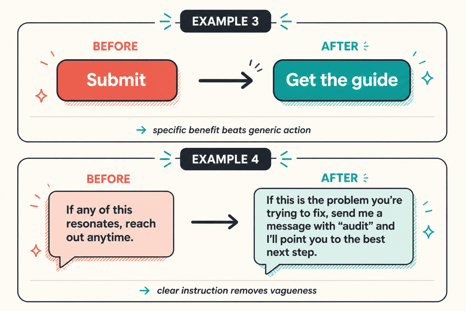
Before-and-after CTA rewrites
Sometimes the easiest way to improve a CTA is to remove the blur. Here are a few rough rewrites:
- Vague: Learn more
Stronger: See the full pricing details - Vague: Submit
Stronger: Send your project request - Vague: Download
Stronger: Download the content planner - Vague: Contact
Stronger: Start your inquiry - Vague: Sign up
Stronger: Get weekly writing tips
The pattern is boring in the best way: clear verb, clear outcome, less guessing.
How to make CTA examples fit your own offer
Do not copy a CTA example word for word unless it already fits your offer, your audience, and the actual next step. Instead:
- swap in the real deliverable
- match the commitment level to the page
- name the benefit when it helps clarity
- remove filler words that do not change meaning
- test one direct version against one softer version
If you are writing for coaches, consultants, or personal brands, this same logic applies with extra attention to trust and tone. The sibling page on CTA examples for coaches, consultants, and personal brands is a useful companion if your offer leans more service-based.
Where CTA examples break down
CTA examples usually fail in a few predictable ways:
- Too vague: the reader cannot tell what happens next
- Too pushy: the ask is stronger than the trust level
- Too generic: the line could belong to any page on the internet
- Too long: the CTA starts explaining itself into extinction
- Wrong format: a button tries to do the work of a full sentence, or vice versa
A good fix usually starts with one question: what action would feel natural here? Not the flashiest action. The natural one.
Quick editing checklist for any CTA
- Is the action clear?
- Does the CTA match the reader’s readiness?
- Does it say what happens next?
- Can it be shorter without losing meaning?
- Is the verb specific?
- Does the CTA fit the page goal?
If the answer to most of those is yes, the CTA is probably doing its job. Which is refreshing. Copy does not need to be dramatic to work. It needs to be legible.
Wrap-up
CTA examples are useful when they help you decide the right ask, not when they just give you more lines to choose from. Start with the goal, match the commitment level, and write the shortest version that still says what happens next. If you want the wider strategy behind these examples, return to the CTA writing guide.