
A draft landing page has a way of looking almost finished right up until the headline starts talking in circles, the proof section feels like it wandered in from another project, and the CTA is doing that cheerful little nothing that buttons sometimes do. The page is not broken in a dramatic way. It is just vague in three different places at once. Good examples help because they show the shape before the polish goes on.
This guide pulls together practical landing page examples for creators, with a focus on what actually changes the page: the headline block, the proof, the structure, and the handoff to the call to action. If you want the broader framework first, start with the landing pages guide. If you are working on one specific piece, the related pages on landing page strategy, headline blocks, and proof sections can help you tighten the parts that usually wobble.
What landing page examples should actually teach you
A good example is not a scrapbook of pretty sections. It is a working answer to a conversion problem. For creators, that usually means one of these jobs:
- sell a service without sounding desperate
- collect leads for a newsletter or download
- sell a digital product or template
- fill a workshop, webinar, or challenge
- build a waitlist before launch
The useful question is not “Does this page look impressive?” It is “What is this page making obvious fast?” A page that makes the offer, the benefit, and the next step obvious will usually beat a prettier page that makes people work.
That basic principle lines up with common conversion guidance from Google’s landing page best practices and the broader advice to keep the message relevant, useful, and easy to scan. Nielsen Norman Group’s writing on how users read on the web is still the same reality check: people skim first, read later, and leave fast when they cannot find the point.
How to use examples without copying the wrong parts
Before you borrow anything, separate the page into jobs:
- Headline block: what the page is, who it is for, and why it matters
- Proof: why the claim deserves attention
- Offer section: what the visitor gets
- CTA: what happens next
That keeps you from copying surface details that do not matter. A creator landing page can look wildly different and still work for the same reason: the promise is clear, the proof is specific, and the page does not ask the reader to decode a paragraph like it is a tax form.
Landing page examples creators can adapt fast
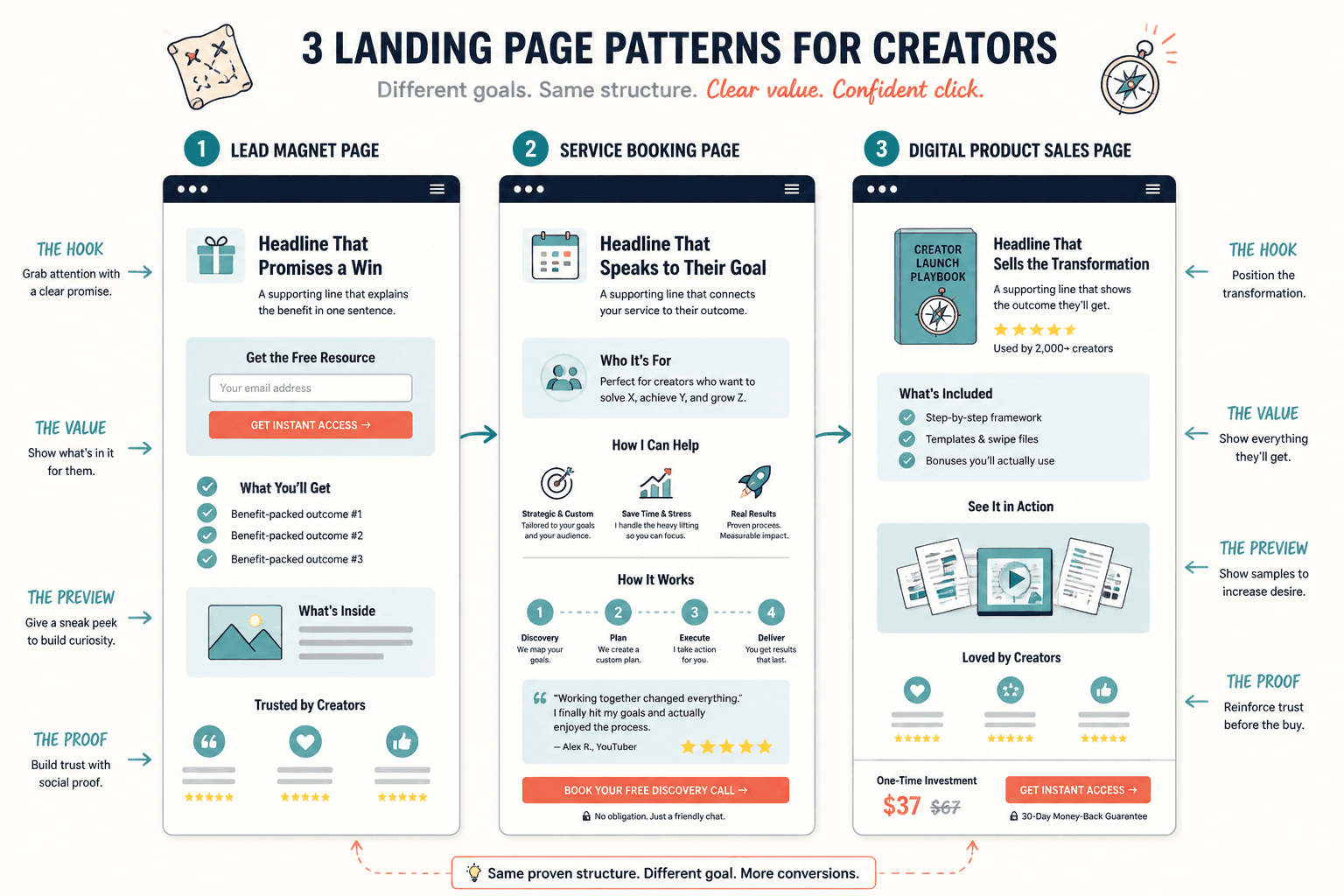
1. Lead magnet landing page
A lead magnet page should make the free offer feel useful, not vague. If the download is “a guide,” the page has already drifted. The example pattern that works is:
- clear headline with the result or problem solved
- one-line subhead that explains what is inside
- 3 to 5 benefit bullets
- proof that the resource is worth the click
- single CTA repeated near the decision point
Example angle: “Get the content planning checklist that helps you publish without rewriting your week.”
That is better than a generic “Download the checklist,” because it says why the checklist exists and what it helps the reader do.
2. Service or consult landing page
For a service page, the fastest mistake is trying to sound broad enough for everyone. The better pattern is narrower:
- who the service is for
- what problem it solves
- what the outcome looks like
- why this process is simpler than the alternative
- CTA that matches the commitment level, such as booking a call or applying
Example angle: “Strategy sessions for creators who need a cleaner offer page before the next launch.”
This works because it names the audience, the need, and the timing. It does not pretend to be all things to all people, which is often what makes service pages feel slippery.
3. Product or digital download landing page
Digital product pages should show the thing, not just admire the idea of the thing. A useful page structure is:
- headline with the main result
- short description of what the product includes
- visual preview or contents list
- proof or example use cases
- price and CTA close together
For a template, swipe file, or mini course, the page should answer one basic question: “What do I get, and what does it save me?”
4. Webinar or workshop landing page
Event pages need momentum. The page should make the topic feel timely and worth a slot on the calendar. The strongest pattern usually includes:
- clear event title with a concrete payoff
- date, time, and format near the top
- what attendees will learn
- who it is for
- registration CTA without extra detours
If the event is free, that does not mean the page should be vague. Free is not a strategy. It is a price tag. The page still has to explain the outcome.
5. Waitlist or prelaunch landing page
Waitlist pages are often underwritten, as if the point were merely to collect emails and hope for the best. A stronger example gives people a reason to care now:
- what is coming
- why it matters
- what waitlist members get first
- any deadline, bonus, or early access angle
The page does not need to reveal everything. It does need enough clarity that joining the waitlist feels like a decision, not a raffle ticket.
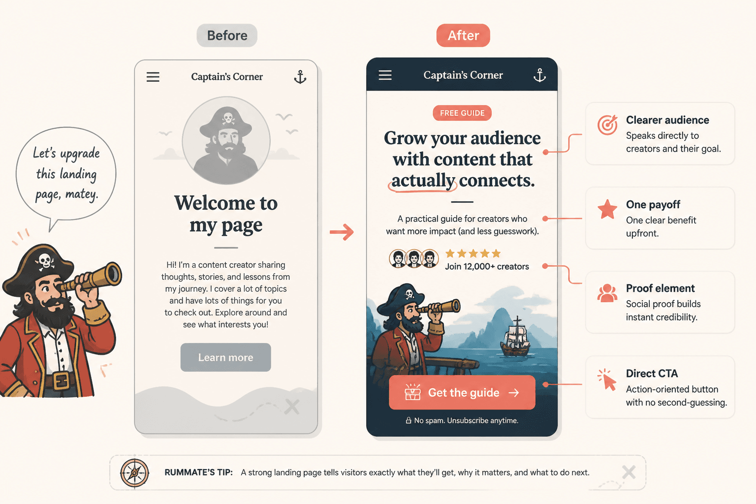
Landing page headline block examples
Most landing page headline blocks fail because the top of the page says almost nothing. The headline tries to sound polished. The subhead repeats the headline in longer clothes. Then the whole section waits for the visitor to do the interpretation work.
Good headline blocks do four jobs quickly:
- state the result
- name the audience or use case
- make the offer legible
- reduce uncertainty
Outcome-first
Example: “Build a cleaner landing page that turns more visitors into subscribers.”
This style works when the outcome is clear and desirable. It is direct, useful, and easy to scan.
Problem-first
Example: “Your landing page is getting traffic, but the CTA is not earning the click.”
This one works when the audience already feels the pain. It is strong for service pages, audits, and fixes.
Audience-plus-result
Example: “Landing page examples for creators who want more signups without adding more noise.”
This is a good fit when the audience matters as much as the outcome. It filters fast.
Offer-first with a clear use case
Example: “A landing page template set for lead magnets, services, and product launches.”
This works when the offer itself is the hook. It is especially useful for templates and digital downloads.
Contrarian or anti-fluff
Example: “A prettier landing page will not fix a confusing offer.”
This can work when the audience is tired of generic optimization talk. Keep it grounded. The goal is clarity, not a wrestling promo.
For more on stronger hero messaging, see the related page on landing page headline blocks for creators.
Proof section examples that do real work
Proof sections are there to answer the quiet question every visitor has: “Why should I believe this?” The answer does not need to be dramatic. It needs to be specific.
Good proof sections usually include one or more of the following:
- short testimonials with concrete outcomes
- numbers that mean something, not just vanity metrics
- client types, logos, or recognizable categories
- before-and-after comparisons
- examples of what is inside the offer
Useful rule: match the proof to the promise. If the page promises speed, show speed. If it promises clarity, show a result that proves clarity. If it promises trust, do not bury the proof three scrolls down like it is a family secret.
For a deeper breakdown, the companion article on simple proof section templates covers how to keep this section lean without making it weak.
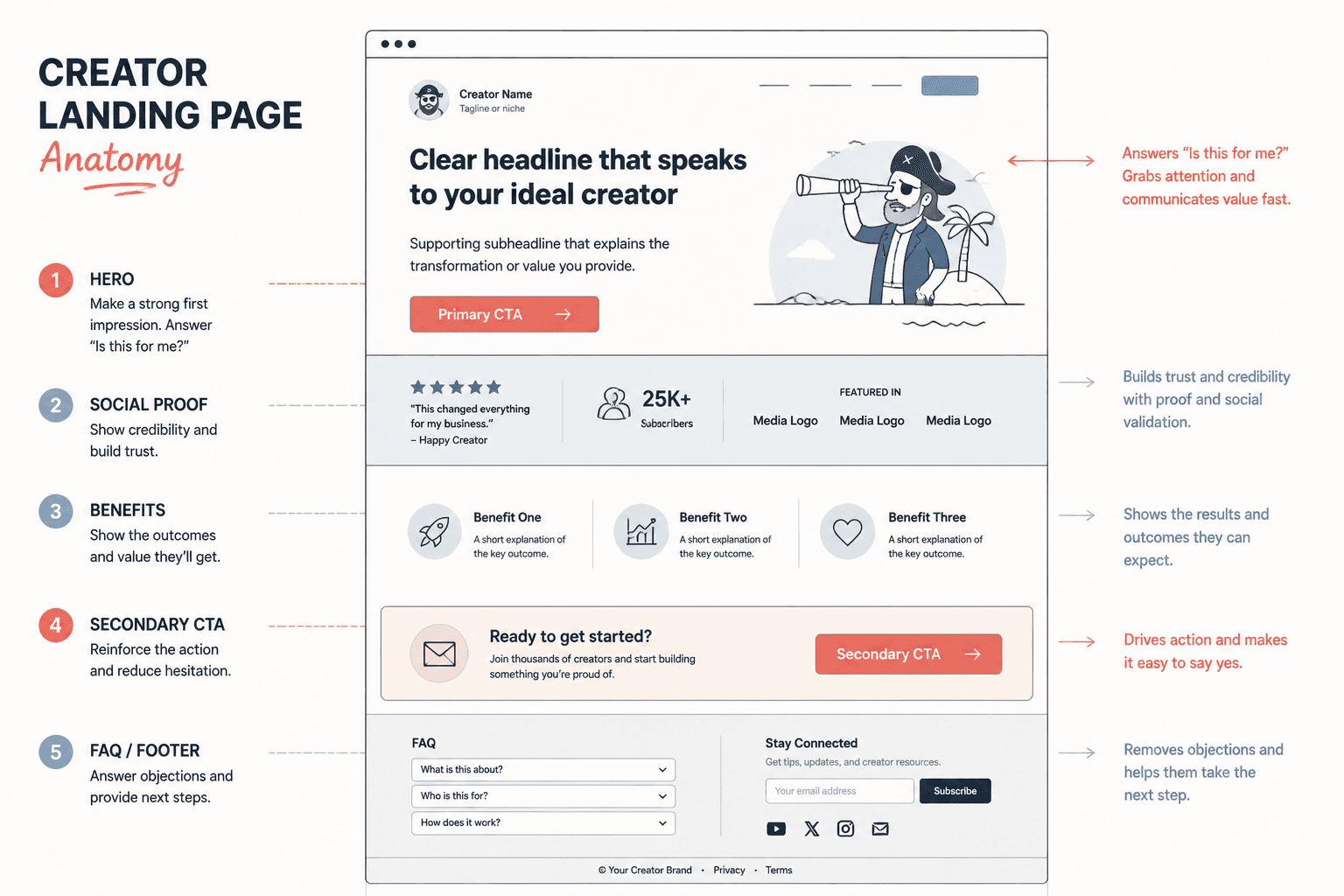
A simple structure that works across most creator landing pages
Not every landing page needs a massive layout. A clean baseline is usually enough:
- Hero section: headline, subhead, CTA
- Proof section: credibility, outcomes, or examples
- What you get: deliverables, features, or included materials
- Who it is for: audience fit
- FAQ or objection handling: remove friction
- Final CTA: clear next step
That sequence keeps the page from jumping around. It also makes the reader feel like the page is doing the thinking for them, which is generally the point.
What to borrow, and what to ignore
Borrow:
- headline patterns that make the offer clearer
- proof that matches the promise
- page structures that reduce decision fatigue
- CTA wording that names the actual next step
Ignore:
- decorative complexity that does not help conversion
- vague benefit stacks with no proof
- testimonial clutter that reads like atmosphere instead of evidence
- button copy that says “submit” and acts surprised when nobody feels inspired
Final takeaway
Landing page examples are most useful when they show how the page earns trust, not just how it looks in a screenshot. For creators, that usually means a clearer headline block, a tighter proof section, and a structure that makes the next step obvious without shouting. Start with the offer, then make the page prove it.
If you want the broader system behind these examples, go back to the landing pages guide and build from there.