
Most tool reviews do not fail because the writer forgot a feature. They fail because the structure makes it harder to think clearly.
You click in hoping for an answer and get a fog machine instead: a padded intro, a recycled feature list, maybe a few screenshots, then a vague “it depends” ending that tells you absolutely nothing. Helpful.
If you want to know how to evaluate tool review structure, the real question is this: does the review help a buyer move from curiosity to decision without making them do all the work themselves?
That is what this article will help you judge. Not whether the review looks polished. Not whether it has affiliate links dressed up in polite clothes. Whether the structure is actually built to help someone evaluate a tool honestly, quickly, and with enough context to make a decent call.
If you are writing reviews, this will help you make them stronger. If you are reading reviews before buying software, this will help you spot fluff fast. And if you are building content that needs to earn trust before it earns revenue, this matters more than most people admit.
For broader context on this content category, it helps to review the full tool reviews topic and how it fits inside the site’s wider monetization funnels and money content coverage.
If you want the bigger picture, start with the parent guide.
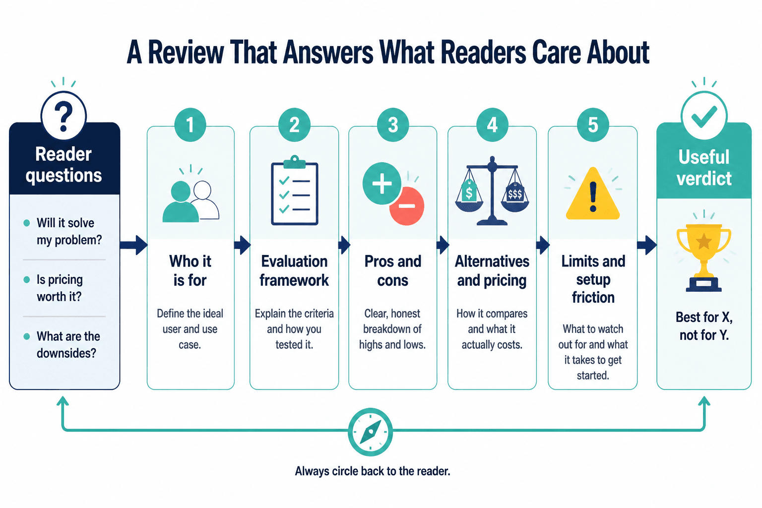
What a good tool review structure is supposed to do
A strong tool review structure does four jobs:
- It tells you who the tool is for.
- It shows you what problem the tool solves.
- It helps you weigh strengths, limits, and tradeoffs.
- It gives you a clear buying recommendation or non-recommendation.
That sounds obvious, but a weird number of reviews skip at least two of those. They act like listing features equals reviewing. It does not. A product page already lists features. A review is supposed to add judgment.
Structure matters because readers are usually not asking “what does this tool have?” They are asking things like:
- Will this solve my specific problem?
- Will I outgrow it in three months?
- Is it easier or harder than the alternatives?
- Is the pricing reasonable for what I actually need?
- What will annoy me after the free trial glow wears off?
A review with a smart structure anticipates those questions. A weak one leaves them hanging and hopes a star rating will do the heavy lifting.
The fastest way to evaluate a tool review structure
If you want a quick test, scan the review in this order:
- Can you tell who the tool is for within the first few paragraphs?
- Is there a clear evaluation framework, not just a wandering opinion?
- Are pros and cons actually specific?
- Does it compare the tool to realistic alternatives?
- Does it address pricing, setup friction, and limitations?
- Does it end with a useful recommendation?
If the answer is mostly no, the structure is weak, even if the writing is smooth. Good writing can hide bad thinking for a while. It cannot make a useless review useful.
The core sections every useful tool review should include
1. A clear opening that frames the buyer problem
The opening should not spend 300 words saying software is important. We know. That is why we are here.
A good review intro quickly answers:
- What kind of tool is this?
- Who is likely considering it?
- What decision is this review helping them make?
Strong example:
This is a review for creators and small teams who need a simple scheduling tool without paying for enterprise-level clutter they will never use.
Weak example:
In the evolving digital ecosystem, having the right tools can make all the difference for modern businesses.
That second one means nothing. It is content wallpaper.
2. A quick verdict or summary box
This section helps readers orient themselves before they commit to the full read. It should include:
- Best for
- Not ideal for
- Main strengths
- Main drawbacks
- Bottom-line recommendation
Not every reader wants the full scenic route. Some are trying to shortlist tools between meetings. Respect that.
This is also where a review starts showing intellectual honesty. If there is no “not ideal for” section anywhere, that is usually a sign the piece wants to sell harder than it wants to help.
3. Evaluation criteria that are obvious and relevant
A strong review does not just bounce from feature to feature like a distracted shopper. It evaluates the tool against useful criteria.
Common criteria might include:
- Ease of use
- Setup speed
- Core functionality
- Reliability
- Customization
- Integrations
- Reporting or analytics
- Customer support
- Pricing
- Scalability
The key is relevance. A review for solo creators should not spend half its energy on team permissions and enterprise admin controls unless that is central to the buying choice. A lot of review structures get bloated because they try to sound comprehensive instead of being useful.
If you want to improve this part of your own review process, read How to Compare Tool Reviews Buyer Questions Without Bias. It helps turn vague comparison thinking into an actual decision framework.
4. Real pros and cons, not decorative ones
This is where a lot of review structure falls apart. The pros are vague compliments. The cons are fake inconveniences. You have seen this nonsense before.
Weak pro: Easy to use
Weak con: So many amazing features can feel overwhelming at first
That “con” is basically blowing a kiss at the product.
Better pros and cons are specific enough to affect a buying decision.
Better pro: The onboarding flow gets a solo user from signup to first working automation in under 15 minutes.
Better con: Reporting is too shallow for teams that need campaign-level attribution across multiple channels.
A review structure should create room for this level of specificity. If the format only allows bullet-point compliments, it is not really a review structure. It is a promo template wearing glasses.
For a deeper look at this section, Best Tool Reviews Pros and Cons Questions to Ask Before You Buy breaks down what buyers should actually look for.
5. Evidence, examples, or scenario-based judgment
Good structure makes space for proof. That proof does not always need to be lab-grade testing. But it should show why the writer reached the conclusion they did.
This might include:
- A short walkthrough of setup
- A realistic use case
- A feature test against a common task
- A comparison with another tool used for the same purpose
- Specific examples of where the tool shines or struggles
The easiest way to spot empty review structure is this: the writer makes claims but never anchors them in use. They say a tool is “powerful,” “flexible,” or “great for teams,” but do not show how those claims matter in practice.
Readers do not need endless screenshots. They need enough evidence to trust the recommendation.
6. Pricing in context
A review structure that mentions pricing without context is not helping much. Twenty dollars a month can be cheap, expensive, or irrelevant depending on the buyer and the payoff.
Useful pricing coverage should explain:
- What the entry plan realistically gives you
- When an upgrade becomes necessary
- Who gets value at each pricing tier
- Where the tool feels overpriced or reasonably priced
This matters especially in monetization content, because tool costs are often framed like minor details when they actually shape margins, workflow decisions, and adoption speed. If a tool only makes sense once you hit the higher plans, the structure should say that plainly.
7. Alternatives or comparison points
Most buyers are not evaluating a tool in a vacuum. They are choosing between options. So a strong review structure usually includes at least a light comparison layer.
This can be simple:
- Best if you want simplicity over customization
- Less powerful than Tool B, but easier to learn
- More expensive than Tool C, but stronger reporting
The point is not to build a giant comparison article inside every review. The point is to give the reader enough context to understand the tradeoffs.
If the review acts like this tool is the only one on earth, that is usually not confidence. That is avoidance.
For examples of what stronger review construction looks like in practice, see Tool Reviews Examples That Actually Help a Buyer Decide.
8. A final recommendation with boundaries
The best review endings are clear and bounded. They do not try to please every possible reader.
A strong final recommendation sounds like this:
This tool is a strong fit for solo consultants and small content teams who want fast setup and clean workflows. It is a weak fit for larger teams that need deep reporting, custom permissions, or heavy automation.
That kind of conclusion helps someone decide. A fuzzy ending like “overall, this is a solid option worth considering” does not. That is not a verdict. That is verbal packing peanuts.
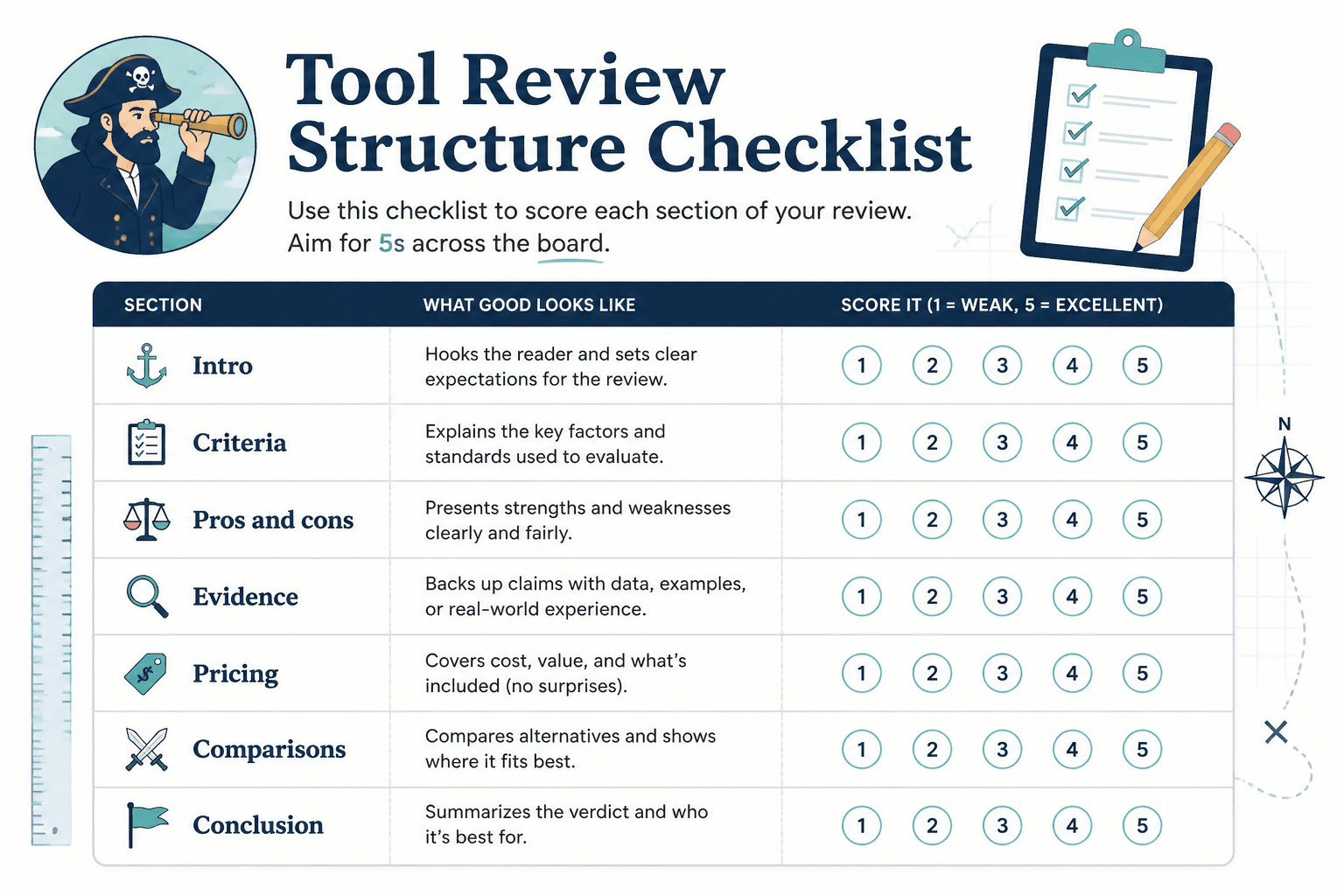
How to evaluate tool review structure section by section
If you want to be more systematic, use this checklist.
| Section | What good looks like | Red flag |
|---|---|---|
| Intro | Frames the problem, buyer, and decision clearly | Generic setup and filler |
| Summary | Quick verdict with best-for and not-for guidance | No clear recommendation early on |
| Criteria | Uses relevant evaluation categories | Random feature hopping |
| Pros and cons | Specific, decision-relevant tradeoffs | Vague praise and fake downsides |
| Evidence | Examples, use cases, or testing notes | Claims without support |
| Pricing | Cost explained in buyer context | Just lists plan prices |
| Comparisons | Shows tradeoffs versus alternatives | Pretends no alternatives exist |
| Conclusion | Clear recommendation with boundaries | Polite non-answer |
That is the bones of a useful review. Fancy formatting is optional. Clear thinking is not.
Common bad review structures to watch for
The feature dump
This review lists every feature in order and calls that analysis. It usually reads like the writer copied the navigation menu from the product website and added a few adjectives.
Problem: features are not priorities. Buyers need interpretation.
The affiliate fog machine
This one is suspiciously positive, avoids real limitations, and keeps circling back to “value” without saying who gets it or why. It often hides weak structure under polished formatting and comparison tables.
Problem: the structure is built for conversion first, trust second.
The diary review
This starts with the writer’s experience in painful chronological detail. First they signed up. Then they clicked this. Then they noticed that. Forty scrolls later, maybe the reader learns whether the tool is any good.
Problem: the structure follows the writer’s experience, not the reader’s decision process.
The “best for everyone” review
This review refuses to narrow. It keeps saying the tool works for beginners, experts, teams, freelancers, agencies, startups, enterprises, and probably your cousin’s dog-walking side hustle.
Problem: if a review cannot define fit, it cannot evaluate anything honestly.
The endless comparison trap
This one tries to compare the tool to six or seven competitors inside one article, so none of the insights go deep enough to matter.
Problem: too many tools in one review usually weakens the structure and the judgment. If you are sorting that issue out, How Many Tools Belong in Tool Reviews is worth reading.
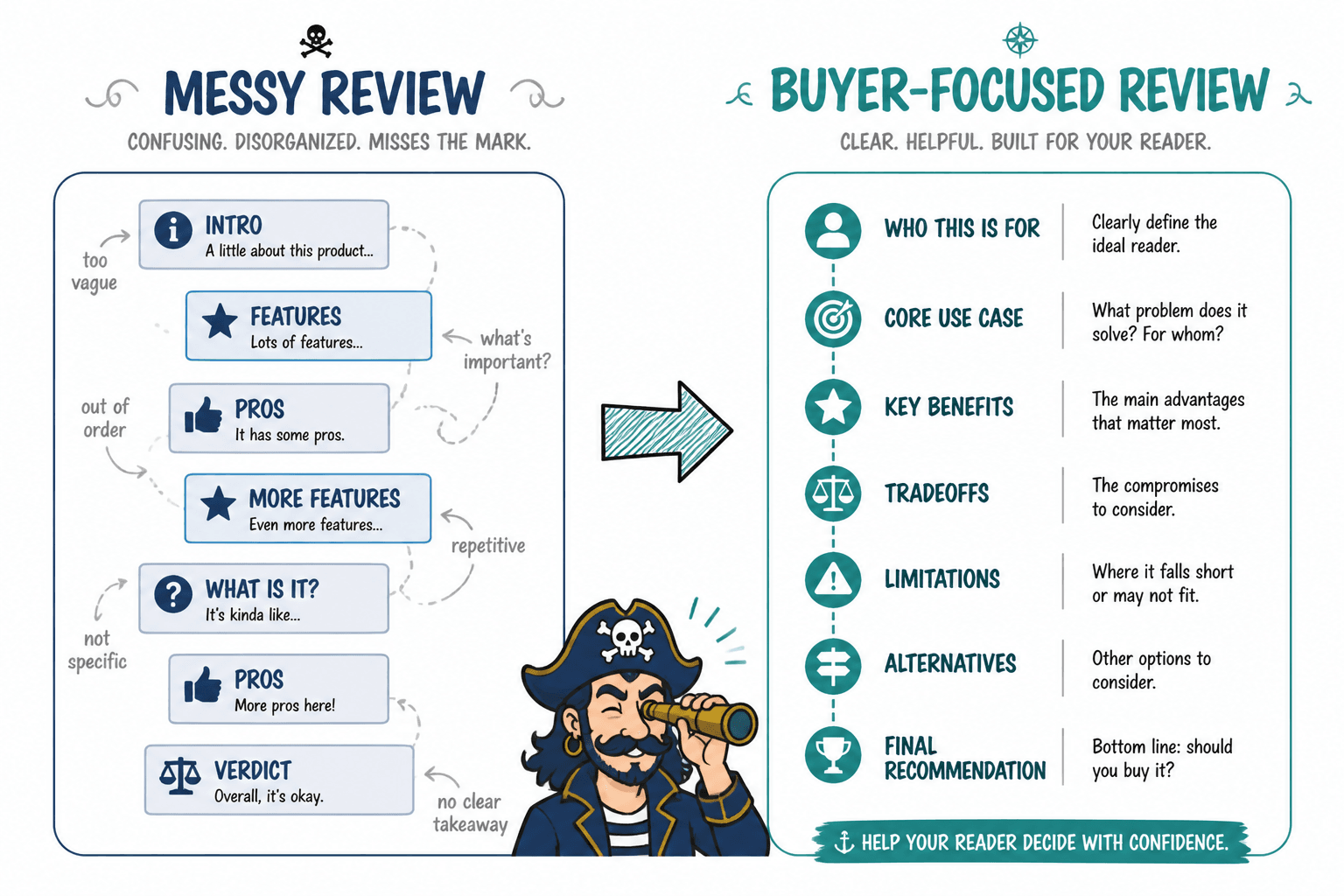
What strong review structure looks like in practice
Here is a simple review structure that usually works well for software, creator tools, productivity apps, and marketing platforms:
- Intro: who this tool is for and what decision the review helps with
- Quick verdict: best for, not for, key pros, key cons
- What the tool does: short overview, not a brochure
- Ease of use: setup, learning curve, interface friction
- Core features: only the ones that matter most to the buyer
- Performance in real use: scenarios, examples, or workflow fit
- Pricing: value in context
- Alternatives: where this wins or loses
- Final verdict: recommend, do not recommend, or recommend with limits
Notice what is missing: endless throat-clearing, bloated feature recaps, and soft conclusions designed to offend nobody. Good review structure is not complicated. It is disciplined.
How writers can improve weak review structure fast
If you are the one writing the review, here is the fix.
- Decide who the review is for before you draft. A review for solo creators should not read like a procurement memo for a 50-person team.
- Pick 4 to 6 evaluation criteria that matter most. Not 14. You are reviewing a tool, not building a museum plaque.
- Write the verdict early. If you cannot state the recommendation clearly, the structure will drift.
- Turn vague praise into specific judgment. Replace “great automation” with what it actually does well.
- Add at least one real limitation that changes fit. If every downside is cosmetic, readers will smell the sales intent.
- Close with a recommendation that excludes some people. Specificity builds trust.
This is also where some writers need to be a little braver. Too many reviews stay soft because the writer is afraid a clear judgment will alienate someone or reduce clicks. But buyers do not trust reviews that avoid edges. If everything is “pretty solid overall,” nothing means much.
Sometimes the strongest thing you can do structurally is say, plainly, “This tool is decent, but only if this very specific thing matters more to you than these three drawbacks.” That is useful. That sounds like a person who actually thought about the decision.
How buyers can tell if a review is worth trusting
When you are reading reviews before buying, structure gives away intent faster than tone does.
A trustworthy review usually:
- Defines who should and should not use the tool
- Separates features from actual benefits
- Names tradeoffs clearly
- Admits limitations without theatrical hedging
- Compares alternatives fairly
- Ends with a recommendation that feels earned
A less trustworthy review usually:
The bigger point is simple: clearer structure and clearer writing make the piece more useful. That is usually what makes the ending land better too.