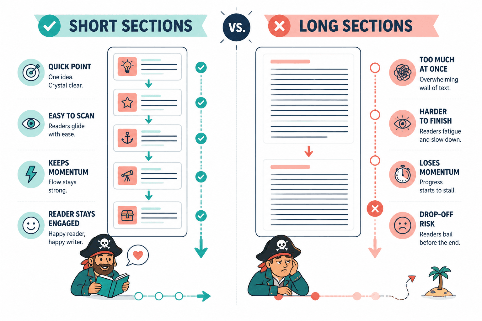
Longer does not automatically mean better in newsletters. It usually just means the reader has more chances to get bored, distracted, or vaguely annoyed before they reach the part you actually wanted them to read.
That is the real issue behind When Short Newsletter Sections and Formats Beat Long Ones. A lot of creators treat newsletter structure like a value contest. More sections, more words, more thoughts, more links, more “helpfulness.” Then they wonder why open rates stay decent while clicks, replies, and actual attention quietly fall down the stairs.
Short sections often win because they respect how people read email: quickly, selectively, and with very little patience for slow build-up. That does not mean every newsletter should be tiny. It means each section should earn its space instead of sitting there like furniture nobody asked for.
Here’s how to know when shorter newsletter sections and formats work better, what they’re better for, and how to tighten your emails without turning them into thin little husks of content.
For the full path around this topic, head to the parent guide.
Why short newsletter sections often outperform long ones
Most subscribers are not opening your newsletter with a cup of tea, a notebook, and a reverent silence. They are skimming between tabs, half-reading on a phone, or checking whether this email deserves two minutes or an immediate archive.
Shorter sections work well because they reduce friction. They make it easier to find the point, easier to keep momentum, and easier to act on one useful idea before another paragraph wanders in wearing a fake mustache.
That matters even more if your newsletter is meant to drive clicks, replies, bookings, product interest, or trust with busy readers. Dense sections can work for deep teaching. But if the structure makes people feel like they are committing to homework, performance usually suffers.
- Short sections improve scannability. Readers can quickly spot what matters.
- They increase clarity. One section, one job, one takeaway.
- They create pace. The email feels lighter and easier to finish.
- They sharpen your thinking. You are forced to cut repetition and throat-clearing.
- They help clicks and replies. Readers are not exhausted by the time they reach the CTA.
This is especially true for creators and consultants whose newsletters support a broader content funnel. If your email is one part of a trust-building system, it does not need to contain your entire worldview every Tuesday. It needs to move the reader one useful step forward.
If you want a broader framework for choosing the right newsletter structure in the first place, the main newsletter sections and formats hub is a good place to start, along with this more complete guide for creators who want better results.
When short newsletter sections and formats beat long ones
Not always. But often enough that you should stop defaulting to long.
Shorter formats tend to win when the goal is speed, clarity, action, or consistency. Longer formats tend to win when the goal is depth, nuance, story, or authority. The problem is that many newsletters are trying to achieve the first set of goals with the second kind of structure.
| Goal | Shorter sections usually work better | Longer sections may work better |
|---|---|---|
| Quick useful email | Yes | Rarely |
| Drive one click | Yes | Sometimes, if context is needed |
| Increase replies | Yes | Only if the story earns it |
| Teach a deeper concept | Sometimes | Yes |
| Build thought leadership | Sometimes | Often |
| Tell a full narrative | No | Usually |
The smartest question is not “Should my newsletter be short or long?” It is “What does this section need to do, and how much room does that actually require?”
That sounds obvious. It is. People still ignore it all the time.
1. When the section only has one real point
If a section can be summarized in one sentence, it probably should not take eight paragraphs to say it. This is where a lot of newsletters go soft. The writer has one good observation, then piles on examples, side comments, and moral-of-the-story fluff until the original point loses all shape.
A strong short section might look like this:
Your newsletter CTA should match the size of the ask. If the email offered one quick insight, ask for one quick next step. Do not go from “tiny useful tip” to “book a strategy call” like nothing weird happened.
Clean. Memorable. Easy to act on. Done.
2. When readers are likely on mobile
Email is heavily consumed on phones, and long dense sections feel even longer there. A section that seems fine on desktop can turn into an endless slab on mobile.
Short sections are not just visually cleaner. They lower the mental cost of continuing. That matters a lot in newsletters with multiple parts like tips, links, updates, story snippets, resources, or offers.
3. When your format has recurring sections
Recurring newsletter formats work best when each piece is predictable and easy to consume. If you have sections like:
- One idea
- One tool
- One mistake
- One recommended link
- One quick offer or CTA
…then each section usually benefits from being short. The format itself is the value. Readers know what they are getting, and they can move through it quickly. If every recurring section turns into a mini essay, the structure stops helping and starts dragging.
For more examples of formats that actually work, see best newsletter sections and formats ideas and examples for creators.
4. When the goal is click-through
If the email exists to drive the reader to an article, product, landing page, booking page, or offer, shorter sections often perform better because they do not drain all the energy before the click.
A common mistake is over-explaining the linked content inside the email itself. If your whole article is already packed into the newsletter intro, the click becomes optional. You accidentally gave away the ending and then asked people to buy a ticket.
In these cases, the job of the section is simple:
- Frame the problem
- Show why it matters
- Hint at the payoff
- Send the reader to the full thing
That usually does not require 500 words. It requires precision.
5. When consistency matters more than completeness
A shorter format is easier to sustain. That matters.
Many newsletters do not fail because the writer lacks ideas. They fail because every issue feels like assembling a Victorian greenhouse by hand. If each edition demands multiple long sections, polished transitions, and several distinct insights, consistency becomes fragile fast.
Shorter sections make newsletter production simpler. They help you ship on time, maintain quality, and keep the format recognisable. Readers generally prefer reliably useful over occasionally monumental.
6. When long sections are mostly padding in nicer clothes
Sometimes the real reason a section is long is not depth. It is hesitation. The writer keeps circling the point instead of stating it plainly.
Watch for these signs:
- The section repeats itself in slightly different language
- The first two paragraphs are just warm-up
- Examples say the same thing three times
- The takeaway could have appeared much earlier
- The closing sentence finally gets interesting, which is rude
Shorter sections beat longer ones when the “extra value” is mostly decorative filler pretending to be nuance.
Formats where shorter sections usually work especially well
Some newsletter formats are naturally stronger when each part stays tight. These are not hard laws, but they are useful defaults.
Curated newsletters
If you are sharing links, tools, examples, trends, or resources, readers usually want brief context, not a full companion essay under each item.
- What it is
- Why it matters
- Who it is for
- Optional opinionated note
That is often enough.
Tip-of-the-week newsletters
A single practical tip can absolutely carry an email. But if the tip is simple, stretching it into a long essay usually weakens it. Better to make the point crisp, show a fast example, and end cleanly.
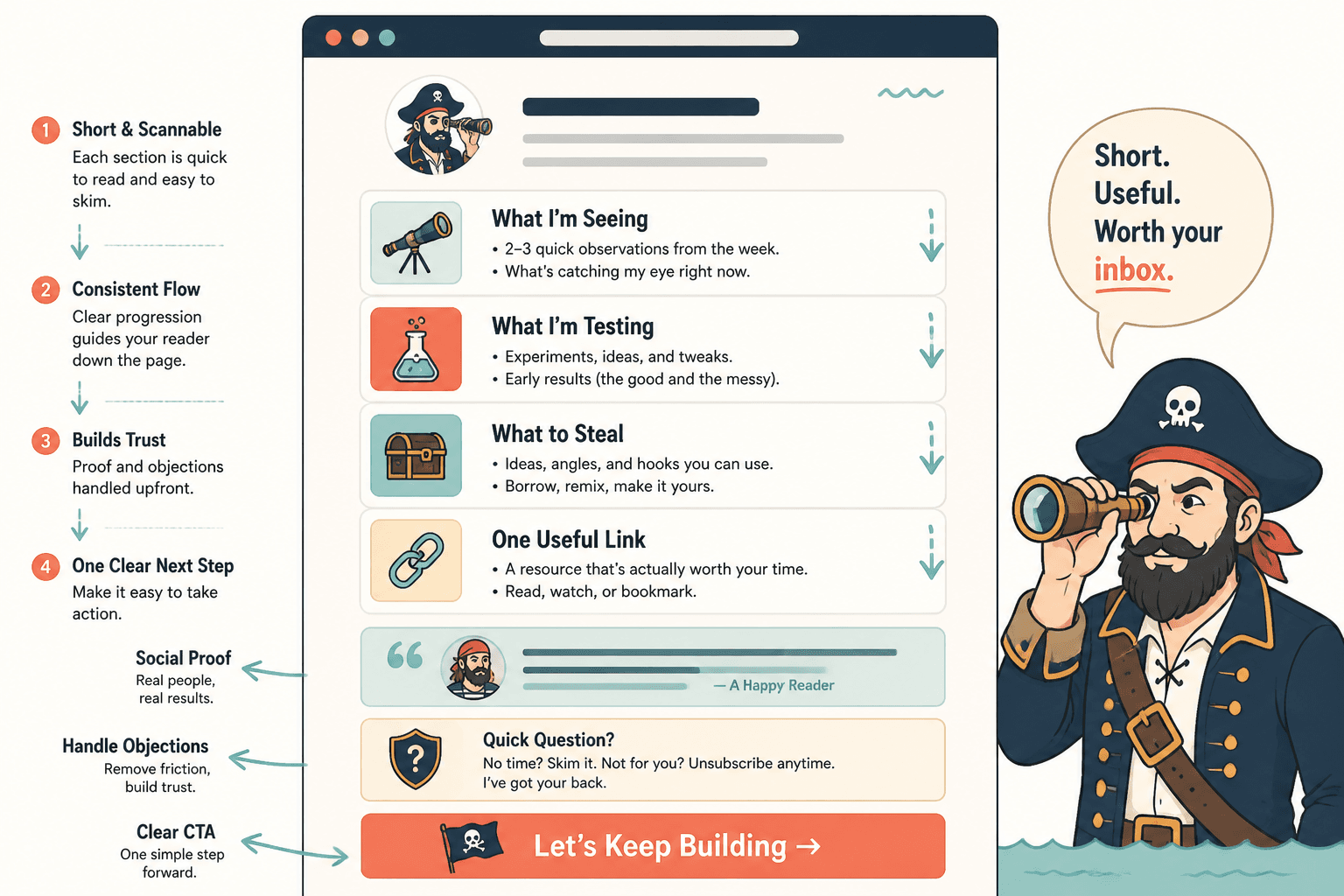
Multi-section creator newsletters
Newsletters with sections like “what I’m seeing,” “what I’m testing,” “what to steal,” and “one useful link” benefit from short modular writing. The variety keeps things interesting. Long sections flatten that advantage by making each piece feel heavy.
Sales-support newsletters
If the newsletter supports an offer, short sections usually work better because they keep the reader moving. One insight, one piece of proof, one objection handled, one CTA. That is often plenty.
Turn every section into a manifesto, and your conversion path gets muddy.
When longer sections still deserve the space
Short does not mean superior. It means efficient. Some ideas need room.
Longer sections are often worth it when:
- You are telling a story with a real payoff
- You are teaching something nuanced that would be oversimplified if compressed
- You are building authority through a developed argument
- You need proof, examples, or explanation for the idea to land
- Your audience actively expects depth from you
The key is that the length should feel earned. If a longer section keeps revealing something useful, readers stay with you. If it keeps clearing its throat and adjusting its tie, they leave.
Story sections are a good example. A story can do real work in a newsletter, but only if it has shape, tension, and a point. If your story sections keep underperforming, read these mistakes that hurt performance.
How to shorten newsletter sections without making them weak
This is the part people botch. They hear “shorter is better” and strip all the life out of the writing. The result is technically concise and emotionally dead, like a meeting agenda with a pulse.
Good short sections still need substance. They just remove what is not carrying weight.
Start with the point, not the runway
Bad:
I’ve been thinking recently about how many people approach newsletter strategy in ways that may not fully align with reader behavior and expectations in inbox environments.
Better:
Most newsletter sections are too long for the job they’re trying to do.
There. We are awake now.
Give each section one job
If a section is trying to teach, entertain, sell, update, and prove credibility all at once, it will usually get bloated. Pick the main job first. Then write to that job.
Examples:
- Teaching section: one principle, one example, one takeaway
- Curated link section: one-sentence context, one reason to care
- Story section: setup, turn, lesson
- CTA section: what it is, who it is for, why now
Cut repeated meaning, not useful texture
Not every extra sentence is waste. Sometimes a second sentence adds rhythm, contrast, or specificity that makes the section stronger. What you want to cut is repeated meaning.
If two sentences do the same job, one should probably go.
Newsletter structure works best when each section has one clear job and supports the main point of the issue. Simpler formats usually outperform busier ones when the writing stays sharp.