
Most newsletter advice is written for people with huge lists, dedicated content teams, or an unhealthy interest in turning every email into a miniature magazine.
If you have a small audience, that approach usually backfires. You do not need 9 recurring sections, polished editorial sprawl, and a carefully branded “content ecosystem.” You need a newsletter people actually read, remember, and occasionally click.
That is the real job of smart newsletter sections and formats for creators with small audiences: make the email easier to write, easier to read, and more worth subscribing to, without stuffing it full of filler because some marketing blog said consistency means sameness.
Here’s what tends to work better: simple structures, repeatable sections, clear personality, one main point, and a format that fits your actual bandwidth. Small audiences do not need more noise. They need stronger signals.
If you are still figuring out your overall newsletter strategy, it helps to start with the broader newsletter sections and formats hub, or browse more support inside email newsletter writing and newsletter writing. But for now, let’s keep this practical.
If you want the bigger picture, start with the parent guide.
What small-audience creators actually need from a newsletter format
When your list is small, your newsletter has different jobs than a giant creator’s newsletter.
You are not optimizing for mass-scale ad inventory. You are building familiarity, trust, and a reason for someone to stay subscribed long enough to care what you make, sell, or say next.
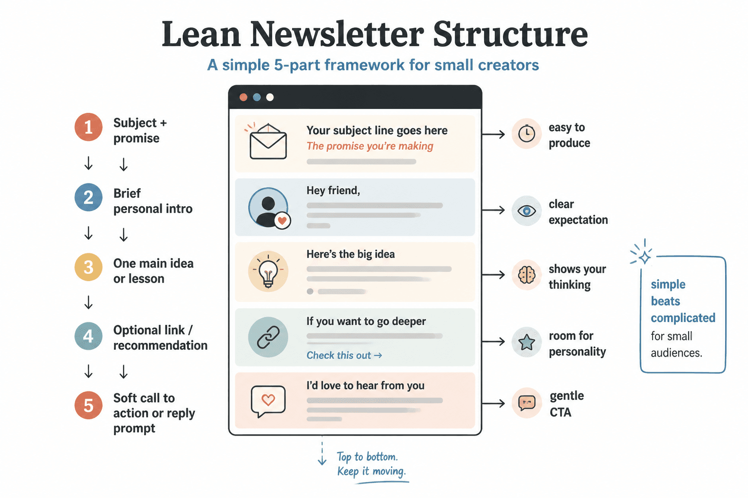
That means your format should do a few things well:
- Be easy to produce consistently
- Highlight your thinking, not just your links
- Train readers on what to expect
- Leave room for personality without turning into rambling
- Support clicks, replies, or offers without sounding needy
A good newsletter format reduces creative friction. It gives your email shape before you write a single sentence. That matters more than people admit. Most inconsistent newsletters do not die because the writer ran out of ideas. They die because every issue feels like rebuilding a house with oven mitts on.
The best newsletter formats for small audiences are usually simple
You can absolutely get fancy later. Right now, simple wins.
These are the most useful formats for creators with smaller lists because they are sustainable, clear, and flexible enough to grow with you.
1. The one-idea email
This is exactly what it sounds like: one useful point, one argument, one lesson, one observation, or one story with a payoff.
It is one of the best options for small audiences because it creates a clear reading experience. People know what they’re getting. You know what you’re writing. Nobody has to hack through three unrelated segments to find the point.
Simple structure:
- Quick opening
- Main idea
- Practical takeaway
- Soft CTA
Best for: writers, coaches, consultants, experts, educators, and anyone building trust through ideas.
2. The note plus links format
This gives you a short main note followed by a few curated links, resources, tools, recommendations, or observations.
The trick is that the note still has to matter. A lot of people use links to hide weak thinking. Do not do that. The links should support the issue, not replace it.
Simple structure:
- Personal or practical intro
- Main thought of the week
- 3 to 5 relevant links or picks
- Closing CTA or reply prompt
Best for: curators, marketers, niche creators, and people who consume a lot of good material their audience would actually want.
3. The recurring column format
This is where you use the same 2 to 4 sections in each issue. Think of it like a lightweight editorial skeleton.
Done well, this is great. Done badly, it becomes a content tax. If one of your sections keeps feeling thin, forced, or suspiciously like something included only because the template demands it, cut it.
Simple structure:
- Opening note
- Main lesson
- Tool/resource/example
- What to do next
Best for: creators who like routine and want a recognizable rhythm.
4. The story-driven lesson
This starts with something that happened, then turns it into a useful insight. Not fake vulnerability. Not diary sludge. A real, relevant story with an actual point.
If your audience buys into your perspective as much as your tactics, this format works well. Stories create memory. Lessons create value. Put them together and your newsletter gets harder to ignore.
Simple structure:
- Scene or moment
- Tension or mistake
- Lesson
- Practical application
- CTA
Best for: personal brands, service providers, founders, and creators whose experience is part of the offer.
Newsletter sections that actually earn their place
You do not need lots of sections. You need useful ones.
Here are the sections that tend to hold up well for small creators.
Opening note
This sets the tone and gives the issue a human entry point. It can be a quick observation, a scene, a challenge, or a sharp statement.
Good opening notes are short and directional. They pull the reader into the issue. They do not wander around warming up for six paragraphs like a keynote speaker who forgot the point.
If you want more help with this specific part, see these opening section examples creators can adapt fast.
Main lesson or idea
This is the core of the email. If everything else disappeared, this section should still justify the send.
It can be:
- A lesson from client work
- A useful opinion
- A framework
- A mistake to avoid
- A process breakdown
- A trend you disagree with and why
Keep it focused. One strong point beats five undercooked ones every time.
Example or proof block
This is one of the most underrated newsletter sections. A good example block makes your advice feel real instead of floating around like abstract “value.”
You can use:
- A before-and-after rewrite
- A short case example
- A breakdown of a post, offer, headline, or email
- A screenshot summary later turned into a visual
- A short “what this looks like in practice” section
If your audience is small, proof matters even more. They may not know you well yet. Show your thinking at work.
Curated recommendation block
This can be links, tools, reads, prompts, resources, or “worth your time” recommendations.
Keep it selective. Three strong picks feels curated. Twelve feels like you dumped your browser tabs into an email and called it strategy.
Reply prompt
If you have a small audience, replies are gold. They create conversation, signal resonance, and give you language you can reuse in future content and offers.
Good reply prompts are easy to answer and tied to the issue:
- What part of this are you currently stuck on?
- Want me to break down your bio or CTA in a future issue? Reply with it.
- Which of these formats are you already using?
Bad reply prompts feel generic, lazy, or desperate. “What do you think?” is not a prompt. It is you giving up.
Soft CTA block
Your newsletter does not need a sales pitch in every issue, but it should have a next step often enough that readers know what to do when they are ready.
This can point to:
- A service
- A consult
- A product
- A waitlist
- A guide
- A related article
If you want cleaner calls to action, these CTA block templates for busy creators will help.
Three practical newsletter structures you can steal
Let’s make this less theoretical. Here are three clean structures that work well for small audiences.
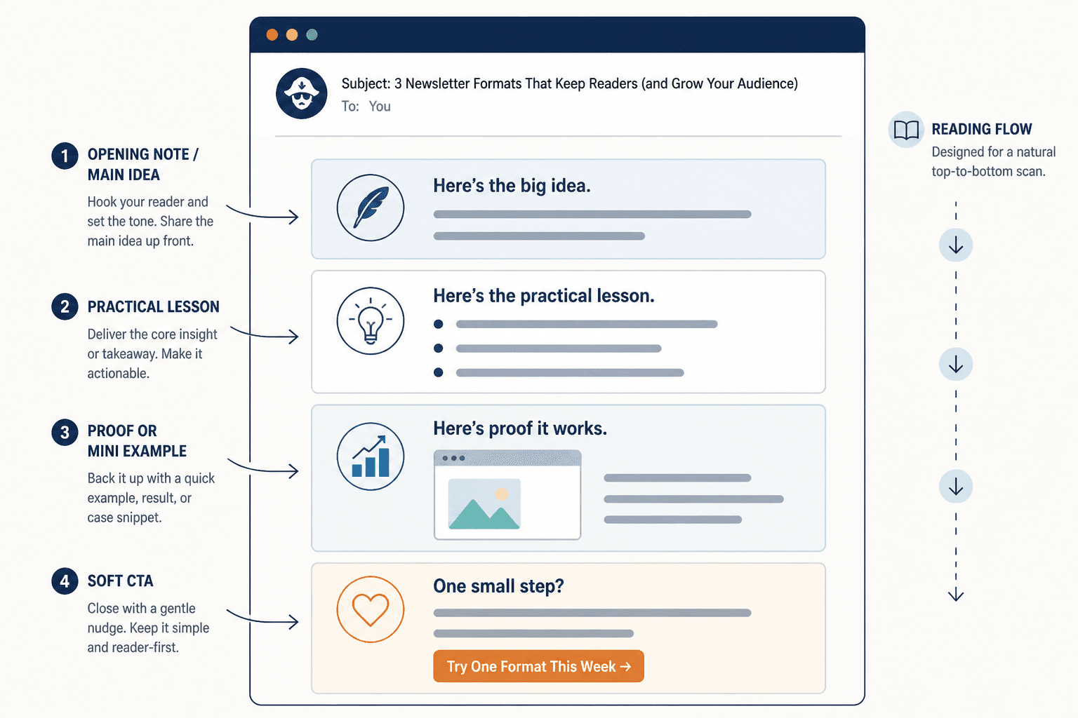
Format 1: The lean authority email
- Section 1: 2 to 4 sentence opening note
- Section 2: one practical lesson
- Section 3: one example or mini breakdown
- Section 4: soft CTA
This is ideal if you want to build trust around your expertise without sounding stiff or overproduced.
Format 2: The relationship-building email
- Section 1: short story or observation
- Section 2: takeaway for the reader
- Section 3: one recommendation or resource
- Section 4: reply prompt
This works well when you are trying to deepen reader connection, not just distribute information.
Format 3: The curated insight email
- Section 1: editor’s note or opinion
- Section 2: 3 curated links or tools
- Section 3: why each one matters
- Section 4: CTA or related offer
This is especially useful if your value comes from filtering noise, spotting patterns, or surfacing useful things quickly.
How to choose the right format for your newsletter
Do not pick a format because it looks sophisticated. Pick one that matches your actual goals and operating style.
| If your main goal is… | A strong format is… | Best reason why |
|---|---|---|
| Build authority | One-idea email | Keeps the insight central |
| Build relationships | Story-driven lesson | Feels personal without losing usefulness |
| Share curated value | Note plus links | Easy to scan and consistently deliver |
| Reduce writing friction | Recurring column format | Gives you a repeatable system |
| Get more replies | Short lesson plus prompt | Makes interaction feel natural |
There is no prize for choosing the most elaborate format. Small audience newsletters tend to perform better when they feel clear, intentional, and alive. Not “content-rich.” Alive.
What small creators keep doing wrong with newsletter sections
A few mistakes show up constantly.
Adding sections before earning them
If you do not yet have enough material for a recurring “tool of the week,” “quote of the week,” “trend watch,” and “creator corner,” then congratulations, you have built yourself a maintenance problem.
Start lean. Expand only when a section keeps proving useful.
Using sections as filler
A section should have a job. If it exists only to make the newsletter look substantial, cut it.
Newsletter structure works best when each section has one clear job and supports the main point of the issue. Simpler formats usually outperform busier ones when the writing stays sharp.